2026 Dulux Colour Awards Winners Announced
IMG LINK
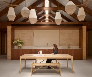
Project: Above The Clouds by Pattern Studio Award: Winner - Commercial Interior - Workplace & Retail
IMG LINK

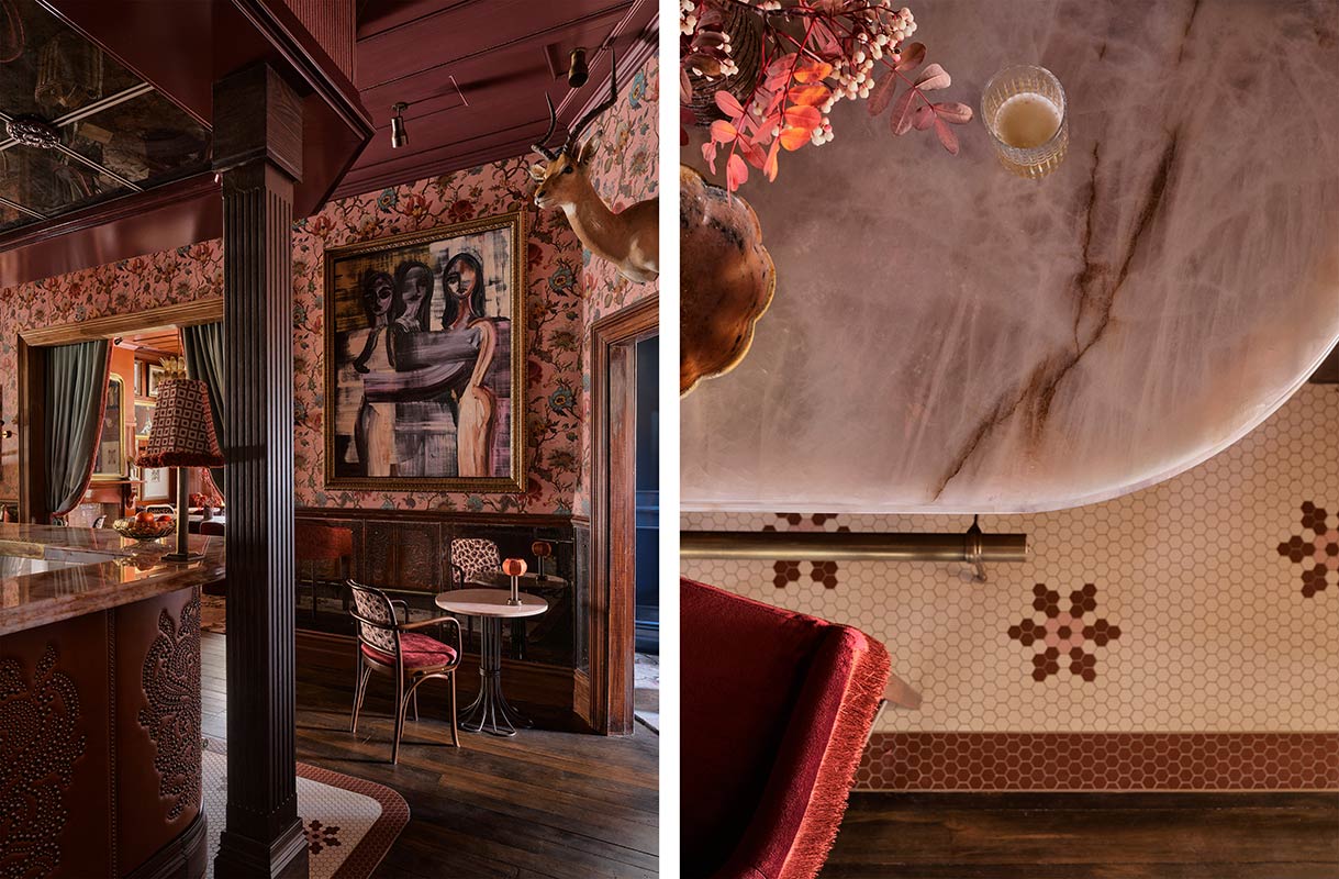
Project: Billy's, Ayrburn by Alexander &CO. and SA Studio Award: Winner - Commercial Interior - Public & Hospitality
IMG LINK

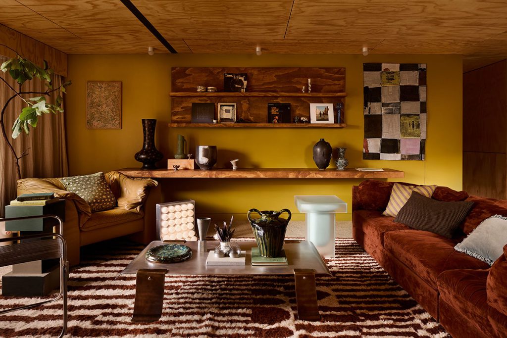
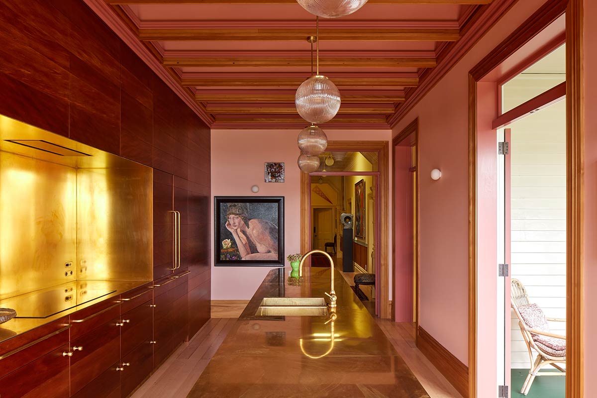
Project: Waka Huia by Pac Studio Award: Winner - Grand Prix NZ; Commendation - Residential Interior
IMG LINK
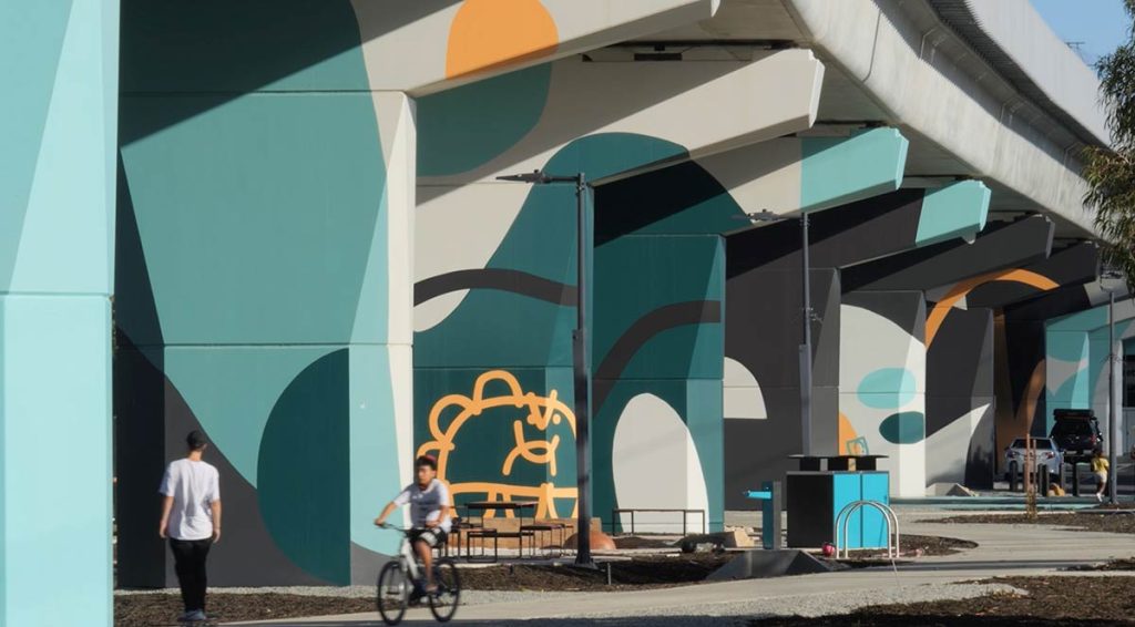
Project: Moving Colour - Linewide Graphic Trail by Moving Colour Studio Award: Winner - Commercial and Multi Residential Exterior
IMG LINK
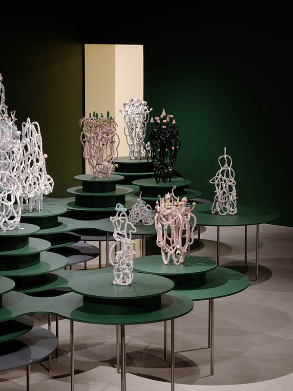
Project: Lynda Draper: Glimmer by Youssofzay Hart Award: Winner - Grand Prix AU; Winner - Temporary or Installation Design. Photo
In a fittingly colourful gala event, the winners of the prestigious 40th Dulux Colour Awards celebrated the milestone occasion at Bennelong, Sydney Opera House last night.
The symbolic moment honoured four decades of awarding exceptional colour use in the built environment, as well as the extraordinary winning projects chosen from a record number of entries across Australia and New Zealand this year.
“Our long-running Dulux Colour Awards are regarded as a design industry vanguard, unique for their recognition of colour as an integral design tool,” says Dulux Colour and Design Manager Lauren Treloar. “For forty years, we have highlighted the potential of colour to transform architecture and design and applauded those who most masterfully employ it to enhance our user experience.”
Critically, the Dulux Colour Awards have constantly evolved, introducing new categories and attracting increasing numbers of entries as the significance and prestige of the program has grown since its inception in 1986.
“The remarkable recognition of the awards by architectural professionals parallels the growth and calibre of the design industry as a whole. Consequently, in this anniversary year, we have more entries than ever and our winners truly epitomise the most ambitious and accomplished work we’ve ever seen,” says Treloar.
“In all these winning projects, the architects, designers and students confidently step away from traditional or stereotypical palettes and applications to show us what is possible when colour is prioritised as a foundational design tool,” says Treloar. “From an urban underpass to a ceramic art exhibition, they are conceptually courageous, pushing the boundaries in every typology and, in doing so, universally transforming our built environment.”
This year’s Grand Prix winners are demonstrable exemplars of the evolution of the awards program. Vastly different, their strategies embody opposing concepts – one minimal, one maximal – thus highlighting the versatility of colour as an architectural device.
From a category that was only introduced two years ago, the Australian Grand Prix winner also took out the award for Temporary or Installation Design. The chromatic restraint of Glimmer, a survey exhibition of work by ceramicist Linda Draper, designed by Sydney duo Youssofzay Hart, drew upon subtle tonal hints in the artist’s work to derive its restrained palette. A prime example of colour mastery, it deftly strikes the balance between offsetting the sculptural works and maintaining its own presence. Together with its topographic installation of modular display elements, it eschews the stereotypical black box/white plinth exhibition norms in favour of a conceptual strategy with relevance across multiple genres.
Contrastingly, the complex palette of New Zealand Grand Prix winner, Waka Huia, designed by Pac Studio, sees an array of bold hues co-exist in a kaleidoscopic interior, which beautifully embodies the clients’ personal history within a harbourside home, resplendent with art, original architectural details and precious memories. It is the breathtaking result of the architects’ deep understanding of the theory, their conviction, and capacity to collaboratively create a scheme of saturated colour.
“Both approaches require huge commitment for they exist at the margins, pushing the boundaries to the limits, testing what is possible,” says Treloar.
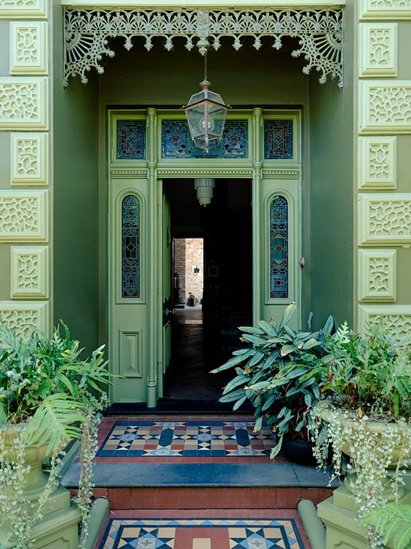
In the residential categories, both interior and exterior winners demonstrated contextual appreciation, with colour-drenched homes eliciting strong emotional responses from the judges. Modern nostalgia emerged as a theme, with nods to twentieth-century design highpoints, ranging from 1970s Australian bush aesthetic to the Italian modernism of the 1920s. Bold, warm shades of red, yellow and earthy tones were widely evident, with many projects featuring painted ceilings and nuanced details on architraves and skirtings to achieve visual saturation.
The judges were particularly keen to acknowledge the number of decisions required to realise the chromatic excellence of the winning projects. “As judges we need to assess the quality of the creative concept and colour applications, but it’s vital to also recognise the indepth client collaboration, painstaking consideration and leap of faith required to achieve these results,” says Simone Haag, Interior Decorator
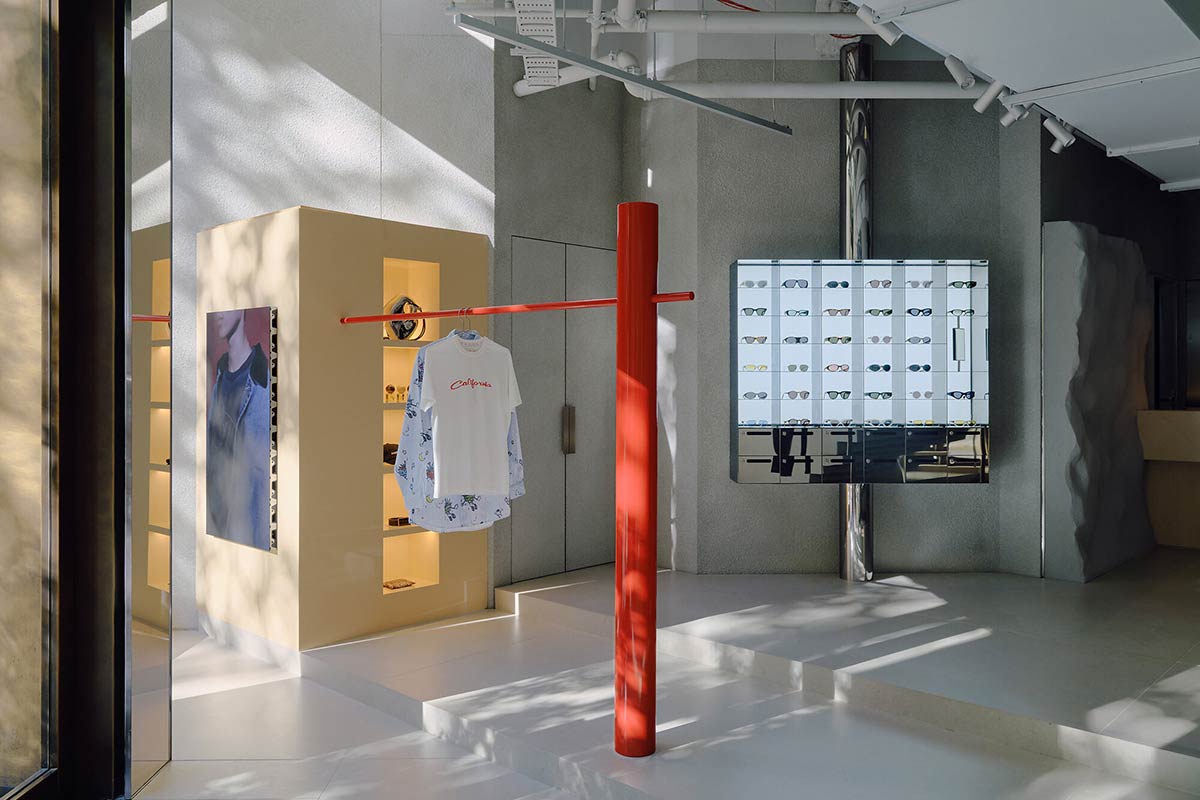
In the Commercial context, retail came to the fore with breathtaking examples of powerful colour concepts determining mood and identity. The two awarded projects opted for highly restrained palettes, resulting in other-worldly, transportive interiors, glowing and temple-like, with a design approach more associated with exhibitions than traditional retail, seeing products treated as exhibits, objects to be revered more than acquired or consumed.
“These colour treatments feel like a 180-degree turn from the residential schemes,” adds Haag. “While residential projects are trending warm and comforting, retail is turning to minimalism, using subtle blues and greys, and evoking dystopian sensibilities.”
For exteriors, the prevailing direction was about placemaking, exemplified in a sensitive mixed-type housing development in New Zealand and an expansive infrastructure art project that enlivens an urban underpass in Perth. Dramatically different in their aesthetics – the former aiming for contextual resonance, with subtle colour distinctions to distinguish housing types, and the latter opting for bold graphic colour statements – they nevertheless share the distinction of positively transforming their locations into memorable landmarks and, in doing so, redefining their respective genres.
As always, the winning student proposals were ambitious, playful and programmatically diverse. “We enjoy judging this category for it shows such breadth and sensitivity,” says Ben Peake, Principal at Carter Williamson Architects. “Students work within realistic parameters but without real-world constraints, so their concepts are often more optimistic and whimsical.”
Irrespective of scope, scale or setting, the winning projects in this landmark year of the Dulux Colour Awards highlight the versatility of colour and the calibre of its usage by architects, designers, students and specifiers. “Their concepts and capabilities have increased exponentially over the four decades of the program and consequently reached new heights,” says Treloar. “We applaud their professional appreciation of colour to transform our built environment and user experience, just as we commemorate all the past winners for making these awards the peak industry program. Recognising and awarding their excellence is a privilege.”
Thank you to this year’s esteemed judging panel of Simone Haag, Interior Decorator; Ben Peake, Principal at Carter Williamson Architects; Buster Caldwell, Director of Wonder Group; Sarah-Jane Pyke, Principal of Arent & Pyke; and Alix Smith, Principal of Hassell, for their deliberations in selecting the winners of our 40th Dulux Colour Awards.
For further information on this year’s finalists, judging criteria and terms and conditions, visit dulux.com.au/colourawards
More green updates