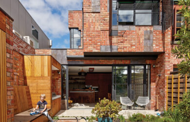
Sustainable, urban design.

Many factors come into play in order to create sustainable development in urban areas. Those that focus on outcomes that use local, recycled or recyclable materials, are of a smaller scale and consume less energy are what we look for to publish in green magazine. Renovations that stay within the original footprint and reuse materials in creative ways, new builds that use less space within a block, thereby allowing vegetation to offset the hard surfaces and medium density developments that focus on ground-breaking, sustainable urban design is what you will find. We look for inspirational architecture with good  passive design that consumes little energy, houses that consider how to reduce the amount of new material, sourced locally when possible, introduce plants for heat control and consider community.
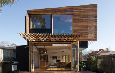
Cornered

Issue 28

This pocket-sized Sydney terrace had one big thing going for it - a south-facing corner position. It gave architect Simon Anderson the key to designing its renovation.

Return To Form

Issue 27

Built in on three sides, skillful siting was the key to a new 7-star home in Melbourne.

Space Challenger

Issue 27

With seemingly little going for it in terms of orientation or space, architect Shaun Carter turned to the site’s stepped levels to drive this ambitious renovation.

Cut Above

Issue 26

Architect Nathan Crump has designed a modernist, and modest, home for his family with a breathtaking view over Hobart.

About Face

Issue 26

Like many home renovators the owner/designer of this semi-detached had to juggle a set of competing demands, not the least being a fixed budget. Her solution was to focus on the simple ambition of bringing the northern light in to where it would be most appreciated.

Ribbons Of Light

Issue 25

When architect Luke Middleton transformed a grand 1920s Arts-and- Crafts-era property designed by Harold Desbrowe-Annear into a six-star entertainers’ home for his client, he tied old and new together using a sculptural ribbon fascia. It’s a striking but practical device inspired by the deep, exaggerated eaves of a designer Middleton describes as ahead of his time.

Open & Shut

Issue 25

The striking coloured side wall of this worker’s cottage in Brisbane gives a large hint that this is no standard renovation. Inside, the absence of walls creates a flowing internal layout that embraces the outdoors yet has the option to bunker down when required..

Rear Extension

Issue 24

Winner of two AIA (WA) awards, this renovation of a narrow, rundown cottage in inner- city Perth shows that more space doesn’t have to be the answer to improved liveability; it’s more about reconfiguring what you have.

Northern Exposure

Issue 24

Driven by the wish to live more sustainably, a Melbourne family has undergone a two-year project to transform a “renovator’s delight” into a highly efficient, individualistic home.

Linked

Issue 24

The central idea for this two-storey addition was inspired by Japanese courtyard houses that are, like this Sydney cottage, tight for space.