Design, Stacked – Second-storey Bungalow Addition
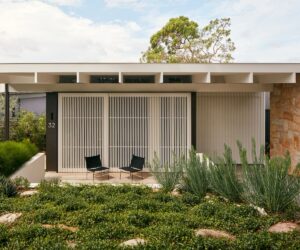
A couple and their young daughter have a new home, built as a second-storey addition to their parent’s ground floor bungalow. This simple decision has created an intelligent, stacked solution without sacrificing the beautiful garden out back.
Built as a second storey stacked neatly on top of one of the client’s parents’ single-storey house, this addition in Sydney’s Lane Cove creates a new home for a young family in a housing affordability crisis, while also keeping close to family.
Architects Harry Catterns and Sascha Solar-March from SAHA were the ones who had the idea to go up rather than out, an idea that also saved the well-established garden out back: “Their original conception was a granny flat in the back,” says Harry. “But [after] the view from the roof that we saw when we first visited the site, we came to the conclusion that it would make more sense to build up rather than taking up more green space.”
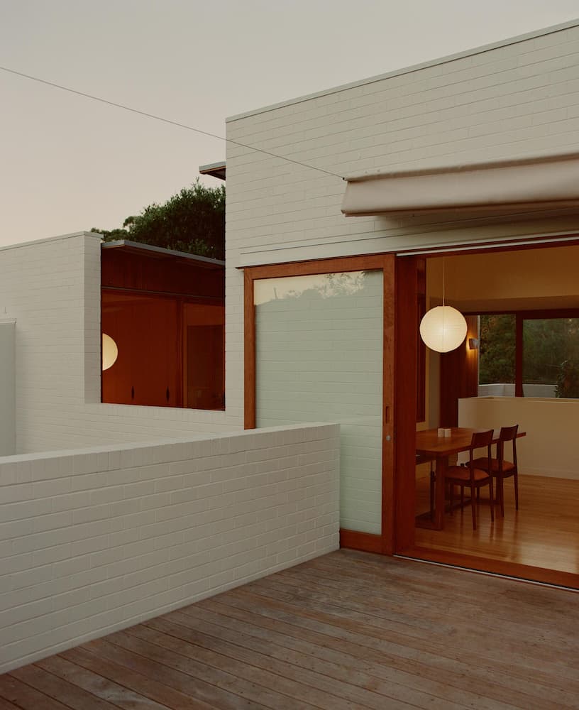
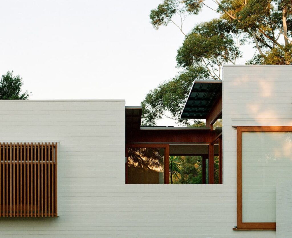
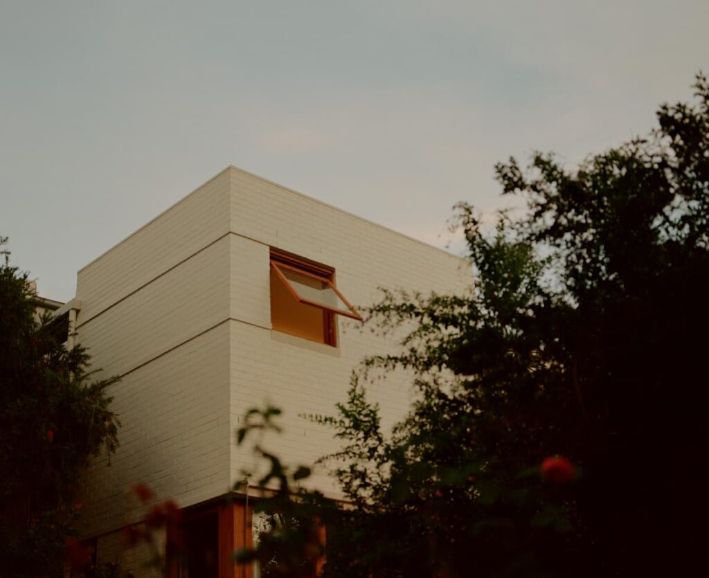
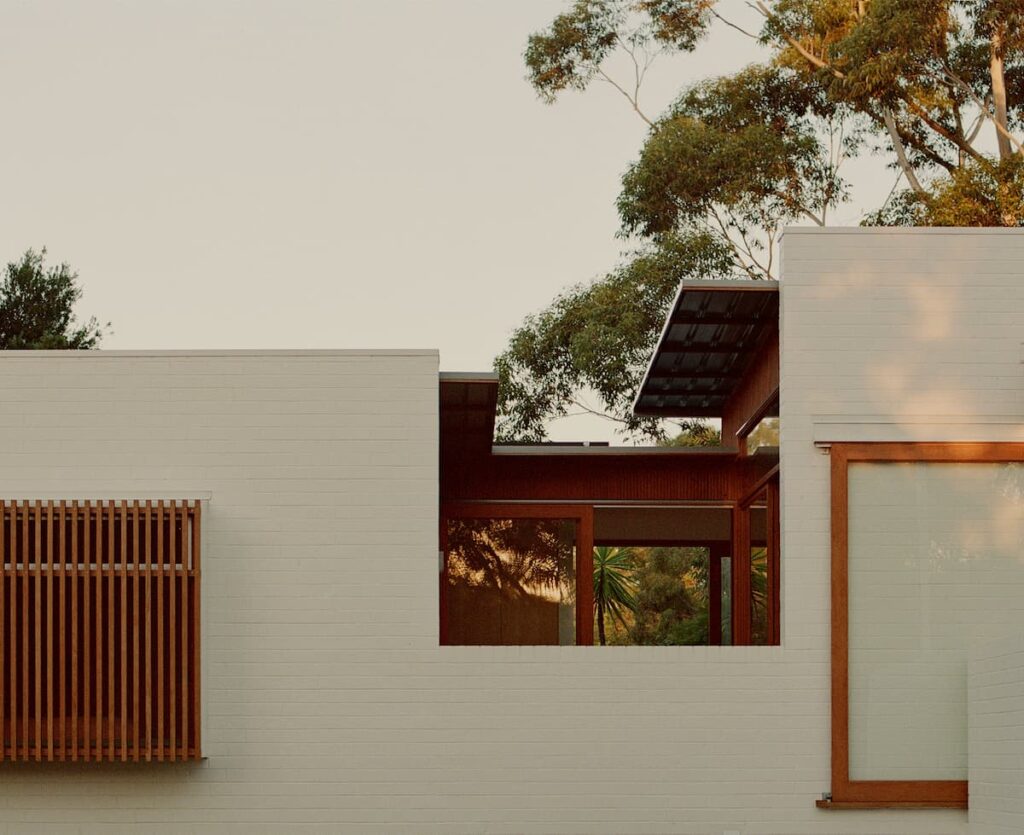
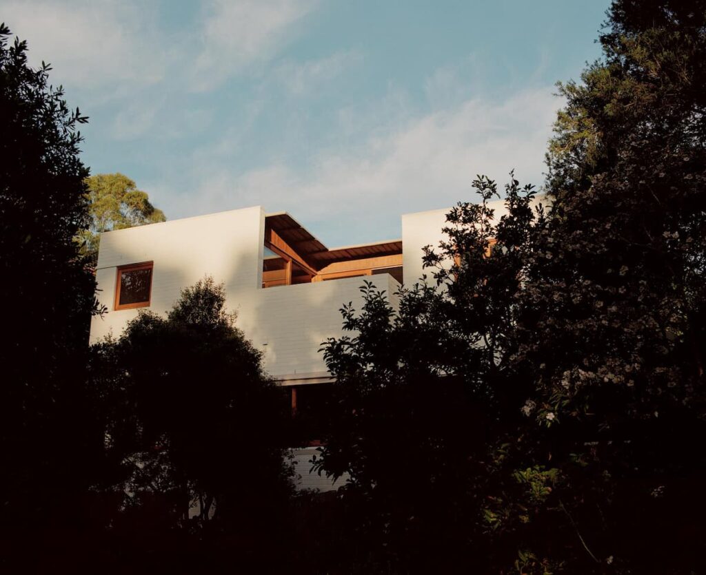
The form of the house is robust in white brick. For the roof style, the architects began by looking at other two-storey houses in the area and, while they found that a pitch tiled roof (like the original roof of the bungalow) was the most ubiquitous, they instead chose a flat roof similar to that of a block of flats nearby. This allowed the ceiling heights to be raised as well. “[It is] a parapet structure with all the roofing hidden behind, [including] a gigantic solar array,” says Harry. The ground floor remained largely as is, meaning there was no change to the way of life of the older generation. The only changes there were a new entryway with separate front doors for downstairs and upstairs, a new shared laundry and a staircase leading up. “Downstairs there was no money spent, no wasted time and no change to 85-year-olds’ way of life,” explains Harry.
The floor plan upstairs was a lot more difficult to design, with external spaces needed to bring in light without interrupting the internal spaces, amenities and flow. “We had many iterations of this plan,” says Sascha Solar-March. “I think the original overall concept was two pavilions running east west. What had the most massaging was the linking element.” SAHA also brought in environmental consultants Atelier Ten to advise on passive design principles for different iterations of the scheme.
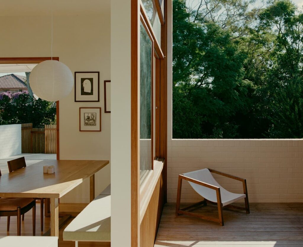
In the end, the upstairs floor plan is split into two zones that roughly match downstairs, with living areas above living areas and bedrooms above bedrooms. An exterior terrace and two internal courtyards were also positioned to capture northern light in winter and allow cross-breezes. “It’s only about 100, maybe 110 square meters and it’s got three very large outdoor areas,” says Sascha. “Having a client that was willing to not maximize their floor area and allow us to do this has made the project such a success because they really just didn’t want to feel like they were in an apartment, trapped on the second level.”
In terms of sustainability, the architects made sure as much of the building demolition was reused as possible. The old roof tiles were taken off site to be recycled and the roof framing was reused for scaffolding and temporary elements during the build. All existing windows were recycled and reused in the client’s holiday home. The new bricks used on the second storey didn’t need to match the original bricks as they were painted white to blend in. Kitchen appliances were also bought second hand.
The house has a solar array and battery storage, which powers both homes, and two rainwater tanks were installed, while the hot water is powered by solar and by one existing gas system as well. The house is also heavily insulated, especially to the west, with concertina and canvas awnings used to shade the courtyards in hotter months. Air tightness has been considered
and air exchange limited by making all external openings casement or sliding style rather than louvres or sash-less sliders.
For the architects, it was encouraging that the clients already had various sustainable initiatives in place, including solar (although not enough), water tanks and a veggie garden. “They were the kind of people who put up a shade cloth every summer and take it down every winter,” says Sascha. “We knew that whatever we were going to propose to them was going to have to meet a hierarchy of needs that we also agree with. Rather than taking the glitziest marble, these guys were already walking the walk.” The project’s success also lies in its simplicity – demonstrating affordability, sustainability and fresh thinking, the design does just what it needs to, no more, no less.
Specs
Architect
SAHA
saha.sydney
Builder
Keith March Constructions
Location
Cameraygal Land. Lane Cove, NSW.
Passive energy design
Passive thermal comfort was fundamental in space planning with the provision of three roof terraces, two of which are internal courtyards. These two courtyards create an east-west break in the building form allowing for the capturing of breezes, cross ventilation to all rooms, multiple aspects from all rooms and orientation of all living spaces to the north. Extensive solar mapping was applied to eaves to all courtyards to maximise solar gain in winter and mimimise it in summer. In addition to this, bespoke canvas shade structures were included in the project and can provide full shade to all terraces and therefore adjacent rooms, downstairs living spaces and entertaining terraces to the rear on both levels.
Materials
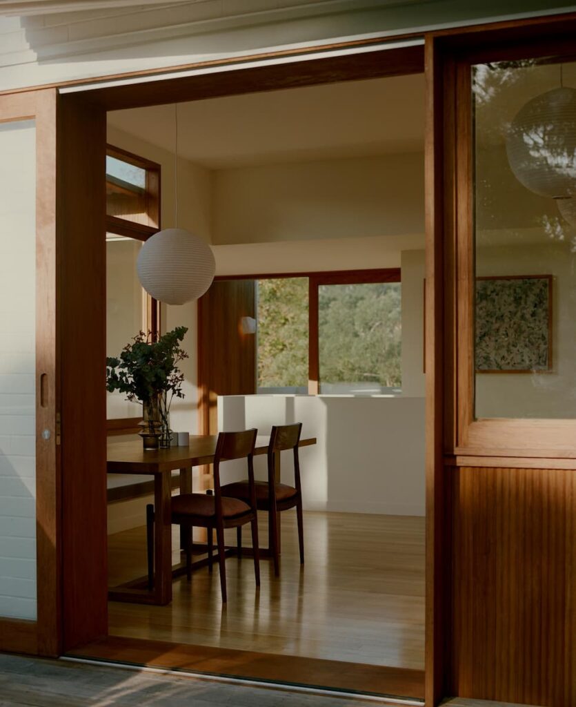
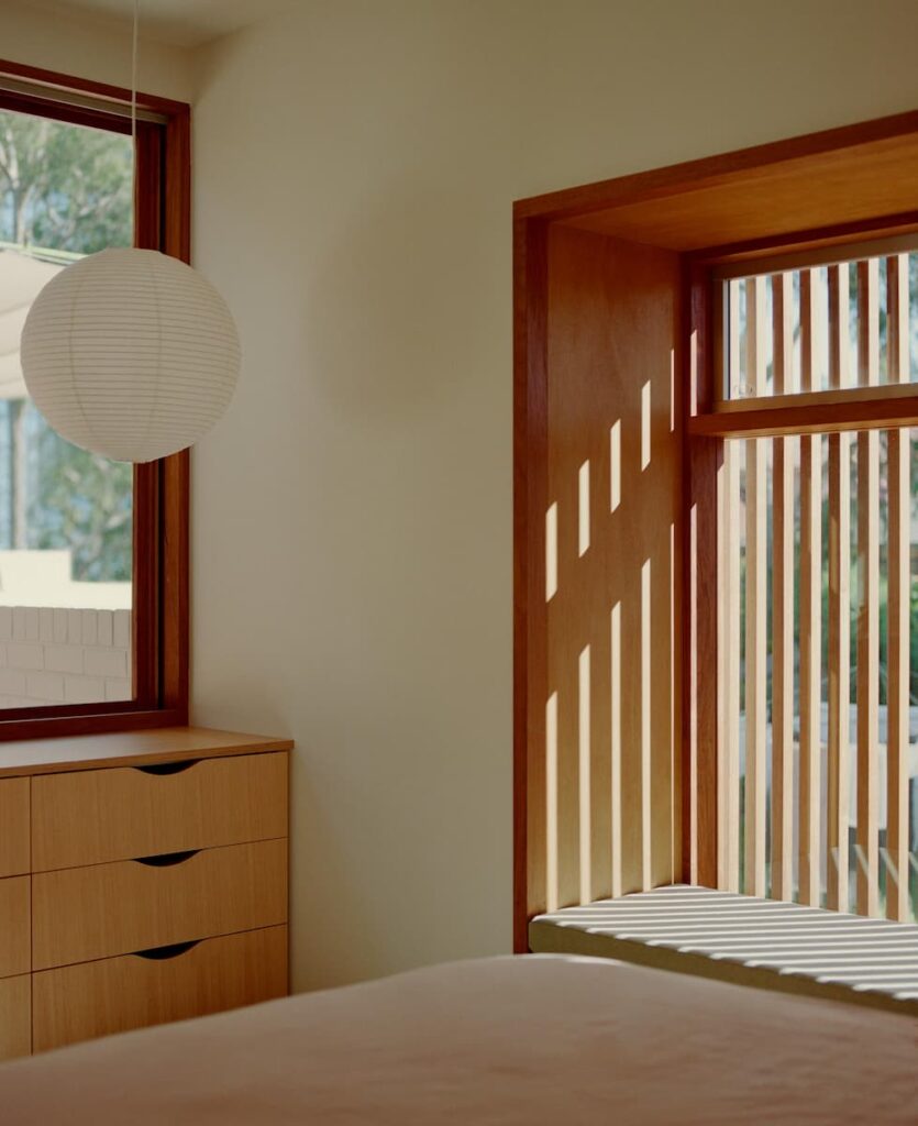
The existing home and lower level have a suspended timber floor between double brick perimeter walls, which was maintained. All upper-level volumes are of a highly-insulated brick veneer skin with pressed common bricks and timber stud internal walls. Paints are low VOC. Joinery is a Victorian ash veneer to hoop pine substrate and handles are routed into the material. A natural oil and wax finish by Osmo is used for all joinery. External finishes are distinguished by two conditions; where maintenance is difficult, a robust, parapet wall in white painted, pressed common brickwork wraps the project. Where regular maintenance is possible, internal elements are lined with white mahogany corrugated timber lining boards. All decks are covered in hotter months by concertina and canvas awnings. Low profile Klip-Lok “Classic700” metal sheet roofing was used in light, reflective Colorbond “Surfmist”. Kitchen appliances were recycled from previous building projects and sanitaryware was made in Australia by Phoenix and Caroma including the 5-Star “Profile 5” toilet suite with integrated hand basin.
Flooring
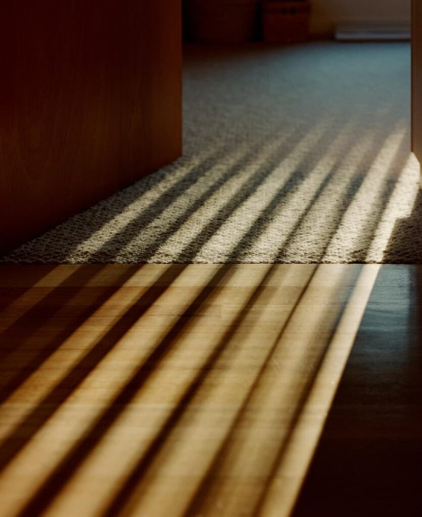
All timber floors are kiln-dried hardwood in Victorian ash in a narrow board to avoid cupping. All bedrooms are covered in 100 per cent Australian wool carpet by Hycraft over 25 millimetre yellow-tongue sheet flooring.
Glazing
Windows (awning/casement) and doors are hardwood timber-framed, with Viridian low-E clear glazing and Aneeta sashless sliding inserts.
Heating and cooling
Cross ventilation provided by the multiple decks removes the need for artificial cooling aside from ceiling fans in bedrooms with operable openings able to be used in all weather. No space heating is provided in the home and a single split-system air-conditioner is installed in the living room. All external elements are heavily insulated, are of light colours and have mature shade planting to ensure the design provides comfortable living with low energy use all year round.
Hot water system
The primary hot water system to all but one bathroom is an evacuated tube, rooftop solar system and one existing Rinnai gas instantaneous system that was not removed.
Water tanks
Rainwater from all roof areas is directed via a single, 900 millimetre-wide gutter to a series of slimline on-ground water tanks which provide water for a shared laundry and for garden irrigation.
Lighting
The house uses low energy LED lighting, low-cost wall and pendant fittings from John R Turk and Beacon Lighting, and features paper pendant shades from HAY.
Energy
A 6.63kW rooftop solar power system and battery storage has been installed, which powers both homes.
