Pocket Change – Sensitive Transformation of Brisbane Worker’s Cottage
The first phase of a clever three-stage renovation sees a rare Brisbane worker’s cottage sensitively transformed into a light-filled and delightful home.
The housing market has become a major talking point for owners and architects alike. With so much uncertainty, buyers are often looking to downsize to satisfy budget constraints, recognising that size does matter – and bigger isn’t always better. Fiona, a Brisbane local, knows this well. With the help of her friend and architect Rebecca Caldwell from Maytree Studios, she undertook renovations on a modest workers cottage in Annerley, proving a series of small, sincere changes can have a profound impact.
When Fiona first stepped foot in Pocket House, she saw an opportunity. Where others may have opted for a ‘safer’ brick veneer turnkey house, architect Rebecca explains that “Fiona didn’t want that. She has such a caretaker mentality about the home, about restoring it responsibly, [with] a long-term vision.” Although a characterful dwelling, the worker’s cottage left much to be desired – dark, insular, and in poor condition – making responsibly transforming it into a home and keeping to a budget no small feat. Fortunately, Rebecca is no stranger to a challenge. “We say three things drive cost – structural complexity, area, and finish,” she says. “So, for Fiona to afford the level of finish she wanted, size and complexity had to scale back.” So, with the intent of building small yet purposeful, a masterplan was established to distribute the renovations and budget, with Stage One commencing early 2021.
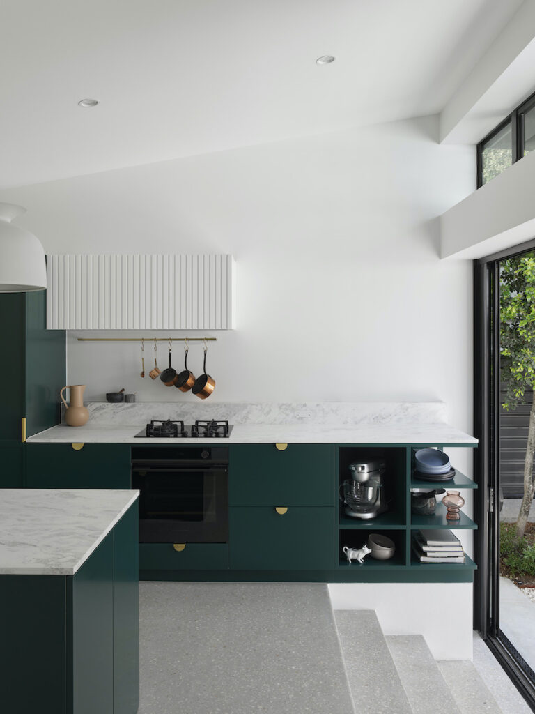
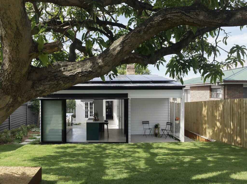
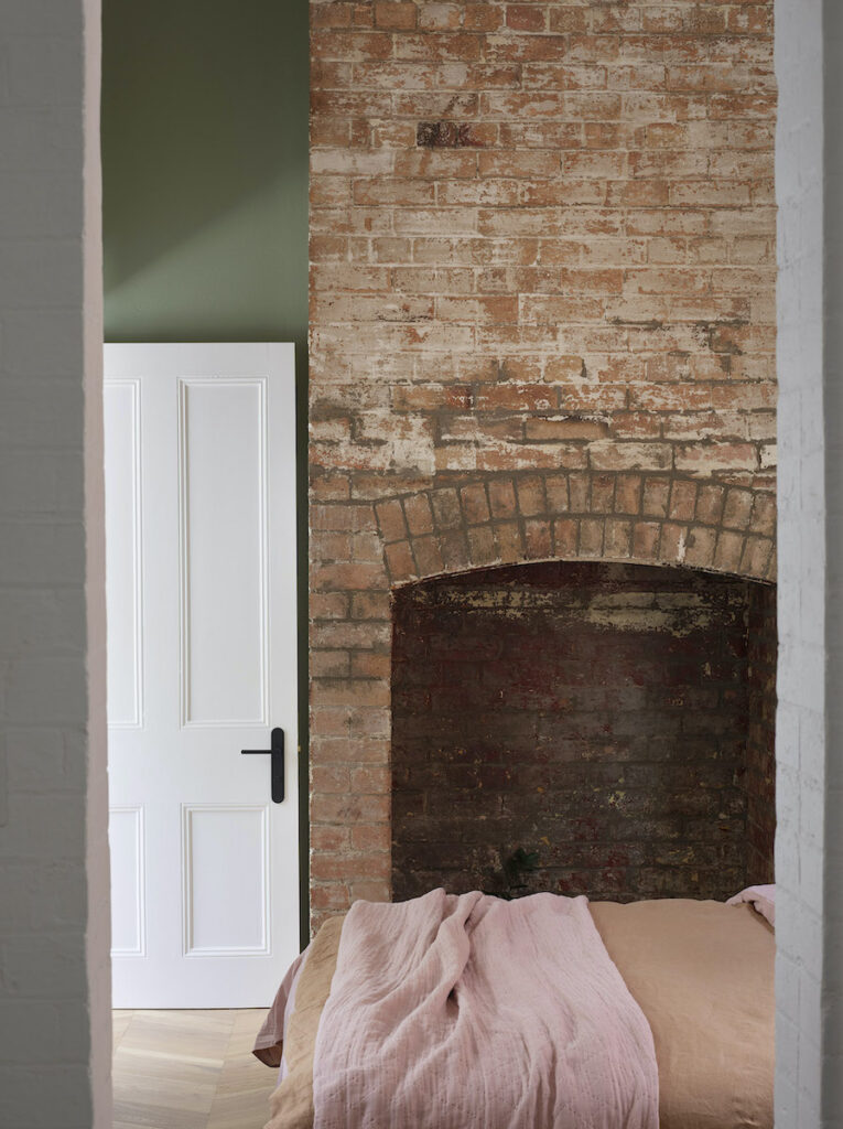
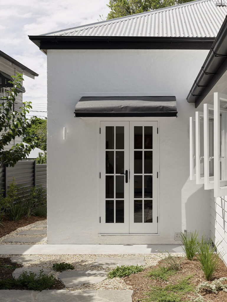
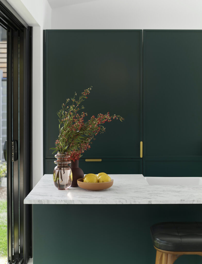
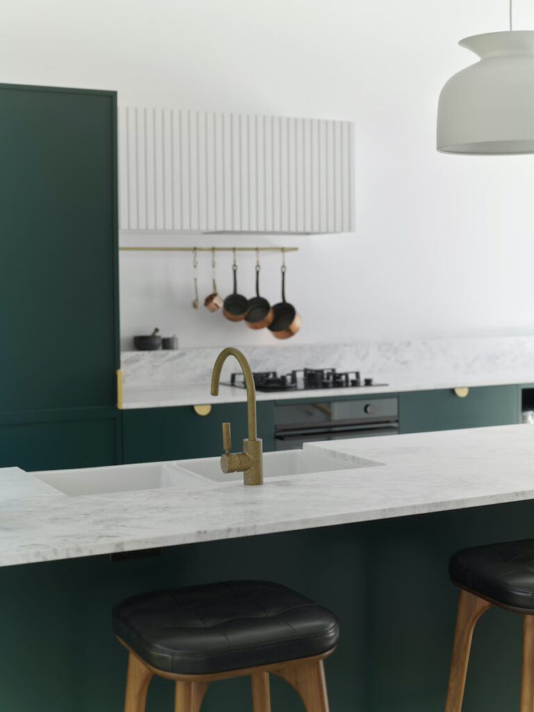
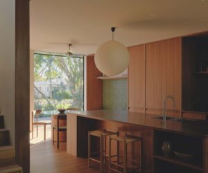
Pocket House made the most of the small 400-square-metre block through a series of selective decisions that prioritise quality over quantity. The original cottage consisted of two bedrooms, living and dining, a kitchen and veranda. Compounding the cottage’s poor external appearance was a previous extension to the rear which yielded a bathroom, laundry, and enclosed the original veranda. Stage One sought to transform the previous extension into an open and airy living wing, with improved flow and character. “The [new] form is very simple, complementary to the cottage, but kept paired back,” Rebecca explains. To conserve budget and space throughout, efficiency was key. While the original kitchen was carefully transformed into Fiona’s new master bedroom, the new kitchen became the hero of Stage One through elevated finishes and optimised natural light.
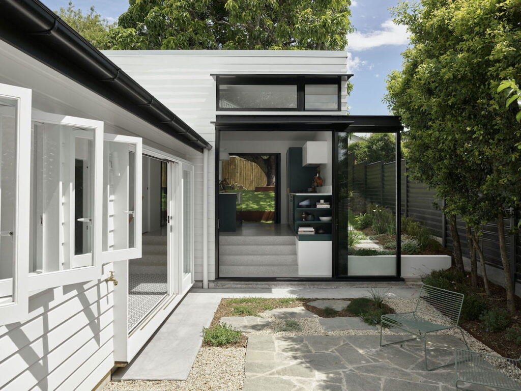
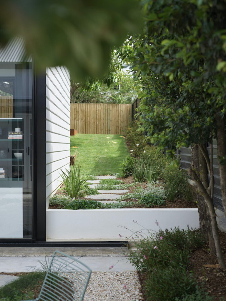
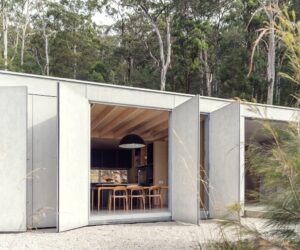
Next, rather than fight the sloping block and attempt costly earthworks, the fall of the land was simply embraced. Rebecca explains, “To avoid excessive cut and fill … we’re just stepping the house with the landscape.” The resulting ‘tea drinking steps’ are a unique feature, cleverly connecting the new kitchen to the central courtyard. Here, generous sliding doors peel back in summer to capture cooling breezes or remain closed in winter to embrace northern sunlight in a welcoming moment, carefully framed by courtyard views.
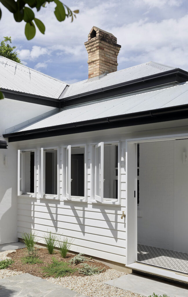
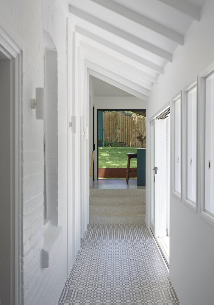
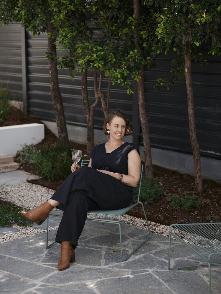
The central courtyard becomes an unexpected centrepiece that strengthens the cottage’s connection with its environment. “This is about that easy, fluid flow. The lovely relationship between spaces is through the courtyard,” says Rebecca. Conceptualised by Ecru Design Studio and installed by EdenScapes, the charming landscaping creates an inviting outdoor room. The adjacent hallway connects old with new, opening to create an indoor breezeway where striking tiles serve as a reminder of the original veranda. “The concrete tile was about delineating what was an external space,” says Rebecca. “We had to fully remake it because everything was in such poor condition. But we replicated the original grid in the new design.”
These sensitive interventions demonstrate a strong sense of homage, ensuring the new renovations do not overshadow the original, yet dramatically increase the spaciousness of the cottage. “I know hallways aren’t supposed to be your favourite room, but it’s pretty special. We tried to encompass what had been there before … so we’ve kept that beautiful brick, and that feeling of indoor-outdoor,” explains Fiona. Stages Two and Three are similarly intended to continue a commitment to responsible restoration, designed to renovate the original cottage, restore the front veranda, and deliver a carport with a green roof as a gesture that gives back to the street.
Pocket House represents a thoughtful response to a contemporary dilemma. A series of small, thoughtful gestures overcame budget, heritage and spatial constraints, transforming Pocket House into a home. “That’s why we love clever little solutions,” Rebecca says. With demolitions discerningly confined to non-heritage elements and the prioritisation of natural light and ventilation, Pocket House becomes a delightful space for Fiona and her cat Lucy. “It’s a small house but because there’s so many windows and feels so light and airy, it’s just sitting in the space rather than taking up space,” says Fiona. Working closely with builders at Frameology, the team dramatically improved the liveability and useability of the cottage, championing efficiency and simplicity. “They are the smallest changes … there’s a real delight in nailing those little things that significantly improve the home’s functionality and life. The greenest thing is to
stop people demolishing,” Rebecca points out. By looking to restore, and approaching decisions with creative sensitivity, Pocket House becomes a memorable offering of contemporary architecture that feels anything but small.
~
Specs
Architect
Maytree Studios
Builder
Frameology Constructions
Landscape
Ecru Design Studio
Install – EdenScapes
Location
Turrbal Country. Annerley, QLD.
Sustainability in design
Pocket House seeks to connect the home more meaningfully to its environment, improve the passive solar design, and celebrate its existing character. Selective demolition, excavation, and space planning was key in designing sustainably. Building smaller, but with greater intention, is an example of how the architects were able to reduce the environmental build impact. The house is on a relatively small block surrounded by houses and fences on three sides. They therefore wanted to ensure openings to the new extension would catch any of the breezes that make their way into the site. Large stacking doors either side of the kitchen allow the room to be completely opened to make it feel like a room in the garden. The new kitchen is set four steps higher than the existing house level. This design move was to mitigate level change between the backyard and the existing house, and to reduce the cut/fill on the site and
the need for retaining walls. The result is better connection from the kitchen to both the courtyard and the backyard.
Materials
The extension is made of a simple polished-concrete slab. Strategic placement of Heka Hoods blocks the sun from hitting the internal slab in summer, while allowing the sun to heat the concrete slab and stairs in winter. The warm stairs provide a lovely spot to sit on a sunny winter’s day, have a cup of tea, and look back at the old house. The new extension has high insulation and is built from lightweight timber-framed construction. The house is clad in Hardies “Primeline Newport” weatherboards and corrugated metal roof sheets on the addition collect rainwater into tanks.
Flooring
The polished concrete is Boral “Snowdrift” with a clear matte sealer. It has a white and earthy-toned aggregate with softer tones that complement the palette of the house. The corridor floor tile is an Italian geometric cement-look tile referencing the existing black and white mosaics of the entry, which carries the monochromatic scheme through the internal spine of the home. The bedroom flooring has been refurbished with a floating oak floor in a chevron pattern and the existing carpet throughout the house will be replaced in the future works of Stage Two. The ensuite tiling is a large porcelain grey tile with subtle veining, wrapping up to a 2100 mm datum height. Material selections were made to complement the small scale of space and the traditional character of the home.
Heating, cooling and ventilation
Large window openings are provided to the north and south for the main living areas. This provides ample ventilation, and capacity for winter sun and natural daylight. The corridor that connects old to new forms the western edge of the courtyard. As the architects wanted to open this edge to the courtyard, it had the potential to become a hot space in summer. To counter this, they treated the corridor almost as an external verandah space with the ability to completely open up to ventilate the space and allow hot air to escape quickly. Essentially the corridor works as a buffer to the living spaces of the house. The existing mature trees to the western boundary were retained to provide shade and cooling to the new courtyard. They also form a lovely green edge to the space. The courtyard is a combination of large stone pavers and soft green ground cover, which aid in cooling the space. Generally, the new extension breathes really well and receives cooling breezes from the shaded backyard. On the few days of the year when the temperature is too hot, a small split system air conditioner services the kitchen extension. High-level windows to the kitchen face north to collect winter sun and provide a small view to the chimney in the old house.
Energy
A 3.52kW solar system has been installed.
