Colour Planet

Designing for Australian light: rethinking colour specification with Colour Planet
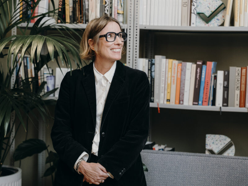
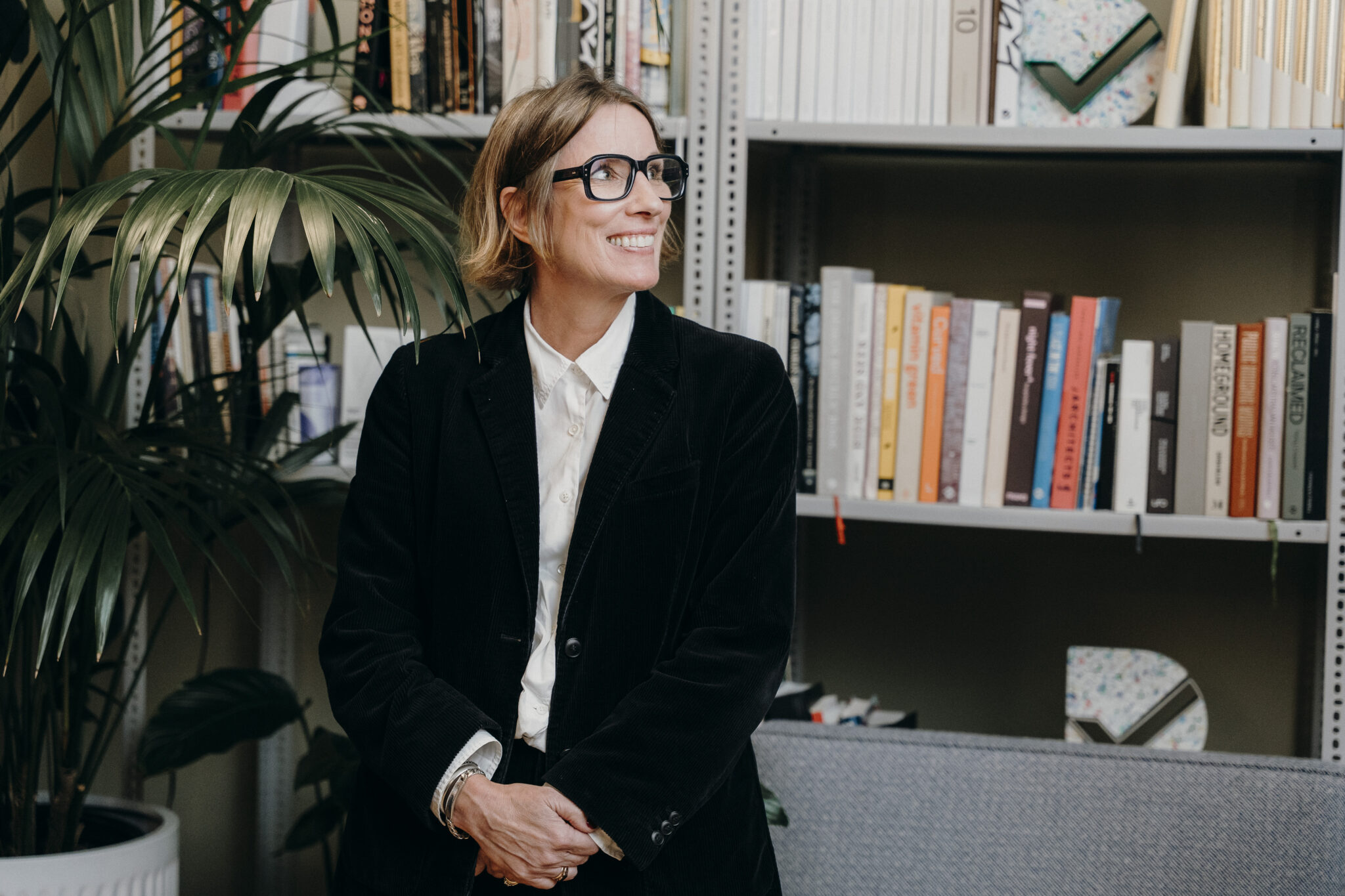
Rachel Lacy, Colour Lead at Haymes Paint
Colour is never static — it is shaped by light, and constantly shifts in response to its environment.
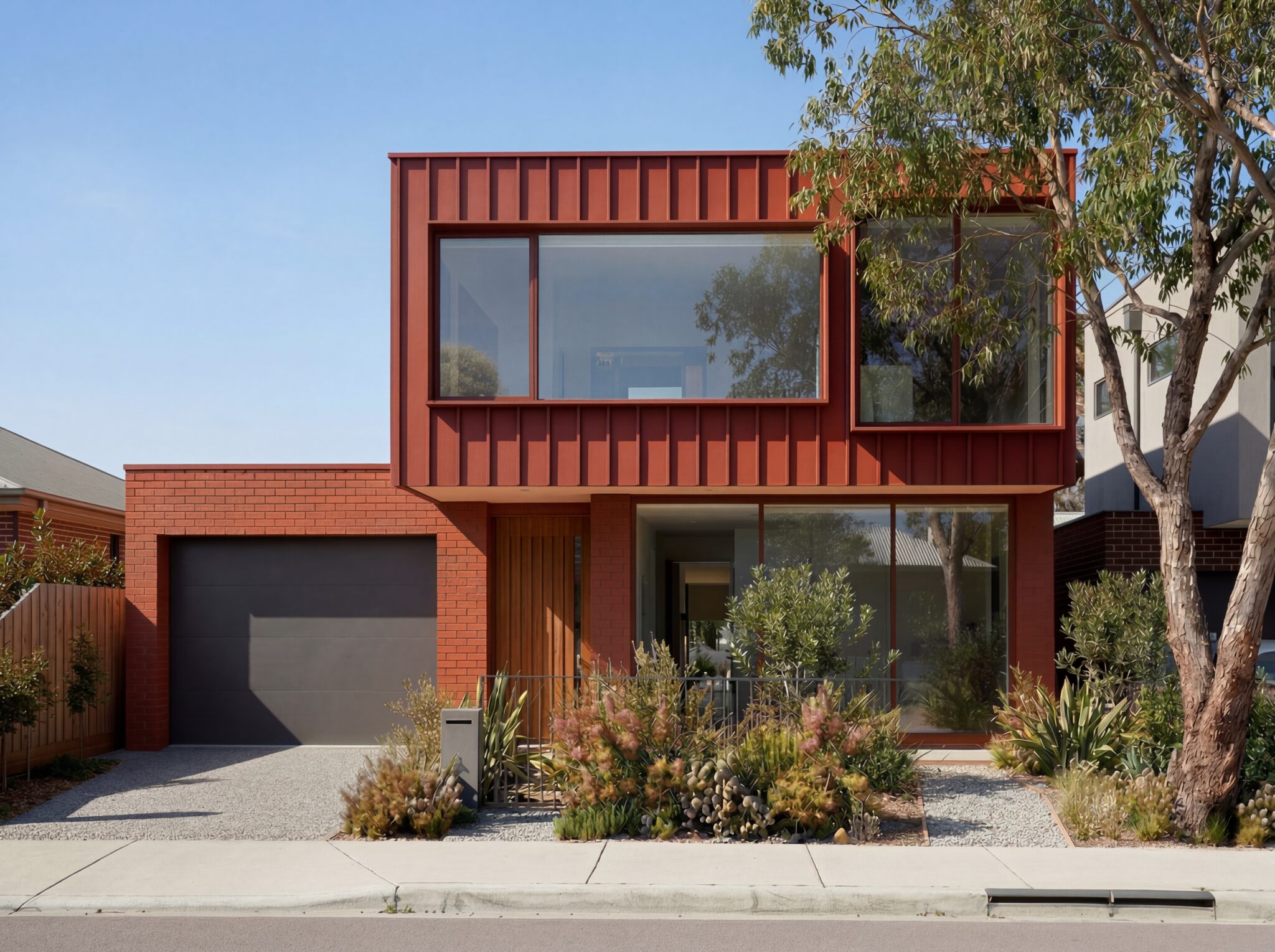
In Australia, where light is typically brighter and higher in contrast, this relationship is more pronounced — making colour less predictable than it may appear at the point of specification. Developed over eight years, Haymes Paint’s Colour Planet system responds to this reality, offering a more consistent and intuitive way to work with colour in the built environment. We spoke with Colour Lead Rachel Lacy about the thinking behind the system and what it enables in practice.
Australia has a very particular quality of light. How does that influence the way colour performs in the built environment?
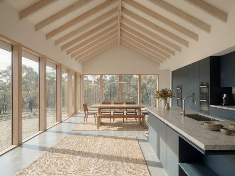
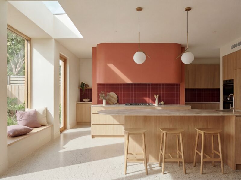
Colour is fundamentally shaped by light — everything we see is a result of that interaction. In Australia, our light is brighter which results in a higher in contrast between light and shadow, which can change how colour is perceived once it’s applied.As an Australian-owned and made company, designing a system that responds to these conditions was a key driver for us. Colour Planet has been developed to ensure colours remain balanced and usable in real environments — particularly across those more nuanced tones that sit between traditional colour categories.
What is Colour Planet, and what sets it apart from other colour systems available to designers?
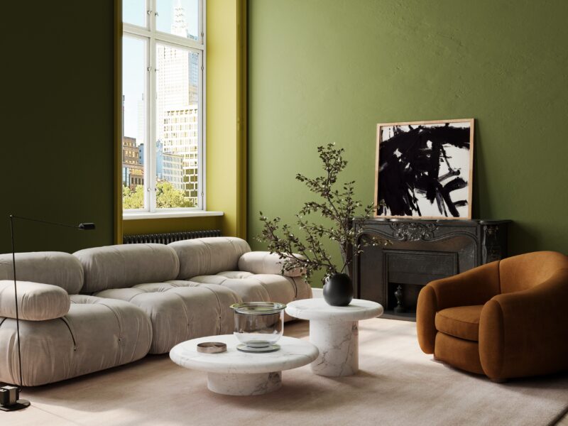
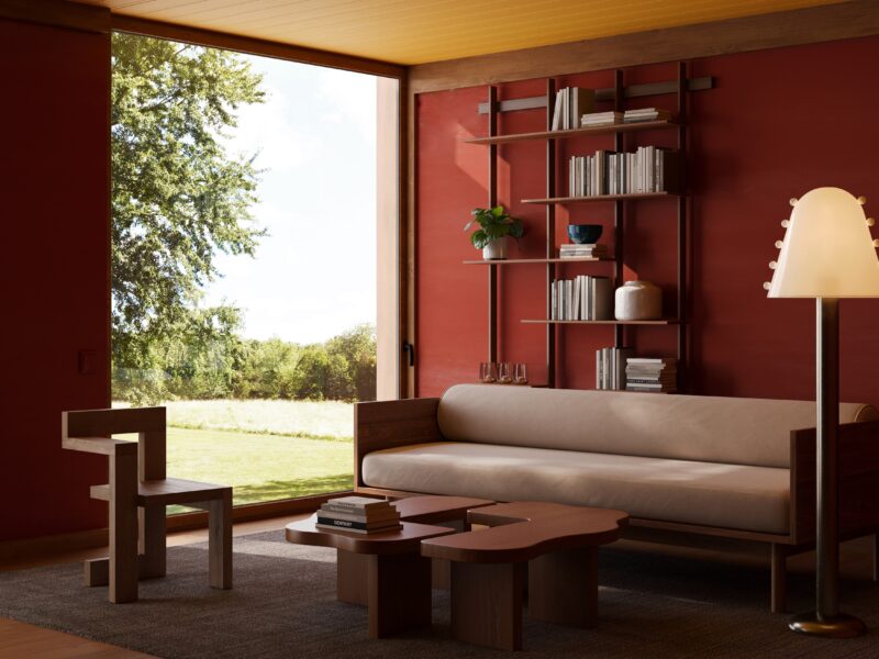
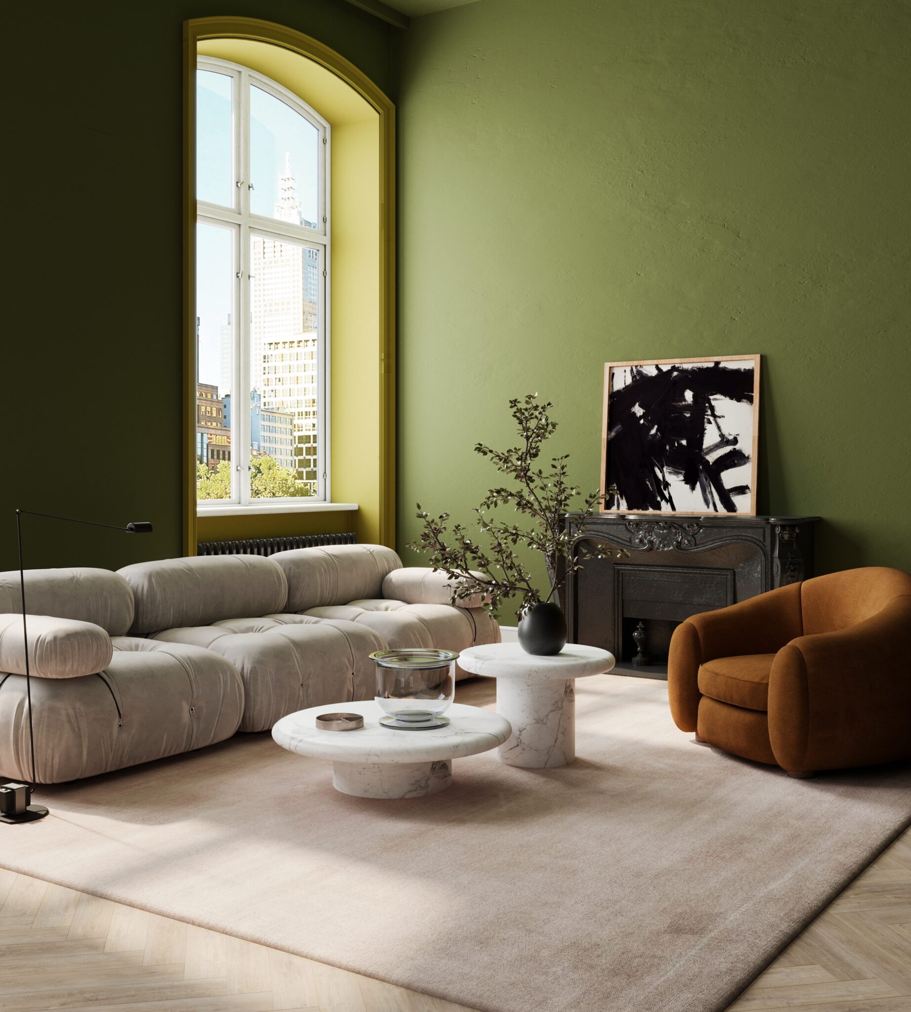
At its core, Colour Planet is a comprehensive colour system designed to make specifying colour more intuitive. Rather than organising colours into fixed categories or trend-led palettes, it presents them as a continuous spectrum — allowing designers to understand how colours relate to one another and move more fluidly between them. The system brings together 6,000 colours — including more than 1,000 newly developed colours— into a single, unified structure, supported by both physical and digital tools.
The system has been developed over eight years. What did that process involve?
Colour Planet began as a research and development project within the Haymes Paint laboratory, with the ambition to create a proprietary colour space developed specifically for our context. Over time, that work evolved through collaboration across the business — from technical teams through to sales, retail and marketing — to ensure the system would be both robust and practical in real-world use. Like most R&D processes, it developed iteratively, gradually becoming a framework that could support both creative exploration and technical precision.
What does Colour Planet allow architects and designers to do differently whenspecifying colour?
One of the key differences is the level of control it gives designers when working with colour in context. Rather than selecting colours in isolation, it supports a more considered approach where relationships between tones are clearer and subtle variations can be used more intentionally. This is particularly valuable in architectural settings, where colour needs to perform consistently across changing light conditions, materials and scales. Because the system is built within a perceptual colour model, it also helps ensure greater alignmentbetween what is specified and what is ultimately realised — reducing the risk of colours appearing flat, overly saturated or inconsistent once applied.
How should architects and designers use Colour Planet in practice?
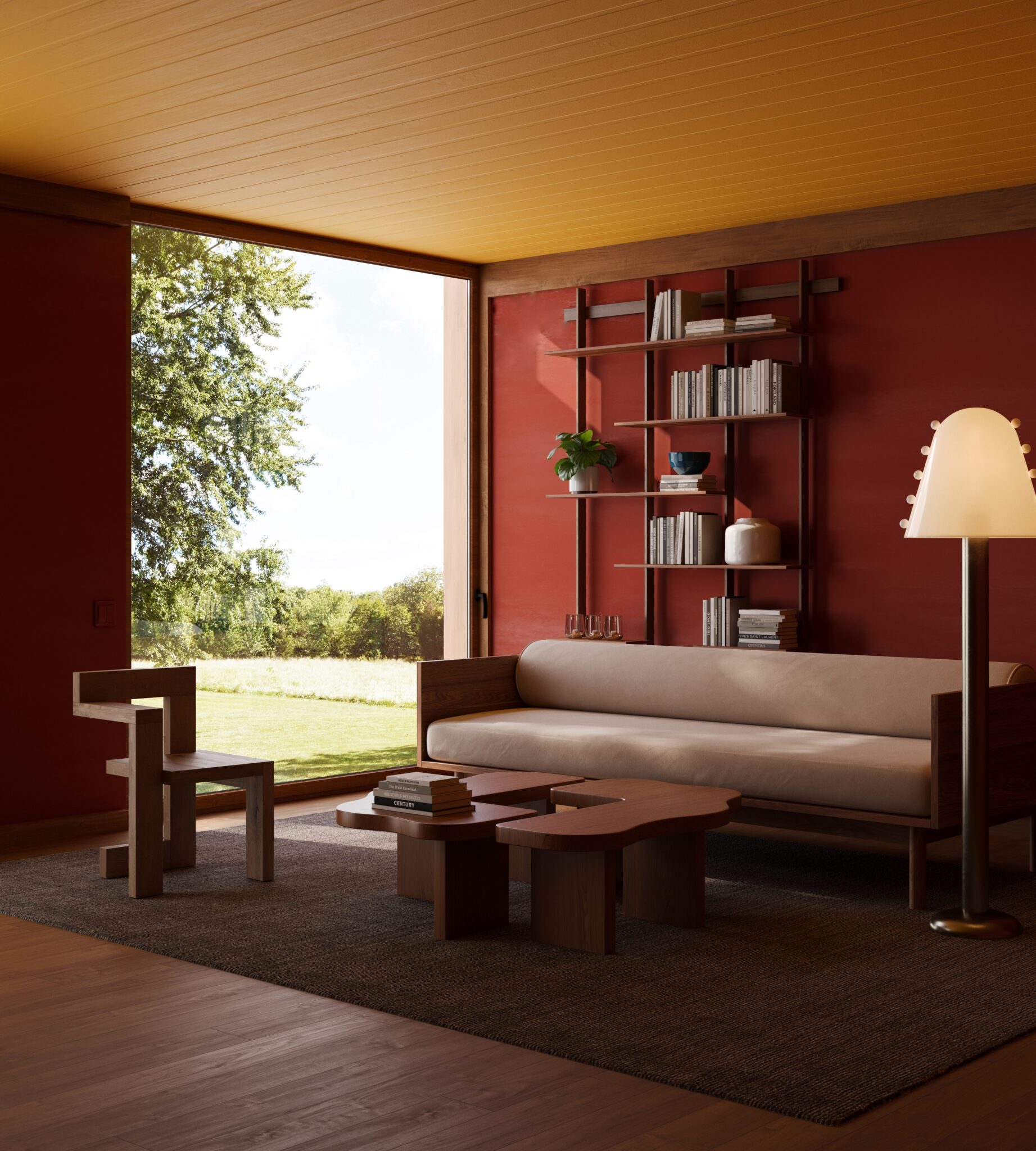
The system has been designed to work across both physical and digital workflows. The fan deck provides a curated entry point into the broader system, allowing designers to navigate colour in a more intuitive way and understand tonal relationships at a glance. Neutrals are integrated within their respective colour families, making undertones more legible and easier to work with in context. Digitally, Colour Planet is supported through BIM files and online tools, enabling consistency from early concept stages through to documentation and delivery.
More broadly, how do you see colour specification evolving in architecture and design?
Colour specification has always required a balance between intuition, experience and technical understanding. What is evolving is the level of precision and consistency designers expect from the tools they use. As colour is considered ever more carefully in relation to light, materiality and the experience of a space, there is increasing value in systems that support those decisions — particularly in helping designers anticipate how colour will perform once realised. For us, Colour Planet is about supporting that process – providing a clear and structured framework that enhances creative decision-making.
About Rachel Lacy
Rachel Lacy is a colour specialist at the intersection of art and science, with more than 30 years’ experience in the building and coatings industry. Over that time, Rachel has founded a pigment technology company, worked for numerous businesses within the global paint sector,and collaborated with architects in Australia and internationally. Since 2024, she has led colour strategy and design at Haymes Paint.
