Labour of Love – Darlington Grove
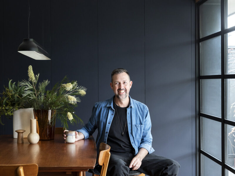
Matt and Peter didn’t expect to settle into the northern suburb of Coburg, nor did they expect to grow so fond of it. However, it was their search for the ultimate ‘renovators delight’, liveable but with plenty of future potential and of course, a nice size backyard for Frankie, the French bulldog, that led them to this eclectic, vibrant, community that they now love and feel a strong bond to.
For this couple, the move to Melbourne’s north wasn’t exactly planned. After having mostly lived in apartments, including a long stint abroad in the UK for Matt, the couple initially thought inner city apartment living would always be for them. It was the addition of their little dog, Frankie to the fold, that altered this thinking. Being very much ‘part of the family’ they soon realised that she needed more space, a back yard was in order! And so, the search began.
Trawling the inner north for their ideal home, it was in Coburg that they found ‘the one’ that ticked all the boxes. Liveable immediately, with plenty of potential to improve down the track, and mid-century features and styling, that had been mainly covered up over the years, however, Matt could see the potential to make these features shine once again. “The previous house had heavy carpets, drapes and chandeliers, others walked in and walked straight back out, but I could see the potential to make it an incredible 70’s inspired place”. And, of course, the house had a nice amount of space surrounding it, a backyard for Frankie and a front garden ripe for a green thumb (Peter) to jump in and recreate. They were sold, and they snapped up the property with plans to make it their own.
They purchased the property in 2013 and got underway with some minor updates immediately. “We did the floors, painted the interior and changed the blinds before moving in. With the plan to do all the outside once we were in”. They continued to tackle the updates in sections, a project at a time, completing the landscaping a few years later, updating the living room, then the bathrooms and bedrooms. Knowing the kitchen and laundry area was the biggest undertaking, they saved this till last, and were finally ready to tackle it in 2018.
Matt had already earmarked Cantilever for their dream kitchen, having seen a Cantilever kitchen installed years earlier in a friend’s home. He approached Cantilever in 2018, speaking to Travis about their proposed plans. After getting a better understanding from Travis on the project requirements and scale, which was quite a bit bigger than they initially thought, they then waited another few years before getting underway in 2021. They wanted to complete the job ‘properly’ so took the time to ensure they had everything in place and were ready to take it on.
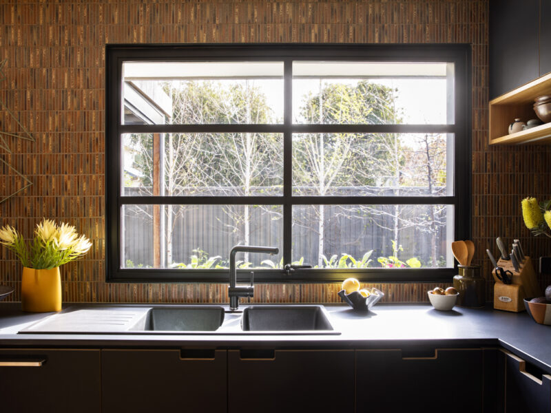
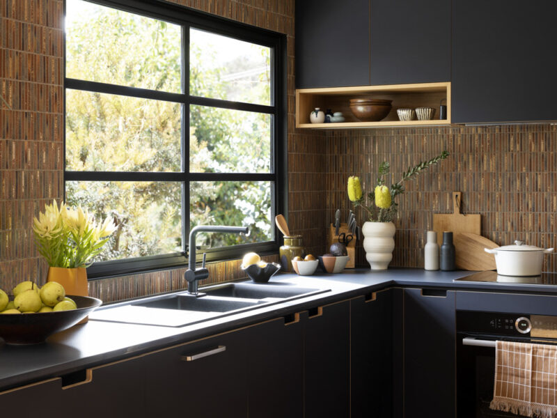
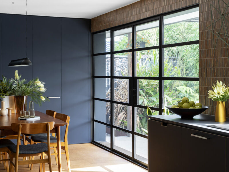
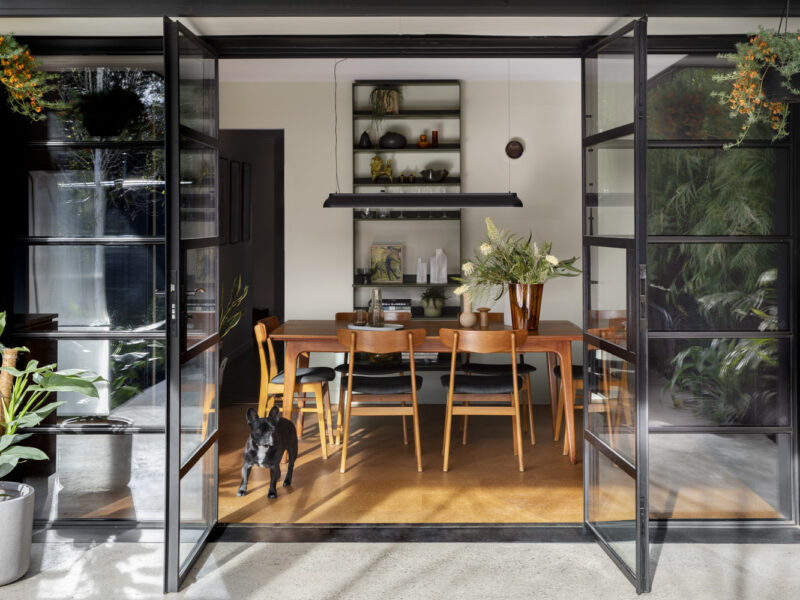
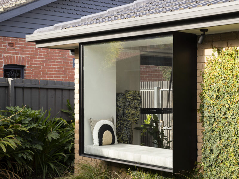
The project involved removing a wall which separated the laundry and dining room. This created a larger, open space at the rear of the house, a better flow between the kitchen and dining areas, and the ability to add a large push out window in the kitchen and French doors in the dining room. A steel box feature window was also added to the living area. All windows running along the rear wall of the house, facing west.
The black, steel framed French doors and tuck shop style window are striking features, bringing in loads of lovely natural light and leading out to an inviting, outdoor living space. The whole area feels really connected to the backyard and has become a favourite spot for the couple, whether its sitting at the dining table enjoying the warm sun pouring in on a winter’s day. Or when they have the doors pulled back on a summer afternoon, the breeze flowing through the house and the outdoor patio feeling like an extension of the dining area. The steel box window in the living area is also a key feature, acting like an artwork itself, providing a picturesque frame to the back garden.
The decision to tackle the garden prior to renovating the back section of the house, really paid off for Matt and Peter. Luckily the work was able to be completed without any damage or major disruption to the back garden. And once the windows along the back wall were updated, they instantly looked out onto a beautifully designed and well-established green space. With the growing focus and better understanding of the importance of creating green spaces, particularly in urban areas, this was a real win for the couple.
Making these updates and adding the three feature windows, required a number of different parties to be called on. Once Travis understood what Matt and Peter were trying to achieve with the project, he was able to guide them through the process and introduce them to the contractors required to make it all happen. Whilst no building permit was necessary as the updates remained within the footprint of the house, an engineer and architect were required to achieve the proposed window placement and the structural changes necessary to install them.
Travis introduced the couple to Richard from Lytton DC, one of the builders within Cantilever’s Build Network, “I was so impressed by Richard, together they guided us through the whole process”. Richard is a registered builder, who is qualified to complete larger project updates such as wall removals and, in this case, the structural updates that were needed for the windows. Matt spoke highly of the process, “We needed to engage an architect and engineer in order to change the windows, Richard and Travis helped us navigate all of that. The Cantilever process felt like a very well-oiled machine”. In fact, he found this throughout the project, “I was most impressed by the communication between Travis, Richard and the other trades. They always kept me informed but I didn’t need to intervene at all. I felt really informed and communicated with throughout”.
Matt has a discerning eye for art and design, and had a clear creative aesthetic for the project, including the kitchen, “I had a vision for the style of kitchen and décor that I wanted”. He knew he wanted to celebrate the 70’s features of the home, having had a lifelong passion for mid-century design and a nostalgic connection to the period. Some of his childhood memories of a friends mid century home, even playing into his material and colour choices. “Family friends had this amazing quirky mid-century house, I realise now looking back that their house was the source of some of my inspiration. It was full of texture, the bathroom had gorgeous blue mosaic tiles, the kitchen had brown mosaics, lots of dark, moody colour palettes through the house, lots of geometrical shapes”.
On Matt’s first visit to the Cantilever showroom, he was immediately taken with the K3 System for its mid-century styling cues and pared-back design, “The lines and aesthetic really appealed to me”. During the early planning phase, Travis suggested Matt engage Cantilever’s Interiors Service, working with Kylie, Cantilever’s Creative Director to help bring the styling and palette decisions together. Matt is so grateful he decided to use the service. “Kylie was incredible to work with, I felt really listened to throughout the process. She also pushed my boundaries, in a good way, and I loved that. It was lovely to work with such a creative person, it felt really collaborative”.
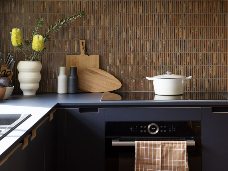
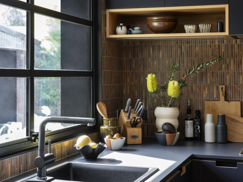
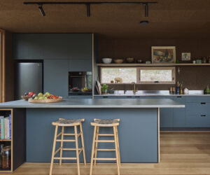
The palette of the project is a celebration of light and dark tones, the navy cabinetry sitting comfortably within the light drenched space. The striking brown mosaic tiles are a strong feature within the room, anchoring the palette. The decision to extend the tiles from the kitchen wall into the dining space, brings the two areas together. The brown tones, a fitting reference to the nature beyond the windows, in Peter’s beautifully manicured backyard.
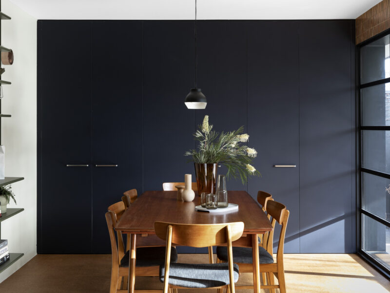
Some of Matt’s favourite features include the Soft Touch Navy on Ply cabinetry, his initial thinking was to go with black but working with Kylie, they agreed on navy as the best option. Matt is really happy with the choice, “I love the navy, I love the softness, it has a warmth to it”. The cork flooring is another stand out feature, with a water-based finish it successfully bounces the light around the room whilst also having a lovely soft feel under foot, its links to the 70’s era are also undeniable. “Kylie suggested the cork flooring, and I was all for it!”.
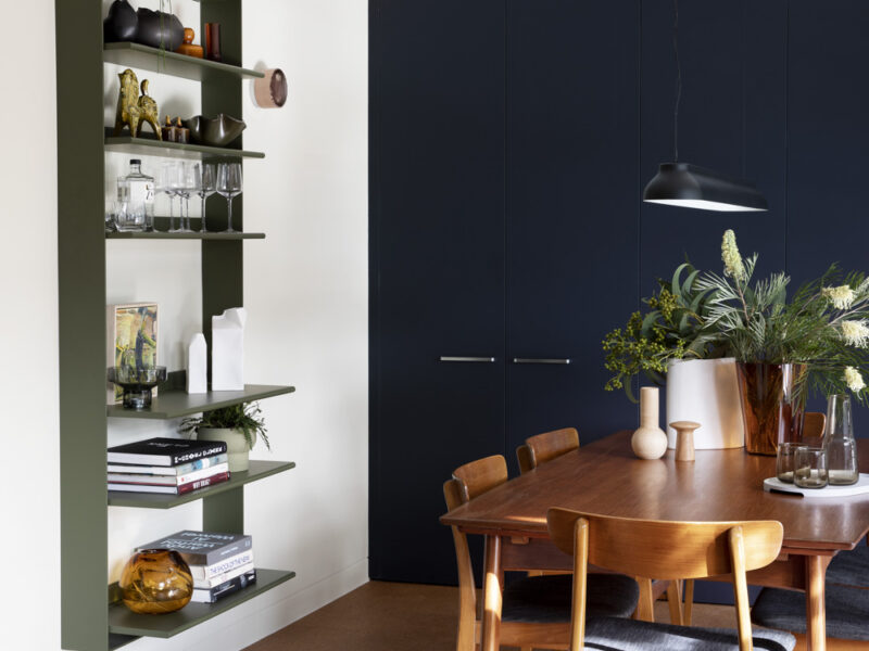
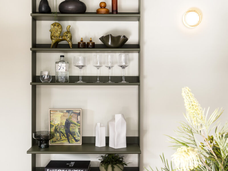
The Cantilever Shelf unit is a design feature that brings interest to the dining area. Matt loves colour, interesting design pieces and contemporary art, the Shelf unit providing a display area for some of these. “I love the shelf unit, I am very happy that Kylie suggested it, it makes the space feel more interesting”.
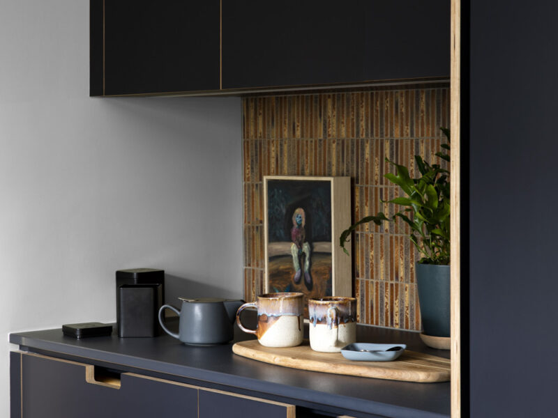
Peter has a more practical approach and loves the functionality of the kitchen layout and ability to keep it clean and organised. The kitchen design is an open configuration with a separate utility bench area, a clever concept allowing Matt and Peter to make a cup of tea or coffee without needing to be in the cooking or washing up zones. They find that they can both easily use the space without it feeling crowded. “The layout and efficiency of space in the kitchen is so good”.
This entire project took place during the covid pandemic, adding a few layers of complexity, including lock downs, material and trade shortages, and work site restrictions. Despite these challenges, the project ran to schedule. Matt and Peter moved out of their home for 3 months to allow the work to take place. Moving out is often the best option with a kitchen renovation, allowing for a more efficient installation. Matt reflects on the whole experience in a positive light. “The entire team we worked with were just so impressive, they all had a lot of integrity”.
Richard of Lytton DC, also reflects on this project as a great success, “it was one of those projects where everything ran really smoothly and the communication between everyone was great”. Richard loves the way the project focused on maintaining the original design details of the home. “This project is a great example of utilising interesting details to create a really impressive, finished product. It’s really unique and has a great mid-century vibe, it really suits the clients”.
There’s something quietly remarkable about the refurbishment of this home, a labour of love over a decade. The finish result is a beautiful, design focused home. Brave in its use of colour, yet bringing a relaxed and somewhat understated feel, a calmness. Matt and Peter intend to enjoy the results of their hard work for many years to come, “we are very happy here”.
Photos: Martina Gemmola
