Cubomania
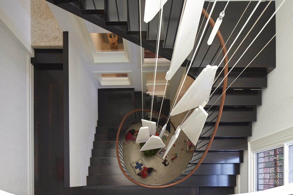
The centerpiece of this newly renovated house, lovingly designed and imagined by the Phooey team, Peter Ho and Emma Young, for a young family in inner Melbourne, is undeniably the three- storey volume that houses a bespoke spiral staircase and a uniquely crafted chandelier, set against the backdrop of a ‘window wall’.
The clients’ brief was to convert an existing 1880s heritage-listed house in a great location, and in itself a lovely place, into a unique, sustainable, open and bright home, capable of accommodating a family and interstate visitors. This was the owners’ second project with Phooey, and due to planning constraints, the unusual decision (within an Australian context) was made to extend down, rather than out.
The brief called for three bedrooms and a retreat for visitors. The front section of the house was retained and restored, re-invigorated with an altered spatial layout which involved relocating the front door and removing the existing staircase which was small and steep. This allowed the conversion of the old hallway into a study at ground level and an ensuite and walk-in robe on the upper floor. A main bedroom and sitting room are retained in the original positions, and a new double-storey extension at the rear provides children’s bedrooms upstairs, and laundry, kitchen and dining below.
To accommodate the visitors, however, the owners were driven by a desire for a habitable basement, linked by a centralised staircase that provided one point of vertical access. “We wanted the stair to link all three levels,” says the owner. “This was a priority, but once we started talking about the window wall, we began to get this idea of the light coming through the window wall and washing down the three-story volume into the basement space. We began to see the potential.”
Phooey has a very considered approach to materiality in their projects, which is once again evident in this latest work.
“We inventoried all the existing materials that were to be removed, and committed to only replacing in an area what was taken away,” says Young. “For instance, all the windows in the window wall came from the old part of the house – when it was demolished, they were salvaged.”
In remarkably good condition for their age, but lacking the thermal performance of modern windows, they, and left-over doors, were re-imagined into a three-storey high internal wall, located adjacent to a glazed link between new and old. Hanging resplendent in front of the window wall in the central void of the spiral stair is the chandelier. Constructed from remnants of the existing staircase, it hangs in pieces from the ceiling.
The architects were inspired in this project by the surrealist technique of cubomania – the art of making collages by cutting an image into squares and re-arranging them into a new image – and looked to the existing materials to provide the pallet for the new. Phooey took photos of the existing rear section of the house, which was to be replaced.
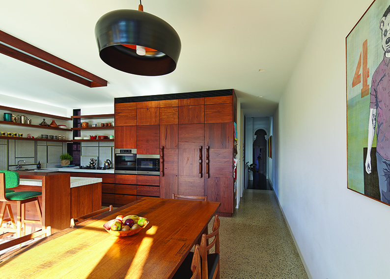
“We cut these photos into cubes and reassembled the images,” explains Young. This determined the design for the façade, and internal details such as joinery and tiled patterns.
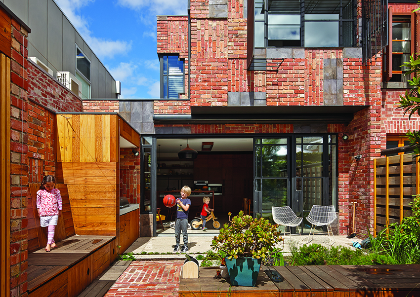
The approach is evident in the modular grid of the brickwork of the new extension, where alternating vertical and horizontal stretcher bond segments step in and out in a way that provides texture and depth. The detail is further emphasised by the strategic use of salvaged slate roof tiles.
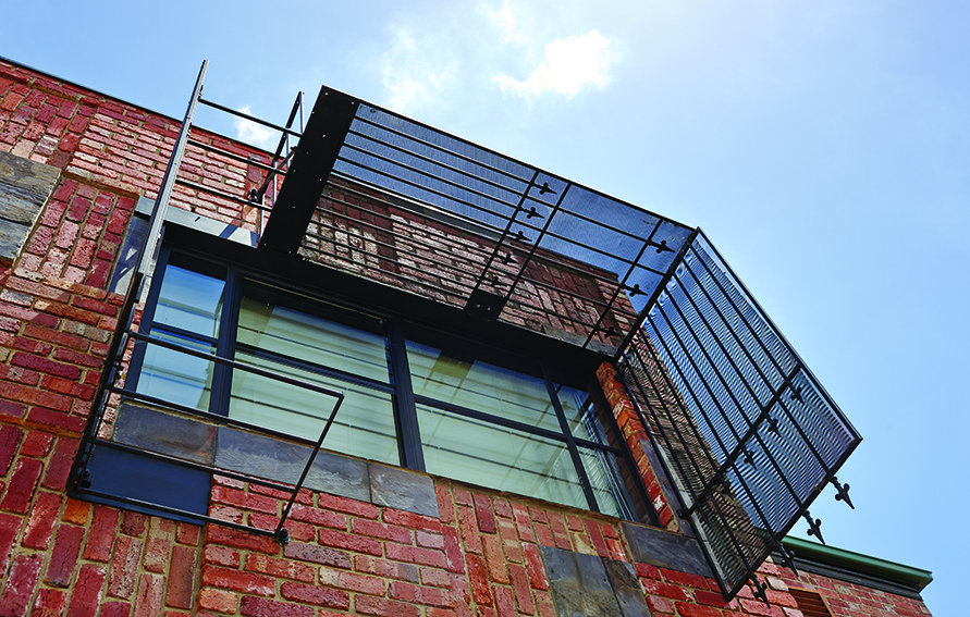
The reuse of materials is evident throughout. Old window and door steel security screens have been re-invented as beautiful sun and privacy screens, fixed to the rear façade around the new windows. Even the existing bluestone slabs from doorsteps have been reused as fireplace hearths.
It’s been a challenge though. “The builder was extremely supportive of the process,” says the owner, “but the building industry doesn’t naturally allow you to re-use what’s in your house,” Young agrees. “Builders will actually try and talk you out of re-using materials, ” she says. “It’s really important though. The owners bought this house for a reason and it wasn’t just about the location – it’s because they liked the old bits and pieces. There are some things that can’t be salvaged because they fall apart, but if they are beautiful and are intact – why not re-use them?”
“It’s been an interesting experience living in the house,” says the owner. “Before we moved in I wasn’t quite sure exactly how the spaces would work. I couldn’t understand why I didn’t have that in my mind. But what has been great is that our experience of the house keeps evolving. We are living here and getting a feel for the house, and it keeps changing.
“It’s autumn now – the sun is lower in the sky and it’s streaming in through those windows at the back. It’s quite delightful. You plan for it but when you actually see it, it’s magical.”
And the best bit? The owner stops to think. “When you buy a house like this, you fall in love with the old parts. When you walk in, that’s what grabs you. But then you look at how impractical it is, and you start to think about how it might be renovated and restored. We wanted the modern conveniences but we didn’t want to lose the old character … The best part is that we have kept a lot of what the house was before and re-invigorated it into something very unusual and something very livable. It just feels lovely.”
Architect
Phooey Architects phooey.com.au
Builder
Conterno Group conternogroup.com.au
Passive energy design
A new three-storey lightwell delivers sunlight into the centre of the house and provides natural light and air to the new basement. The rear of the house orients east and is protected during summer by the overhanging upper floor and an Aluxor motorised retractable awning. In winter the sun penetrates the living room, warming the floor slab. A dual-purpose privacy screen and shading device (up-cycled from old security and fly screens) protects the upper rear bedroom. Windows and doors are positioned to enable effective cross-breezes. The design provides comfortable living with low energy use year-round.
Many existing features were salvaged for adaptation and reuse prior to demolition. This applied equally to original features which were deemed “significant” by the authorities and to resilient elements that were added during the building’s subsequent life. Future generations can enjoy identifying which cannibalised elements have been cut away and re-positioned from where.
The “cubomania” technique minimised embodied energy by balancing of the quantity of demolished materials against those brought in to replace them. It also became the guiding principle influencing the layout of many finishes.
Internal materials
Face joinery is made from up-cycled T&G timber flooring, salvaged during demolition. New internal doors are rebated and shop-sprayed timber veneer. Ceramic tiles were supplied by Artedomus, Old World Tiles & Classic Ceramics. Kitchen and laundry appliances are Miele. Sanitary fixtures are from Rogers Seller, CB Ideal & Reece. Urban Intelligence provided an integrated data, communications, security & A/V system.
Insulation
Bradford Anticon ThermoFoil faced blanket 100 mm thick Rm2.5 insulates ceilings/ roofs; 20 mm high density Styrene foam board insulates concrete slabs; 40 mm DOW Thermax LD foam board insulates basement walls. Wall batt (R1.5) 50 mm thick insulates new external walls.
Glazing
New windows and glazed doors are Skyrange double-glazed steel with matt- black flush steel reveals. Openable panels are Aneeta sashless sliders with magnetic flyscreens. The main rear sliding door features a Centor recessed retractable flyscreen. The lightwell features Fieger double-glazed thermal break louvre windows within Capral aluminium frames and with flyscreens. Existing windows and doors from the old demolished portions were salvaged during demolition and were re-assembled to form the central new recycled window wall. Existing windows (retained in the significant heritage front section) were retro-double-glazed.
Heating, cooling and exhaust
A hydronic heating system comprising gas boiler and flue, in slab coil, new and relocated panel heaters was provided by Nissl Eichert Heating. Heated towel rails were from Hydrotherm Austalia. A ducted, reverse cycle, split-system Daikin air-conditioning system and in-line ducted exhaust system were provided by Griepink & Ward. The kitchen rangehood is a Sirius downdraft.
Hot water system
Hot water is provided by a Rinnai Solar Hot Water with Gas Instantaneous booster.
Water tanks
Rainwater from all new roof areas is directed to 20 Atlantis Matrix Underground Rainwater Modules, which provides water for toilet flushing and garden irrigation.
Lighting
The house uses low-energy light fittings placed on individual new circuits, including LED strips from Inlite and feature lights from Artemide, Coco Flip, Euroluce, Kyo, Volker Haug, Jielde and Nicholas & Alistair.
Energy
A 1.96 kW grid connected solar power system supplied by Going Solar provides an expected average daily output of 7.5 kWh/day.
Landscaping
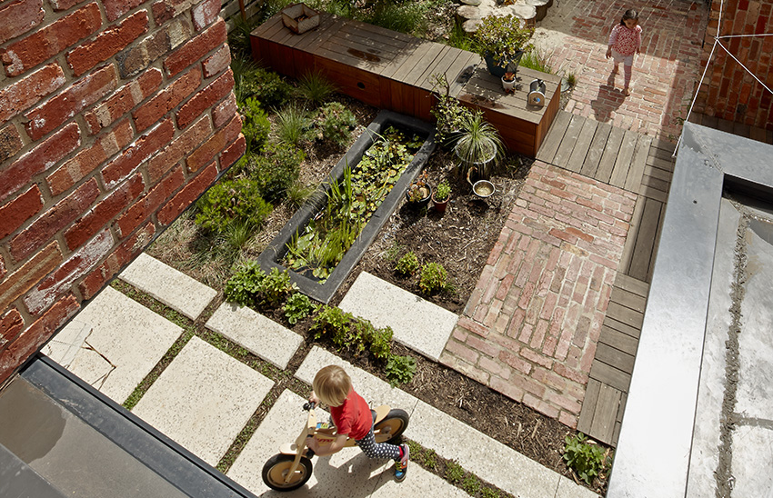
Phooey collaborated with landscape architect, Simon Ellis, to design the rear small child-friendly garden, filled with as many interesting and sustainable features as any large garden.
