Vantage Point
Small but perfectly formed - this home in southern Tasmania was customised to the clients’ needs, and their budget.
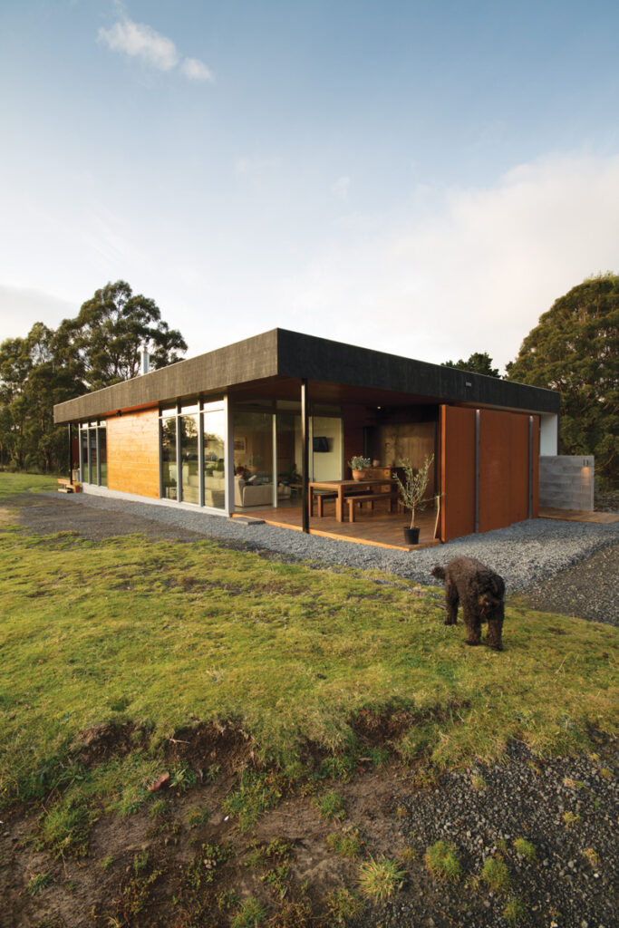
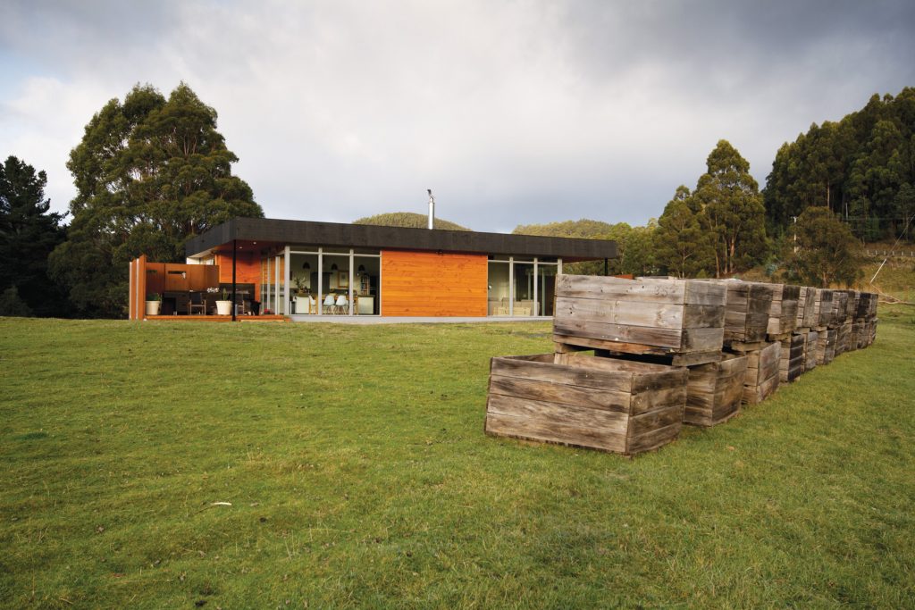
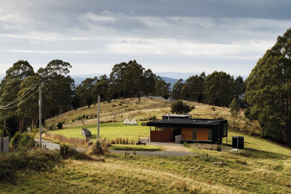
When approaching Ang Hade Harris and Rob Harris’s house, perched on its rural hilltop, one is greeted with stacks of apple crates, an old plough and an entrance lined with golden Macrocarpa and the burnt orange of weather-beaten steel. The impression is at once warm, earthy and contemporary.
This recent residential project in Woodbridge, southern Tasmania, was designed by Stephen Geason, Director of Cykel Architecture, around client need and the themes of materiality, sustainability and the rural context. The pair’s conversation with Geason began after they saw their 2.3-acre property for the first time, and following purchase it quickly moved into design priorities, particularly the need to fit design to budget.
“I wanted a small space where every square metre counted,“ said Hade Harris, “for economic and environmental reasons and because I’m the cleaner!” The couple’s lifestyle, notably frequent visits from extended family and a shared love of food, was another key determinant of the design.
They were impressed that Geason was able to capture most of their wants and needs in his first drawings after only a few meetings; the only significant amendment was the removal of an artist studio and car space beneath the house because of the risk of excavation costs blowing out the budget should excavators hit rock.
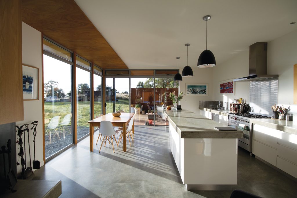
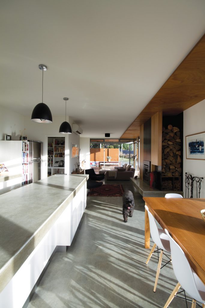
The large and light kitchen with its waxed concrete benches and generous walk-in pantry is the centre of activity, where both cook and guests can enjoy expansive views.
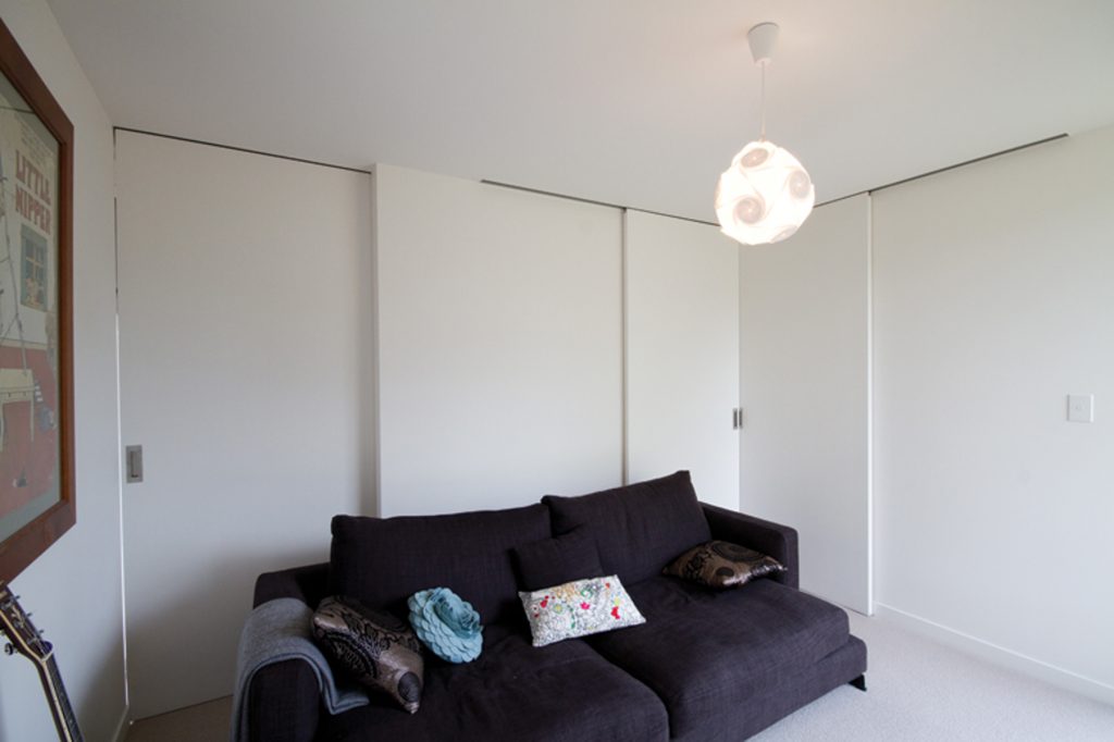
Both Hade Harris and Harris wanted a guest area that could feel separate, but which was not a wasted area when they were guest- free. So Geason designed a versatile space on the south-western corner to fit the brief. His ingeniously simple solution utilises a series of sliding doors that can be used to reconfigure the area according to need. The guest wing can be transformed into two private bedrooms or one bedroom and an adjoining living space, and either opened up to the neighbouring study or enclosed from the rest of the house for privacy.
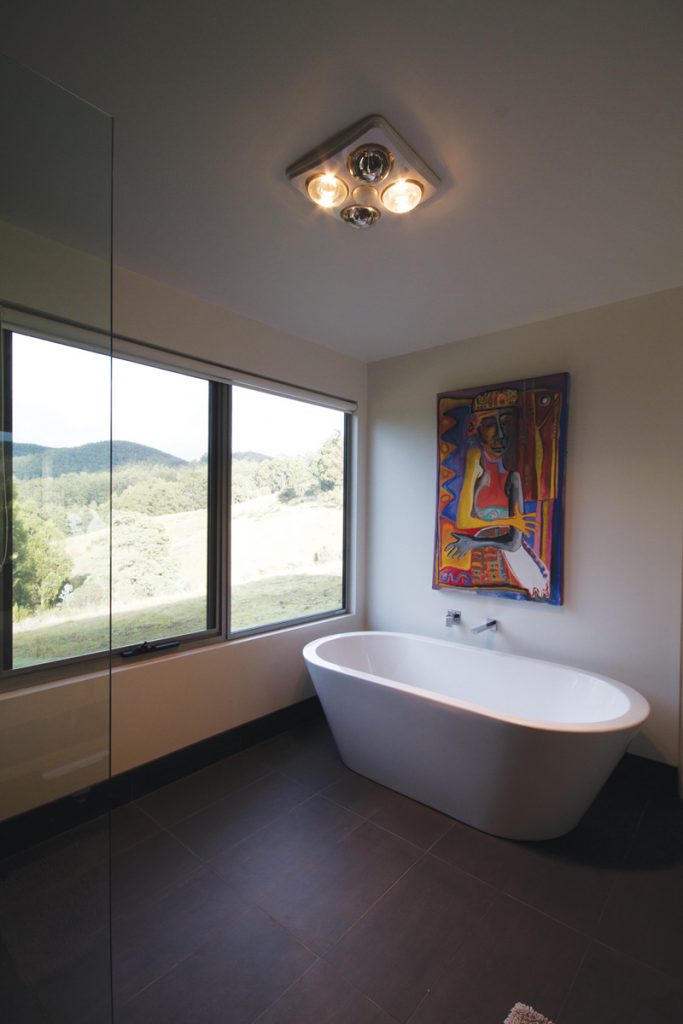
The decision to have one large bathroom rather than two small ones was based on the desire to keep cleaning to a minimum and the fact that a guest bathroom would be unused for a large part of the year. Instead, the single bathroom works equally well as a large ensuite or family bathroom when there are visitors.
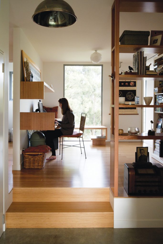
The couple wanted their house to be refined and organic, rather than ostentatious. And Geason’s design has achieved this with a predominance of natural materials. The house is clad externally in Macrocarpa shadow ply and internally with FSC-certified hardwood which has an oil finish. Floors are a well-insulated burnished concrete slab with a wax finish in the living area; bamboo flooring in the hallway, study and guest areas; and stone tiles in and around the wet areas. The amber bamboo flooring contrasts nicely with the cool slate-grey tiles and their meeting marks the transition between different purpose areas. Glass and steel are used elsewhere in and around the house.
The modest 150-square-metre house has been built within the snowline, with building parameters basically determined by planning regulations, and was delivered for just $350,000. Its complex step design has the main living spaces a few steps lower than the rear of the house and the whole structure sitting under the same roof plane. This was done for economic reasons and to create a subtle separation between areas.
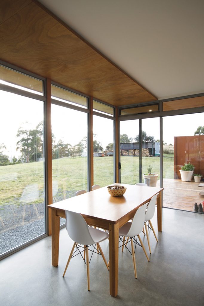
“The best thing about the house is that it doesn’t feel small,” says Hade Harris. “With all this glass it’s like the inside is invited in, which is so nice on cold winter days when you can’t go out. You never feel trapped or confined.”
This sense of connection to the outside is enhanced by timber panels lining the ceiling border of the living room. These extend out to beneath the external eaves and increase the sense of internal space and the perceived connection to the external environment.
The house has been positioned to optimise the sun throughout the day, with an eastern deck for the morning and one on the opposite side for the afternoon. “The concrete floor is much warmer than we expected it to be,” said Hade Harris. This is due to aspect, double-glazing and a strong insulation rating which together keep the slab in the main living spaces at a constant 18 degrees.
The external decks are sheltered by Corten steel panels, which provide definition and shelter. As planned, the panels have rusted to a rich ochre with exposure to the elements, and the eastern deck has a couple of peek holes cut out. “This offers a sense of what’s behind the screens,” said Hade Harris. “We call it our Ned Kelly deck.”
Observing the ever-changing atmosphere on their Woodbridge hill is an unexpected pleasure. The weather and mood can shift dramatically from hour to hour and the house offers the perfect, cosy vantage point to watch the mists, rains and light roll in and out.
Geason, who enjoys the detail as much as the larger design and project administration work, also designed the study’s minimalist Tasmanian Oak desk and shelving units which are both elegant and functional.
From the architect’s perspective client satisfaction is the ultimate reward for his work – above industry or monetary recognition. So for him the Woodbridge project was both successful and thoroughly enjoyable because the clients are delighted with their new home and the development process was a positive one. “The clients brought very clear principles and ideas to the table and it was very much a three-way conversation between builder, client and architect throughout,” said Geason, who is quick to give high praise to Ian and Elise Simondson at Skookom builders.
Hade Harris concurs: “Stephen did his utmost to do what we were asking for rather than wanting us to fit into his vision, and Ian was such a perfectionist it made us feel like we were in good hands.” Both took a lot of pride in the detail. “For example, the house was spotless when we moved in. It felt like they didn’t just build the house, they crafted it.”
Specs
Architect
Stephen Geason, Cykel Architecture cykelarchitecture.com.au
Builder
Skookom
Joiner
AJB Furniture & Joinery
Passive energy design
The house is oriented north with floor-to- ceiling glass and decks to the east and west. Eaves and setbacks are detailed to precisely control the sun’s angles. In summer the living level and the deck are shaded. In winter the sun can penetrate the living level. Windows and doors
are double-glazed and positioned for effective cross-breezes.
Materials
The main living level has a burnished concrete slab for thermal mass. The main volumes are of highly insulated, lightweight construction. The interiors are clad in FSC timber panels and plaster and the external skin is clad in Macrocarpa Pine shiplap, sourced from northern Tasmania, with clear Madison oil finish. SHADOWclad in plywood with Madison oil finish with black tint.
Flooring
Exposed burnished concrete slab in entry, living, dining and kitchen areas. Bamboo flooring in study and hall are BT Bamboo Vertical Board with Carbonated Satin finish.
Carpet in bedrooms is Cavalier Bremworth, Troika 100% wool. Decks and entry deck are Macrocarpa with Madison oil finish.
Insulation
The roof is insulated with R4.0 wool bats and R1.8 thermal blanket. Bulk insulation to Walls is R2.0. Concrete floor is insulated with 50 mm Styrofoam edge and under floor. Timber floor has bulk R4.0 lined under with cement sheet.
Glazing
Clarke windows, aluminium-framed and double-glazed with powdercoat finish.
Heating and cooling
Passive solar design features including northern orientation, external shading and effective cross ventilation reduce the need for heating and cooling devices. In winter extra heat is provided by a wood fireplace.
Hot water system
Siddons hot water heat pump.
Water tanks
2 x 5000 L poly tanks and a newly constructed dam.
Lighting
Continuous Flexi-lined LED strip lighting. No recessed downlights.
