Tricks and Texture
Landscape architect Tim Nicholas has used design smarts to full effect in this textural, Japanese-inspired garden.
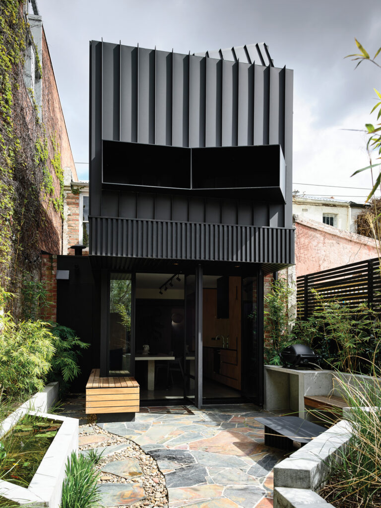
At first glance this tiny space seems uncomplicated, basic even. It’s a sign of true excellence in design – when everything seems in its obvious place. Tim Nicholas employed all of his favourite tricks to create a calm and super user-friendly garden for his clients on the five-metre x seven-metre site.
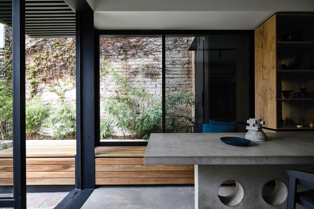
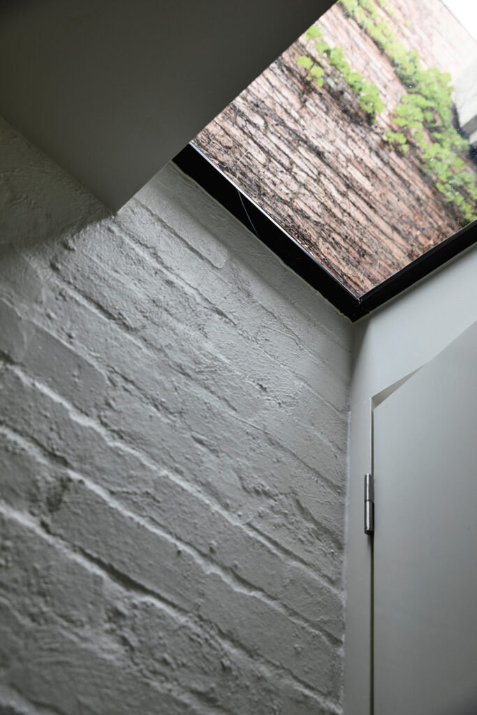
Tim Smart and his team at Wolveridge Architects have excellently designed the alteration to the house. Taking inspiration from the clients’ love of Brutalist architecture, the design shows a perky confidence with in-situ concrete and neat skylights and flow through seating that offered an invitation to Tim Nicholas and his team to follow their lead.
“We got off to a really good start with this project – we had really fantastic clients, can’t speak highly enough of them. I was also working with one of my preferred contractors, Heath Clifford – we work really well together,” says Tim.
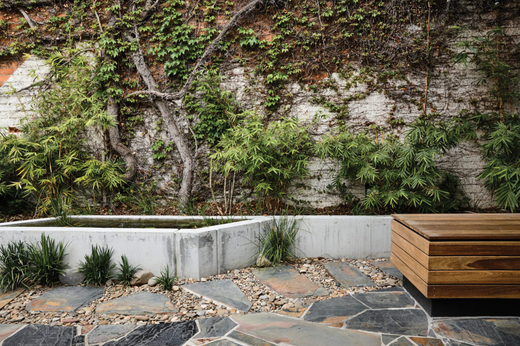
“So in the brief there were pragmatic concerns – obviously, to connect to the indoors, to definitely retain the ancient Boston ivy on the south wall (it was tricky to look after this on such a tiny construction site – it got bashed around a little bit), to do something about the privacy on the northern boundary and back lane and finally, (I thought, most importantly) we wanted to make the most of the great inner urban aspect to the east. The views from upstairs out across the neighbourhood are fantastic and we wanted to frame those nicely and also make sure their views down into the garden were good to look at!”
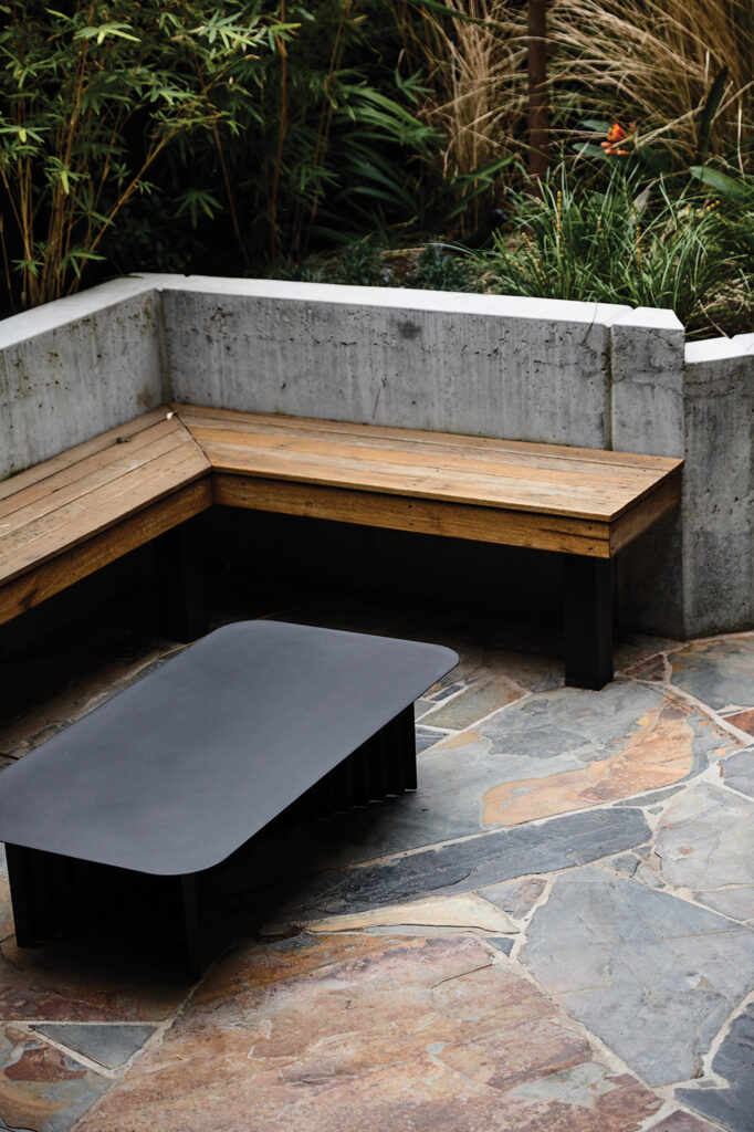
“The guys (clients) really like entertaining and have a really diverse range of friends – so they wanted plenty of seating options. They were also quite interested in exploring different materials.”
Tim adds: “… Once we had an idea of the pragmatic side of what they wanted, we could explore their ‘somatic’ issues. They were interested in the Japanese concept of wabi-sabi, however it was hard to employ the full concept of a Japanese garden – they have a dog – and like many people, they live a fairly full-on urban existence. We wanted the garden to give them a bit of stillness in their busy lives.”
The materials Tim chose for different elements of the design celebrate his passion for texture.
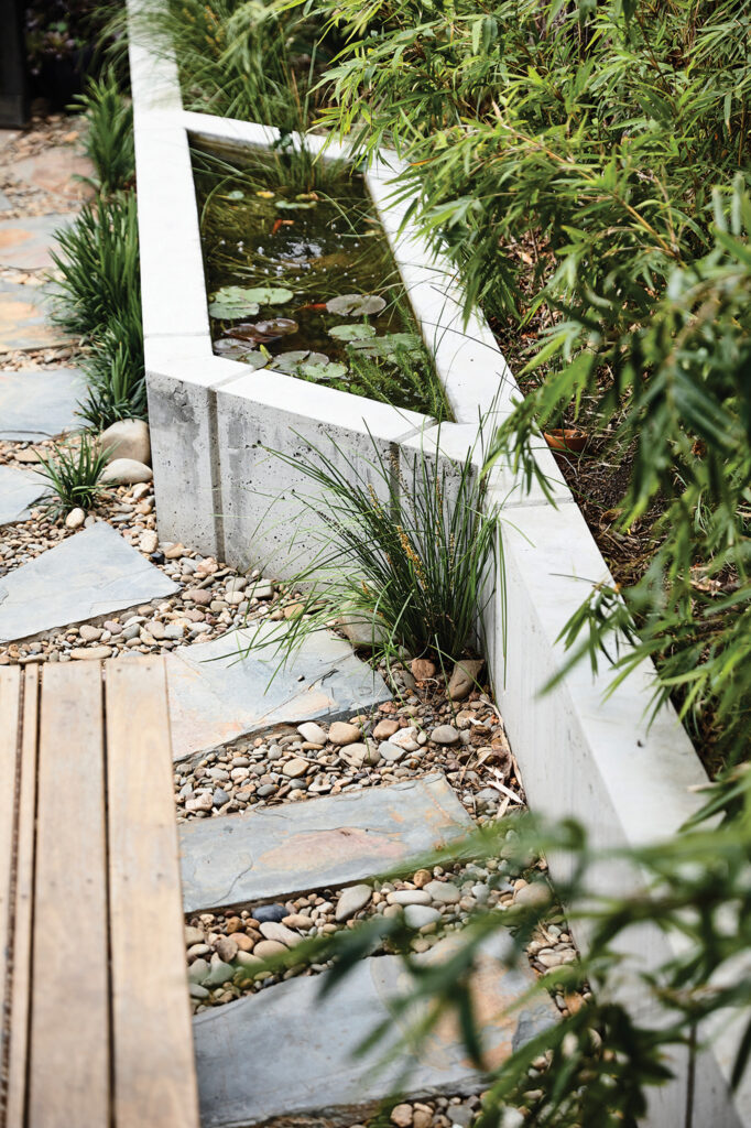
“It’s pretty obvious in most of my work,” says Tim, “I really love texture. Combining the old wall, the trunks of the Boston ivy with the rough face of the concrete, the slate and the river stones – and then fragmenting the slate into the steppingstones …” Midway along the concrete retaining wall on the south side is an unusually shaped fish pond; one of Tim’s tricks of perspective.
“One other consideration that I looked at, and felt was important too, was trying to work with perspective and space – that’s why the fish pond is the way it is. When you look at it from inside it feels bigger and longer. We were so limited by space, we kind of tweaked it – squashed it,” explains Tim.
One of Tim’s sneaky tricks was to reorient the gate to behind the garden bed, and continue the path right down to the back fence. It creates an illusion that the garden is much longer than it is. The fence is also painted black, creating a sense of length – a kind of ‘disappearing view’.
“We’ve always used that trick,” says Tim. “I’ve had a house in the country for forty-odd years that’s been painted black – I love what it does with the washes of green in front of it. Again – it’s texture.”
