The New Weatherboard
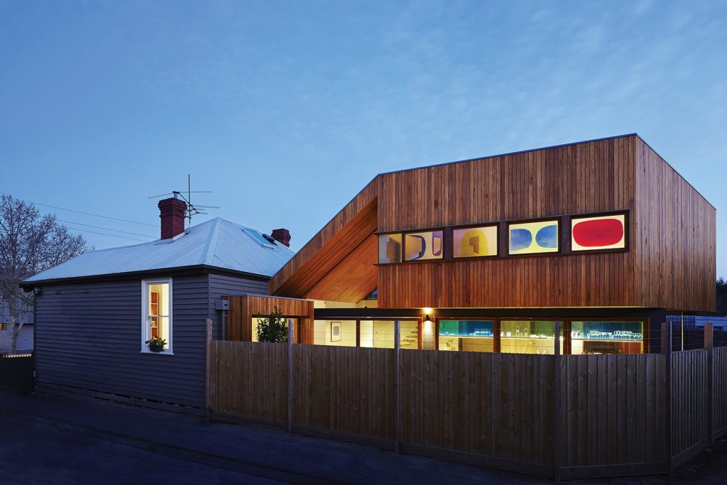
This well-thought out addition to an old Melbourne weatherboard celebrates its two core materials while leaving space for unexpected moments of art and craft.
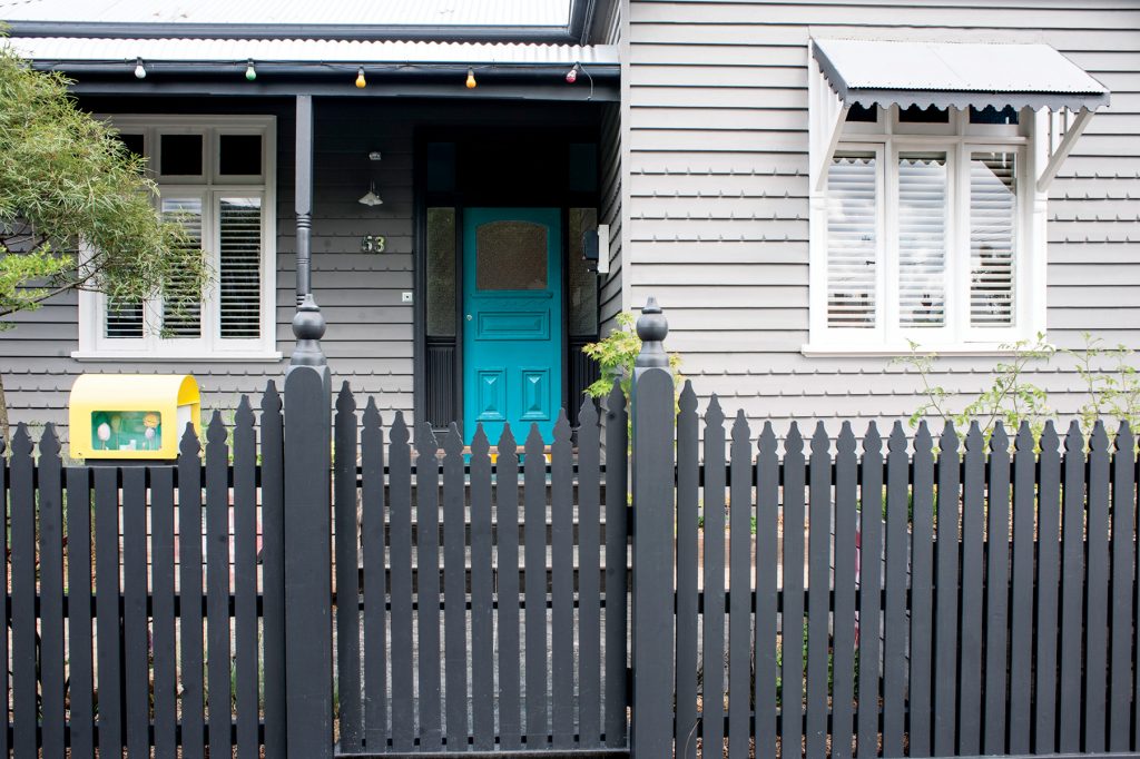
It’s not often I find myself making detailed notes about letterboxes on assignment for green. But Leah Harcourt’s new letterbox is a whimsical work of art: a cheery yellow number that, on closer inspection, contains a tiny perspex house and a miniscule owner mowing the lawn. It’s a delightful, surprising detail Leah dreamed up herself and commissioned a friend to make – one of several pieces of “everyday” art that give this elegant renovation a genuine sense of fun.
It was May 2009 when Leah, then a recently graduated doctor, and her partner Rob Smith, an accountant, bought a Clifton Hill weatherboard she describes as “a classic renovator’s delight”. “When we bought it we did up the front section to a degree – we re-stumped, re-plastered and put in insulation – and then the back we just patched,” she says. “It was a sixties lean-to that we just kind of painted over. So it was colourful and cheerful but very basic.”
The pair had two young sons and knew they wanted a third child. So in 2010 the brief they gave Julie Firkin, an architect who had previously renovated Leah’s parents’ home, was for a light, bright four-bedroom home that a three-child family wouldn’t outgrow. They wanted it to perform well energy-wise, block out some
ugly flats to the rear, honestly express materials like timber and concrete, and incorporate the craft of others. A study and kitchen with sightlines throughout the house was important for keeping track of kids. Openness was a must, too, albeit with some discrete, interconnected spaces so they wouldn’t feel as if they were all living on top of one another.
Firkin’s response was to present three basic options for the clients to choose from: a low-cost, one-storey design; a more expensive design with an upper storey of children’s bedrooms and a larger rear garden, and a mid-range design (the clients’ eventual choice) featuring a cantilevered mezzanine level with master bedroom, ensuite and study. It’s a strategy that added significant time to the design process (construction didn’t start until May 2013) but it helps explain the clients’ profound satisfaction with the end result.
“I find it works well for me because you discover so much by offering some options and just seeing how people react to them,” Firkin says of her approach. “People might think carefully about what they want, and write down what they want, and tell you exactly what they want, but until they see your interpretation of it it’s quite easy to miss the mark.”
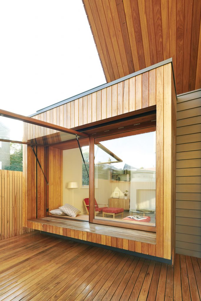
The original façade and front rooms were retained, previously enlivened by bold paint choices and fun detailing like a full sized map-of-the-world feature wall in one of the children’s bedrooms. A wall separating the old dining and lounge rooms was knocked out to create a living room with a two-way timber bench seat (offering seating inside and out in the garden outside). Above the seat is a huge window that bathes the room with light, opens mechanically via a gas strut much like a car boot, and offers the young children an entertaining route for scrambling outside.
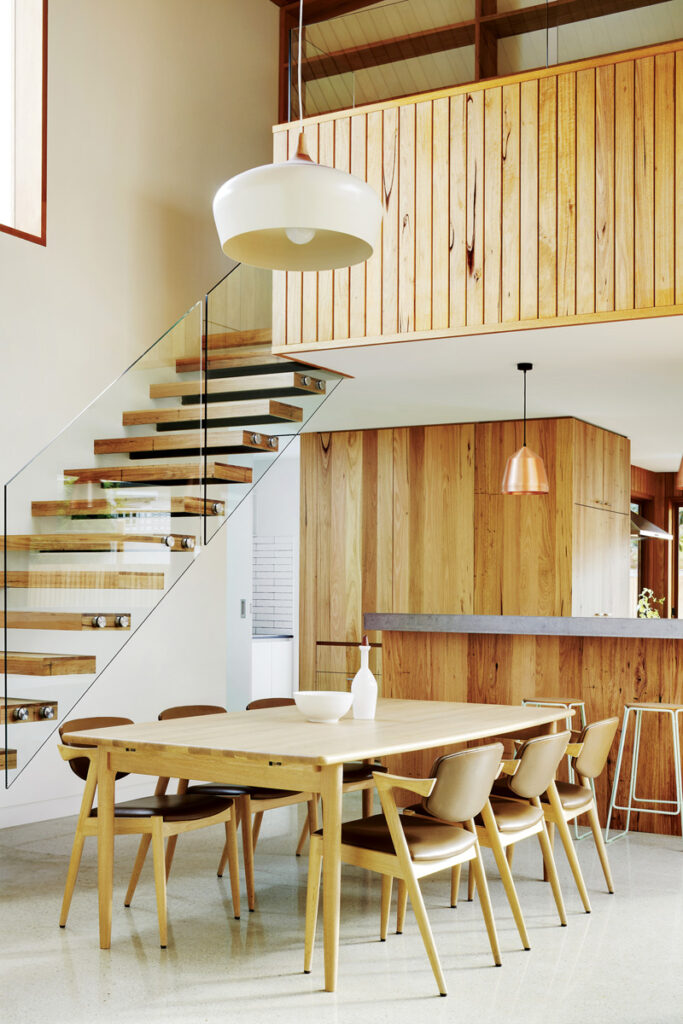
The rear of the house was demolished to make way for a central dining room and rear kitchen with a well-used breakfast bar and, behind it, a large timber feature wall concealing a generous pantry. Tucked around to the south are a small laundry and drying room with an oval skylight above. Along the northern wall a long workbench is topped with more gas-operated windows, which open out into a compact garden with a timber deck. Above this glazing, the clients’ collection of colored glassware is displayed to great effect inside a suspended, custom-made cabinet with sliding, coloured-glass doors.
A central bathroom is an unexpected treat thanks to a boldly colourful glass splashback created for the clients by Melbourne printer and artist Ellie Malin. It features a woodblock print of an angular, abstracted underwater scene – a perfect foil for the pale green porcelain tiles on the wall opposite. Delicately patterned, the tiles look like textured paper that’s been folded, origami style, and roughly flattened out again. It’s an unusual effect that catches sunlight from the oval skylight above, creating subtle shadow play.
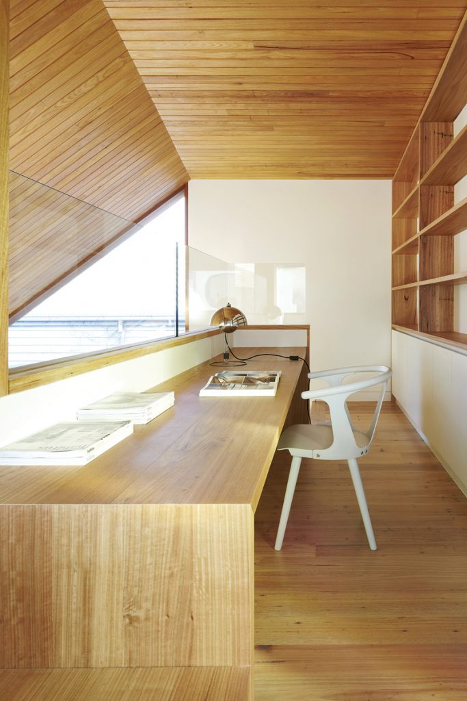
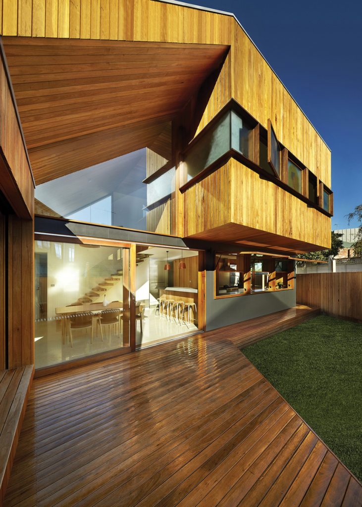
The upper level is accessed via an open-tread timber staircase that’s suspended from the wall behind by chunky metal posts. It’s topped with a massive triangular window that Leah says creates quite a floorshow at sunset. Upstairs there’s a small study space with views through the addition, a curvaceous ensuite elegantly tapered at one end to mirror the contours of the oddly shaped block, and a handsome master bedroom with a series of knockout feature windows designed by Leah’s graphic designer brother. Like the bathroom splashback, each pane of glass uses abstracted forms, warm colour and a bold, graphic style.
The brief was simply to block views of neighbours while allowing the windows to open far enough to admit cooling breezes in summer. But the resolution is so original and so pleasing it has become one of many highlights of the new house for the owners. “I really love them,” Leah says of her brother’s clever design. “It’s really nice to wake up to, and at night they just kind of glow outside.”
Specs
Architect
Julie Firkin Architects
j-f-a.com.au
Builder and joiner
Overend Constructions overendconstructions.com.au
Passive energy design
The house is oriented with living spaces facing north and bathrooms and utility spaces facing south. An overhanging upper level allows living spaces to be drenched in sunlight in winter while providing shade in summer. Windows and doors are positioned for effective cross-breezes.
Materials
The ground level of the addition has a concrete slab for thermal mass. The façade is clad in renewable Silvertop Ash. Inside, the feature ceiling and joinery are also Silvertop Ash. Natural materials like timber and concrete are juxtaposed with white surfaces and select areas of strong colour. The downstairs bathroom features Mutina Folded porcelain tiles and a Marine Garden glass splashback by Ellie Malin.
Flooring
Blackbutt boards from the original house are retained at the front. The rear extension uses polished concrete at ground level and Silvertop Ash floorboards on the upper level.
Insulation
The roof is insulated with Bradford Anticon Roof Blanket, R 1.3 and Bradford gold ceiling batts, R 2.5. The walls use Bradford gold wall bats and Enviroseal sarking, R 2.0. Floors use foil board between the structural slab and the topping slab/hydronic heating.
Glazing
The house features timber-framed, double-glazed windows and skylights by Pickering Joinery. The large kitchen and living room windows have hydraulic gas struts for easy opening, reinforcing the sense of connectivity with the back garden.
Feature coloured glass panels are designed by the client’s brother, Jethro Harcourt, and made by Les Baxter of Architectural Glassworks. [email protected]
Heating and cooling
Passive solar design features including northern orientation, external shading and effective cross ventilation reduce the need for heating and cooling devices. In winter extra heat is provided by a hydronic slab and wall panels. A split system on the upper level can provide cooling on very hot days. An external motorised blind can also be employed to shade the western window of the living room in summer.
Hot water system
The hot water system is a Rinnai Infinity 26 instantaneous gas hot water service.
Lighting
The house has ample natural lighting, with large north- facing windows and skylights over the southern utility rooms. When required, the house uses low energy and LED lighting.
