Telling Storeys – a three-level home on a tight footprint
House For Eva’s location in a Brunswick East Melbourne activity zone enabled MRTN Architects to conjure a surprising three-storey home, office and rental out of a tricky 88-square-metre garden subdivision.
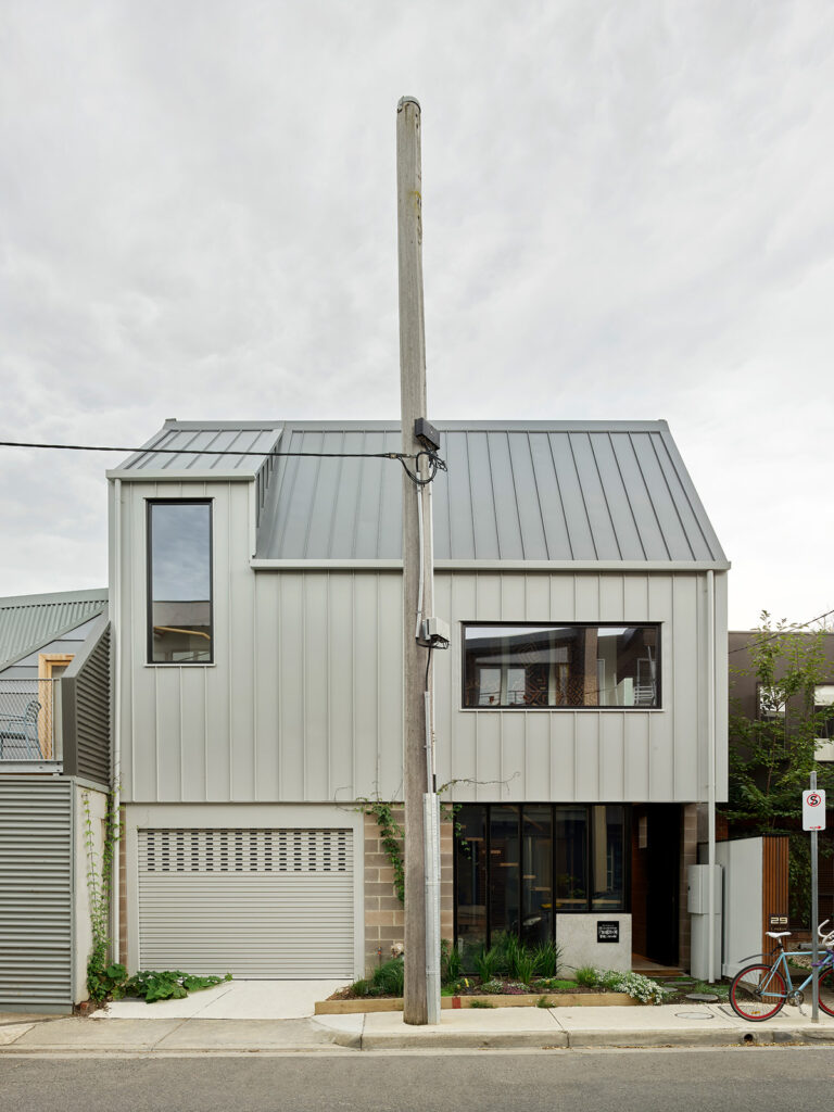
It’s lucky architect Antony Martin enjoys creative problemsolving because House For Eva presented more than its fair share. On a tight budget and an even tighter, south-facing corner sub-division in Brunswick East (with a power pole in the middle of the narrow footpath out front) his client saw space for a two-bedroom residence, a home-office with street frontage, and a studio apartment with courtyard. The latter would generate rental income critical to the project’s viability long-term.
That’s not all. The brief extended to a garage required by council, space for a Japanese onsen-style bathing experience, and an outdoor terrace where mother and daughter could enjoy art activities and outdoor movies. How, may you ask? Vision. Zoning. Perseverance. And a spot of architectural ingenuity.
Eva initially contacted Antony about a Carlton terrace she’d found for sale, ripe for renovation in a prime location. He told her its heritage zoning would make the brief extremely difficult. When she came across a much cheaper Brunswick East site several months later, the brief became deliverable thanks to its location in a mixed-use activity zone which allowed them to build an all-important third storey.
To Antony, the particularly tight building envelope suggested a clear design solution: ground-floor garage, studio apartment and home office, first-floor kitchen, living and terrace spaces, and top-floor bedrooms. “There was a really great feeling of success when we were able to get everything to work together,” he recalls. “There was no, ‘Oh maybe we should have done this differently’ … the iterations we went through – I’m pretty sure we came up with the only solutions possible on the site.”
Eva and Antony had both lived in small homes overseas and understood their pros and cons. They drew inspiration from Japanese floorplans and precedents, analysing likely layouts and calculating minimum dimensions required for each space. “That was design: colour-coding room types and trying to fit them into the site,” he quips.
“Early on I did go down with three different coloured cans of spray paint and marked on the site, saying ‘This is your living room, this is your kitchen’.” Architectural models are normally 1:100 or 1:200, but this small project could be modelled at 1:50, allowing them to really get deep into the spaces and work it out. “On a site this small you actually need to think about it in plan and section the whole time. It’s not enough just to think about it in plan,” Antony says.
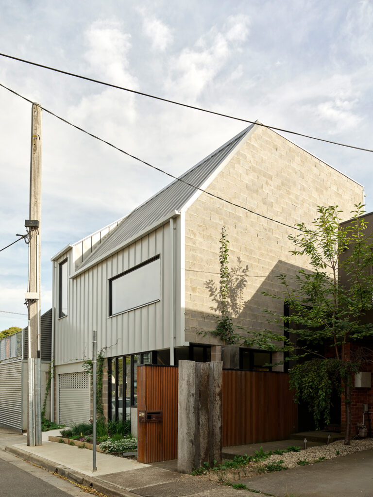
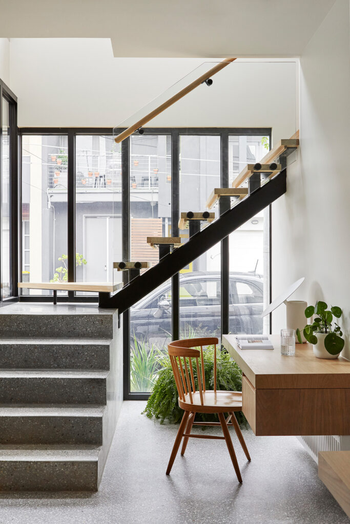
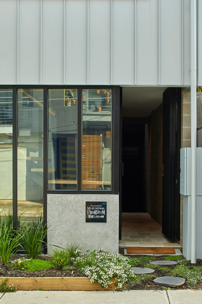
The result resembles a life-size 3D jigsaw and is beautifully realised. Its south-facing façade is quietly intriguing from the street. At ground level to the left there’s an inscrutable garage door and, to the right, a glazed entry corridor to the studio apartment ahead and residence upstairs. “It’s like a laneway – a mini civic gesture,” Antony explains. Centrally, a concrete block anchors the staircase and announces Eva’s business. Inside, simple timber joinery links, rather than differentiates, spaces. Glazing creates lovely light and streetscape connections. At the rear, an entirely self-contained rental includes a stylish bathroom and small side courtyard.
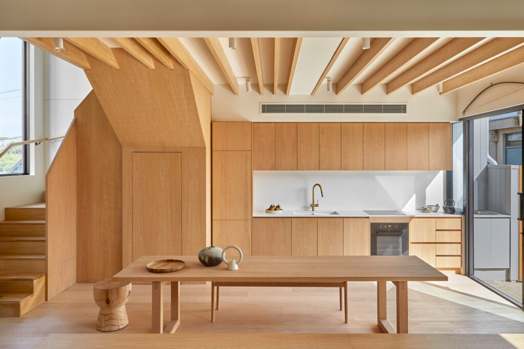
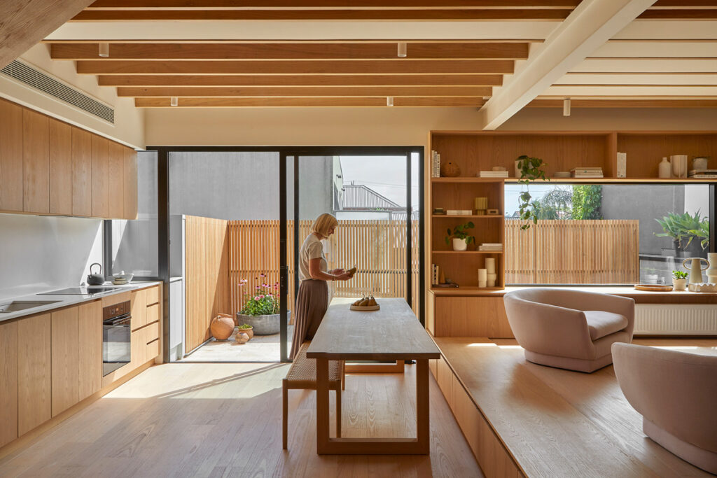
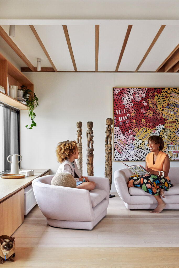
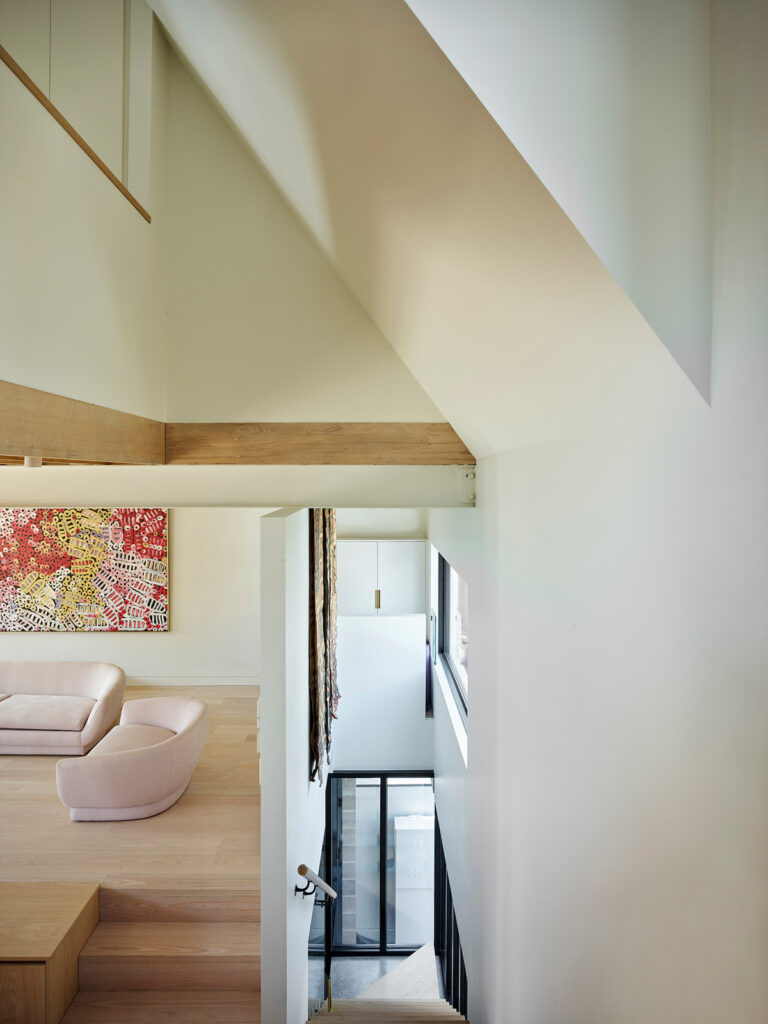
Up the timber staircase to level one, Eva and her daughter Matilda’s living quarters feel surprisingly spacious. Partly, that’s down to three-storey volumes, northern glazing and a tiled terrace large enough to accommodate the promised art cabinet with sink and cinema screen. But it’s also a product of those carefully planned proportions, which were finessed in situ. A split-level kitchen/dining and living space, for example, provides staircase clearance overhead and creates a stair-sized bench seat with hidden storage, shaving precious millimetres off dining space requirements.
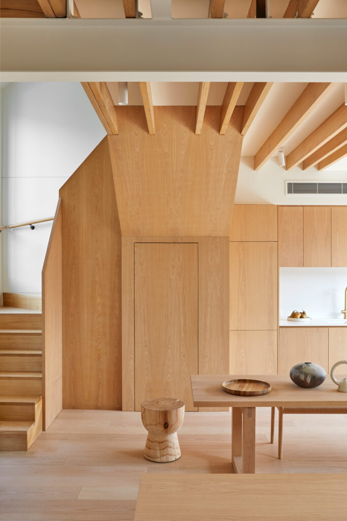
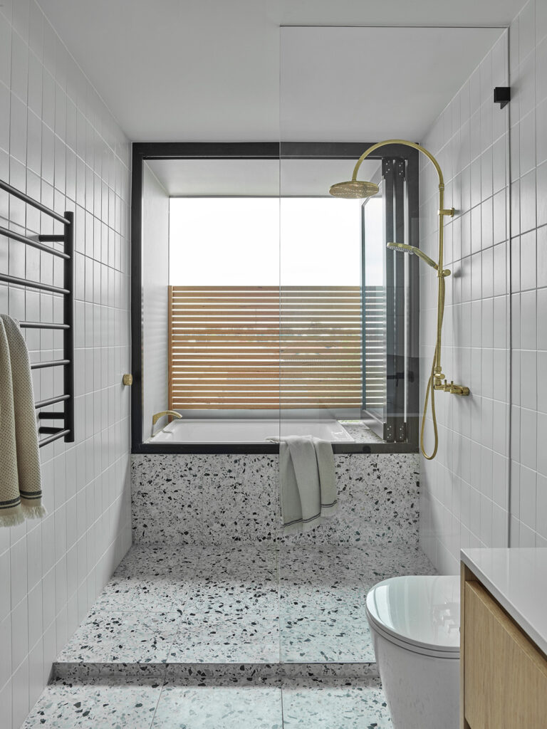
On the upper level, Eva and Matilda’s bedrooms feature vistas over bustling Brunswick and are separated by a playful central bathroom. The bi-fold window opens to an external bath enclosed for starlit bathing in blissful privacy. Looking back down the clever staircase (which conceals practicalities at each level such as a pantry and washer/dryer), glazing visually enlarges the interior and the complex spatial arrangements that make it tick become apparent.
The architect concedes he initially questioned whether the brief was feasible on 88 square metres, and if the studio apartment’s income would justify its cost. Now, with his hard work done and client happy, he applauds Eva’s vision for an adaptable place with myriad future uses, including as an intergenerational home. Refreshingly, he also hails council’s activity zoning, which allowed him to bring Eva’s vision to life. “I think it’s such a great model for suburban density,” he says. “It was really made possible because of the town planning and zoning. The most significant part of the project was actually bureaucratic.”
Specs
Architect
MRTN Architects
mrtn.com.au
Builder
Resicon Master Builders
resicon.com.au
Location
Wurundjeri Woi Wurrung. Brunswick East, Vic.
Passive energy design
The house is oriented to the north with full height, north-facing glazing to all first-floor living areas. Limited openings to the south provide multi-directional daytime light that alleviates the need for artificial lighting. In winter, the sun penetrates well inside the kitchen, dining and living room. Windows and doors are positioned for effective cross ventilation. The design provides comfortable living with low energy use year round.
Materials
The ground level has a concrete slab and concrete terrazzo-topped slab to the entry and wet areas. The shared east and west party walls are constructed from concrete blockwork and timber framing. The south wall is clad in standing seam metal cladding and the north façade in cost-effective painted fibre “Scyon Axon” cladding from James Hardie. The interiors feature expressed dressed timber beams, oak veneered panels and plasterboard sheet lining to the upper floor. Paints are low-VOC.
Flooring
The ground floor concrete floor is burnished. Entry stair and wet area floors on the ground floor are in situ concrete terrazzo. Timber floors are engineered oak from Bowens Timber. Bedroom floors are wool carpet. Mountain ash tongue and groove flooring on ply sheet underlay is used on the slab for the kitchen, dining and laundry areas. The upper-level floors and stairs are covered in 100% wool. The upstairs bathroom uses terrazzo tiles from Fibonacci Stone.
Glazing
Windows are powder-coated aluminium in “Capral Narrowline 425” from Finadri Windows.
Heating and cooling
Heating is provided by hydronic radiators and cooling by an electric reverse-cycle split system.
Water tanks
Rainwater from all roof areas is directed to a water tank located in the garage which provides water for toilet flushing and washing machine.
Lighting
The house uses low-energy LED lighting from Light Project.
