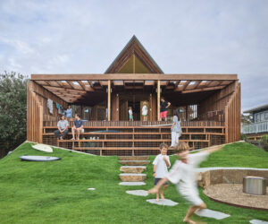
Sun Catcher
On a tight site in Melbourne's inner north, Make Architecture have reconfigured a tangle of rooms into three new spaces and in doing so created a garden sanctuary.
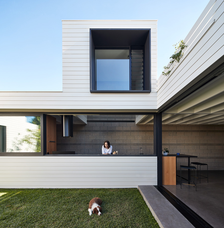
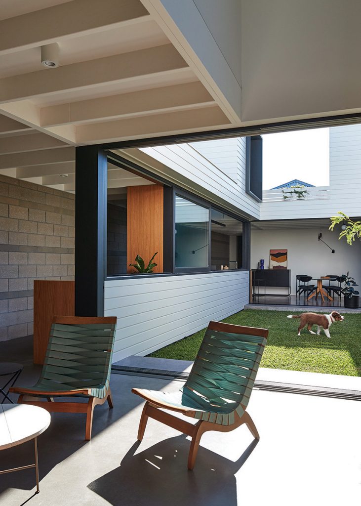
Four-month-old puppy, Frankie, chews happily on a sock on the courtyard lawn, while Honey watches and chats to her mother, Georgina, who is standing in the adjacent kitchen. Her husband,
Mark works in the adjoining study nook and waves to Daisy, their second daughter, who’s reading in the next door living area. None of this would have been possible 10 years ago. The family’s butchered and weathered workers’ cottage suffered the ailments typical of a tight, inner-city site: poor room configuration, two bedrooms and an ugly lean-to on the back. Not to mention the Buddha-coloured orange walls, backyard with no aspect from the house and ugly triangular windows – a giant bugbear of the homeowners.
When Melissa Bright, director of MAKE Architecture was engaged for a less shiny and more raw makeover, she stepped back and considered how the entire 264-square-metre block could be better utilised: “How do we fit all the program in and give as big a space as we can, without ending up with one big room facing the backyard?”
The renovation had to weather the growth of the family of five over the long term, with the grand plan to create a smaller, more efficient footprint that would work hard to provide the amenity of a big house. So, some spaces were opened and activated, while others were compressed and minimised, enabling Bright and her team to play on convention and flip tradition.
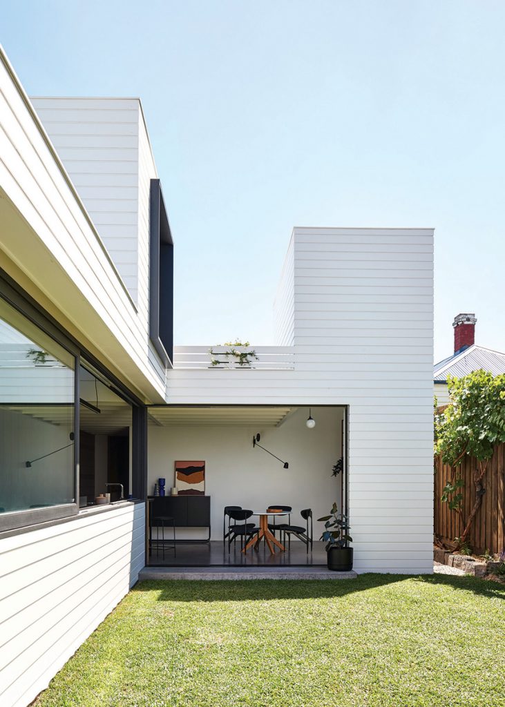
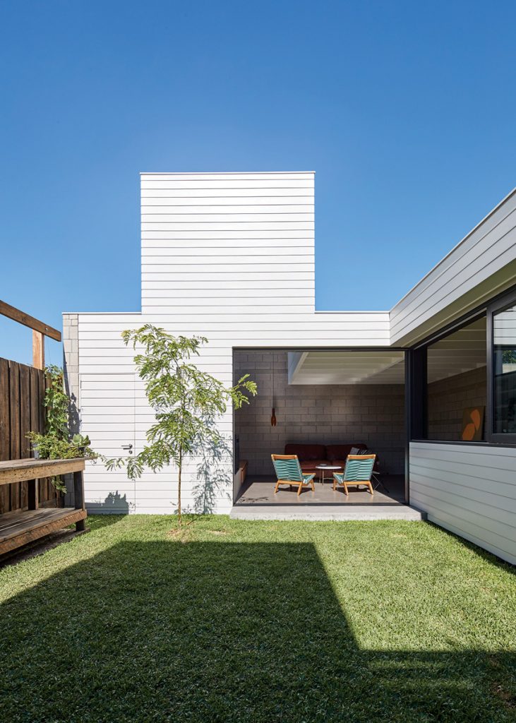
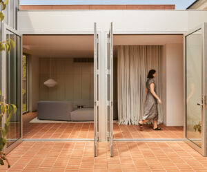
Avoiding the tendency to build an open-plan box on the back, Bright chopped off the rear of the house and moved the backyard to the middle of the site, around which flows a kitchen, living and dining room. The three new spaces are arranged in a U-shape to maximise northern sunlight, and are enjoyed as separate or shared zones thanks to floor-to-ceiling glass windows that disappear into walls and open up the entire zone to the backyard.
“This is what I love. It feels like this walled, garden sanctuary – really private and peaceful,” Bright says.
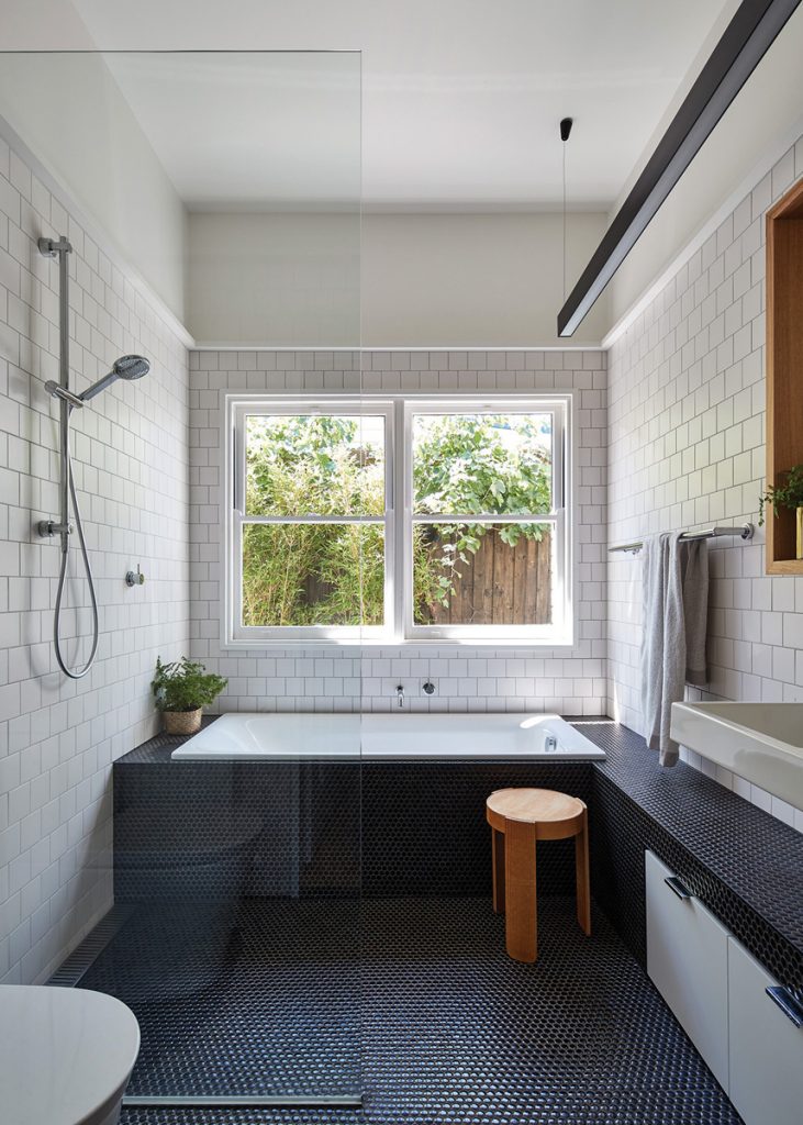
The front of the house was retained, incorporating two good-sized bedrooms and the original hallway, but a new bedroom, bathroom and ensuite were added, featuring windows salvaged from the former lounge room, and contemporary picture rails bridging the old and new. The existing timber floors were also retained. At the base of the site, a simple bike shed eliminates the need for a garage, while a rear gate reveals a laneway with a netball ring for further play.
“This whole thing becomes an outdoor space in a tight site where the interior and the exterior work really well together,” Bright says.
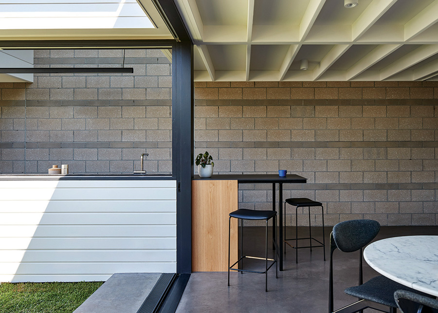
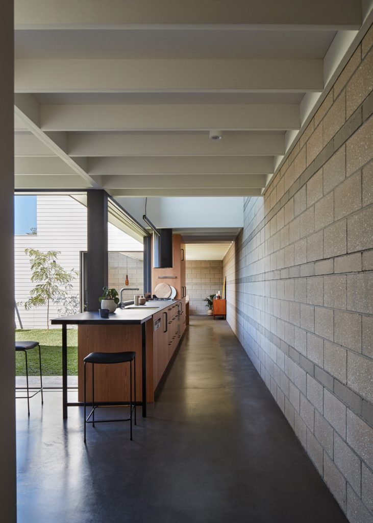
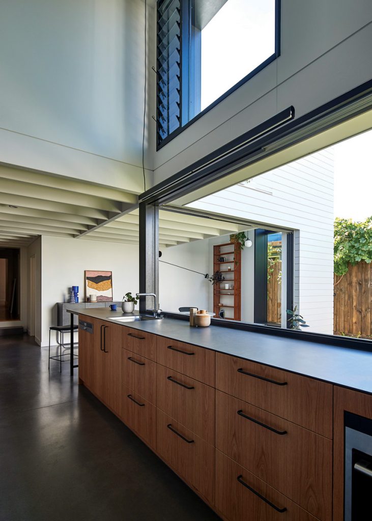
At the heart of the house is the kitchen. Centrally positioned, it has no default island bench or dining table as per the standard response. Instead, the kitchen extends lengthways as part of a new boundary wall along the southern edge of the block, and contains a neat study nook at one end – replacing the need for a separate office – and a bench that juts out at the other – replacing a breakfast bar. This long space faces the courtyard, creating a camp kitchen aesthetic when the windows slide back.
“Georgina sits down one end and waves at the kids,” Bright laughs. “I like this sense of being connected but with separate spaces you can sneak away to.” Building so close to the block’s boundaries raised concerns about the effect on neighbours, and Bright was challenged to find innovative ways to minimise the impact while providing moments of sustainable spaciousness within the design.
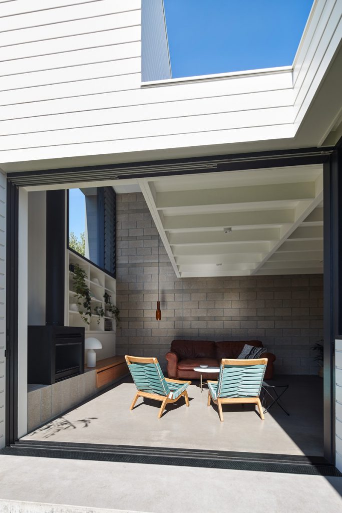
“We liked the idea of these pop-ups or sun catchers,” she said. With their delightful, periscope appeal, there are three sun catchers that rise from the kitchen, living and dining rooms. The double-height pop-up volumes offset the lower ceiling heights, and perform an important job as solar chimneys, sucking up hot air during summer and releasing it via high louvre windows for cross ventilation.
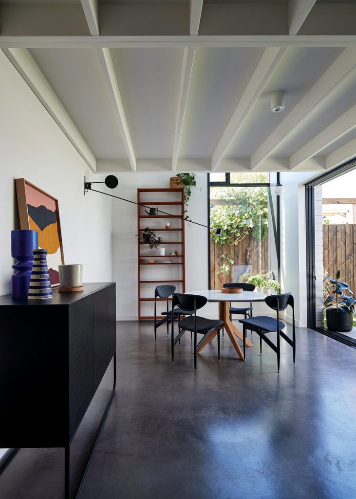
As the seasons grow cooler, the house responds accordingly. The sun penetrates deep inside the kitchen, living and dining rooms during winter, warming the floor slab and internal block walls for thermal mass. In the dining area, a sliding timber screen filters light that flickers across the floor, with deep eaves on a selection of other windows providing shading too.
“You get all these lovely moments of sunlight coming through at different times of the day,” Bright says.
As the family moved eight times during the nine-month build, staying with friends and practising a minimalist lifestyle, it made the result more special and doubly worth the wait.
“It was amazing coming in for the first time,” Georgina recalls. “It encourages shared space and I love our house now,” she said.
Specs
Architect
MAKE Architecture
makearchitecture.com.au
Builder
Basis Builders
Passive energy design
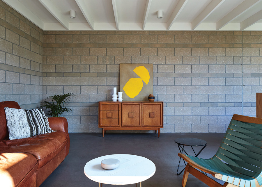
The extension runs hard along the southern boundary, maximising northern light, as well as offering a courtyard with good amenity. The kitchen, living and dining spaces are organised spatially around the courtyard so each area receives northern solar access and a connection externally. They also each have a double-height pop-up volume, with louvre windows to act as a thermal chimney, removing hot air whilst providing good natural ventilation. The deep window reveals and sliding timber screen provide summer shading to windows. In winter the sun can penetrate deep inside the kitchen, and living and dining room, warming the floor slab and internal block walls, which provide good thermal mass.
Materials
The materials selected were chosen for their durability and quality. The extension walls are concrete block (Pearl Grey Achitec honed and shot blast from Austral Masonry). Every fourth course alternates in the finish of the block as well as the height, adding texture to the solid wall. This is combined with lightweight walls clad in Design Pine shiplap cladding. The concrete slab is burnished with black oxide and finished with Resene Concrete Wax. The roof structure is exposed with plywood sheet ceiling internally, minimising the use of plasterboard where possible. The interiors are fairly restrained due to the expressed concrete block walls. The kitchen is an American oak timber veneer with a porcelain benchtop from Maximum in “Moon”. Paints are low-VOC. The roof sheeting is Zincalume and run-off is collected in a storage tank and used for the toilet.
Flooring
The existing house timber floor was retained and refinished with Bona Natural. The bathroom penny round tiles are from Academy Tiles.
Insulation
The roof is insulated with R2.5 Earthwool thermal insulation and sisalation. There’s bulk insulation to lightweight walls R2.0 Earthwool and sisalation, and foilboard insulation within double block cavity walls. The existing house has been fitted with new underfloor insulation reaching R1.5.
Glazing
Windows are painted Australian hardwood timber frames with Viridian low-E clear double-glazing and ‘Breezway’ louvre inserts.
Heating and cooling
Aside from the great natural ventilation provided by the fully operable glazing and high level louvres acting as a thermal chimney, the house also has evaporative cooling. In winter the kitchen, dining and living room slab and internal block walls receive sun, reducing the need for additional heating. The concrete floor has in-slab hydronic heating and the existing house has hydronic panels. The living room also has a wood fireplace – the Heatmaster A650 from Jetmaster.
Hot water system
The existing instantaneous gas hot water system was retained with a new hydronic furnace.
Water tanks
Rainwater is collected in an above-ground tank, which provides water for toilet flushing, washing machine and garden irrigation.
Lighting
The house uses low-energy LED lighting from ECC and feature lights from JSB Lighting and Hub Furniture.
