Spatial Gymnastics
An old 70-square-metre unit is transformed into a home that packs a whole lot of living into its sliver of suburbia.
Semi-detached units are seldom thought of as sexy, but rather like marketing a mild-mannered, middle-aged bloke, the real estate firms promote them as “solid and dependable”. When Sandii McDonald and Jared Reynolds first set eyes on this place in the Auckland suburb of St Heliers, it was your classic two bedroom property with a carport. The 70-square-metre unit, with parts in yellow brick veneer, some weatherboard, a few fibre-cement panels and timber-framed windows, was like a smorgasbord of 60s materiality. Squeezed between a five-storey apartment, a Tudorstyle villa and a substantial 80s plaster home, it was dinky in the domestic landscape. “But we really liked the area, it was within our budget and we thought: “we can do something with this,” says Sandii.
Architect Dion Gosling of Studio 106 thought they could too. “They have the ability to pick up gems,” he says of the couple who have renovated units before. As landscape designers and constructors, they also bring a discerning style and practical skills to the mix. Dion helped his clients turn this humble jumble of a home into one that packs a whole lot of living into its sliver of suburbia.
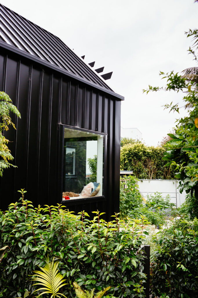
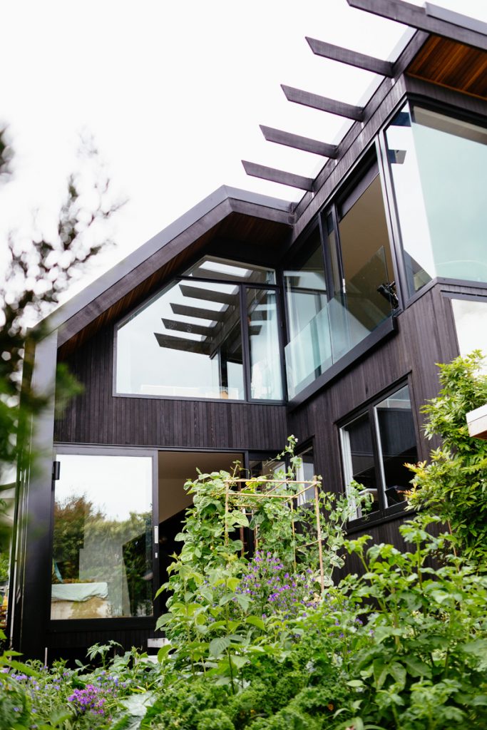
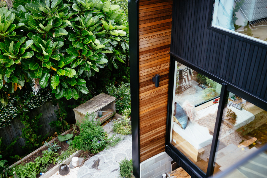
The basic idea was to pull down and push up – an exercise in spatial creativity. Some internal walls were removed, the gable roof lifted and an upper level added. Sounds simple, but it wasn’t. With nine neighbours who could potentially complain, “we wanted to design within existing site controls so as not to trigger resource consent,” says Dion. This meant some innovative thinking. A wrap of vertical black weatherboards on the extension now accentuates the building’s upward orientation. It flows seamlessly into a roof of trough-section steel that is angled to fall within the height-toboundary restriction.
Exploring the internal possibilities of the typical unit was a collaborative challenge. The north and south walls had no windows since one is a fire wall and the other is shared with the neighbouring house. Within these confines, amplifying light would prove crucial.
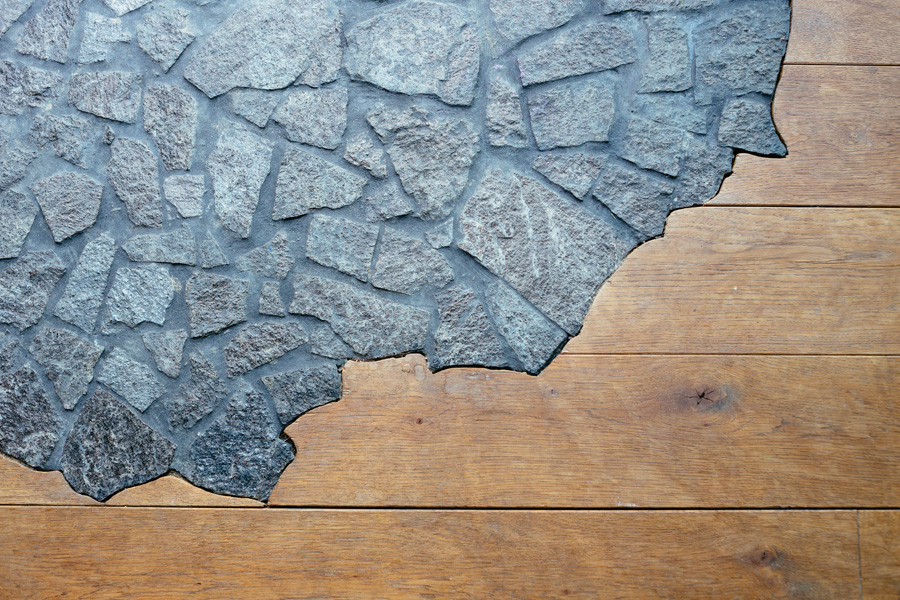
The journey to the entrance is along a crazy-paved schist path. The sparkled stone spills over the threshold subtly, as if nature is encroaching on the manmade. “We like using outdoor materials inside,” says Sandii. Visitors enter directly into the living room where a soaring double-height void makes an unexpected first impression. “We wanted to give a real sense of volume,” says Dion.
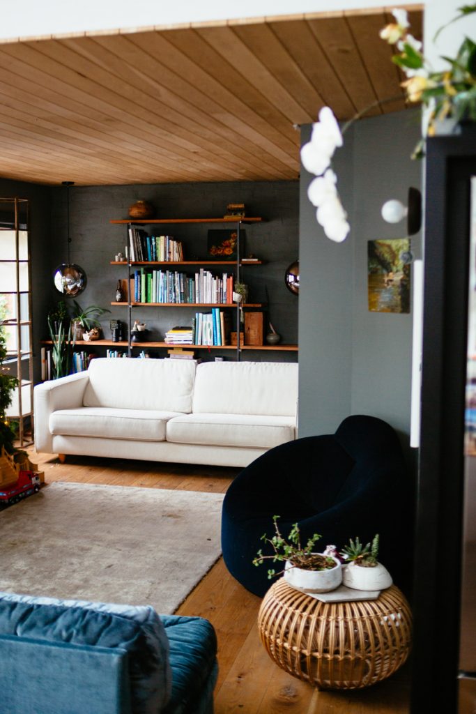
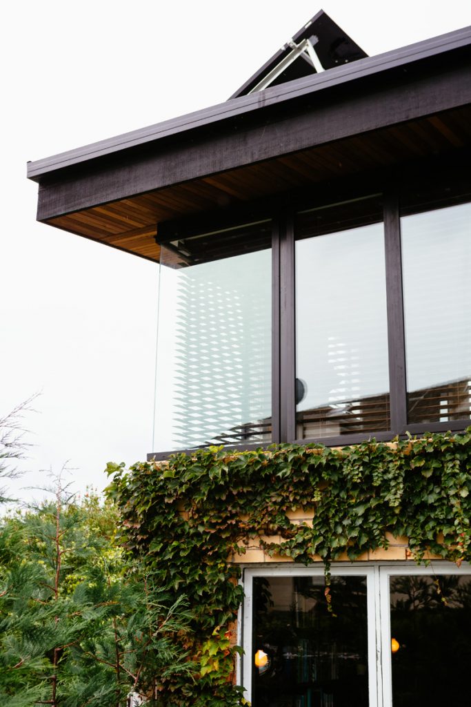
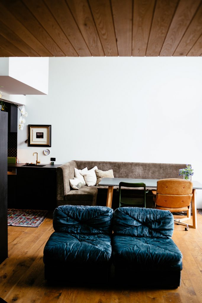
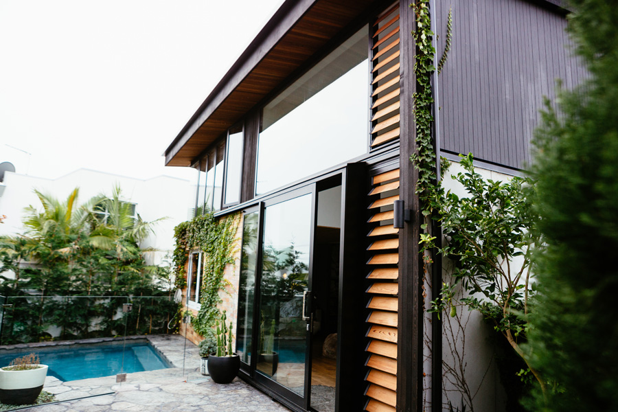
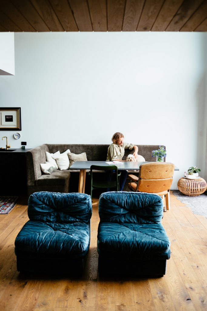
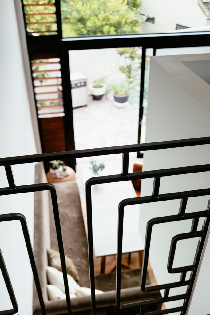
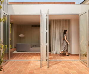
Tall banks of louvres and massive sliders make this compact area feel generous in spirit. With issues of privacy, a connection to the land has been carefully mapped out with precisely placed glazing and open corners, which allow the daylight full access. A picture window in the living room overlooks the garden, while a wood burner and full-length shelving are focal points. “We don’t like the TV to be the centre of attention,” says Sandii. An original bedroom has become an office for the couple’s landscaping business, Babylon Gardens.
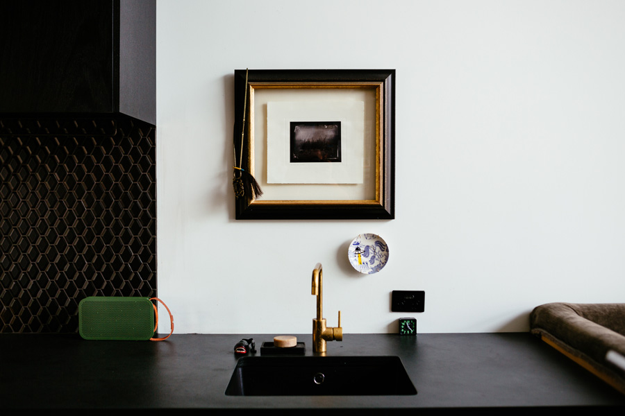
Further surprising spatial manoeuvres happen in the kitchen, where the ceiling drops to an intimate scale. Lined in dark, roughsawn timber, it’s a galley with cooking and cabinetry on one side and more storage on the other. “Unusually, the kitchen is a thoroughfare, so we decided not to include an island,” says Dion. Sandii sees it as a black tunnel between the white volumes of two living areas.
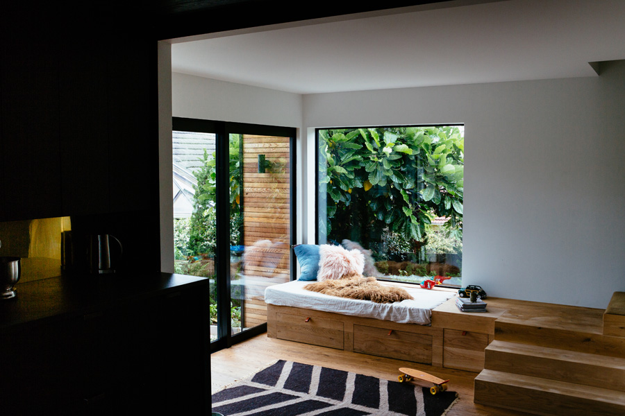
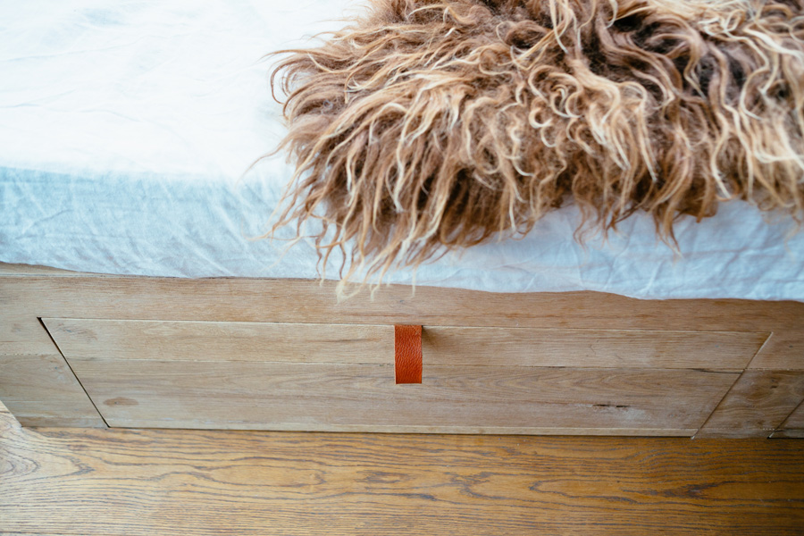
The second living zone occupies the former carport, sacrificed for morning sun. Covered in and with built-in seating, it steps down from the kitchen. “It’s our version of the sunken lounge. On Sundays we sit here to eat breakfast,” says Sandii. With views of the garden and hidden storage in the bench seat and beneath the floor, the decision to convert was a good one. The car can languish on the street.
Stairs here lead up to the bedrooms but, since bar stools are in absentia, double as a place to watch the cook at work. “We’re really interested in multi-use spaces and how that plays out, particularly within smaller homes,” says Dion.
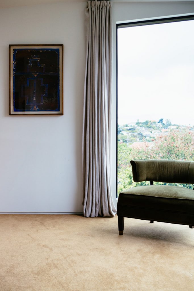
To accommodate the couple and their 10-year-old daughter Mercedes, the mezzanine landing becomes a wide corridor with enough room for a built-in desk that overlooks the main lounge. On any given day Mercedes might practise her tumbling gymnastics here or Sandii will salute the sun as she takes a pose in a morning yoga session. The desk is commandeered on a first-come, first-served basis. It has been a sewing table, a work station and a place to put the doll house. With no door deemed necessary on the master bedroom, Sandii and Jared can look through the clerestory windows of the landing to see the stars at night.
The spatial program is full of interest but recycled materials bring character too. The couple was keen to re-use not just from a sustainability point of view but also to save money on the alteration, which cost them $420,000. “That’s one reason we chose oak seconds for the flooring downstairs,” says Sandii. “The cheaper boards had a lot more knots in them but we like them.”
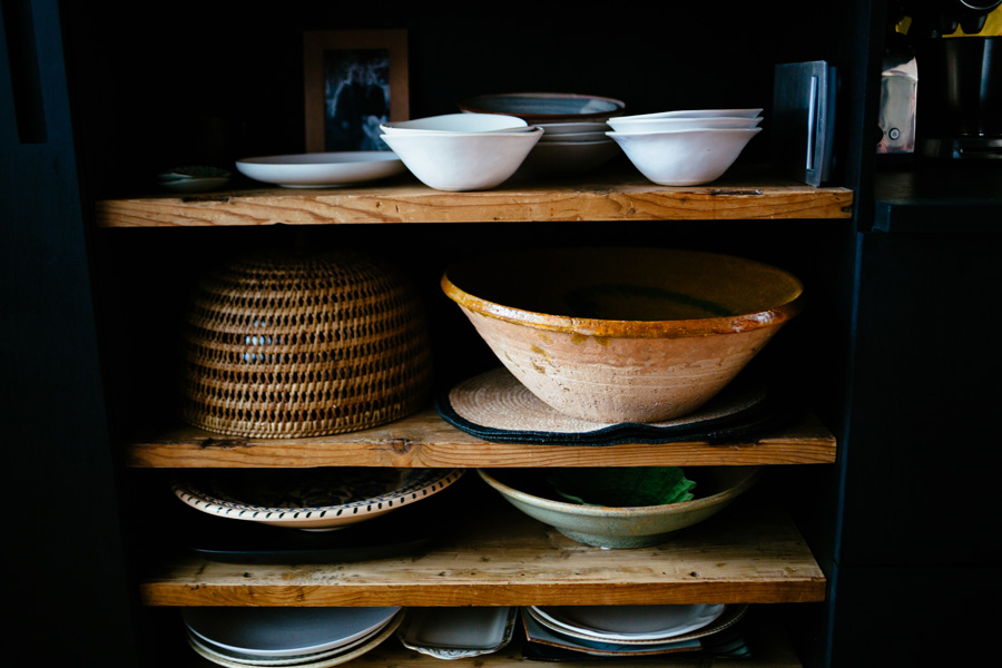
Playing the long game, the idea is to up-spec finishes as they can afford it. Not fans of plasterboard – they’d have none if they could help it – they are relining walls, as budget allows, bringing substance to the palette. Jared has just installed a cedar coat on one wall in the master bedroom and he also made the concrete sink in the blacktiled ensuite. Working as a tag team, Sandii then polished it with a stone and coated it in black wax. The aged look teams well with natural brass tapware. “The taps will develop a beautiful patina over time,” says Sandii. And the best thing is I don’t have to keep them sparkling clean.” In the kitchen, Jared’s handiwork includes a vintage shop counter, originally bought as the island that never was, which he turned into open shelving. “We felt bad cutting it up, but at least we still love it.”
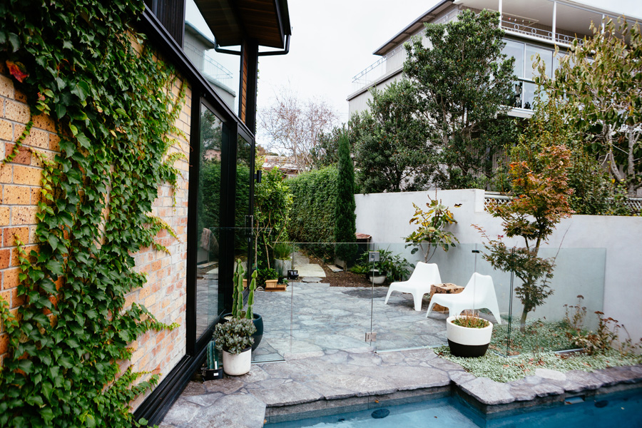
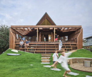
Out in the garden, careful planting will soon hide the conglomeration of neighbourhood properties. To the north, a set of floating concrete steps leads to an area with raised vegetable gardens and a playhouse repurposed from old weatherboards and carpeted with offcuts. But the real action takes places out in the western courtyard. Wedged between the edge of the living room and a fence is a swimming pool. “Our friends didn’t believe us when we said there was space for one,” laughs Sandii. “But we could see the extra metres a griselinia hedge was taking up.”
Inventive on a budget, the pair nevertheless invested in a solar power system. It’s so efficient at producing electricity that, by feeding it back to the grid, the annual household electricity bill was only $58.00 in the first year. “And that was after annual line charges,” says Sandii.
Toasty in winter, with spaces to splash about in summer, this unpretentious unit is now a covetable urban retreat.
Specs
Architect
Studio106 Architect
studio106.co.nz
Passive Energy Design
The house is a ‘middle unit’ sandwiched in a cluster of three dwellings on the site. The north and south walls are boundary fire-rated walls making the orientation chiefly an east-west experience. Morning sun penetrates to the ground floor level via picture windows to the lounge, and reaches into the dining and living spaces through a double-height void over the play area. A raked roof and ceiling ensures maximum light can be achieved, controlled during the heat of the day by overhanging eaves. Solar gain from northern glazing is minimised due to fire rating requirements and primarily considered for particular views. In winter the western sun can penetrate well inside the dining room and kitchen through double-height glazing. External paving that extends into the ground floor – across the sliding door threshold – assists to gather heat during the day and release in the evenings. Windows and doors are positioned for effective cross-breezes with a tall vertical louvre set complementing the large sliding doors on the west living spaces. Solar PV panels on the roof are oriented and tilted for maximum gain and provide energy to power the house and the hot water heat pump. The design provides comfortable seasonal living with low-energy use year-round.
Materials
The ground level has ‘rustic knotty grade’ solid oak flooring from Rosenfeld Kidson, with a natural oiled finish that compliments the natural cedar soffit lining. The lower level utilises the existing brick veneer recycled into face brickwork. The new upper level addition is vertical cedar weatherboard constructed over a lightweight timber frame construction, highly insulated, and finished with painted plasterboard. A steel frame is used to create the large double-height opening to the dining room. The roof is a high tensile steel standing rib profile with a highly insulated ceiling void. The interiors feature reject oak board paneling replicated in areas as ceiling and wall linings throughout. Fittings, fixtures and cabinetry are mostly sourced seconds, then re-purposed to offer an honest palate. Furniture has been sourced from a variety of secondhand stores or shut down auctions. All paints are from Porters Paints and Resene. Brass tapware from Astra Walker.
Flooring
Timber floors to the lower level are large width solid T&G ‘rustic knotty grade’ solid oak flooring over the existing timber floor. The upper level floor and stairs are covered in 100% wool carpet from Artisan flooring over 25 mm structural plywood sheet flooring.
Insulation
The roof is insulated with R3.4 (190 mm thick) thermal insulation. There is bulk insulation to walls: 90 mm thick R2.5 Autex GreenStuf to external walls, plus 90 mm R1.8 Autex sound control batts to all internal walls for improved sound insulation. R1.8 Autex underfloor batt insulation has been used under the existing timber floor.
Glazing
Windows are powder coated aluminium. Metro clear double-glazing and cedar breezeway louvre inserts and awning/casement windows.
Heating and Cooling
Glazing is oriented east and west for winter sun. External shading is provided by eaves for summer heat gain. Effective cross-ventilation removes the need for artificial cooling. In winter the living spaces are centred around a small slow combustion wood fireplace.
Hot Water System
Hot water is provided by an Ecoenergy heat pump water heater with a 280l Ecoenergy outdoor stainless water cylinder powered by a 5kw solar PV panel system.
Power
A 5kw grid tied system that consists of 20 x CSUN250-60P-A Polycrystalline 250W solar panels that is connected to a Kaco 5002 inverter. Provided and installed by Power Technology.
Lighting
The house uses low-energy halogen lighting from Inlite and feature lights sourced from various second hand and vintage suppliers.
