Snappy Moves
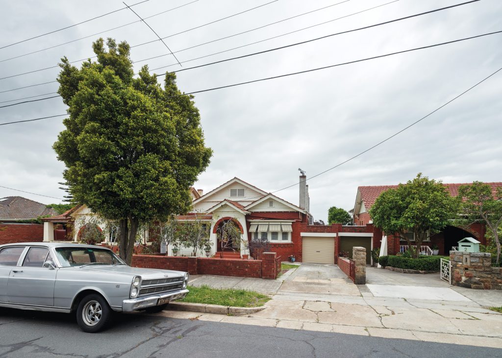
When mature-age architecture student Amy Carroll and her young family bought an elevated Californian Bungalow in Northcote, Melbourne, last May with a big, glorious garden and clear views to the Dandenongs, the brief for an unusually quick, quirky, low- waste renovation that preserved the house’s history soon revealed itself.
Amy Carroll, a former lawyer now studying architecture at RMIT and working part time at MAKE Architecture Studio in Kew, and her partner Tony Macvean, knew they were onto a winner
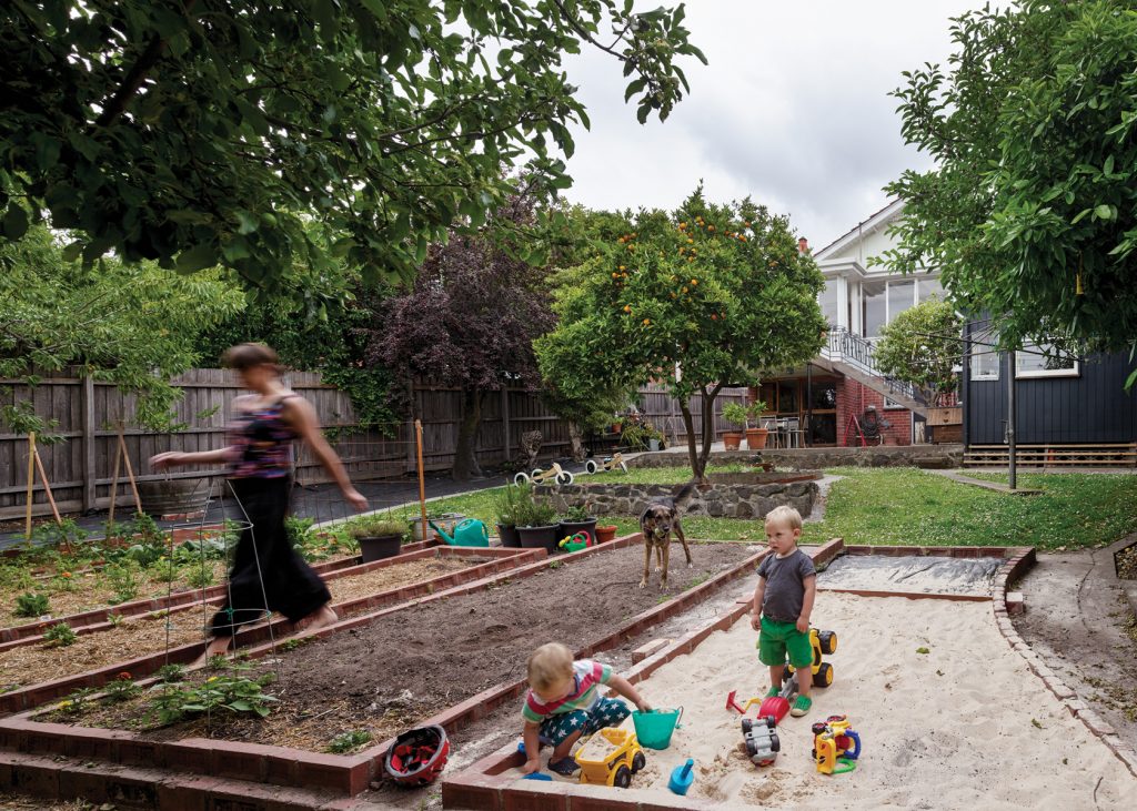
six months ago when, after a long period of searching, they found a well cared for, double-brick Californian Bungalow untouched since the early 1960s on an elevated 695-square-metre site with established, productive gardens, and close to central High Street.
The pristine vintage kitchen, complete with narrow benches miles from the tiny stove, was impractical by today’s standards. Ditto the minute bathroom, the dark, dog-legged interior and the disconnected sunroom at the rear that squandered the home’s killer easterly views. But this was a solid place on which the couple could make their mark judiciously, leaving intact as much of the home’s history as possible. “I’m quite nostalgic,” Amy says. “I place a lot of value on the history and memory of a place or objects, I suppose.”
Initially Amy and Tony considered a quick makeover of the kitchen and bathroom prior to moving in with their young twins Henry and Joe, now two, followed by a more substantial renovation later on. But with low waste a high priority they settled for something in between: minimal intervention to maximum effect, designed to reprogram the house within the existing envelope, re-orient living spaces to capitalise on the light and views at the east-facing rear, and re-use materials wherever possible.
“We bought the house in May, we settled 30 days later, we were renovating the next day and … designing as we went,” Amy says. “We’ve done a lot more than we initially intended, and we probably don’t need to do much more for a long time.”
With no planning permits required and a client doubling as a designer and specifier who was available most days either on-site or in the design office, the MAKE team of Amy, Director Mel Bright and Senior Architect Bruce Rowe was able to complete the job in less than four months. The key was demolishing and designing simultaneously. Mel concedes it’s far from the usual process but adds that Amy isn’t the average client, student or employee.
“Everything in the office is really a collaboration, and obviously for this project Amy was more than a member of the team,” Mel says. “She really drove a lot of the process but with the back-up of Bruce and me, who have done it … before.”
The truncated design and construction process required “very fast work in the office,” Mel concedes. “We split it into two parts. The plans were decided, the holes were punched out with a rough idea of where the kitchen and bathrooms were going to be, and then while they were happening we were finishing documenting the joinery. Bruce did most of drawing work.” Amy sourced materials, organised trades and made design decisions on the fly. “There was a lot of thinking on our feet,” Amy recalls.
Amy’s hands-on approach extended from deciding which period features to retain to making a coat rack for the front entrance featuring various salvaged coat hooks, including one from her grandfather’s old work-shed in Footscray that she had carefully kept since the age of five. One week was spent experimenting with plasterers on a thin wash that would seal the freshly exposed brick walls without losing their texture and character. Despite some good-natured ribbing about her colleague’s fastidious attention to detail, Mel clearly admires Amy’s commitment. “There was some really careful demolition work … and that sort of site involvement was essential,” Mel says.
The front of the house was reprogrammed without structural change. The original living room and adjoining dining room were repurposed as an adult’s retreat and adjoining master bedroom with a floating joinery unit designed to announce itself as a recent insertion. Original Baltic pine floors were stained to tone down their yellow hue and waxed to retain as much as possible of their texture and grain.
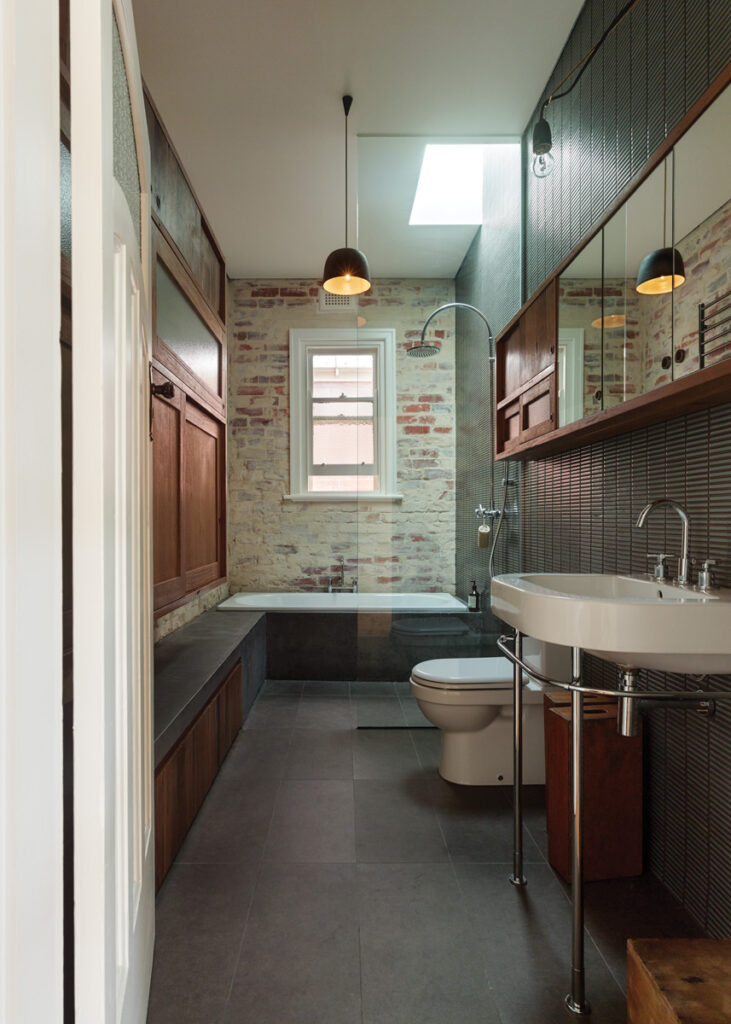
In a second bedroom, currently shared by Joe and Henry, a joinery unit was made from old plastic crates and timber recycled from the home’s original linen press, which was sacrificed to make way for a large new central bathroom that Amy and Mel describe as “moody” and “calming”. It’s a long, narrow space inspired in part by Japanese bathhouses. It features lots of natural light, an exposed brick feature wall, floating timber cabinetry, in- built seating, a hinged light designed by Amy to swing out from above a long mirrored cabinet, and exquisite ceramic finishes including dark, elegant rectangular wall tiles made in Japan and a handcrafted pendant light created by Bruce as a prototype design for his side-line in ceramics. “We always treat bathrooms as a special space and bathing as a ritual,” says Amy.
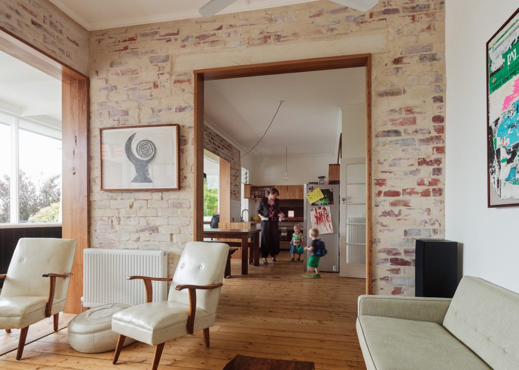
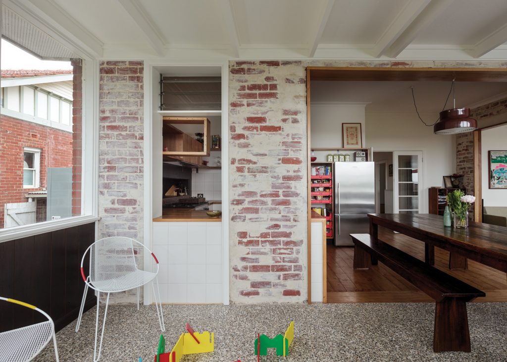
Outside, a dilapidated, asbestos-ridden bungalow with nearby laundry and toilet was rebuilt to serve as a flexible space that functions as a study and guest quarters. Internally, at the rear of the house, an old bedroom and corner toilet were removed, as were the walls to the narrow sunroom that spanned the width of the property. This effectively created a generous, light-filled space for living areas, into which were built a corner sitting room, a spacious central kitchen and a dining area that straddles the kitchen and the old sunroom.
It’s a compact, striking space that feels big, bold and spectacularly light thanks to its elevated position and lovely vistas over the garden and beyond, but it’s deliberately odd too. Determined to retain the layers of history embedded in the house, Amy elected to retain an assortment of original details, from the position of light fittings to an old doorway linking what was once sunroom and storeroom, and an awkward corner in the kitchen into which Amy has wall-mounted part of the original timber cabinetry.
She admits her meticulous, traditional German builder, Jan Knecht, was initially appalled by some of her decisions. “When I told him that I wanted to put the kitchen shelves up with exposed brackets he was horrified,” Amy recalls. “And when I said the pantry will be made with plastic bread crates he thought I was crazy.” But once he understood her mission to minimise waste and celebrate signs of the home’s rich past, he embraced it wholeheartedly. “Now he thinks it’s all great,” Amy says.
Specs
Architect
MAKE architecture studio
makearchitecture.com.au
Builder
The Zimmermann Oz the-zimmermann-oz.com.au
EcoEdge Homes (structural works) ecoedgehomes.com.au
Joiner
The Zimmermann Oz
Passive energy design
The floor plan was reconfigured to orientate the living spaces toward the north and east. The new openings in the internal walls facilitate cross-ventilation and allow the living spaces to take advantage of the morning sun, which penetrates the sunroom and stores heat in the existing slab floor.
Materials
A key objective of this project was to minimise new materials and waste. Materials, fixtures and fittings from the demolition were repurposed wherever possible. Doors, windows and fittings from the existing house were re-used and repurposed. Joinery is made from recycled timber (kitchen/living and bathroom) and low-VOC plywood (bedroom) finished with tung oil. Textured glass and wardrobe doors were recycled from the existing house. Kitchen drawers are recycled discarded plastic crates. Walls were washed to seal, rather than replastered.
Flooring
The existing terrazzo and timber floors were retained. The latter were stained and finished with Treatex hard wax oil.
Insulation
Existing batt insulation was retained.
Glazing
Existing windows were serviced and retained.
Heating and cooling
An old ducted heating system and gas heater were replaced by hydronic heating throughout and the sitting room fireplace was restored for occasional use. The existing air conditioners were removed. Two ceiling fans were retained.
External sheer blinds reduce morning heat gain to the living spaces in summer.
Hot water system
The electric hot water system was replaced with an Apricus evacuated tube solar hot water system.
Water tanks
2 x 3000 L slim-line rainwater tanks service the laundry, a second toilet (under the house) and productive garden. A greywater recycling system is scheduled to be connected around the time of publication.
Lighting
The house uses low energy and LED lighting. No recessed downlights are used. New fittings include a handmade MAKE Potter pendant by Bruce Rowe (bathroom), a brass-plated light hook by Amy Carroll (bathroom), a secondhand vintage Swedish pendant light (dining) and NUD pendant lights with re-usable halogen globes.
