Simple Illusion
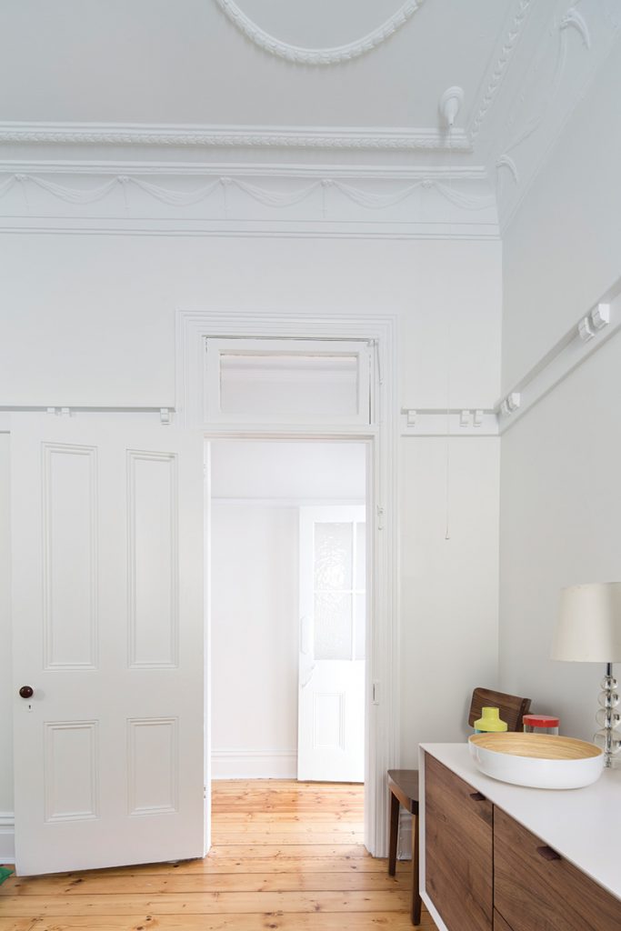
The devil is in the detail of this deceptively simple Federation cottage in the inner-west of Sydney that effortlessly combines the old with the new.
Architect Christopher Polly is a man of detail. Obviously he appreciates the big picture as well, but it’s the small things that really delight him.
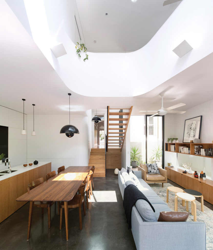
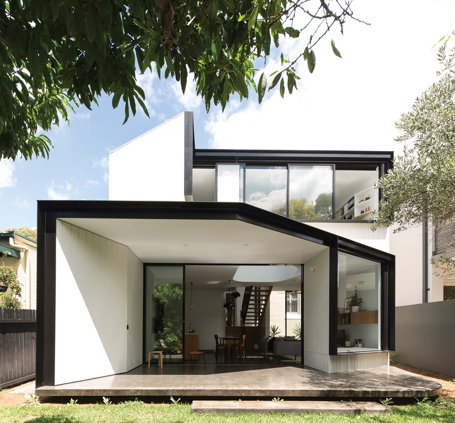
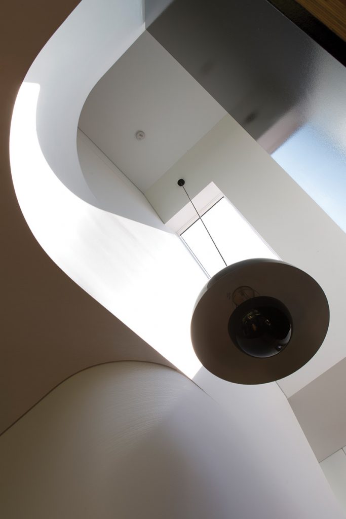
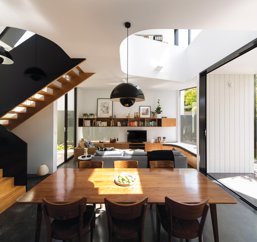
Walking around his latest completed project – a renovated and extended house in the inner-west of Sydney – he points out the many architectural features that make this house sing, such as the cranked roofline of the new addition, the floating rear terrace and the curving void above the new living area.
“Achieving this apparent simplicity takes a huge amount of effort, structurally and detail-wise, to resolve,” he says. “There are lots of little intricate things that make every millimetre of this house work.”
He’s dubbed the project the “unfurled house” because of the way the new rear addition appears to unfold in response to its setting. In plan view, the two-storey extension reads as an interesting exercise in overlaying geometric shapes; in elevation, it’s a bold composition of folded forms.
None of this is obvious from the street though. A typical, double-fronted Federation cottage, the east-facing brick house fills most of the width of its block and is partly concealed by a 1960s garage that’s been jammed onto one side. When the current owners bought the house, it had two original bedrooms on one side of the central corridor and what had once been a formal double living and dining room on the other side, which was partitioned into two separate rooms to create a third bedroom.
The block falls away from the street and at the back of the house was a skillion-roofed extension that had been reworked a couple of decades ago. Cascading down four levels to eventually open onto the rear garden, it comprised a series of small rooms that included the kitchen, a dining room, a bathroom and a small study.
“It was an inefficient use of the space,” says Christopher, “with poor planning and connections to the backyard.”
Three children and almost a decade later, the owners realised that the house wasn’t going to suit their growing family unless the rear extension was rebuilt and enlarged. Their brief was for a renovation that would give them a fourth bedroom with a study area and a private reading nook, as well as a second bathroom, a new laundry, a second living space, a covered deck and more storage space. What’s remarkable is that all this has been achieved without any increase in the house’s footprint. In fact, the existing lawn area and garden behind the house are exactly the same size as they were before this latest renovation, and the way the new addition is linked to the old house has created an additional outdoor courtyard between the two.
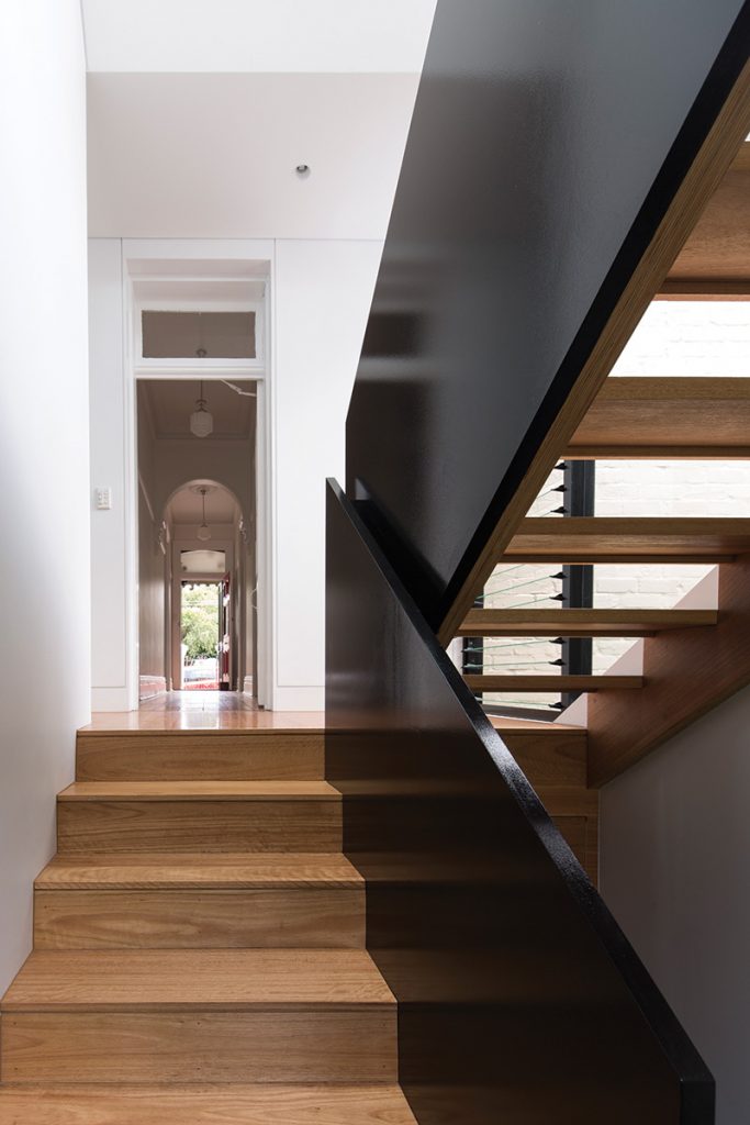
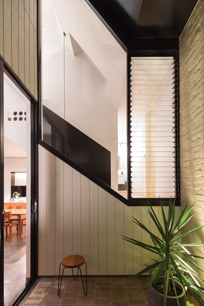
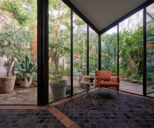
“We managed to retain the exact same garden area, which was important,” says Christopher. “Keeping the same footprint of the house was my overriding sustainability objective.” The glazed link between the old and the new allows air and light into the house’s centre. To anyone standing on the new timber landing at the end of the existing hallway, the transparent link acts as a transition zone, providing a visual breathing space. On one side, a wall of north-facing glazing allows views into the new courtyard that separates the original house from the rear addition.
On the other, a short passageway leads past a new laundry into the main bathroom. Both utility rooms are compactly planned but share a raked ceiling with an internal highlight window that fills them with light and creates a sense of volume.
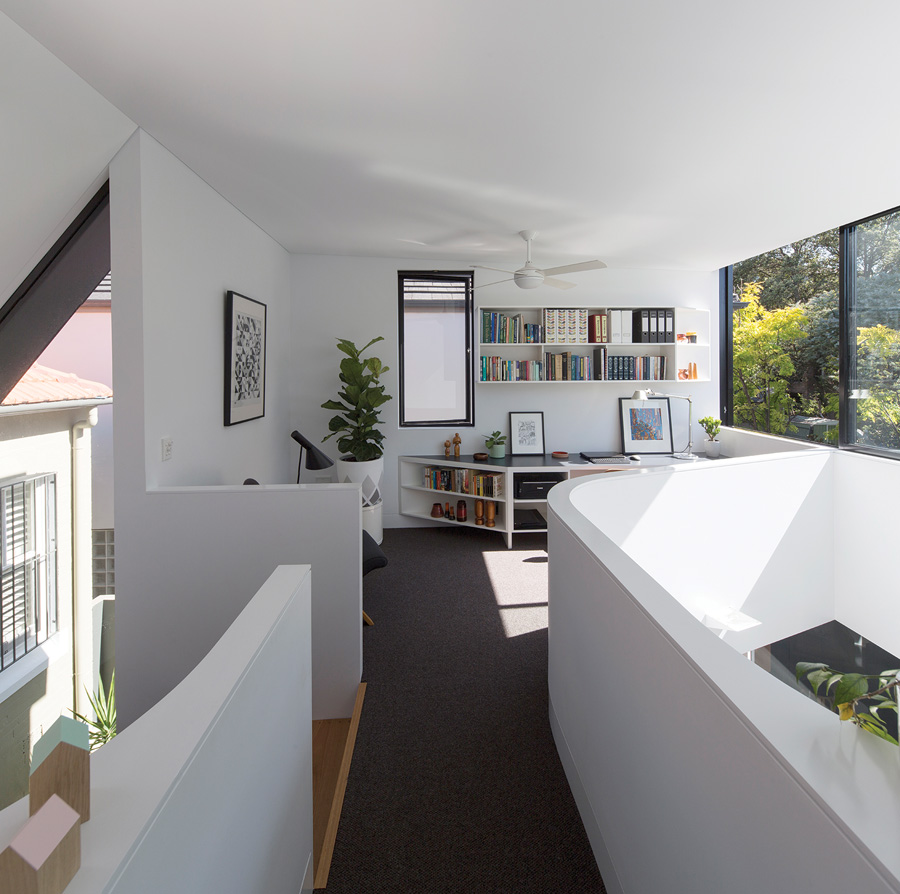
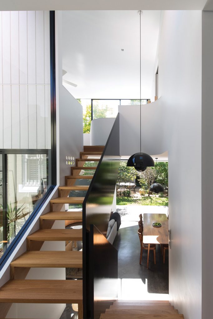
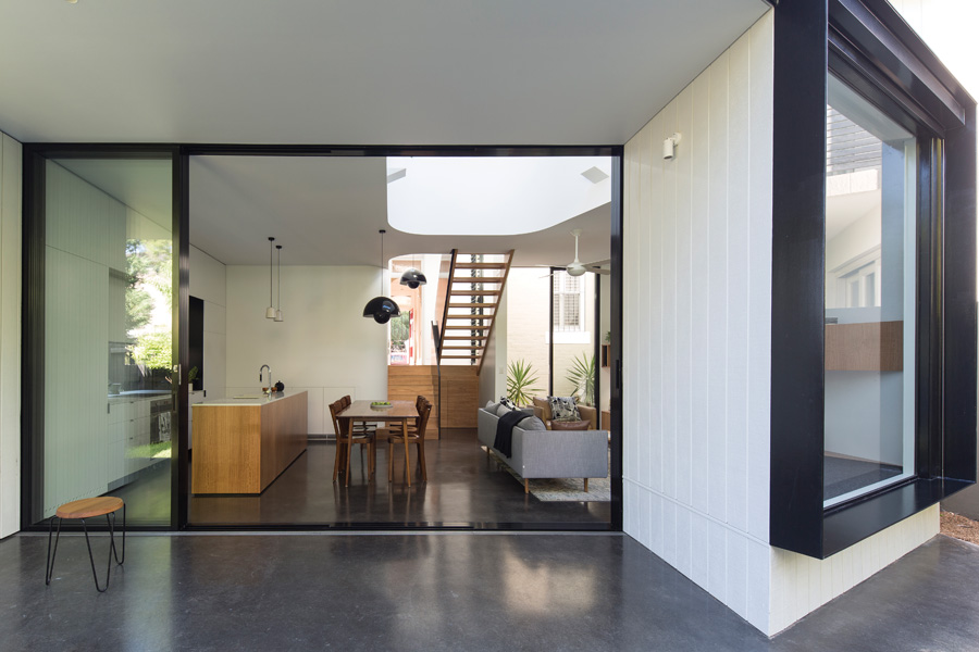
Upstairs, via an open-riser stair with handsome blackbutt treads, is an airy study with a bridge linking it to a new master bedroom and a glamorous ensuite bathroom. Downstairs is the new open-plan kitchen, dining and living space, which occupies the full width of the ground floor. A glazed door on one side leads into the new courtyard, paved with bricks recycled from the build, while to the rear, a bank of sliding glass doors opens onto a covered terrace, which shares the same burnished black concrete slab as inside.
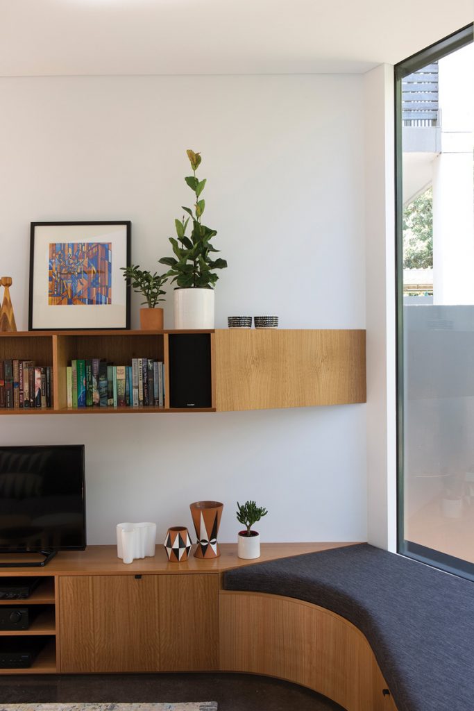
Hidden behind huge doors is an outdoor storage cupboard with the capacity to rival the largest stand-alone shed. Admiring the house from the productive back garden – filled with citrus and stone-fruit trees, and several raised vegetable beds – the faceted quality of the addition can be fully appreciated. The reading nook upstairs is cut back to maximise the amount of sunlight falling on the neighbouring house to the south, and mirroring its angle is the opposite corner of the downstairs living area, occupied by another day bed.
“The projecting wedge in the main bedroom is repeated in the living space on the ground level, with the third wedge being the outdoor shed,” explains Christopher. “These features helped to develop the geometry of the scheme. It could have been a very plain, two-storey box, but instead it’s the complete opposite, both formally and creatively.”
Not only has it enriched the lives of those who live here, the visually arresting addition has also improved the outlook from a neighbouring apartment block. It’s a win-win all round.
Specs
Architect
Christopher Polly Architect
christopherpolly.com
Builder
Matrix Additions
matrixadditions.com.au
Passive energy design
The environmental sustainability value entailed in retaining the original fabric is augmented by a modestly-sized footprint and lightweight-framed envelope of a “new build”. Fenestration placement significantly improves natural light access and promotes passive ventilation, assisted by ceiling fans and existing openings within the original house. A northern courtyard and circulation zone enable light and ventilation at the centre of the plan.
Projecting plywood and steel hoods shade glazing, and external retractable blinds temper or maximise solar access when required. Heavily insulated walls, ceilings and roofs further optimise the thermal performance of the envelope to stabilise internal temperatures and comfort levels. Surrendered internal floor area enables generously carved voids flanking an upper bridge for diverse views to sky, trees and outdoor spaces, while projecting “wedges” at the rear further unfurl the envelope for strengthened connections to its external environment.
Materials
Products and materials selections were all integrated for their life-cycle durability and performance in their respective applications. Gunnersen Shadowclad plywood wall cladding for its environmental sustainability from plantation-grown Radiata pine (FSC), and H3 preservative treatment to provide long-term protection from decay. Klip-lok Colorbond Steel roofing for its durability, long life, reusability, recyclability, and high strength-to-weight. Burnished concrete slabs to the ground floor and terrace for durability, thermal and resource efficiency, long life and thermal mass. Aluminium for sliding doors, pivot-stay and fixed windows for its lightness, durability and low-maintenance, excellent thermal performance, high recyclability, and dimensional stability in these applications. Recycled bricks from the existing fabric reused to rebuild a rear portion of the original envelope and new subfloor walls, and recycled brick pavers used for exterior landscaping.
Flooring
Ground floor: Burnished concrete slab with CCS integral “Liquorice” oxide and matte acrylic sealer. Blackbutt T&G strip floor with Feast Watson modified oil finish. First floor: 100 per cent wool carpet, Victoria Carpets “Torridon”.
Insulation
The roof is insulated with R3.5 Bradford glasswool insulation, with Thermoseal sarking and vapour barrier. The ceilings are insulated with R3.0 Bradford glasswool insulation. All framed walls are bulk insulated with R3.0 Bradford glasswool insulation to both external and internal stud skins. The upper floor zone is insulated with R3.0 Bradford Optimo thermal and acoustic insulation.
Glazing
Alspec powdercoated aluminium-framed sliding glass doors. Pivot-stay windows and shallow pocket concealed frames for fixed glazing, with Viridian ComfortPlus and Sunergy low-E glass. Breezway Altair powder coated aluminium framed louvres, with low-E glass. Velux double-glazed fixed skylights.
Heating and cooling
East and north fenestration placement improves natural light access and promotes passive ventilation, assisted by ceiling fans and existing openings within the original house. Acmeda external retractable blinds enable solar penetration to be tempered or maximised when required.
Hot water system
Existing Edwards 305L Titan Solar Hot Water Boosted System was reincorporated.
Water tanks
Two 2600L Colorbond Waterpoint Slimline rainwater tanks for garden use.
Lighting
Energy-efficient LED lighting for majority of fittings – XLUX Pixel Mini LED down-lights, Tovo exterior down-lights and Tovo in-ground up-lights; IBL Linear LED strip lights, Hunter Pacific integral lights. Flowerpot VP2 energy-efficient halogen lighting, Anchor Ceramics “Small Potter” & “NUD Classic Cord & Socket” pendants, Lumascape “Pagoda” exterior wall lights.
