Separated At Birth
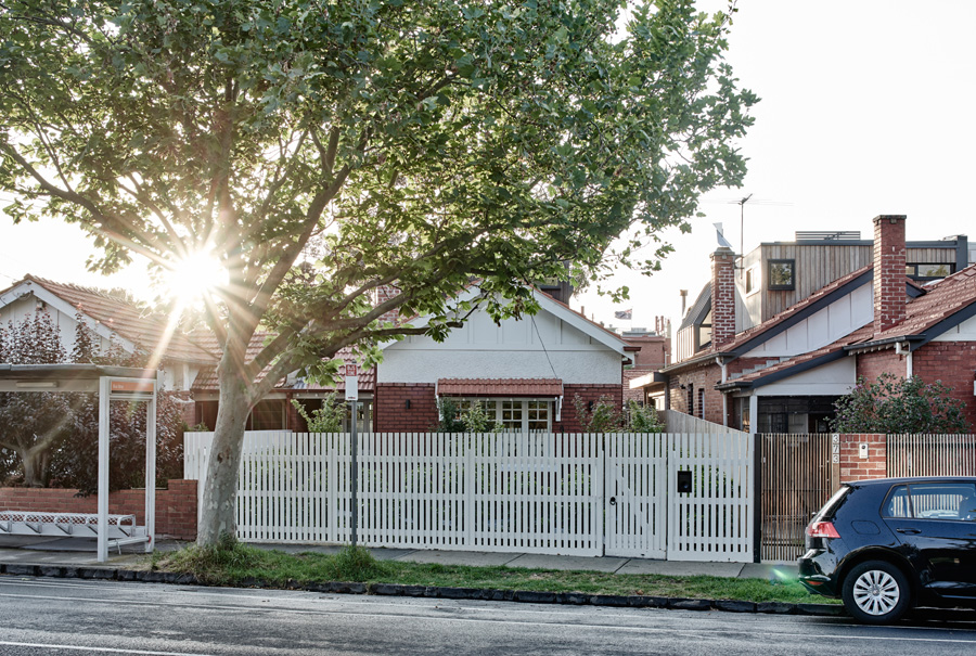
When architect Alex Lake of Therefore Studio took on his first residential project, the brief was to not only transform a dilapidated Californian bungalow by the Elwood canal, but the bog-standard plans that came with it.
It seemed like a good idea at the time: snap up a brokendown semi-detached Californian bungalow in beachside Elwood with plans and permits already in place, call in a young architect mate cutting his teeth on hospitality fit-outs, and give the former squat, with the “nasty” 1950s renovation, the tasteful contemporary update it sorely needed. But we know what happens to the best laid plans. And no-one involved in this project would suggest the plans in question were the best laid.
It was early 2014 when Alex Lake of emerging architecture and interior design practice, Therefore Studio, first sighted the Elwood property and plans. Architect and client had once worked together in the hospitality industry, and Lake’s outfit had completed a number of restaurant and café projects the client admired. Lake jumped at the chance to take on Therefore Studio’s first residential job: the transformation of an utterly unexceptional rear addition – a mirror image of the house next door – into a bespoke version that reflected the client’s love of entertaining and natural timbers. The catch? Construction was set to start in just four months, so he needed to move fast.
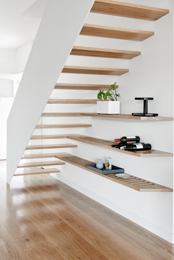
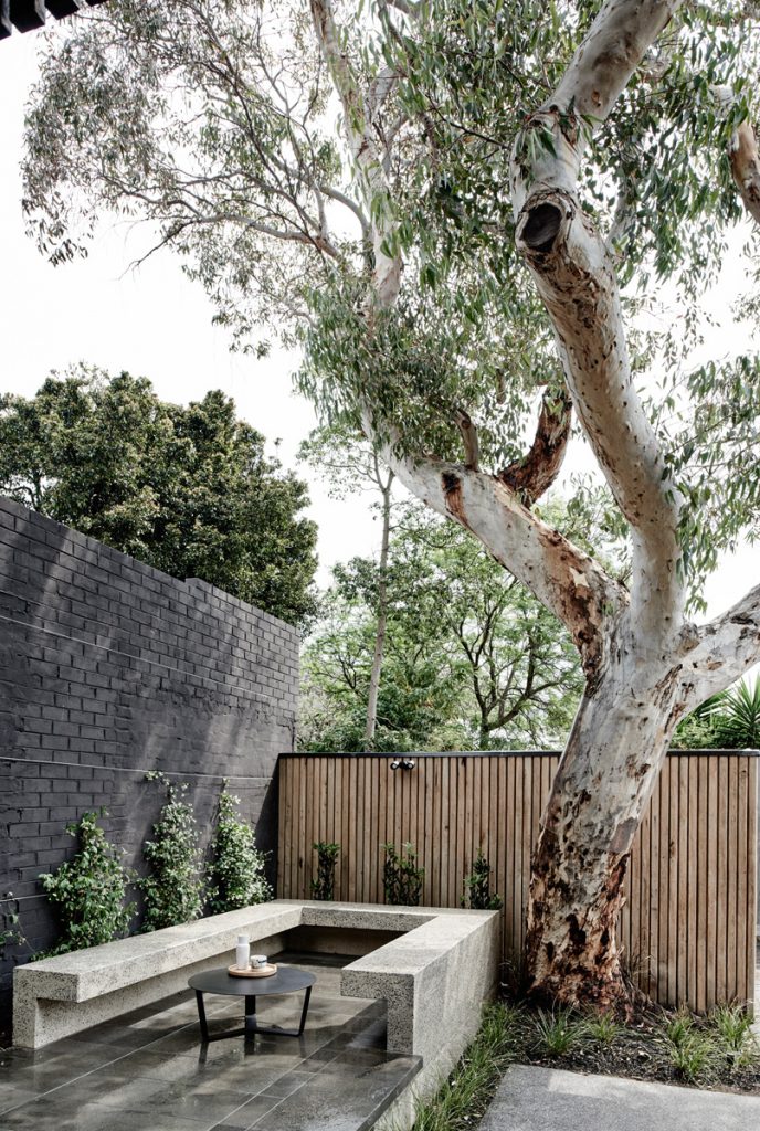
Lake’s amendments to the original plans effectively separated the twins at birth. He swapped small rooms, an uninspired materials palette, poorly placed windows and an impractically tiny upstairs balcony with larger, lighter, more flexible spaces delineated by solid oak joinery that harmonised beautifully with matching floors, open tread stairs, custom lighting and a towering sugar gum that dominates the small rear garden.
“Council had approved something and we wanted to go back to council with an argument that was very easy for them to say, ‘No worries, that’s fine’,” Lake recalls. “It would have been to everyone’s detriment if I [had] tried to make some changes that then got held up for six months.”
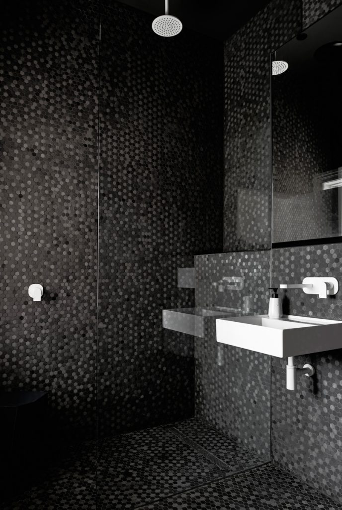
At the front of the house, three original rooms in particularly poor nick were stripped back to brick and timber before being carefully restored. “It really was ready for some love,” Lake says. A sunny front bedroom or sitting room was augmented with built-in robes, and another was converted into a home office. A sleek new bathroom adds a touch of glamour and plenty of textural interest via floor-to-ceiling basalt mosaic tiles that are laid to pop out in places, creating shadow play with running water and the light streaming in from an opaque side window.
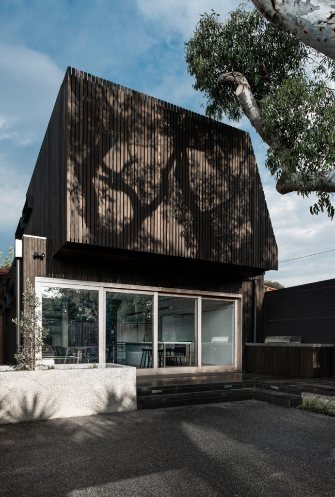
At the rear, the demolished 1950s extension made way for a lightfilled double-story addition designed to create myriad entertaining possibilities in a relatively compact space. Given the size of the block there’s no space in between for a transitional zone that visually announces the contemporary addition, but that’s fine by Lake.
“My overarching principle is … reuse is the best form of heritage preservation – having buildings that are lively and used. If this was carpeted and dark, and we maintained the traditional front sitting room that no-one uses … that to me is not a very positive reuse. At the end of the day making sure that you have really functional rooms and that they meet the needs of a contemporary family is far better than having the original cornice.”
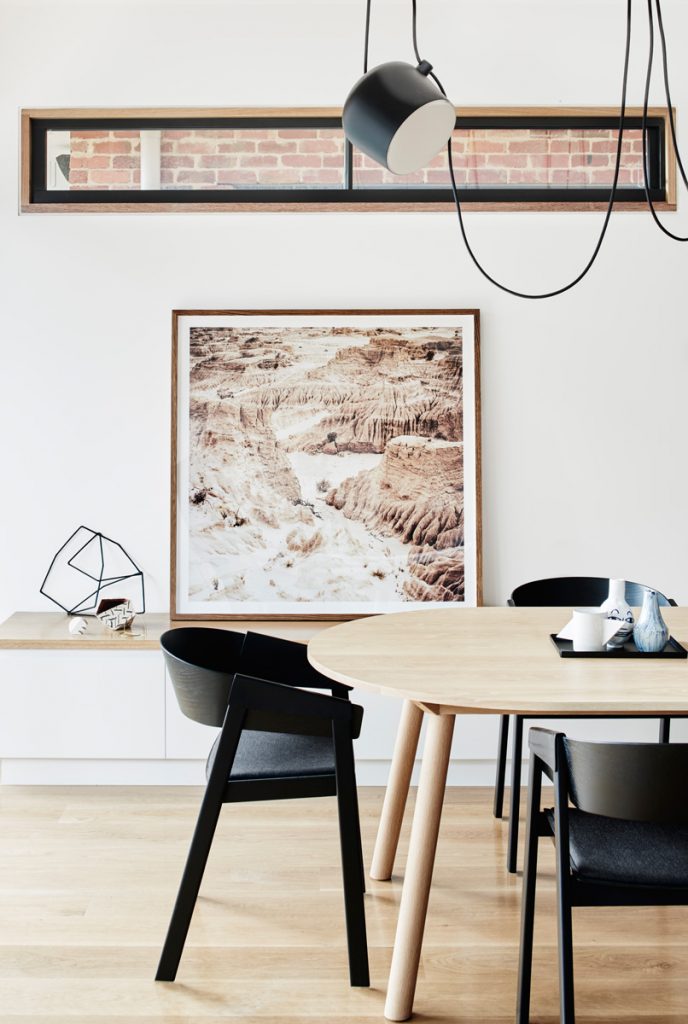
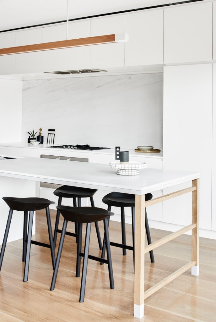
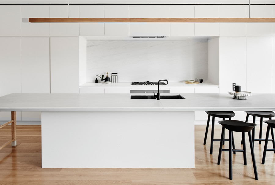
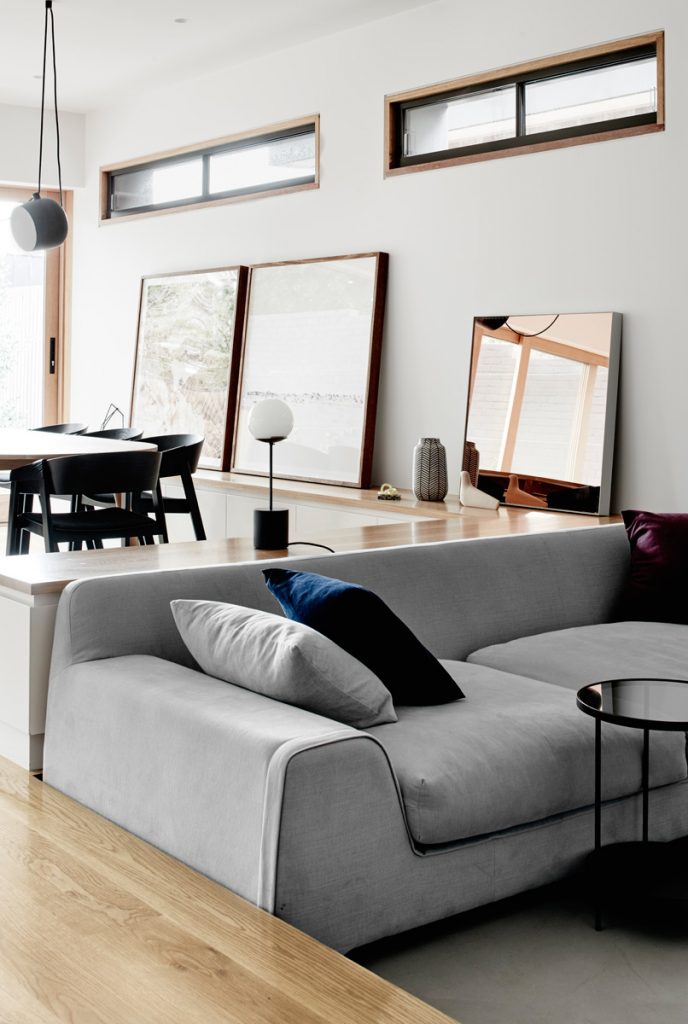
The pre-existing plans indicated an open-plan living and dining space at the rear, with a small kitchen, limited light and garden access. Lake’s re-imagining of the area has created an expansive entertainment space delineated by timber joinery that wraps around a central sunken lounge room (providing not only storage but extra seating for crowds), with a crisp white kitchen featuring an elongated café-style island bench that comfortably accommodates six. There is an additional dining space opposite with dramatically oversized feature “spotlighting” that overlooks a minimalist landscaped garden accessed via four massive sliders. This glazing floods the entire space with natural light dappled by the constantly shifting leaves of that majestic gum.
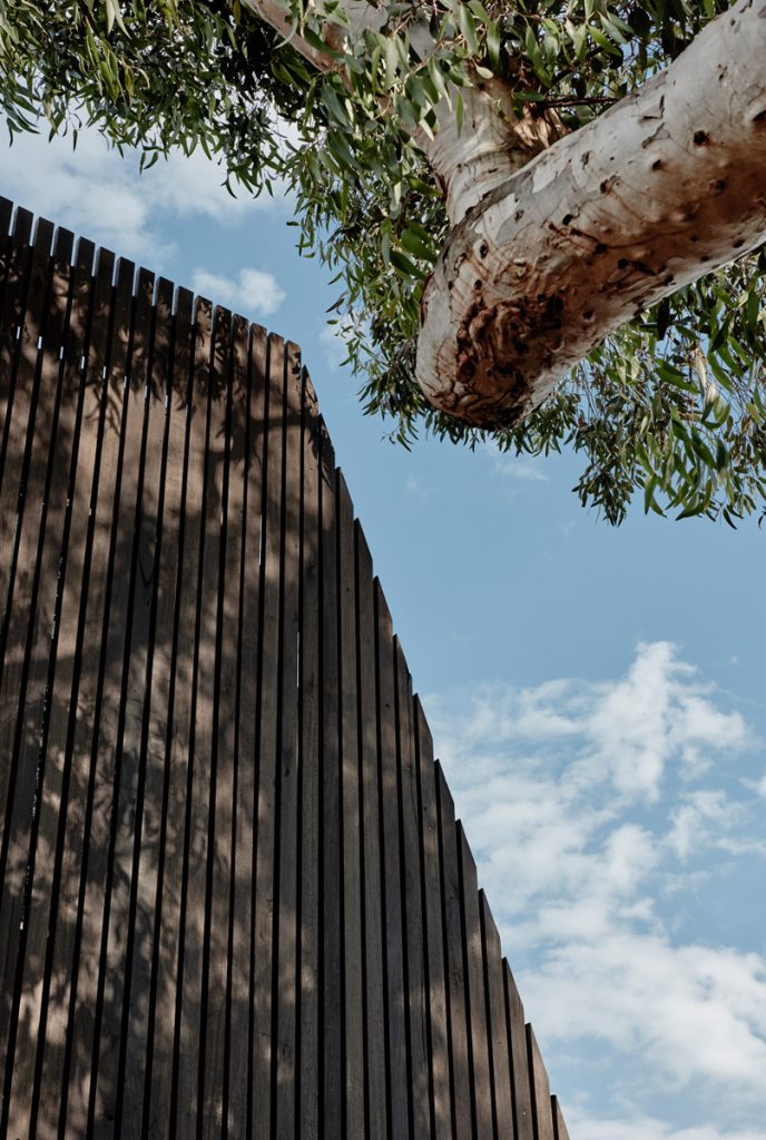
Upstairs the master bedroom annexes space originally destined for a balcony so small the owner would never have used it. Instead, it is now a generous private space with glorious treetop views through a handsome exterior screen made from vertical battens of blackbutt. Working in a high-stress job the client was keen for a particularly dark, quiet bedroom offering real rest and respite, hence serious sound insulation and a motorised blind that fits into an in-built timber bedhead for complete, luxurious darkness. Additional bedrooms, and a bathroom that mirrors the glamour of its downstairs counterpart, round out a floor plan designed to accommodate all kinds of families in the future.
For Lake the combination of simple, liveable spaces with quality finishes, a “fantastic” committed builder and a client friend who trusted his judgement – despite this being his first foray into residential architecture – made this job a pleasure. “Small, simple, less-but-better is what we try to live by,” he says. “It’s great to have something built in a fashion that we believe in because [in] a lot of people’s first works … your voice is not the loudest.”
Specs
Architect
Therefore Studio
thereforestudio.com.au
Builder
John Condon
mayconbuild.com.au
Landscape architect
Andrew Plant
andrewplantlandscapes.com
Passive energy design
The plan is oriented to the northern site boundary with a bias given to evening light to suit the social habits of the clients. It controls solar gain through window shrouds and timber screening. The building envelope is well insulated for thermal and acoustic transmission. Windows and doors are positioned to maximise cross- and through-ventilation in conjunction with highlight windows and skylights to vent the building vertically.
Materials
Floorboards are American oak. Joinery and pendant light are American oak finished in clear matte Two Pack. Window and doorframes are local KD hardwood in Cutek clear oil. Window shrouds are folded steel in Dulux Monument Powdercoat. Exterior cladding is solid blackbutt boards finished in Cutek black ash. The backyard fence is made from vertical slatted radial sawn timber, and the pavers are rough sawn bluestone.
Flooring
Floorboards are American oak finished in clear matte polyurethane.
Insulation
The building envelope is well insulated for thermal and acoustic transmission using two layers of cladding as well as Comfort Plus glazing and bulk insulation. Timberframed walls use Sisalation & Bradford Glasswool R2.5 bulk insulation. Brick walls use foil board R2.0 insulation. The ground slab uses extruded polystyrene insulation with foil board R2.0 insulation. Ceilings and roof uses Sisalation & Bradford Glasswool R5.0 bulk insulation.
Glazing
Windows are Viridian clear double-glazed 6/12/6 Comfort Plus glass. External folded steel shrouds are powdercoated.A large timber screen to the rear façade givesprivacy and shading as well as soft light to the masterbedroom.
Heating and cooling
Daikin ducted reverse cycle air conditioner with linear slot diffusers.
Hot water system
The hot water system is a Rheem 24 7-Star Equivalent continuous flow gas water heater.
Water tanks
A 3500-litre water tank was installed below ground.
Lighting
LED lights are used throughout. The kitchen pendant was custom made in American oak. The Aim pendants in the dining room are by Flos.
