Semi Social
This creative renovation of a Sydney semi blurs boundaries and reconfigures spaces to create a home full of surprise and personalit
When owners Dawn Piebenga and Patrick Franklyn commissioned an architect to transform their Tamarama semi, they agreed to give him freedom. They are happy they did, as they love the home he designed: a north sun-filled semi with refreshingly blurred boundaries; a semi that subverts its conventional layout to deliver skillfully scaled spaces for each of their family of four.
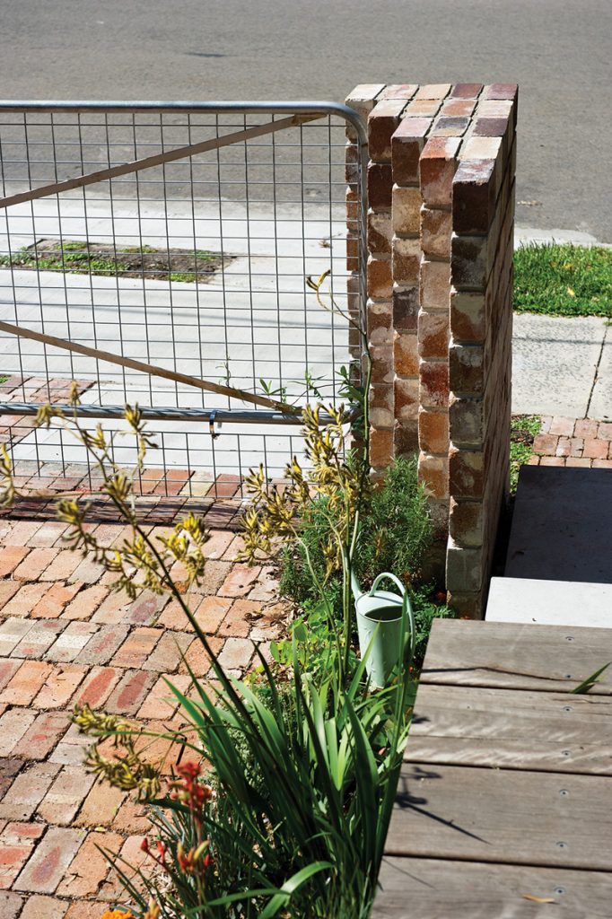
The playful renovation by David Boyle announces itself from the street front. It has a farm gate opening onto a double car park where native ground cover is already growing up between paving of recycled bricks. A timber bridge on one side leads into the house and, in the entry, a deep skylight painted retro green continues the promise of something special.
“The house is all about flexibility and building in a sustainable way, maximum light, ventilation and gardenscape,” Boyle says, as he leads the way into the newly renovated home.
Unlike the usual gun-barrel layout of a semi, this home reveals itself in chapters, with each room having its own engaging narrative. Even the hallway, with its deep skylight of green and just a small pane of glass linking to the outside, sets a mood.
The first room of the semi is still a bedroom, and little has changed, Boyle says, but it does now open into a shared bathroom, so can operate as separate sleeping quarters if needed. The next room is utilitarian: a laundry and storage. It runs across the plan, opening to a shared outside area where the wheelie bins of two households, Dawn and Patrick’s and their neighbour’s,
are kept. It is part of the social agenda of the home, to keep boundaries porous and neighbour-friendly.
“We all love the subversiveness of the house being reversed,” says Patrick. “It provides a wonderful anticipation.”
Certainly that is repaid when you walk past this utilitarian lynchpin into the heart of the family home. The house opens up and sunlight floods in, as does a view stretching through the main living room to the back garden, which was cleverly and practically designed by Patrick, whose vocation is landscape architecture.
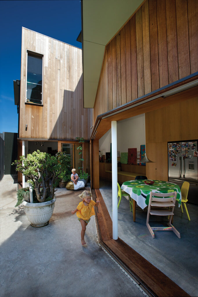
“We had some overbearing houses to the north and rear, so we cut a wedge shape out to let northern light in and increased the side setback to connect this courtyard space into the backyard,” Boyle explains. “It lets all the northern light in and brings
the effect of the garden space to the centre of the house. We controlled the privacy by deliberate 1.2-metre-height windows onto the courtyard and [then] a high fence [to the neighbour] on the other side. It is not overlooked or overlooking.”
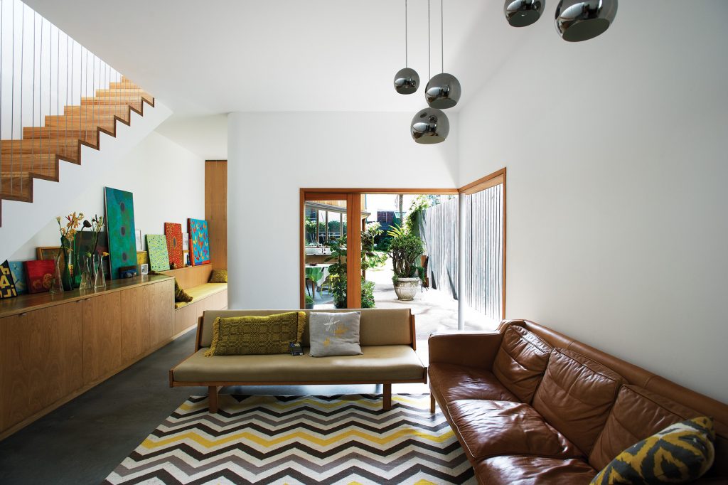
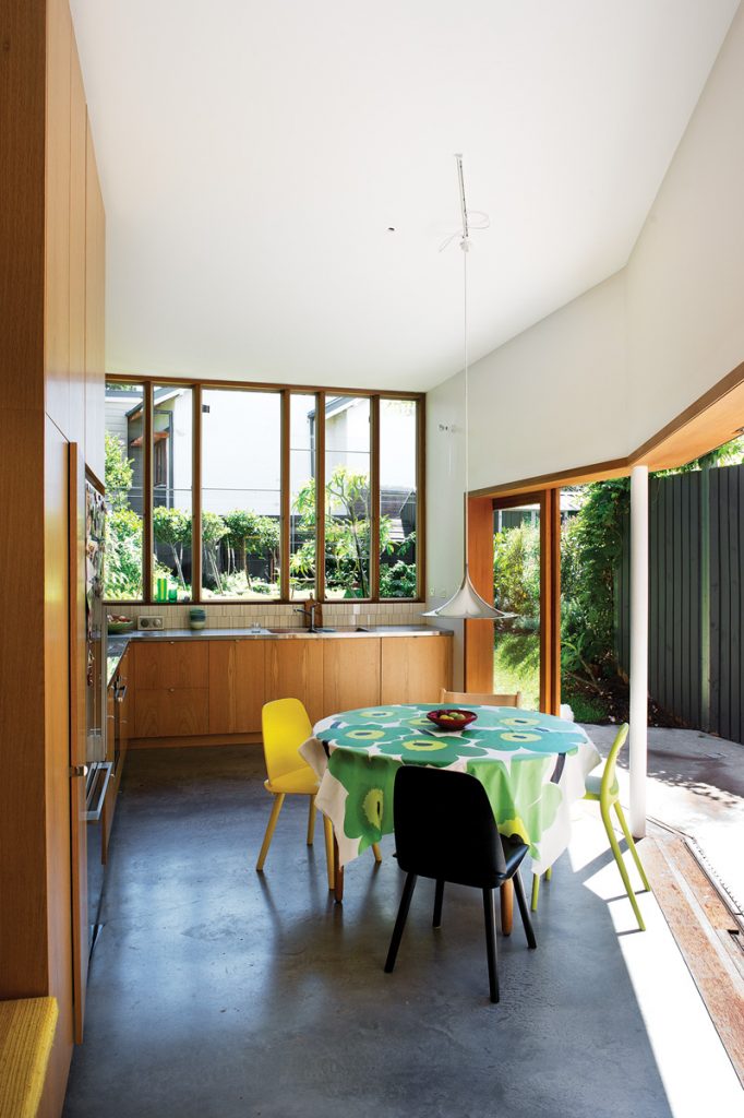
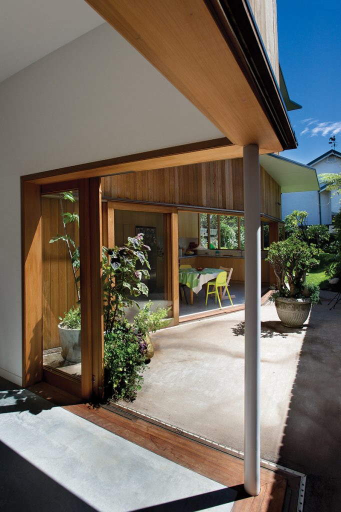
The rear is essentially two living spaces, with a narrow pinch-point separating them. The first space is a sitting room, filled not with the usual television but with a piano and other musical instruments. “They are very involved in the children’s education,” says Boyle. The second space, directly overlooking the garden, is a kitchen and dining room. They each have a polished concrete floor, so inside and out link seamlessly. “It is a robust in-and-out space,” Patrick says. Boyle adds, “So the kids can ride their scooters in and out.”
Boyle illustrates this easy connection by opening the glass doors in both living areas. “The whole house opens and you feel like you are in a verandah space, you feel you are open to the garden.”
Another priority was to design living spaces that offered different experiences. “Each gives you a spot to go, so you feel you are in a different space, connected but separate,” says Boyle. “People can feel they have their own little spot.” There is another of these potential retreats between the two living rooms. Incorporated in a low joinery unit is a built-in seat. A rich corn yellow, it was hand-woven out of hand-dyed New Zealand wool by Dawn’s mother, a textile artist.
The rear garden is a labour of love too, designed by Patrick. To counter the site’s dampness, he created an undulating grassed backyard, with a vegetable garden and room for chooks in one corner and a trampoline sunk into the ground in the other. He also negotiated landscaped “fences” with neighbours. “I was interested in designing more porous boundaries, Patrick says.
“I was aware of the possibilities, how we could just bleed a little bit into set boundaries.”
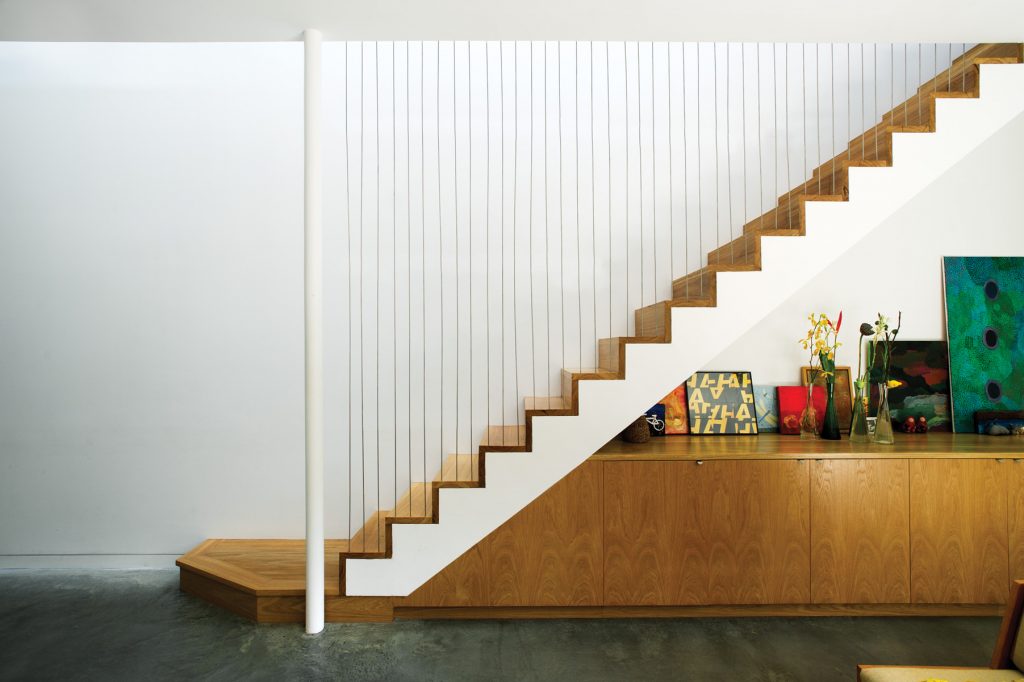
Boyle has similarly harnessed a relationship with the elements upstairs. He kept the circulation on the party wall but narrowed the stairway, at the same time keeping it open with a two-storey screen. These open stairs, plus a long skylight above the upper hall, combine to form a light well.
“Light filters down through the void into the centre of the house,” says Boyle. “So it always feels light and sunny in here.”
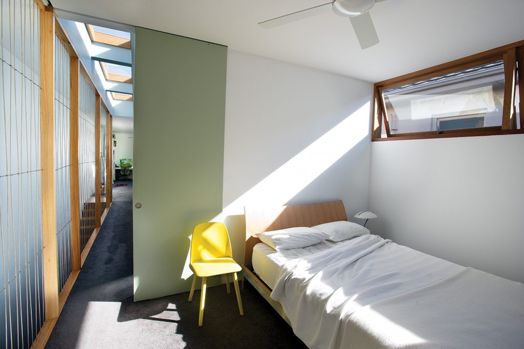
Like downstairs, the layout upstairs is quite flexible. On green’s visit Patrick is working in the back room, with big folding doors open onto the landing, where his young daughter plays.
“This room is a multi-purpose space at the moment. These big doors allow it to engage into a hall and to be a play space, or they can close the door if they want a proper bedroom,” Boyle says. Like downstairs, given the comparatively high density of the suburb, it is private too. “The solid casement windows grab the northern light and screen the neighbour.”
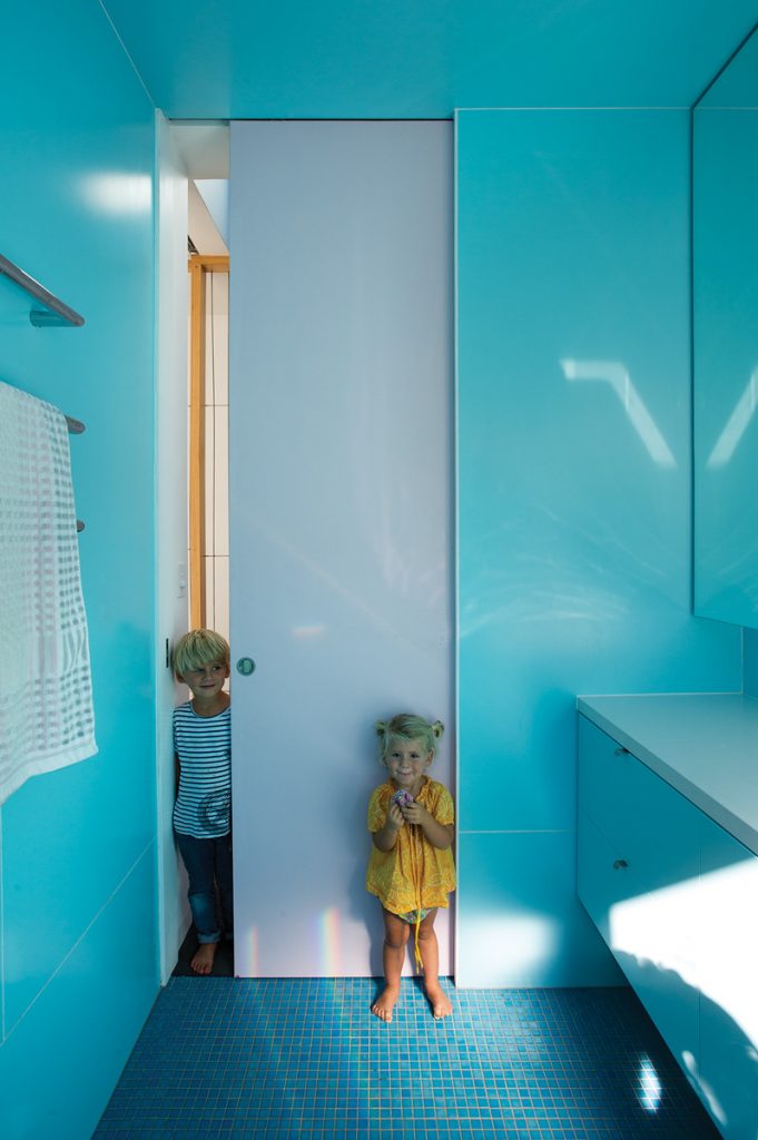
The children’s bedroom sits directly above the central sitting room, with a long north-facing window onto the courtyard. A shared sea-blue bathroom provides another chapter in the home’s narrative, as does the parents’ bedroom, which surprises with wall panels that peel back to connect the room with the void, delivering light, air and a playful sense of space.
“It is quite an organic house, I think,” Boyle says. Patrick agrees and he and the whole family seem delighted with this organic quality, and similarly with the generously sunlit, creative spaces Boyle has designed for them. Walking back out through the politely unconventional front garden, Patrick remarks that even this outdoor space works for them. “We had a street party here at Christmas,” he says. “We are social by nature and this house allows us to be.”
Specs
Architect
David Boyle Architect
davidboylearchitect.com.au
Builder
City Wide Developments citywidedevelopments.com
Landscape architect
Patrick Franklin
Passive energy design
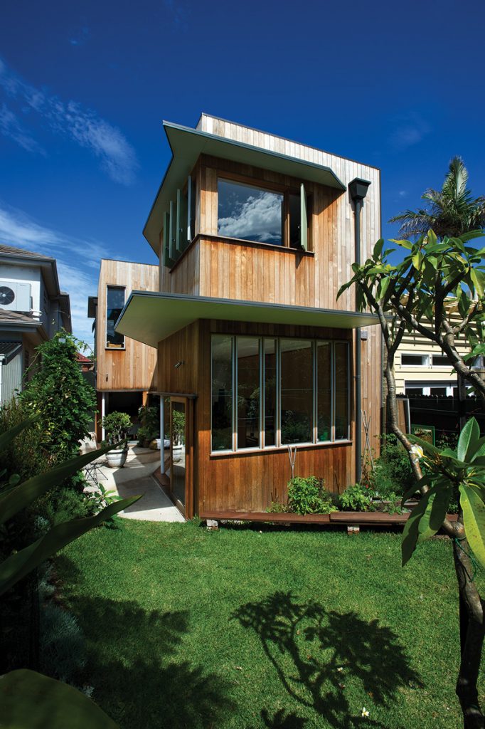
With no views and surrounded by overbearing houses, the sculptural design focusses within the site boundaries to maximise the available light by creating a series of sequential and interlinked spaces for the owners and their two young children. Passive ESD principals underpin the design for this extension. The building form has been carved to create a wedge-shaped northern courtyard. This courtyard acts like a funnel to capture the available sunlight between the neighbouring buildings. A central skylight draws light through the filtered screen of the stair down to the living room via a full length void along the central party wall. Operable windows on opposing walls, and large format sliding doors to upper level bedrooms, encourage passive cross-ventilation, which is augmented by ceiling fans when required. Awnings added to the façade provide appropriate shading to northern and western windows as well as sculptural armature to the building form.
Materials
Construction utilises concrete slab on ground with lightweight timber framing and minimises steelwork. Exterior and interior walls, floors and roofs are heavily insulated. Materials used have been recycled or have low embodied energy. Where possible natural materials have been used and left in their natural state, thereby minimising maintenance and re-painting. Exterior cladding is vertical silvertop ash, which has been left untreated and will naturally weather to grey. Recycled brickwork is used for the front courtyard and pillars. Windows and external doors are framed in oil-finished western red cedar with single-toned glazing.
Flooring
Existing timber strip flooring has been repaired in the existing house. New concrete slab on ground has a burnished finish with a clear penetrative sealer. The stair uses solid blackbutt treads and risers. Carpet used in the upper level bedrooms and hallway is 100% wool.
Insulation
Timber external walls are insulated with R2.0 bulk insulation, roof uses R3.5 bulk insulation.
Heating and cooling
Passive solar design features, including northern orientation, external shading and effective cross ventilation, reduce the need for heating and cooling devices. No air conditioning is used.
Water tanks
A 5000L Toroid subterranean rainwater tank, located under the front courtyard, supplies water to toilets, laundry and garden and acts as on-site detention.
