Ribbons Of Light
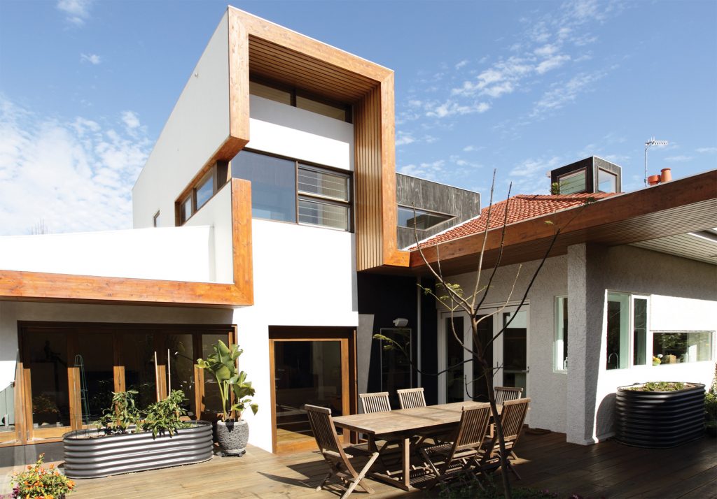
When architect Luke Middleton transformed a grand 1920s Arts-and- Crafts-era property designed by Harold Desbrowe-Annear into a six-star entertainers’ home for his client, he tied old and new together using a sculptural ribbon fascia. It’s a striking but practical device inspired by the deep, exaggerated eaves of a designer Middleton describes as ahead of his time.
When clients Hilary Cook and Peter Geraerts approached EME Design’s Middleton in early 2007 to renovate their freshly acquired dream home he found plenty to work with in a gloriously curvaceous exemplar of the Arts-and-Crafts architectural style designed in the 1920s by Harold Desbrowe-Annear. It came with an individual listing in the City of Stonnington’s heritage overlay, exceptional with its strong forms, lovely craftsmanship, established gardens and forward-thinking relationship to site.
“He’d thought about how the spaces will open and close to the landscape,” Middleton says. “He was way ahead of his time. He must have planned this garden to be there, and he must have planned that set back. He obviously put the building to the side and allowed enough room to have a beautiful north-facing garden that provides some shade, and luckily that … hasn’t been obliterated by any renovations.
“The eaves is another thing that was distinctive, and a beautiful expressive stucco (façade) which we took our cues from when we went to a natural render. We suspect his original work expressed timber beams. But rather than stripping back all those beams, because they’ve probably had 15 layers of paint and might not turn out all that well, we introduced our own natural timber, which is part of the EME palette and has been for many years because … you can never get bored looking at something that’s going to express more and more beauty as it gets older.”
The clients’ brief was clear but comprehensive. Cook and Geraerts both had children from previous relationships – three teenagers living with them and three adult children who also needed to feel welcome any time. So what was needed was a large, flexible family home complete with pool and sauna, plenty of entertaining space, zone-able living and sleeping areas, and an upper level with guest accommodation that could ultimately be adapted (by turning the storeroom into a kitchenette) into a self-contained living space.
“We wanted a really relaxed kind of house where the kids felt comfortable bringing their friends, and they do that all the time,” Geraerts says. Middleton recalls his clients’ desire for “a beautiful house with ‘wow factor’”. In addition to retaining the heritage features that drew them to the house and garden in the first place they wanted four bedrooms, a gallery-like space to display their appealing collection of Australian art, a highly practical laundry, a lighter, more airy interior, a more functional layout, and a sustainable approach overall.
Delivering this meant righting the wrongs of a poorly conceived 1980s renovation that had scrambled the floor plan somewhat, contributing to what Geraerts describes as a dark, “pokey” interior despite, as Cook points out, its “beautiful bones”. Although they baulked at Middleton’s initial suggestion of a subterranean addition complete with grassed roof, all three saw sense in sinking the new, rear section of the house partway into the ground for thermal
gain, relocating bedrooms to the south and living and entertaining spaces to the north. Middleton’s design retained or re-used original materials wherever possible – insulating existing floors and ceilings and sealing doors, for example.
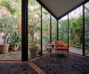
The deep eaves and established garden were already doing a fine job shading the thick walls of the original structure from summer sun. EME’s design built on this, introducing a discreet car port at the front of the property to allow for the widening of garden beds and expansion of the garden – a move the green-thumbed clients say they’re heartily enjoying. Desbrowe-Annear’s idea of minimal window openings was continued in the new design, which used strategically placed “slices” of double-glazed, argon-filled glass to create beautifully cropped garden views and some unexpected site lines through old and new sections of the house.
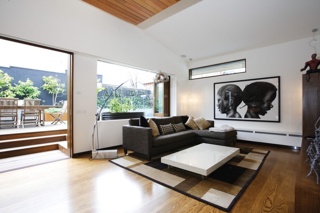
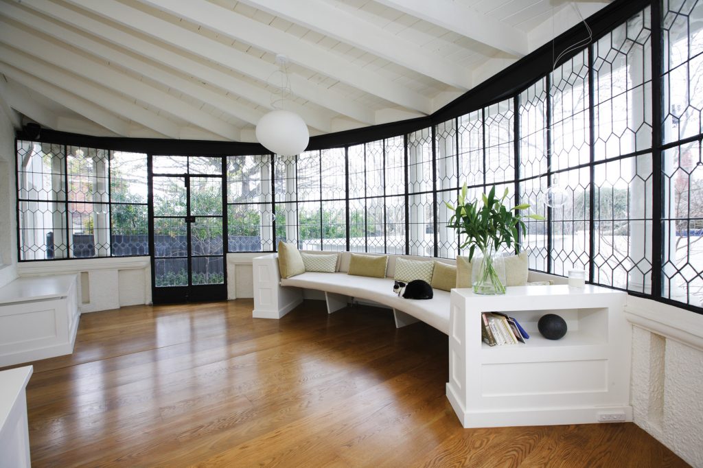
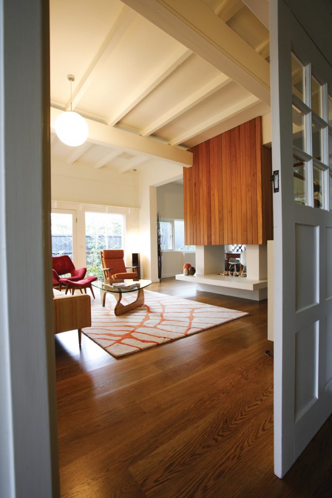
The beautifully curved portico at the front of the house, which previously served no real function, was fitted with a daybed to become a relaxed and quietly glamorous reading room which Geraerts nominates as a great pleasure of the renovated house. The wide hallway was extended and carefully illuminated with low-energy lights to create a gallery-style space to highlight selected works of art. Dark rooms at the centre of the eighties renovation were replaced with light, airy living and dining spaces, including a living room with a funky back-to-back timber fireplace-come-feature wall and carefully framed views outside to the garden.
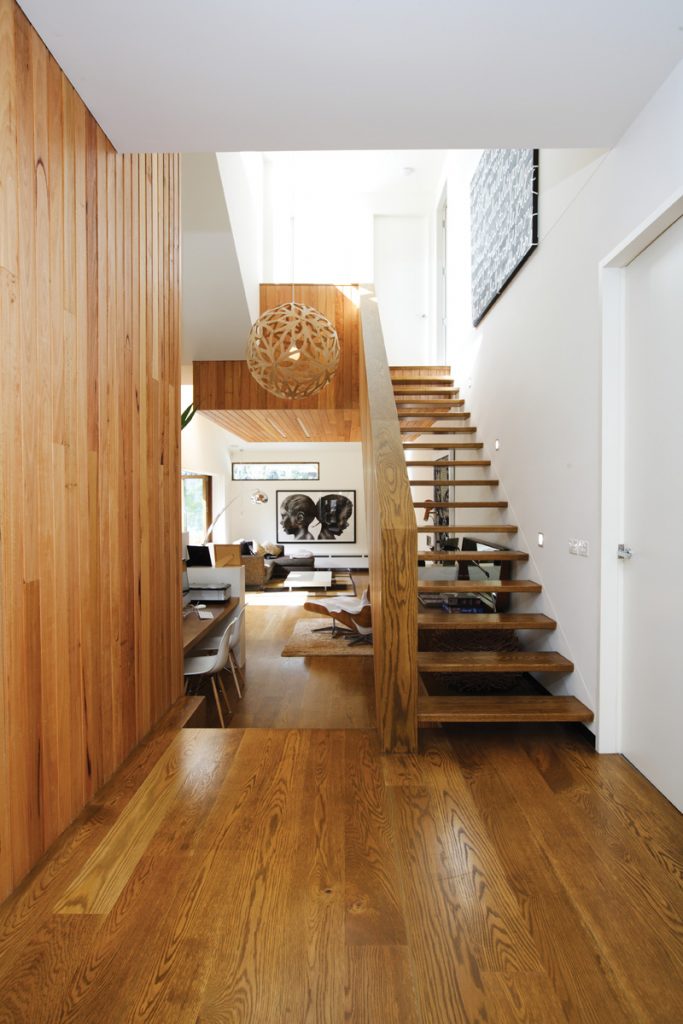
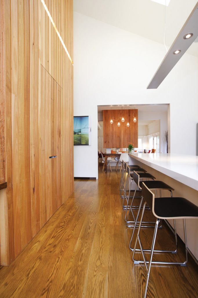
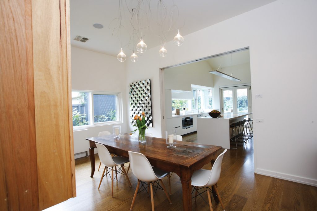
The new kitchen infuses its surrounds with both natural light and ventilation. This is partly thanks to more of those precisely composed views and largely due to a sweeping cathedral ceiling added, along with a clerestory window (or “roof pop”, as Middleton calls it) with electronically controlled louvres, to function as a heat stack for the original front section of the house. The addition at the rear has a secondary stack formed by an open-tread timber staircase with enclosed timber balustrade that’s topped with north-facing highlight louvres. This also illuminates and ventilates the “social” study below and the space above, which include a more secluded home office and library as well as guest quarters.
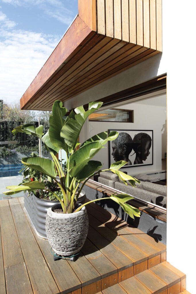
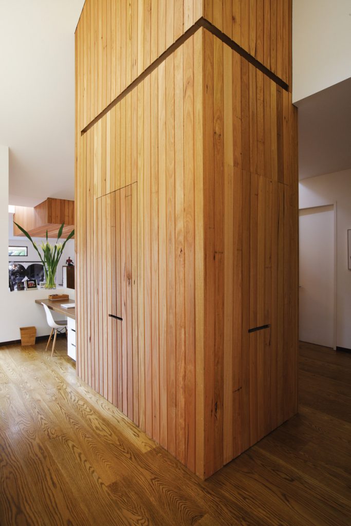
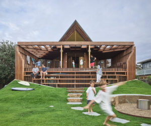
On the ground floor bedrooms are zoned via an oversized pivot door. Entertaining areas inside and out are tied together literally and visually with strong timber features. These include a dramatically tall, five-metre-plus multi-function pantry-joinery unit in the kitchen, the aforementioned timber fireplace/feature wall, and the external ribbon-like fascia. The latter wraps around the house at the sides and the rear, providing not only a visual reference to the distinctive original slatted eaves but stylish illumination for practicalities like a built-in barbeque and a washing line tucked discreetly behind the laundry.
For Cook and Geraerts, nearly three years living in their new home has done nothing to diminish their delight in coming home to it each night. “It’s actually a joy to live in,” Cook says. “I don’t think people would understand how easy this house is to live in unless they had actually lived here.” Knowing they’ve enhanced an already stately home while dramatically improving its water and energy efficiency is part of the appeal. “Why wouldn’t you do it this way?” Cook asks. “Maybe you spend a little bit more during the process of building but it comes back to you in spades. Plus I think the enjoyment of the house is higher because you know you’re not living in some great guzzling thing.”
For Middleton, the success of his design is easier to experience than to photograph. “The highlight is being here, and the lowlight is you can never capture it on film,” he says ruefully. “I think it happens in most of our houses.” While the eyes can take in multiple, highly layered views simultaneously, the camera lens inevitably struggles. “We believe that if you are designing architectural spaces you should be thinking about foreground, mid-ground and background, and if you’ve got those layers you can make any space more interesting.”
Specs
Architect
EME Design Pty Ltd emedesign.com.au
Builder
First Impressions Projects
Joiner
Ideal Cabinets
Passive energy
The design re-invents a dark, disjointed building to provide a livable and healthy home without compromising its heritage charm. Taking advantage of the inherent qualities of the existing building, it integrates thermal mass, passive solar and strategic ventilation to improve the building from a one- to a six-star rating. The building and its internal spaces were re-oriented to provide 100% north-facing living spaces and bedrooms shifted to the south, greatly improving thermal performance.
New landscaping included feature trees to increase western shading to the front semi-circular portico.
Materials
Using the existing building features and garden helped reduce waste and consumption of new materials. Salvageable materials from the demolition of the rear of the existing home, including concrete rubble, were recycled. New materials used include locally sourced, sustainably harvested timbers such as Eco
Ply, Radial Cut Shiplap and hardwood timber windows. The laminated fascia is made from local Durabeam. Roofing is durable and recyclable Colorbond. MDF used is low formaldehyde emissions and all paints are low VOC.
Flooring
Existing floors were insulated along with floors in new areas.
Insulation
The refurbished heritage building was given insulated floors, upgraded double-glazed windows, a new under-roof insulation blanket and R 3.5 ceiling batts.
Glazing
Double-glazed argon-filled windows were used sparingly and strategically to minimise heat loss in winter and heat gain in summer. Deep eaves, strategic planting and the ribbon-like sculptural fascia provide effective shading.
Heating and cooling
The extension was sunk into the ground to draw on the moderating effect of ground temperature. Adding a cathedral ceiling and highlight window vent to the original home created effective ventilation that complements high thermal mass, re-orientation and shading strategies. Northern highlight louvres within
the stairwell provide a secondary heat stack ventilation option. The floor plan allows airlocks to bedroom zones, providing better natural control and passive solar heating in winter. In summer this also enables bedrooms to be isolated from heat loads experienced during the day. As a result the building remains comfortable in summer without the assistance of mechanical cooling up to temperatures approaching 40 degrees.
Hot water system
A gas-boosted solar hot water system was installed and faces directly north.
Water tanks
The building has been designed to capture rainwater run-off from the entire roof area. A 25,000-litre underground tank stores the rainwater for re-use in the toilets, garden, and pool top-up. All toilets are dual flush, basin taps are four-litres per minute and a circulation pump has been installed to reduce water waste for hot water supply.
Lighting
High efficiency indirect T5 lighting has been used, in many cases integrated into the architecture and joinery, providing powerful indirect lighting. Feature lighting was achieved with low hanging pendant globes positioned for maximum refraction effect.
The result is better quality of light with less energy consumed and no need for grids of downlights.
