Return To Form
Built in on three sides, skillful siting was the key to a new 7-star home in Melbourne.
After 12 years in Hong Kong and Taipei, Kate Bulling and John Bailey returned to Melbourne four years ago, keen to build sustainably and planning to sell the dark old Federation house they’d bought 23 years earlier to invest in a new home.
After more than a decade working in Asia, the Elwood couple were committed to creating a sustainable house with a beautiful garden that would be their home for the long term and accommodate their two adult children from time to time. “We were going for something that was going to last,” John says. “This is going to be it until we have to get wheeled off.” Their Federation house in Elwood was dark, no longer suited to their family’s needs and, after 12 years as a rental property, was showing its age. Soon after they returned to Melbourne a sustainable home built nearby by Sunpower Design came onto the market. Kate and John were impressed, but missed out on buying the place. At the time they were disappointed, but not any more. “We didn’t get that, but we got the builder and the architect instead,” John says. “I think we got a better (house) in the end.”
Kate and John found Sunpower’s approach compelling but, having never taken on a renovation before, much less a sustainable one, they thought it prudent to speak with several architects before making any decisions. In the end they were won over by Sunpower’s aesthetics and its on-going relationship with a good builder.
“We liked what we saw,” John says simply. The brief was to create a light, highly sustainable three-bedroom home over two levels with a strong sense of connection to a naturalistic garden they commissioned from landscape designer friend Margot McDonald.
The key challenge in creating a liveable indoor-outdoor space at the heart of the home was to introduce privacy to a site overlooked all around by neighbours (including some in a multi-storey block of flats to the west). Additional requirements included two bathrooms, a study, a decent sized laundry and a smallish garage/ workshop, as well as simple but appealing bedrooms for the couple’s adult children (now aged 24 and 22), who are currently travelling. The couple were also keen to save a couple of established trees in the rear garden: a massive eucalypt and a deciduous Ginkgo tree.
Initially John and Kate spoke with Sunpower Design director Andreas Sederof and project architect Brent Lamb about the pros and cons of renovating the Federation house. All agreed they’d get more bang for their buck by razing the old place to the ground and starting afresh. With no heritage overlay on the site that’s precisely what they did. Sunpower opted to build the new house with cost- effective AAC (autoclaved, aerated concrete) blocks, which offer better thermal and acoustic insulation than regular bricks and use less than half the embodied energy. The bricks, roof tiles, concrete, metal and internal appliances salvaged from the demolition were recycled on other jobs.
Planning constraints may have been minimal but Andreas says the high-density site presented plenty of logistical challenges, which shaped their approach quite literally. “The gist of the brief was a highly efficient, attractive, sustainable home, energy efficient – the highest rating that we could achieve – that maximised the block.”
Andreas recalls, “The block was not perfect in the classical sense, with everything facing north. We had constraints on … three sides: east, north and west. The west side was a particular issue because we had these three-storey flats, which were ugly, so they had to be blocked out as much as possible. We backed the building pretty much against that west boundary and really had very few … windows in that wall, purely for ventilation purposes, so that we pretty much eliminated the flats. And … eventually with landscaping we’ll plant out the buildings to the north and north- east. You’ll notice the brick wall on the east side was rendered, because it was pretty ugly before. So it was an attempt to shield the living spaces from the flats as much as practicable and to maximise the solar efficiency and work within the constraints of the site.”
Locating the house in the western corner of the block was the key to making the site work. “It turns out, luckily, that north-east, which is their orientation, is pretty much a good one, especially when it comes to outdoor living and solar performance,” Andreas says. “Fortunately those walls (next door) were far enough away that it didn’t impact on the solar gain or solar access to the living spaces. There’s a two-and-a-half storey building behind that rendered wall that would have thrown quite a shadow over a lot of the deck area (if the house was sited centrally). That was another reason why it was important to move the building back towards the flats, so we kept any shadow away.”
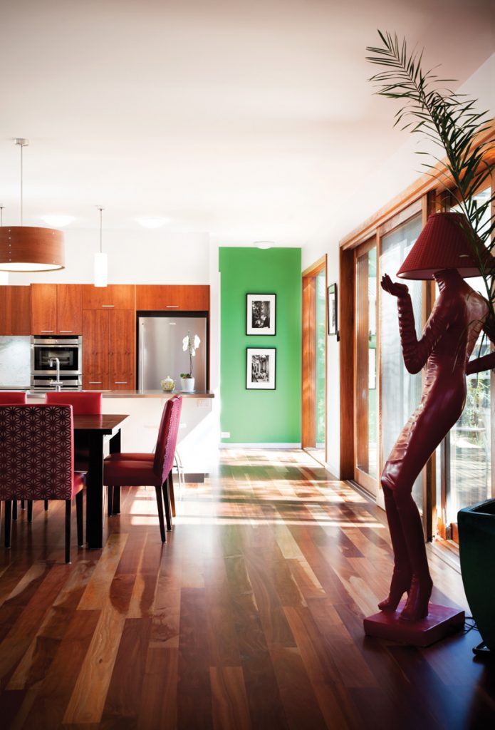
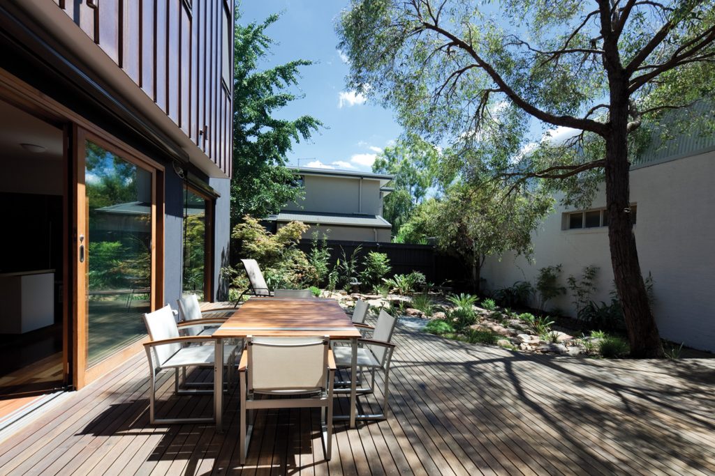
Andreas and Brett decided to centralise living quarters downstairs in an L-shaped zone that faced north-east and linked strongly with the outdoors via massive, double-glazed, sliding glass doors framed in cedar. This allowed northern light in despite the proximity of neighbours. It also created an axis from which the rest of the design could logically flow, and placed at centre stage a delightfully undulating, mainly indigenous garden full of personality. A curved timber deck placed between house and garden snakes around the aforementioned eucalypt.
“Because that corner gets east and north sunlight most of the year, that’s where we start from,” Andreas says of the L-shaped living quarters overlooking the garden. “Everything else flows from there. The bedrooms are upstairs, obviously, because that’s the most practical place to put them given outdoor living these days. The study faces over the street, you’re not that interested in it being north facing, generally speaking. You’ll notice the bedrooms do have north-facing windows, so they got priority. The corridors are to the west and south because they’re not so much of interest in terms of sunlight. The flow of that design really started when we figured out what is the best way to site it. What drives us is where the sun is, not so much the raw, sculptural architecture. That’s really important, but it’s not what drives it entirely.”
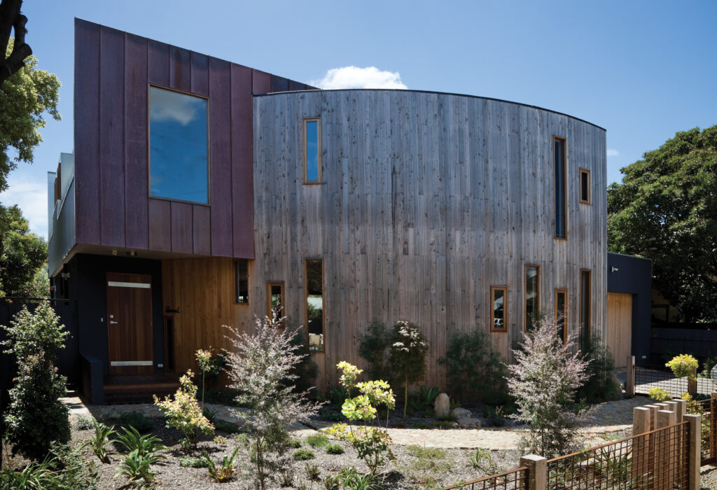
From the street the inscrutable façade of the building reads like an expansive, double-height, cedar-clad cylinder sliced on an angle and pierced by a cluster of small, rectangular feature windows. Flanking the upper level of each side (and at the rear) are recessed boxes clad in copper. The choice of bold shapes and natural materials offers a pleasing contrast of colour and texture as well as form. A three-quarter-sized garage with cedar doors sits discreetly off to one side, allowing the eye to focus on the central structure and the free-flowing, richly textured garden surrounding it. With its curvy path of naturally decorative stones (bisected in one place by a ribbon of tiny plants so cute they look like hairy little sea creatures in formation) and a low, naturalistic fence line of timber posts and sections of rust-coloured screen through which growing plants spread, it’s no wonder John nominates the garden as a highlight of living here.
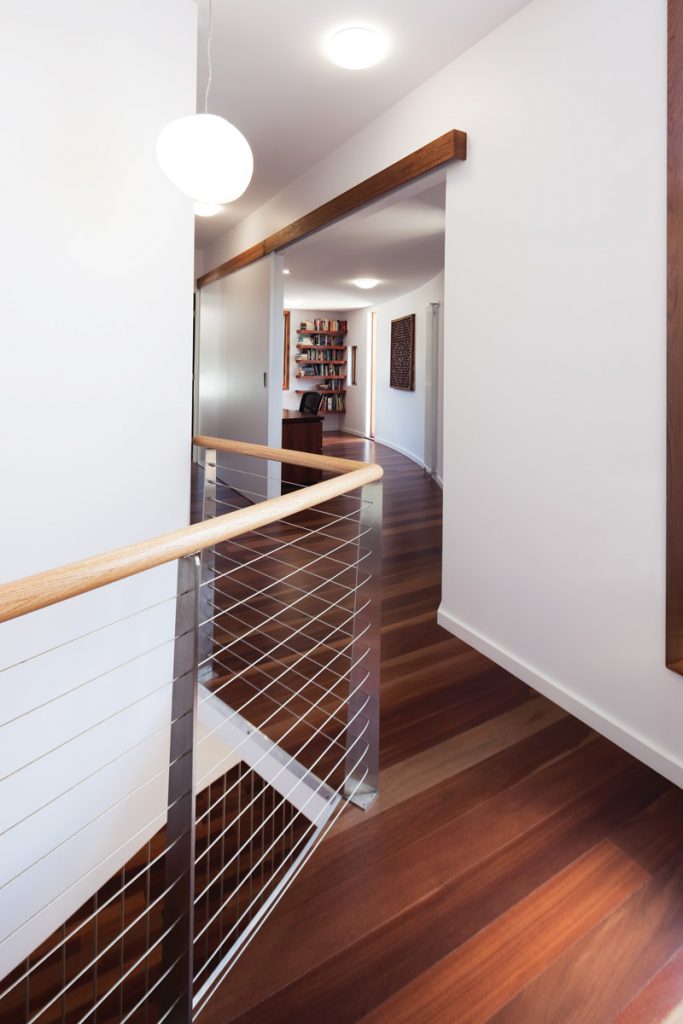
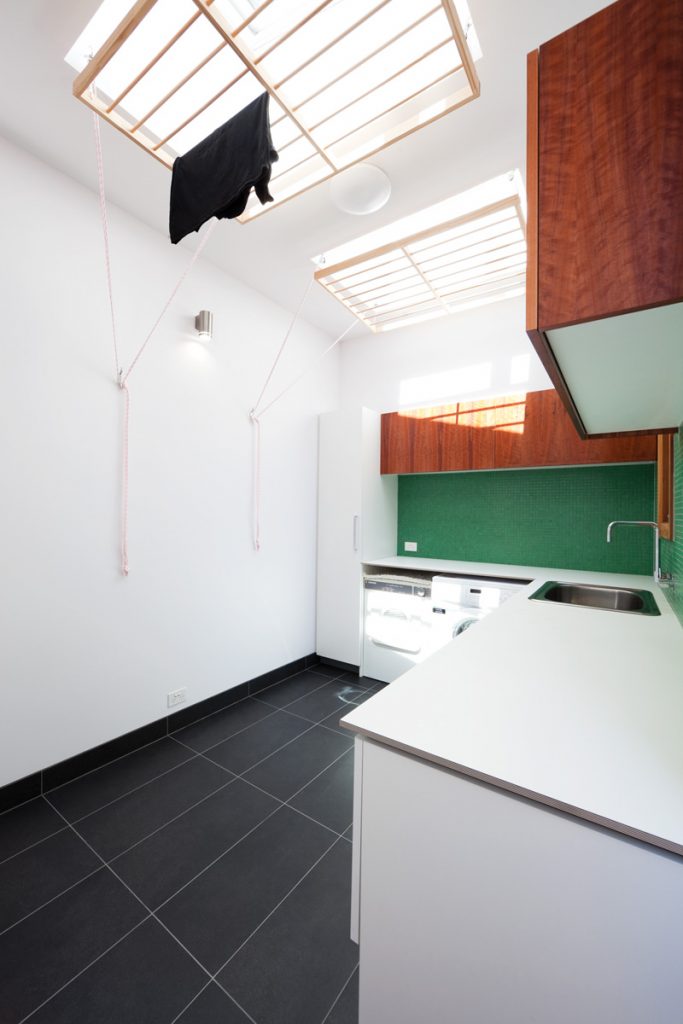
Entry to the house is recessed below one of the cantilevered copper boxes. An entry corridor provides an airlock of sorts, helping to maintain stable temperatures in the adjacent living areas. An elegantly curved feature wall wraps right around the living spaces and supports a suspended, open tread staircase made from timber boards and thin vertical posts of reflective metal. Beyond the open plan kitchen and dining area opposite are service areas, including a large laundry with two timber drying racks. These can be hoisted to ceiling height for an extra burst of heat directly below two openable skylights.
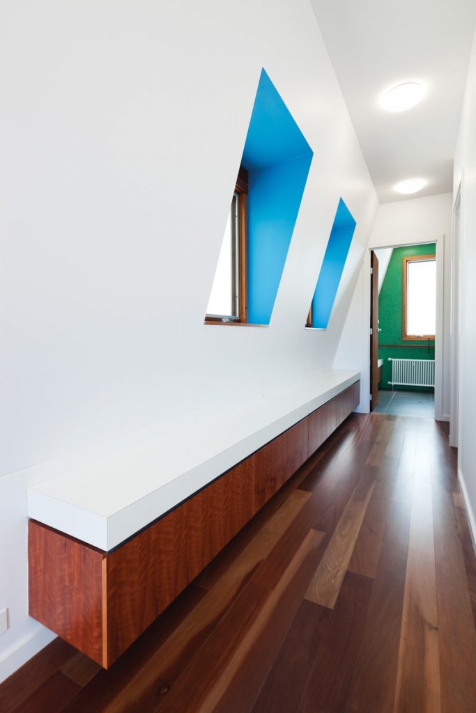
Upstairs are compact bedrooms with lovely views to the garden below and a study/yoga room with a full-height sliding door that allows it to be transformed into a guest bedroom as required. The master bedroom includes a concealed walk-in robe and an ensuite which, like the other bathrooms, sing with deep rich colour inspired by the owners’ collection of Asian art. Bedroom doors are finished with Porter’s Paints “Instant Rust”, containing tiny metal shavings and an acid wash. It’s a pleasing textural touch and a subtle nod to the distinctive materials used externally.
For Andreas, the gently curving wall and light, open suspended staircase were ideas that cropped up as naturally as the rectilinear L-shape at the home’s central core. “To me, curves are beautiful,” he says. “Nature doesn’t know what a straight line is. Light doesn’t travel in a straight line, especially over long distances. It’s a much more organic feel, thus the timber lining to give it that very soft line. A building can get really hard-edged at times, I think, very sort of blunt. For me at least I love that softness.”
Specs
Architect
Andreas Sederof, Brent Lamb and Judy Sederof of Sunpower Design sunpowerdesign.com.au
Builder
Peter De Campo
Passive solar design
The home achieves a 7-Star Energy Rating for energy performance despite limited access to northern sun. The two-storey home was designed around a courtyard space facing north with large, double-glazed, sliding cedar-framed doors to enable living spaces to be opened up to the garden. The house turns its back on neighbouring flats and provides privacy using carefully placed opaque glazing.
Passive heating and cooling
The house was oriented to the rear north-facing aspect to maximise solar efficiency. It is built on a concrete slab with an overlay of FSC certified, sliced Pacific Jarrah boards, which are sealed with low-emission matt timber sealer. All windows and doors are double glazed and weather stripped to prevent draughts. All glass surfaces facing west and north are fitted with adjustable external shade blinds. Effective cross- flow ventilation is supported in summer by ceiling fans.
Two clothes-drying racks in the laundry offer an alternative to a conventional clothes dryer. They can be elevated to ceiling height to take advantage of warm air beneath two large skylights.
Active heating and cooling
The heating system is a Greenheat hydronic system hooked up with a gas-boosted solar hot water service: the Edwards LX 305 Litre Stainless Steel water cylinder with glycol heat exchanger and two Australis solar collectors.
Renewable energy
The home is serviced by a 2 kW grid interactive photovoltaic system installed by Premier Solar. This consists of nine 230 watt Conergy Power Plus panels and an Aurora PVI 3.6 inverter. Over the warmer months the system produces surplus energy which is returned to the grid.
Building materials
These include rendered Hebel AAC blocks, Independent Cement’s Ecoblend Cement, copper cladding to sections of the second level and Cypress Macrocarpa vertical shiplap cladding to the front façade. Cypress cladding is also used on the garage door. Cabinets are constructed from E0 laminates and timber veneer is Briggs Eco Certified Tasmanian Myrtle.
Floors
Internal floors are certified Pacific Jarrah boards with clear satin sealer from Australian Recycled Timbers. The curved garden deck is made from dressed radial Southern Mahogany hardwood.
Finishes
All paints on walls and ceilings are Dulux Wash & Wear low emission 101 Advanced. Internal timbers are finished with Organ Oil. Enviro Pro Sealer was used on floors, followed by two coats of Enviro Pro Endure (Satin Finish).
Insulation
Insulation is R6 polyester batt insulation with Air-Cell Insulbreak 65 between battens and roofing and between rafters and battens.
Lights
All light fittings are LED or compact fluorescent.
Water
The underground water tank on the property provides a 23,000 L capacity with mains supply connection for back-up during dry spells.
