Refocus
Architects Liz Walsh and Alex Nielsen have breathed new life into a Tasmanian one-room apartment that is incredibly detailed and full of little surprises.
Imagine the ideas that might be fermenting if you had recently returned from overseas after a six-month sabbatical and a highly successful restoration already under your belt. Architects Liz Walsh and Alex Nielsen sought a second project that would let them test ideas, keep busy for half a year and exemplify the concepts of small, cleverly-designed spaces in New York and Japan.
The one-room apartment they found is on the third and top floor of a block built in 1973. While small and originally uninspiring internally, it has a cracker view of the River Derwent. This pocket of Sandy Bay has tiny gardens, but is a short walk from a wide, green esplanade. Even better, the apartment’s aspect had been widened by the removal below of a neighbour’s shed. In winter, a nearby maple sheds its leaves to allow in light and warmth; as a bonus, expansive views to the south, down the river, are revealed.
However, aspects of the planning didn’t go as expected. The six months dragged on to 10 and a baby happened, which meant the pair couldn’t live there as originally intended. The final outcome though is an incredibly detailed and beautifully jointed space, which bears no resemblance to the plain boxiness of the original apartment. Its name, #TheBaeTAS, refers to its Bay location, its freshness and its ties with their inner-city and award-winning project, #theBarnTAS (see green magazine issue 47).
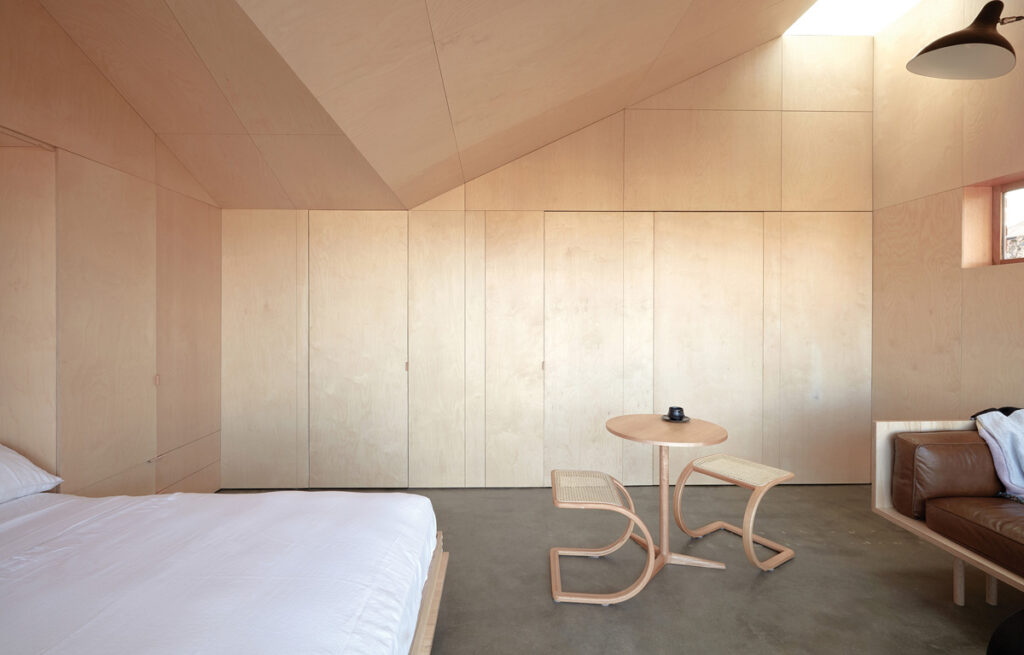
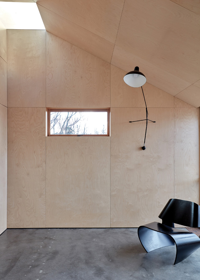
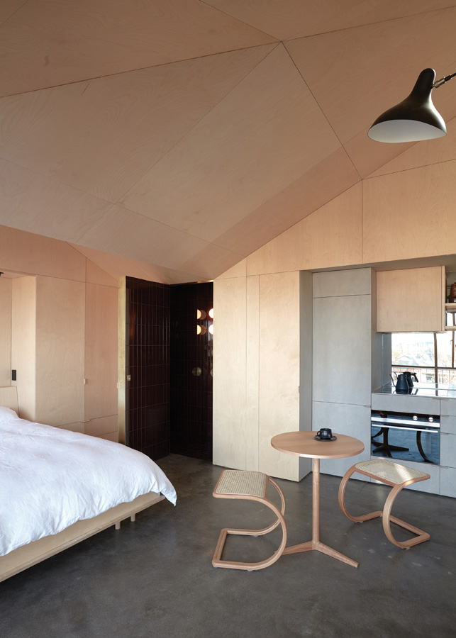
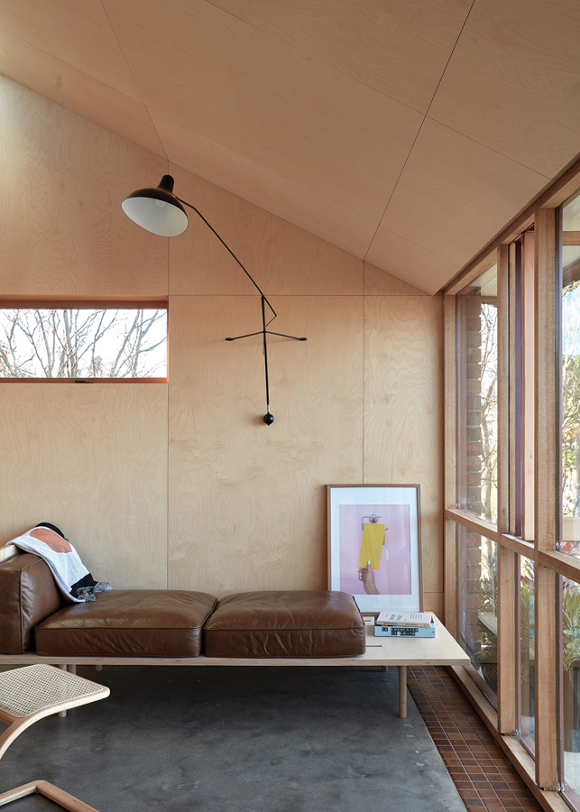
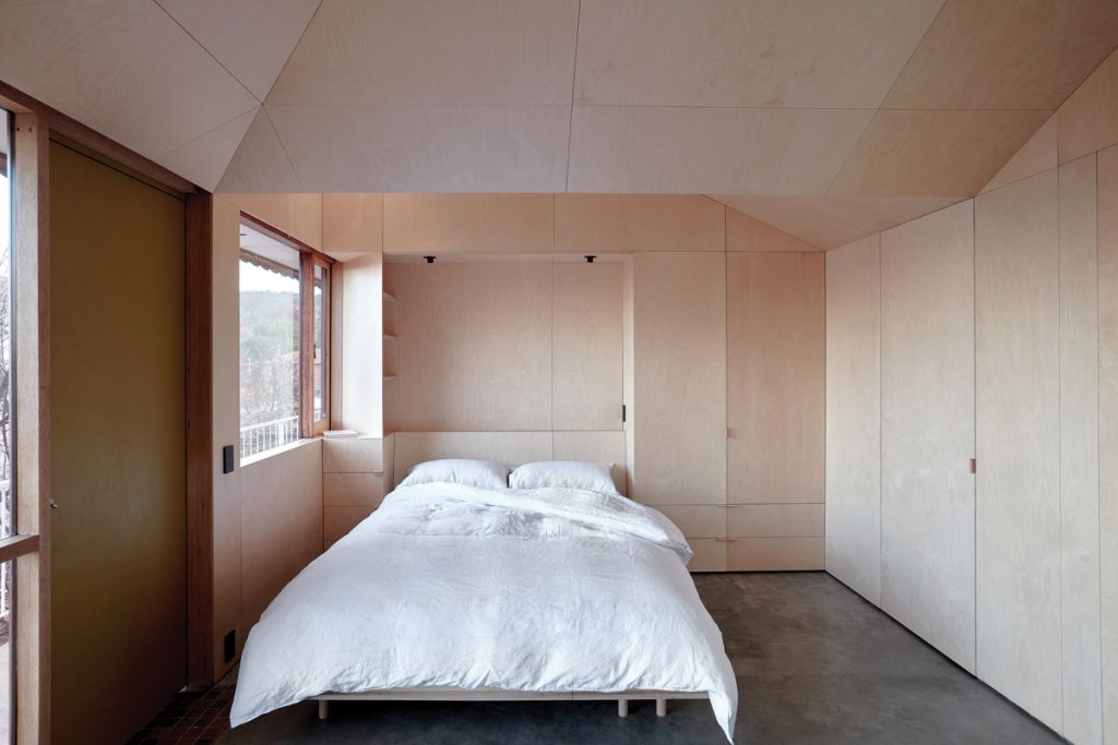
The floor dimension is only 26.5-square-metres, but the variation in ceiling height, strategic insertion of Velux skylights and concealment of the bathroom behind another matching panel tricks the eye into thinking it is a much bigger space. Liz explains it is “an experiment in volume [and] we wanted to explore how small a comfortable, liveable space can be, in the short-term.” The datum point for all of the geometry and detailing is 2100 millimetres. The ceiling planes pitch up, from the top line of the windows, to create internal volume and hidden storage spaces. The experience upon entering is much like walking into a small chapel, where the increasing richness of the internal details forces the eyes upwards.
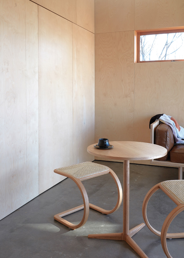
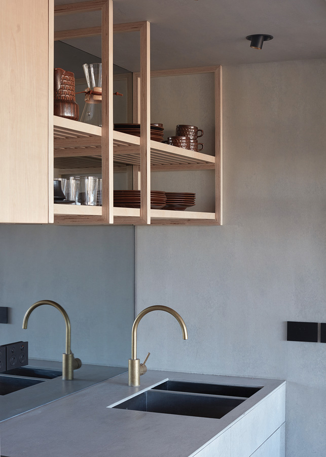
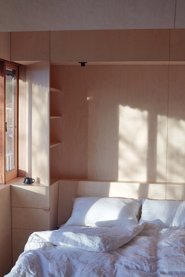
A limited material palette is vital to make a hero of the detailing: birch ply for all wall panels, oxblood-coloured highgloss bathroom tiles and Cemintel Barestone on the kitchen surfaces. To further control noise, glare and temperature, the newly installed double glazing (within the existing timber window frames) is screened by an opulent gold curtain on one side of the door, and a gold blind on the other (beside the bed). Only a narrow band of the original, small, brown/green entry tiles remains, as an indication of the apartment’s provenance.
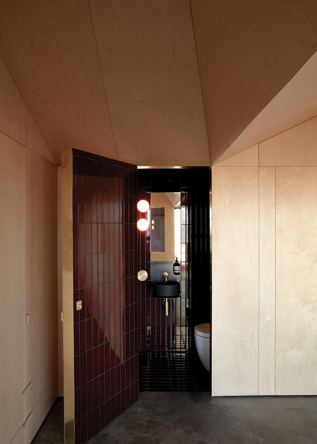
Another aim was to play down the domestic functions normally overt in a tiny bed-sit without internal walls. The kitchen and bathroom “functions” are reoriented to the western wall, to create a wider “bedroom” space. The timber dowel handle for the proprietary (but carefully re-detailed) pull-down bed is eventually evident in the panelling, as is the space on the floor on which it rests. Liz notes that they worked with a superb carpenter and joiner, Andrew Otto. While walking around the bare unit with his laser level, and viewing the internal elevation drawings, he realised how cleverly the joints line up around the space: the geometry within is incredibly complex.
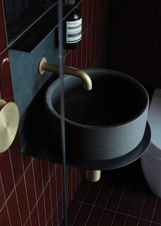
The bathroom is a little more difficult to find at first, but with careful consideration of the depth of the spaces, the hidden room can be determined. In addition to proprietary light fittings, the bathroom is lit by a narrow cut of skylight over the shower head, to encourage what Alex calls “bathing in light”. The only respite from the rich redness of the tiles is a hand-thrown hand-basin by local ceramicist Lindsey Wherrett. When the brass-edged door is fully closed, the effect inside is much like a cool, glistening, water-side cave.
Rather than working on separate components of the design and build, “the design and concept work was done together … we would take time to think about the approach, drawing, sketching and modelling (CAD),” says Liz, “and then we would come together and decide which approach worked best and evolve it from there.”
Lighting is absolutely minimal, and beautiful. For example, Bernard Schottlander’s 1951 Mantis Lamp hovers over a daybed (designed by Liz and Alex), and can be swung around to light a small round table (by local furniture designer/maker Matt Prince). Ralph Stools (by Heimur), of Australian messmate and rattan, slide discreetly under Matt’s table.
In Liz and Alex’s skilful hands, #TheBaeTAS is imbued with a depth of concern for comfort, quality and connection with community. Other residents are delighted by its addition, including long-term tenant Jim, who waves at Liz and Alex with his walking stick as they pass.
Specs
Architect
Liz Walsh and Alex Nielsen
#TheBaeTAS
Builder
Andy Otto Woodwork
Small footprint living
The adaptive conversion of an existing 1970s bed-sit apartment into a functional micro-home is inherently sustainable. Repurposing and upgrading an existing space and tapping into existing amenity, infrastructure and community (rather than building anew on the CBD periphery) is a low-tech but arguably fundamentally sustainable approach to growing our cities. As fiscal and physical resources are under increasing pressure, efficient and generous small footprint design offers an accessible and sustainable alternative in the current housing sector. #TheBaeTAS demonstrates how we might find “the all in small”.
Passive energy design
Due to its south-east orientation, the retrofit of this apartment could have been predetermined; however, the introduction of a north-facing, double-glazed skylight has dramatically increased the natural daylight in the space. This skylight also provides the opportunity to warm the thermal mass of the concrete floor.
Materials
The internal material strategy for the project was deliberately restrictive to create continuous, wrapped volumes, rather than highlight individual wall and ceiling planes. Birch plywood, with a water-based polyurethane sealer, lines the ceiling, walls and joinery within the main vaulted spaces. The entire bathroom (with the exception of the mirror) is lined in “Piombo” tiles from Academy Tiles + Surfaces. The kitchen, including the joinery, is lined in Cemintel Barestone™ cement fibre sheeting (normally used for external cladding) and left for the most part unfinished. The bench, however, is coated with Resene “Concrete Clear” waterborne glaze, with a flat finish. The original concrete floor was exposed and refinished, with a strip of the original Mission Brown 70s tiles retained to mark the entry threshold. Wherever possible, materials, fittings and fixtures are left raw and unfinished, to gather patina with age. The introduction of specifically-chosen indoor plants softens the starkness of the birch ply walls, while also improving indoor air quality.
Insulation
Despite the tiny footprint, it was important to thermally and acoustically seal the existing shell. Hardwood framing was added to the existing block walls to accommodate R2.5 Bradford Gold batt insulation. The construction of the new ceiling provided the opportunity to insert a vapour-permeable roof underlay, as well as R5 Bradford insulation, into the existing cavity.
Glazing
The existing single-glazed timber window panes were removed and re-fitted with double-glazed units, and the seals were replaced to increase the overall thermal efficiency of the units. The number of operable windows was increased for natural cooling and cross ventilation. The windows are draped in a heavy, lined fabric curtain to prevent further heat loss. The double-glazed skylights are Fixed Velux and the mirrors are Viridian MiraStar® coated glass.
Heating and cooling
The small footprint and orientation, in combination with the increased thermal envelope, makes heating almost redundant. However, electric underfloor heating has been installed in the small bathroom and a future connection for a heater has been installed for additional comfort. For the warmer months, the apartment will rely completely on passive cooling: the operable windows were retained and increased in number to capture sea breezes.
Lighting
As with the material strategy, the lighting strategy was deliberately reductive. The main space is lit by one adjustable feature fitting, the “Mantis Lamp”, designed by Bernard Schottlander in 1951. Unios “Shift Out Downlights” provide spot lighting over kitchen workspaces and the bed. Artemide “Dioscuri” translucent globes give a soft wash in the bathroom, in concert with the narrow skylight over the shower. All of the light fittings have low-energy LED globes.
Community amenity
The unit block’s communal laundry means vital space was saved in the unit – no need to install a washer or dryer. The added advantage is the opportunity for guests to chat with residents while waiting for a load to finish.
