Redux
A sensitive retrofit by PHOOEY Architects retains the best of a 90s house in Malvern and boosts its thermal and acoustic performance.
In retrospect it should probably have set alarm bells ringing when clients Tim and Deidre found their Malvern home on the market back in 2009 during a chilly Melbourne winter. In August, sun pouring in from poolside through masses of north-facing glazing created lovely light, warmth and indoor-outdoor connection throughout the voluminous, shed-like space. By January, the place was a hotbox. Single glazing, little-to-no insulation and plenty of hard surfaces for sound to bounce off made for a sweaty, noisy existence. During storms you couldn’t hear each other speak. As for boiling the kettle while someone in this musical family of four practised piano …
Initial plans to renovate within a year proved impractical due to cost. Besides, the home worked well in many ways. Designed in 1993 by architects Simon Swaney and James Milledge, it had good bones and flexed beautifully for regular extended visits from relatives overseas. The clients appreciated its honest expression of structure and materials, and the layout largely worked: bedrooms and services at either end of an open-plan living and dining area, which overlooked a north-facing garden and pool. The central kitchen, which blocked sightlines and functioned poorly due to two separate parts, was a fly in the ointment. As were ageing elements like sliders that no longer slid and overpowering terracotta floor tiles that irked Deidre in particular. It took closer to a decade, but once the couple had the renovation budget it was a story in green magazine about the home of PHOOEY Architects’ Emma Young and Peter Ho that inspired them to reach out for an ESD-driven overhaul.
“We thought their house was really cool,” Tim recalls. “We had no idea how to go about this and we weren’t even sure if an architect would be interested in this job.” Fortunately, Emma was equally taken with clients and house. “Even though the orange terracotta of the floor was quite overwhelming, I could immediately see what a spectacular house it was and I was pretty keen to be involved,” she says. “It really just so strongly reflects the Australian vernacular of the 1980s and 90s and it caught my imagination straight away. I could see that it could be an incredible house. The bones were quite sturdy. It just needed a little bit of help in order to function properly.”
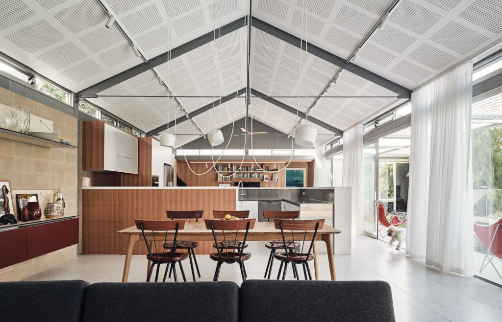
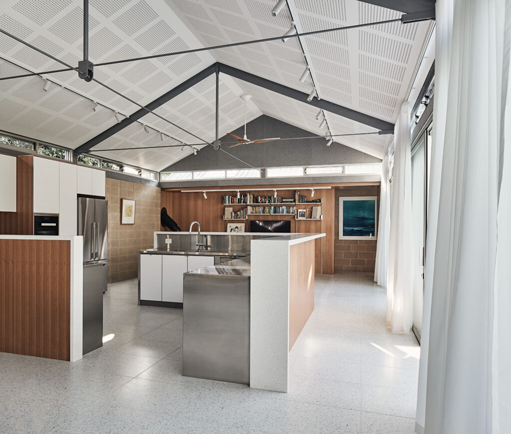
Because the project involved more retrofitting and refurbishing than redesigning, the process was quite streamlined: engage thermal and acoustics consultants, capture the overlapping criteria, scope the works for tendering, and tackle materials selection with a keen eye on cost versus benefit. Only the kitchen needed rejigging spatially, which was easily achieved by reconfiguring it using two L-shaped benches and nudging the whole to the south side wall, restoring sightlines across the heart of the home.
“We moved as quickly as we could towards capturing the scope in a set of documents that could be priced,” Emma explains. “It’s very chicken and egg because you want to capture as much of the brief as you possibly can without spending too much of the clients’ money at the beginning, produce as detailed a set of documents as we possibly can that we can then give to someone to price, and work out where we go from there.” They found a terrific and very patient local builder, Ben Robson, and set about improving the acoustic and thermal performance of the building envelope.
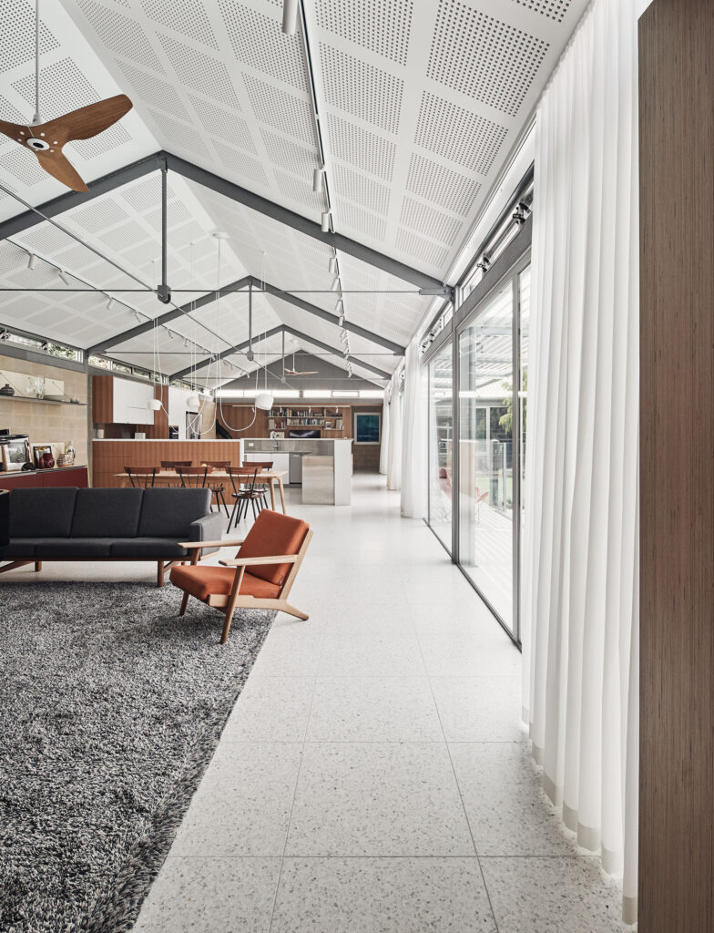
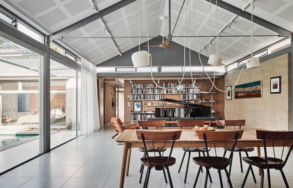
“We had a series of materials we were leaning towards but some of them changed as a result of touching base with reality: the budget,” Emma says. “We initially were quite keen on having acoustic plywood ceilings and after the costing process we realised that acoustic plasterboard was actually much more affordable. And to be honest it’s light and bright and lovely, I think it was actually the right choice in the end.” Fuzzy, feltlike Autex Quietspace® panels fitted in the baffles between exposed beams became a visual feature that worked hard too. Ditto acoustic curtains rather than blinds.
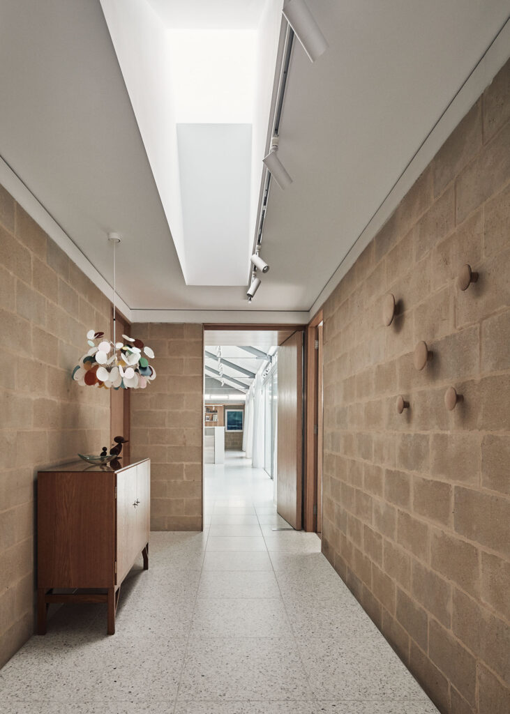
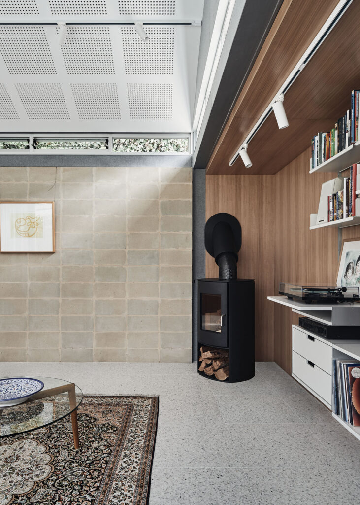
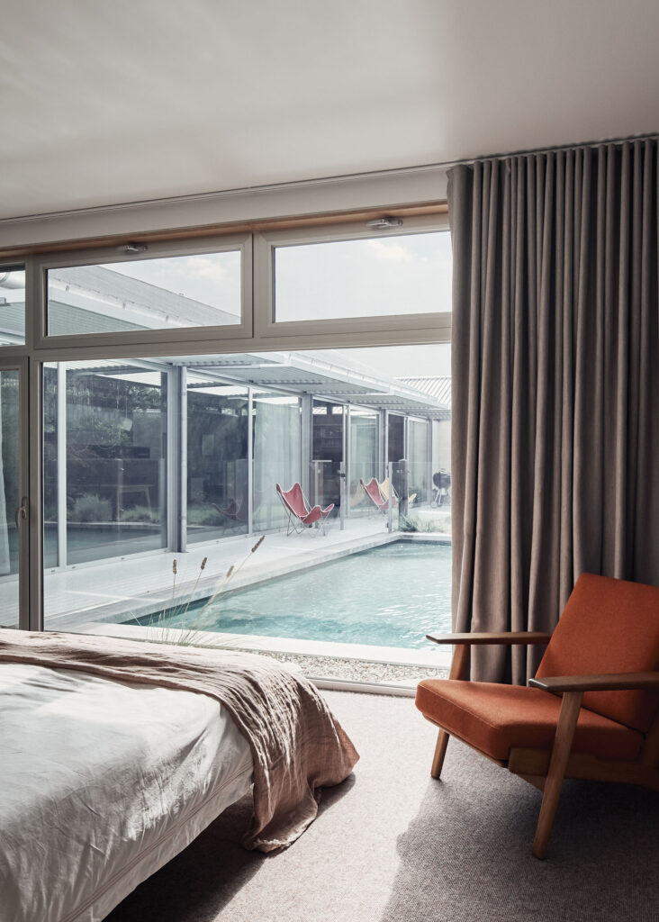
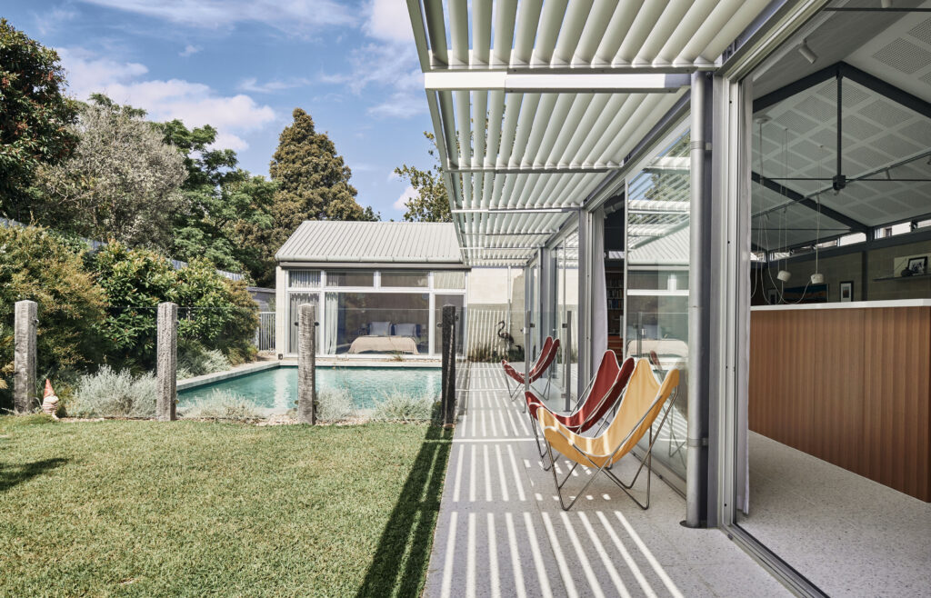
PHOOEY retained the existing beams and tensile structures in-between – key components of the house, its volume and silver colour palette – along with unpainted blockwork walls. They ditched gas, replaced underperforming glazing, enlarged bedroom windows, retained stainless steel benches in the kitchen that the keen cooks loved, and found insulation to fit the existing ceiling cavity (which couldn’t be dropped while retaining highlight windows below). Adjustable external awnings proved insanely expensive for marginal benefit, so they opted for cheaper fixed eyebrow awnings that admit plenty of winter light and suit the original exterior. “We’ve really done quite a sensitive renovation,” Emma says. “If it wasn’t broken we didn’t fix it.” The result is a quiet, “very restful house” according to the clients, who couldn’t be happier with its thermal comfort, uninterrupted views and functionality.
Each person’s highlights are satisfyingly varied. Daughter Maggie says the improved acoustics make the piano sound better. Son Pat loves his bedroom’s big new windows. For Tim the lighting design – a combination of LED downlights, track lights and garden lights – is a revelation. “The whole place just works really well,” Deidre says. “I don’t know how to pick out one thing. I don’t think there’s anything we’d change.”
Specs
Architect and interior design
PHOOEY Architects
phooey.com.au
Builder
Ben Robson Master Builder
Structural engineer
Pariden Consulting
pariden.com.au
Energy consultant
RED Sustainability Consultants
red-sustainability.com.au
Acoustic consultant
Rohan Barnes
waveformacoustics.com.au
Passive energy design
The bones of the existing design were sensitively retained and embellished. Renovations were limited to an upgrade to the existing thermal envelope, new solar awnings, cabinetry, electrical fittings, internal claddings, floor finishes and window furnishings. Early ESD and acoustic research determined thermal and acoustic priorities. Roof and wall details were carefully documented to simultaneously maximise new thermal and acoustic performance. A neutral material palette largely composed of whites and silvers was complemented by the warmth of exposed aggregate stones, lightly stained feature plywoods, textured carpets and huggable woollen acoustic claddings. New LED light fittings enable task or alternatively mood lighting options. Fans have summer and winter settings. The increased level of comfort has been balanced by significantly reduced long-term heating and cooling requirements. Highperforming acoustic reverberation within the voluminous open-plan living space now enables piano practice and TV viewing at either end.
Materials
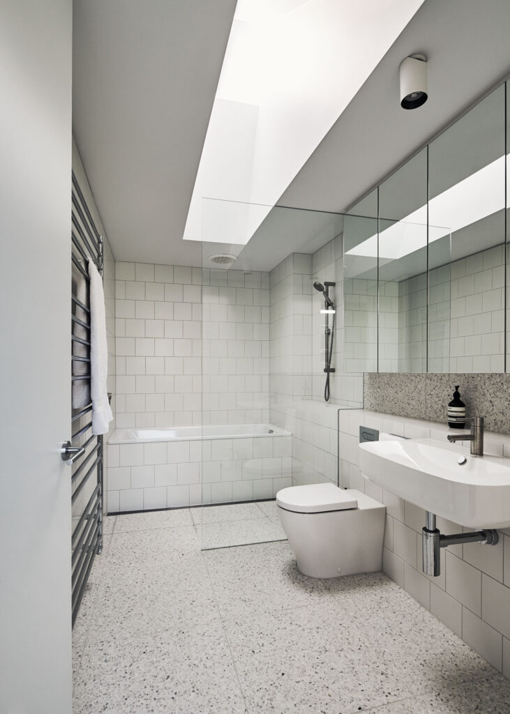
Feature plywood doors, claddings and joinery by MAXI Plywood. Joinery fixtures by Häfele, Blum and Wilson & Bradley. Internal and external stone floor and bathroom feature tiles by Fibonacci Stone. Acoustic plasterboard ceilings by Gyprock. Kitchen and laundry icy white laminate joinery by Bench Top City. White subway tiles by Johnson Tiles. Interior and exterior paint finishes by Dulux and Porter’s Paints. Muuto “the Dots” and toilet paper cloud wall-mounted features by Finnish Design Shop.
Insulation
Acoustic and thermal insulation by Polyester Solutions and Kingspan.
Glazing
Natural anodised double-glazed windows and glazed doors by Element Windows. PVC windows (in kids’ bedrooms) by Ultimate Windows.
Heating and cooling
Aluminium louvred awnings by Bayside Privacy Screens. Ceiling fans by Big Ass Fans. Hydronic heating system by Tubulous Australia. Wood heater by Nectre.
Lighting
Track lighting by Darkon. FLOS “AIM” pendant by Euroluce. Marc Pascal “Eyoi Yoi” by Tongue and Groove.
