Rear Extension
Winner of two AIA (WA) awards, this renovation of a narrow, rundown cottage in inner- city Perth shows that more space doesn’t have to be the answer to improved liveability; it’s more about reconfiguring what you have.
When Mark Eyre and Belinda Witworth decided to renovate their early 1900s worker’s cottage in inner-city Perth, they were fortunate that their neighbours were architect Marco Vittino and designer Katherine Ashe. The pair came up with a design that maximised every corner of available space, by turning a dingy rear extension into a light-filled kitchen, bathroom, laundry and courtyard, and replacing the under-utilised garage with a studio. The results prove that sometimes sustainability is not about decking out a shiny new building in the latest green technology, but about making the most of what you have – a sound basic structure, sunlight, breezes, space.
The journey through the house began promisingly enough, with a jarrah-floored hallway running alongside two graceful high-ceilinged bedrooms. “They chose to retain the front of the house, which we were happy about, as we’re accustomed to seeing buildings in similar condition demolished and replaced with new ones,” says Vittino. “Although it wasn’t heritage listed, it was in sound condition and characteristic of this area and, in a way, retaining an existing structure is in itself a sustainable beginning.”
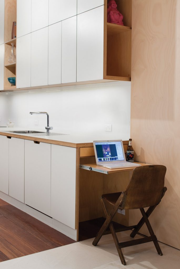
But a long line of tenants had left their mark, and like many homes of this era, a rear extension, added in the 1970s, was badly planned and offered no link between the house and its small back garden. “You’d sit at the kitchen table and stare into the bathroom,” says Vittino. “They didn’t want much more space, they just wanted what they had to work harder. And as Belinda is a fantastic cook, her main concern was getting a decent kitchen.”
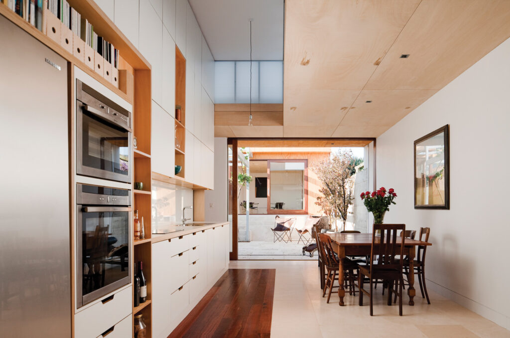
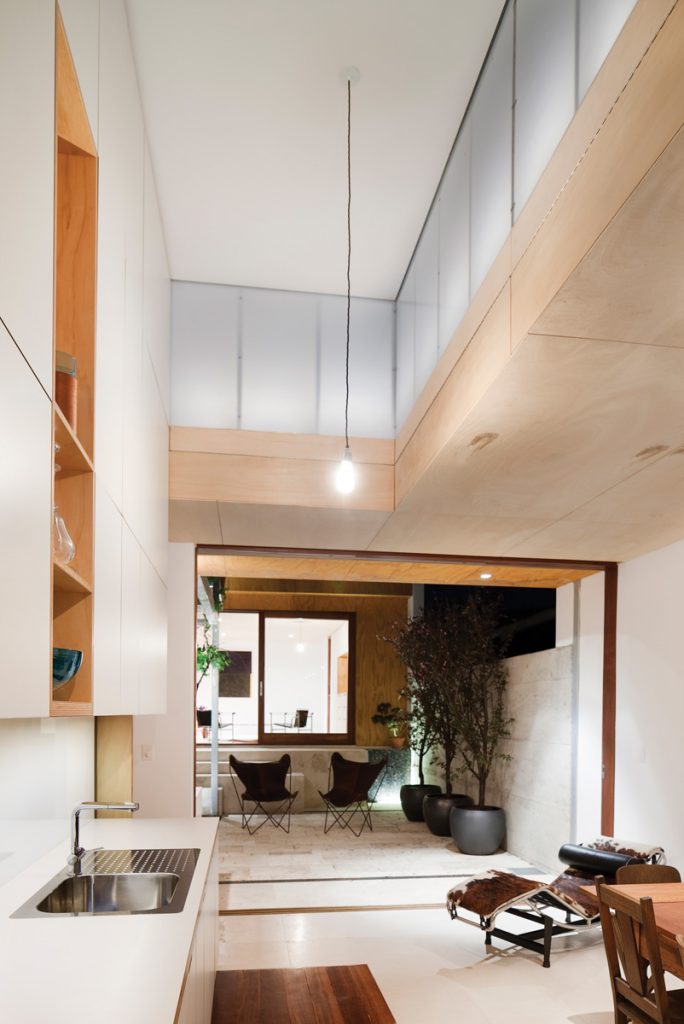
The first thing you notice when stepping into the extension – a kitchen island and dining room with a bathroom and laundry “corridor” running along one side – is the sudden burst of natural light, a rare commodity in these old cottages.
“The block is very narrow, so we maximised the space by building right out to the boundaries on either side, but of course that meant there couldn’t be windows. So we got around that by putting in this” – Vittino points up to a lantern-like pop-up roof, made from opaque polycarbonate, positioned above the kitchen. “This keeps
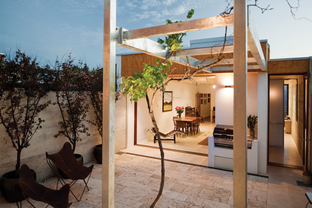
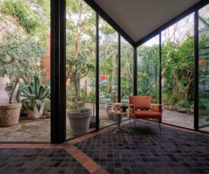
it all very light in the daytime, and at night there are lights in it so it looks much the same.” At one end of the room is a huge glass door that slides neatly into the wall cavity, flooding the room with sunshine from the north-facing courtyard.
Although not a huge space, it feels bigger than it is because it’s been planned so efficiently; the dark corners and cramped hallways you so often find in these old houses are absent. Minimising a building’s footprint in this way reduces power bills, helped by the building’s orientation; the north-facing garden warms the kitchen in winter. “They open up the doors and the sun goes all the way through,” says Vittino. “They do have a gas heater, but find they rarely need to use it as the thermal mass of the walls and floors retains the heat quite well, and there’s no air conditioner.”
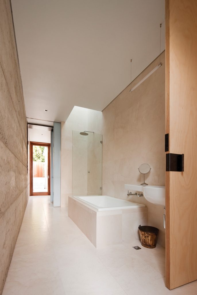
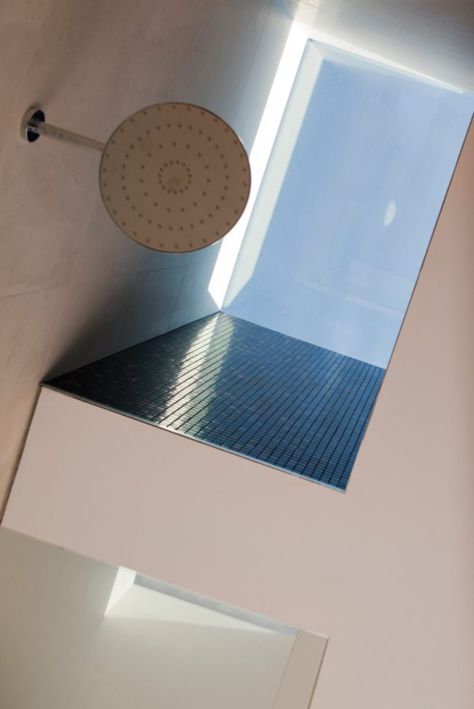
A kitchen island runs down the length of the room, and through pivoting doors on either side you reach the bathroom and laundry. Here, again, space has been accorded out in an exacting fashion – it’s neither cramped nor unnecessarily roomy. A basin, bath, shower, toilet and laundry area are spaced evenly down a wide corridor with restful tones; pale blue polycarbonate screens can close off the toilet or bathroom for privacy, but are translucent to let light in, along with another skylight over the shower. “Mark’s a surfer and he loves showering outdoors, so we put in this skylight to give him that feeling,” says Vittino. A wall of opaque louvres and a door to the back garden can be opened for natural cross ventilation, minimising the need for exhaust fans.
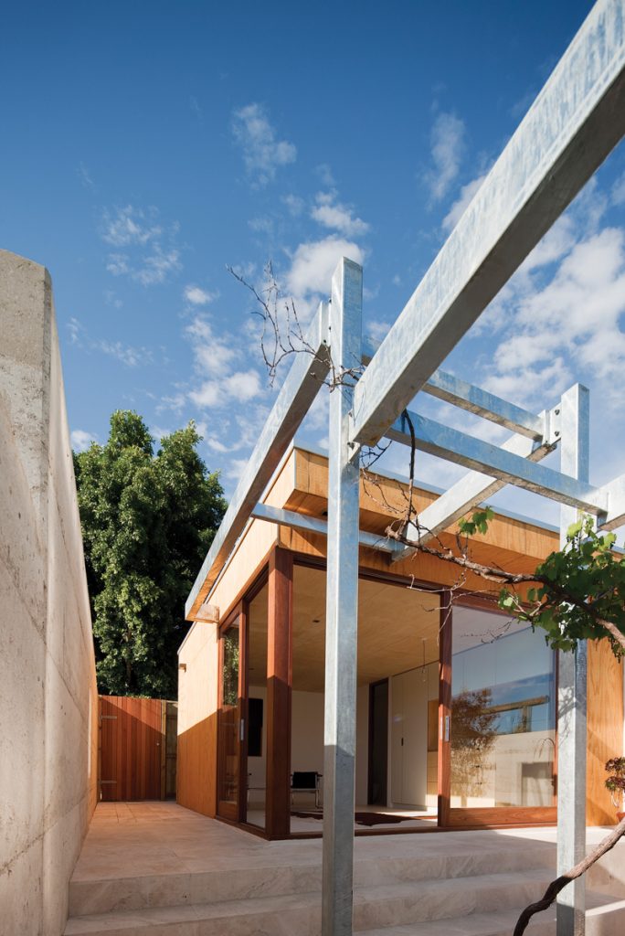
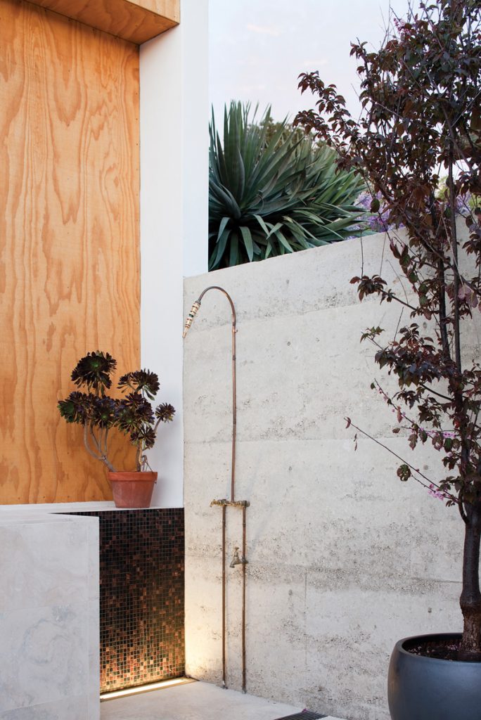
Small touches of recycling are present throughout the house – the kitchen area is delineated by recycled jarrah floorboards, which provide a subtle link to the older part of the house. And a grapevine from the original garden has survived, after spending the renovation period in a bag out the front. Restored to the courtyard, it’s now thriving and will eventually shade the outdoor dining table. The property’s boundary wall outside is made from recycled crushed concrete mixed with limestone – “using the same technology as rammed earth, except you’re recycling concrete. And the limestone gives it a warmer golden colour,” says Vittino.
Perth is now a sprawling city where a car is seen by most as vital, so the thought of doing away with a garage to add more living space had planning officers at the local council perplexed. “We had a lot of trouble getting permission to turn the garage out the back into another living area. But they didn’t need the garage; they simply park on the street and, because we are so central here, they can walk everywhere, anyway. The studio at the rear can be used as a living area or for guests, and the stairs leading up to it provide extra seating for parties. Plus it’s south-facing, so they use it during the day sometimes as it’s so cool.”
This colonising of inner-city workers’ cottages has come surprisingly late to Perth, where many aspire to a huge block of land in the suburbs. As the city grows, however, there are signs that the sprawl is being tempered by increased density. Projects such as this one are testament to a burgeoning trend for living in a smaller property, but surrounded by services and the buzz of the city rather than suburbia. “In any other capital people would pay a premium to live somewhere this central, but for some reason they don’t want that here,” says Vittino, shaking his head before heading across the road to another building project – the worker’s cottage he and Ashe are reviving for themselves.
Specs
Architect
VittinoAshe
vittinoashe.com.au
Structural engineer
Advanced Building Engineers abewa.com.au
Builder
Castleprime Construction castleprime.com
Timber joinery
Kohlen Joiners
Site
Length 40.4 m, width 6.3 m and 2542m – the building’s footprint was increased by only 1.5 m in length, and the previous garage space was converted into a studio.
Passive solar design
A large sliding door allows northern light and fresh air to flood the kitchen, warming it in winter and ventilating it in summer, while the south-facing studio is a cooler spot for hot days. Skylights above the kitchen and shower provide free lighting. A door and a strip of louvres at either end of the bathroom and laundry corridor allow for cross ventilation.
Materials
Walls: the exterior boundary wall is recycled rammed concrete with added limestone; the extension is built using Shadowclad plywood with a natural finish from Carter Holt Harvey (chhwoodproducts.com.au) Floors: Attica-antiquated limestone in dining area, concrete in study/studio and a strip of recycled jarrah to mark out the kitchen footprint. The courtyard is paved with bush hammered travertine. Roofing: Trimdek Lighting: Mance Lighting
