Pre Loved
Using the ingenuity of a designer on a tight budget and the talents of various artisan friends, a creative couple has built a home packed with surprises – including a large green roof – and materials that are either reclaimed or handcrafted and have intriguing stories to tell.
Architect Emilio Fuscaldo of Nest and his partner, writer Anna Krien, had abandoned the idea of home ownership in inner Melbourne and resigned themselves to renting forever when they chanced upon a tiny subdivided block at the rear of a house in Coburg that changed their minds. “Somewhat affordable”, north- facing and with a rear laneway that opens up to provide a greater sense of space, the site offered plenty of attractions to offset constraints imposed by its size.
Living with an award-winning writer has taught Emilio a thing or two about narrative. His new home in Melbourne’s inner north is bursting with stories in the form of building materials and interior features that were either recycled from elsewhere – bringing with them their own unique patina of age and experience – or handmade for the owners by designer friends handy with metal, ceramics, textiles, furniture and lighting.
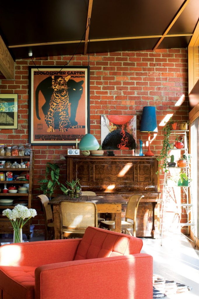
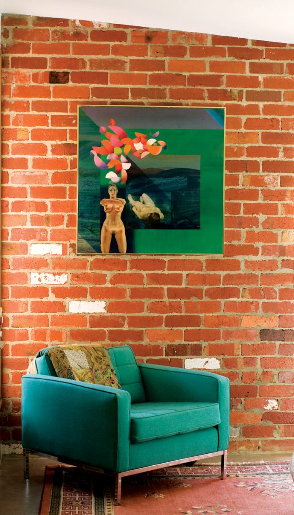
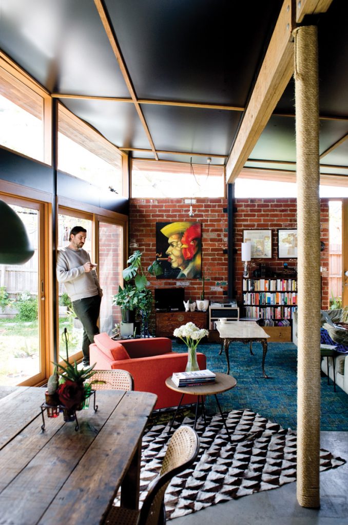
Recycled brick walls and a hand-trowelled concrete floor, which wears its imperfections on its sleeve, set the scene but in the almost complete absence of joinery, which Emilio reasoned would only make the interior look smaller, eclectic detailing steals the show.
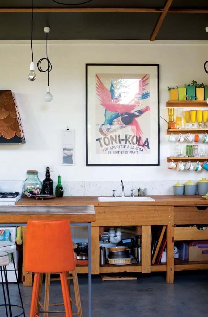
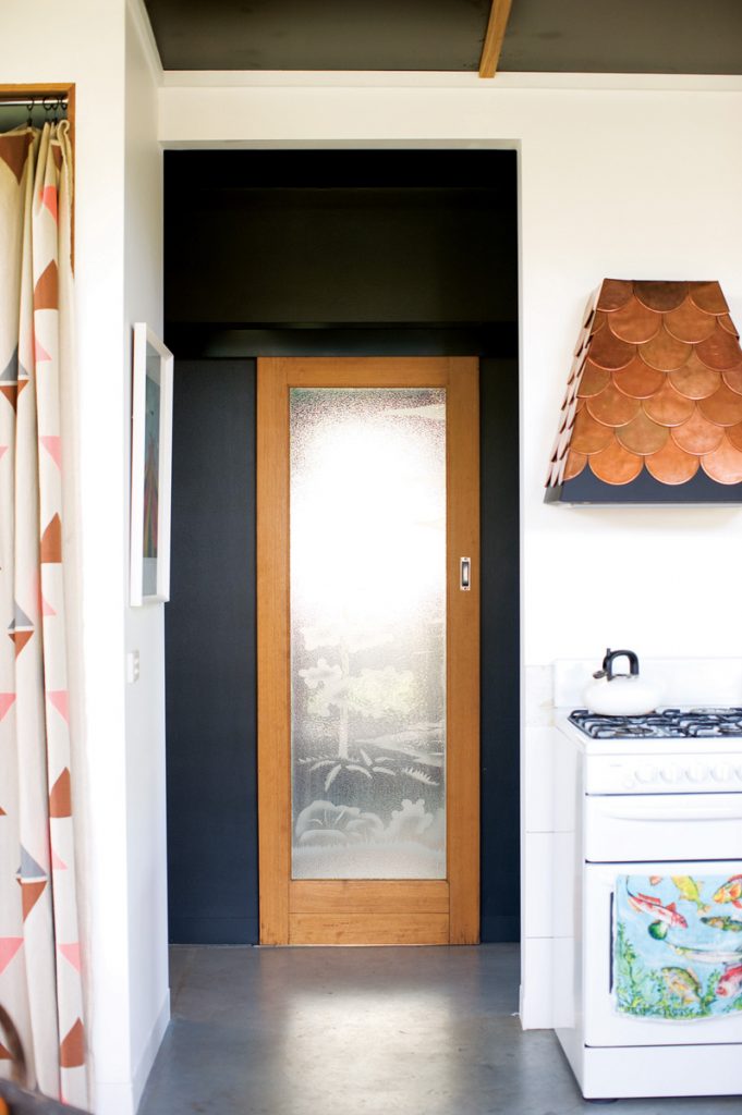
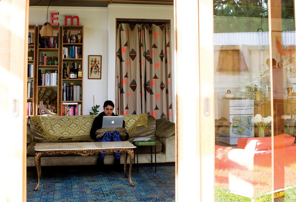
Fashion designer Lisa Gorman, a Nest client from way back, donated the fabric curtain (an off-cut from one of her boutique’s change rooms) that conceals the recessed laundry from the main living space. Metal worker friend John Hall handcrafted a tiny range hood made from copper scales that’s so sweet it could have been conjured from the pages of a children’s book.
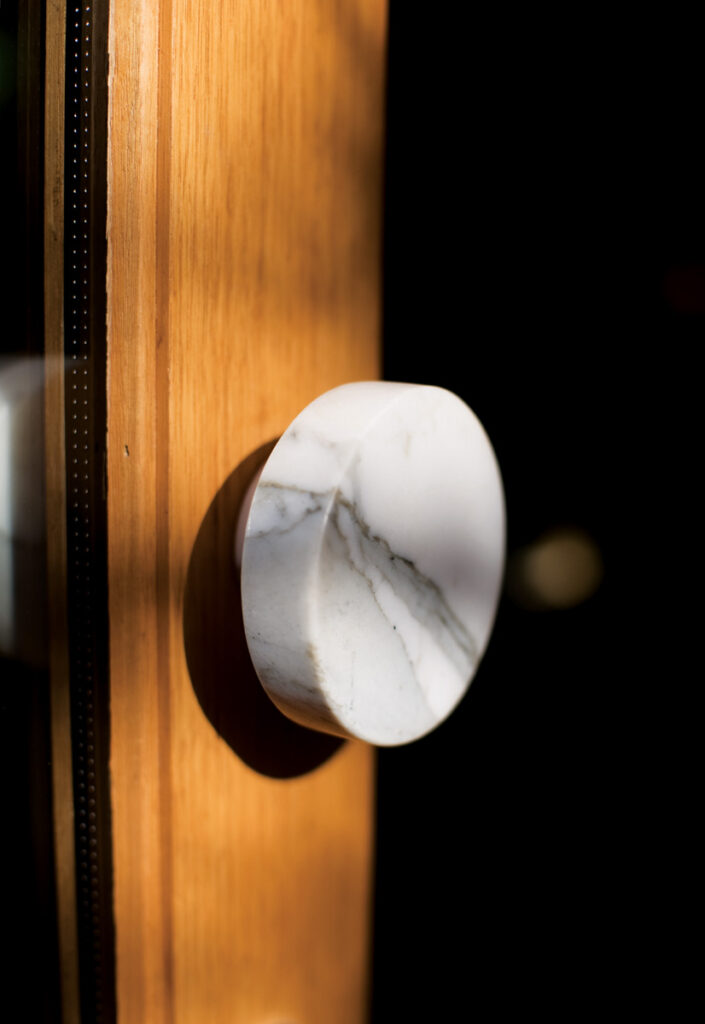
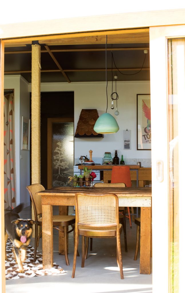
Another friend, photographer Jesse Marlow, whom Emilio describes as a “great finder of things”, found an old workbench being off-loaded for a song; Emilio stripped it of its fluorescent orange paint and installed it as the kitchen bench. Lighting and furniture designer Ross Gardam, who shares an office with Nest, created the exquisite cast ceramic and hand-carved wooden pendant lights throughout. Emilio made the elegant strap-style handles on the doors using leather belts picked up on the cheap at the Victoria Market. The timber used in the bathroom vanity unit was once part of the bowling alley in Thornbury. The toilet hails from the house of fellow architect and Triple R broadcaster Stuart Harrison of HAW. Not many of us can say that.
“Anna’s a writer and she has made me pretty aware of the idea of narrative and the house comes packed with a story already,” Emilio says. “The bricks are the most dominant feature and the reason we used recycled bricks – which extends to all the materials here, apart from the timber in the windows – is that recycled materials come with a patina … a feel, an atmosphere, a look and a colour, so there’s no point in applying anything to them, I think.” There’s not a slick surface in sight. “We don’t live a blingy, shiny lifestyle,” says Emilio, “so the house has a texture and grain to it readymade.”
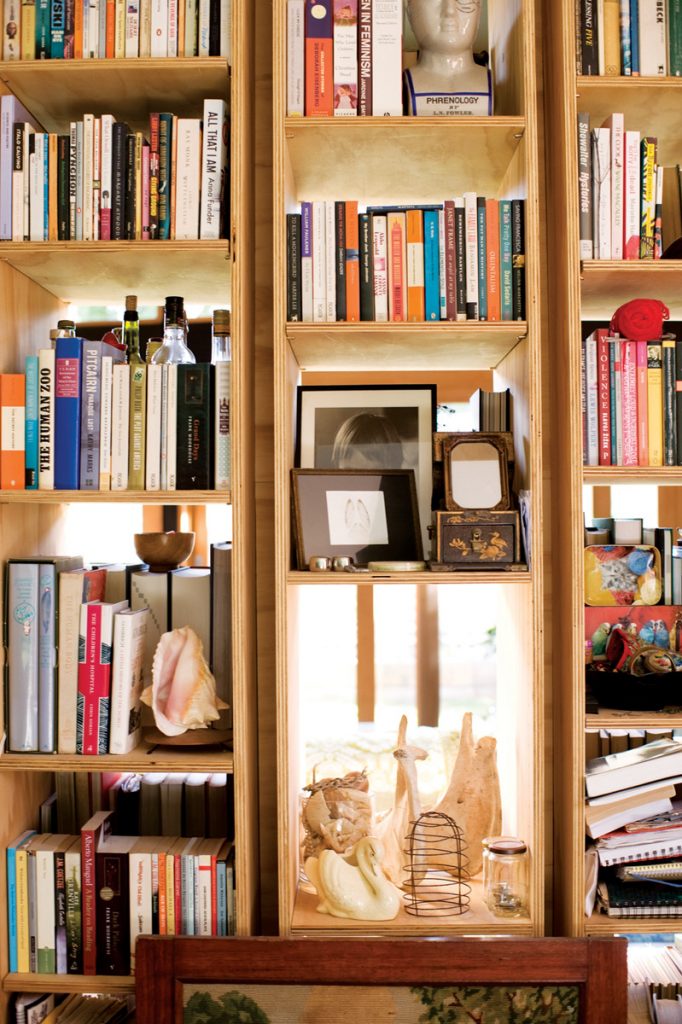
There’s a clever see-through timber bookcase designed by Emilio to sit in (though not seal off) a large wall cavity separating living room from master bedroom. Aside from that, though, there’s a remarkable absence of joinery units for the home of a man who has designed some gorgeous timber pieces for clients over the years.
In part that’s about adding the illusion of space and in part it’s a response to Anna’s aversion to cupboard doors. “I don’t like not knowing where things are,” she says simply.
The “brief” for the house was straightforward and familiar: loads of light, warmth in winter (Anna hates the cold at least as much as doors) and the ability to accommodate the couple and their new baby (due a fortnight after Green visited). While never intended as an architectural showpiece, it needed to give Emilio’s clients some bright ideas for small, sustainable, budget builds. In practical terms this meant providing two bedrooms, a bathroom, minimal laundry space and maximum living and garden space.
Not surprisingly there were no high-powered client meetings, just lots of discussions, sketches and “gestation” time for ideas. “I didn’t treat it as a normal project,” Emilio says. “The great thing about that for me was that I got to do a project that had a really nice spontaneous evolution to it, as opposed to ‘here’s the brief, here’s the design, let’s build it’. During the building process we left a lot of things undone because we wanted to be here to see how it would work and how the house responded to us.” The black laminate ceiling finished with timber battens reminiscent of a 1960s beach house, for example, “took a long time to decide on because we just had no idea what to do.” Likewise, the pair lived with a hole in the bedroom wall for quite some time before dreaming up the idea of a see-through bookcase that would allow them to lie in bed and look out at the trees in the rear garden.
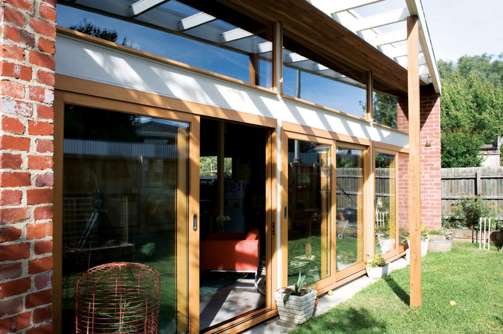
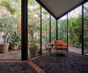
Structure was largely determined by the constraints of the 180- square-metre site. Because access to the house is via a side path running the length of the 620-square-metre block, the side door to the open plan living-dining-kitchen area at the back is effectively also the front entrance. The space is visually enlarged by a bank of large, double-glazed, timber-framed doors topped with a row of clerestory windows, which overlook the small garden to the north.
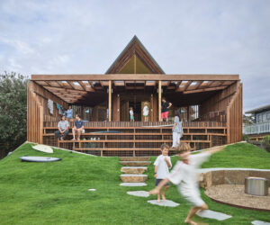
This light, warm space is protected from summer sun by a deep angled eave clad in recycled Jarrah timber from Western Australia. Winter sun penetrates deeply and, much to Anna’s delight, keeps temperatures cosy. It’s helped along by lots of insulation and thermal mass, including a hydronically heated concrete slab, double-brick walls with foil insulation, and a large green roof with 200 mm of soil directly above.
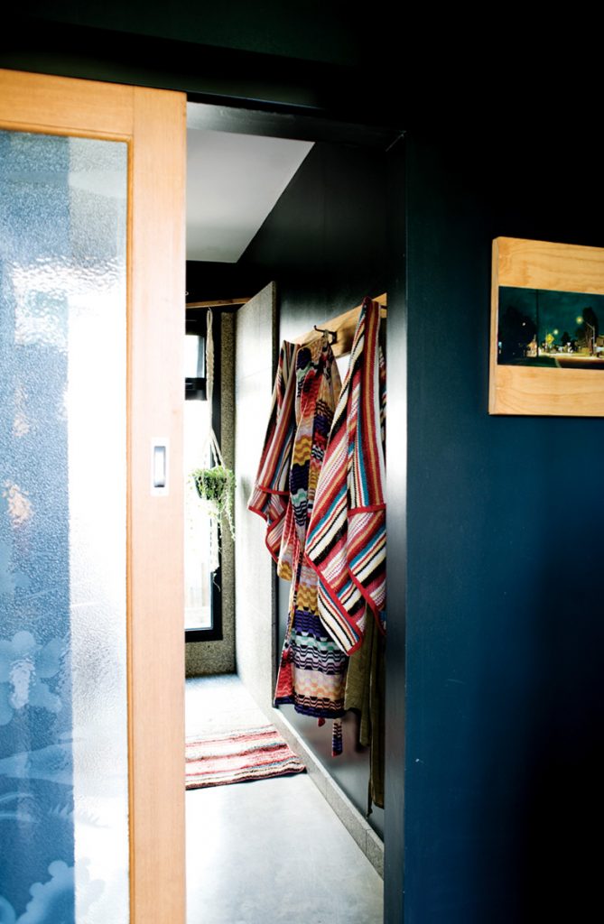
Off the main living area are the master bedroom and, opposite, a smaller child’s room. Both are filled with light and fresh air thanks to carefully placed, timber-framed windows. In between, behind a gorgeous vintage etched-glass door that seems to glow when backlit at night, is a glamorous bathroom Anna nominates as a highlight of the house. With deep charcoal grey-green walls, colour- flecked Fibonacci tiles Emilio calls “a splurge”, the aforementioned reclaimed vanity unit and toilet, and an ambience Anna describes as a cross between a swimming pool change room and a nightclub, she dubs it “our upper class moment – but maybe only to us”.
The $25,000-odd roof garden lined with succulents was another splurge – a complex and time consuming labour of love that required many hours of research and grunt work by Emilio and the expertise of an engineer, soil expert and landscaper friend. It’s an important feature of the build. “This hasn’t really been done on a domestic scale like this before,” Emilio says. Aside from adding insulation and garden space Emilio says it proves “you can achieve really good sustainability goals without spending the earth”. “Perhaps in some people’s eyes to achieve that you have to compromise on something,” he says. “We don’t feel like we’ve compromised on anything. But the fact we didn’t spend a lot of money on kitchen cupboards means we can do something like that.”
Specs
Architect
Nest Architects
nestarchitects.com.au
Builder
Contour Projects (James Longworth) with help from Jim Russell.
Joinery
By the owner and Jim Russell.
Passive energy design
The house is orientated to the north and uses double-brick walls and an insulated concrete slab for thermal mass. Double-glazed windows are located to provide cross ventilation. A north-facing eave prevents summer sun but allows winter sun to enter. Hardwood timber window and door frames minimise heat transfer. A green roof augments ceiling insulation.
Materials
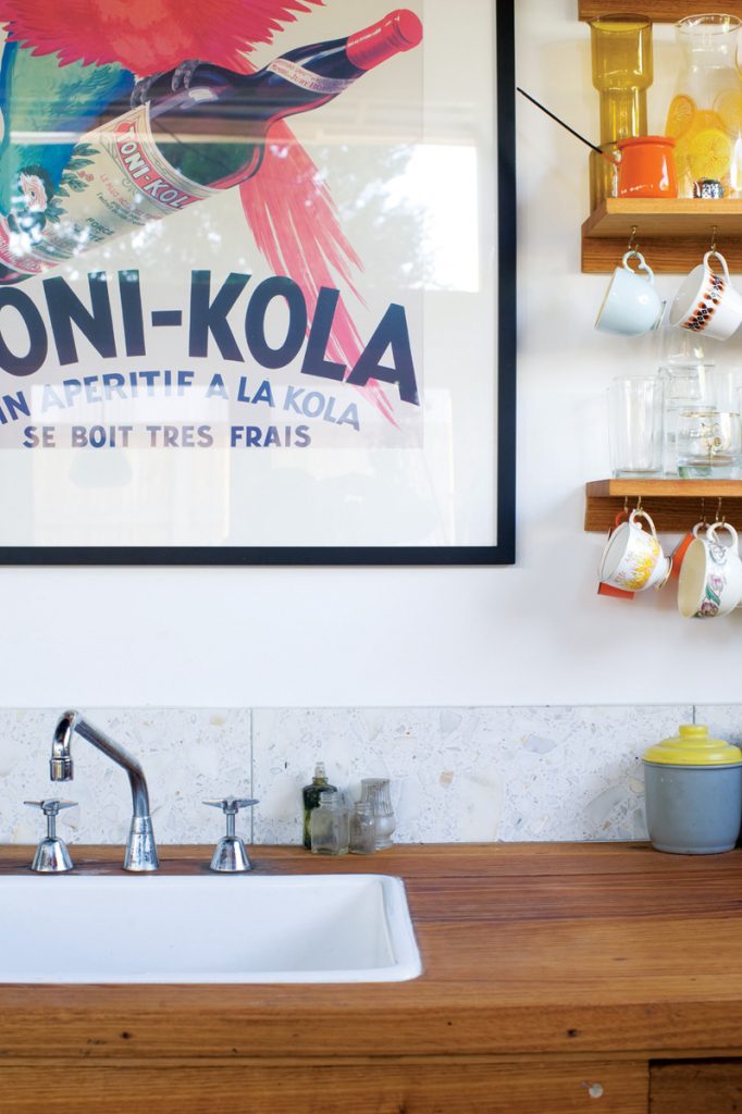
The recycled double brick walls are finished with clear, low-VOC, water-based sealer. All timbers are FSC certified. All paints are low-VOC. The timber used in the eaves is recycled Jarrah. The kitchen workbench, cobbler’s storage rack pantry and bathroom benchtop are all reclaimed. Tiles, taps and laundry curtain were given to us by friends. Timber windows are Victorian Ash hardwood, sealed with a tinted, low-VOC stain. All internal timber is finished with Orange oil, which is similar to Tung oil but uses citrus extract rather than polyurethane to make it dry and harden. The black laminate ceiling is pressed onto EO, FSC MDF substrate.
Flooring
The insulated concrete slab uses hydronic heating and is finished with a clear, low-VOC water-based sealer.
Insulation
The insulation used in the timber-framed walls is recycled polyester R2.0 batts. Brickwall cavity insulation is Kingspan Kooltherm® K8 Cavity Board (25 mm thick). The ceiling uses R3.0 Bradford Gold insulation. This is enhanced by the green roof laid with 200 mm of treated soil.
Glazing
All glass is double glazed with 12 mm thick Argon gas interlayer to prevent heat loss and windows are placed to provide cross-ventilation.
Heating and cooling
Passive solar design features including northern orientation, external shading and effective cross ventilation reduce the need for heating and cooling devices. In winter extra heat is provided by a hydronically heated concrete slab that uses natural gas as its “fuel” cutting the amount of electricity used.
Water
The hot water system, a 270 L Aquamax, features a highly efficient gas storage tank.
Green roof
A 200 mm-thick green roof reduces urban heat radiation, encourages flora and fauna diversity, acts as a sponge for stormwater, reduces the need for heating and negates the need for air conditioning indoors.
Water tanks
A 5000-litre tank collects rainwater from the roof and is connected via a pump to the toilet and a garden tap. It is also used to irrigate the green roof.
Lighting
The house uses CFL lighting throughout. No recessed downlights are used.
