Practical Prototype – Cremorne Apartment Renovation
Renowned for his clever apartment designs, architect Brad Swartz has transformed his own two-bedroom apartment into a light and spacious family home.
When architect Brad Swartz designed his own much-lauded 27-square-metre studio apartment in Darlinghurst in 2015, it unexpectedly became the launching pad for his practice Brad Swartz Architects.
Six years on, Brad has designed another apartment for himself and his partner, Jade, drawing on the ideas he has developed through client projects, as well as testing out new ideas. “Each project becomes a prototype for the next one,” Brad says.
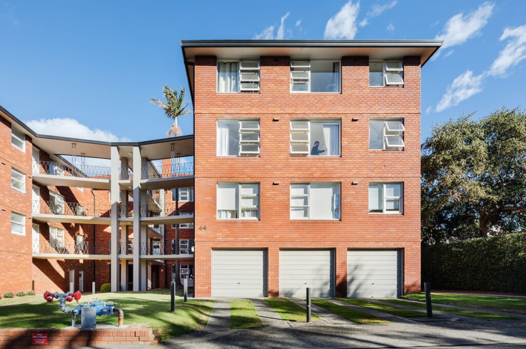
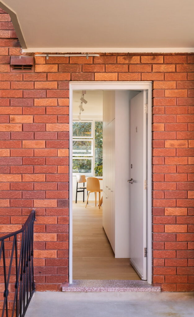
Brad and Jade were taken by the design of the four-storey apartment block where they bought their new home in the North Sydney suburb of Cremorne. Built in 1963, the U-shaped brick building has an open staircase through the foyer and external walkways to access the apartments, creating openness and connection. “It provides the opportunity to cross paths with people or see them at a distance. It’s like a small community,” says Brad. It also means the end apartments – like Brad and Jade’s – have windows on three sides (east, north and west) and only one shared wall (south). In the original design, this provided great access to northern light in the two bedrooms and small enclosed kitchen but not elsewhere.
Consequently, the key move was to switch the locations of the kitchen and living area, and also to remove walls for greater openness and connection. “My work is about creating a sense of space and the feeling of that space,” Brad says.
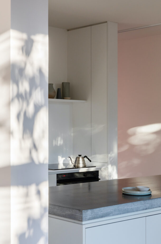
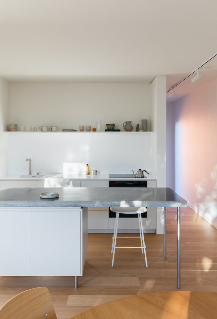
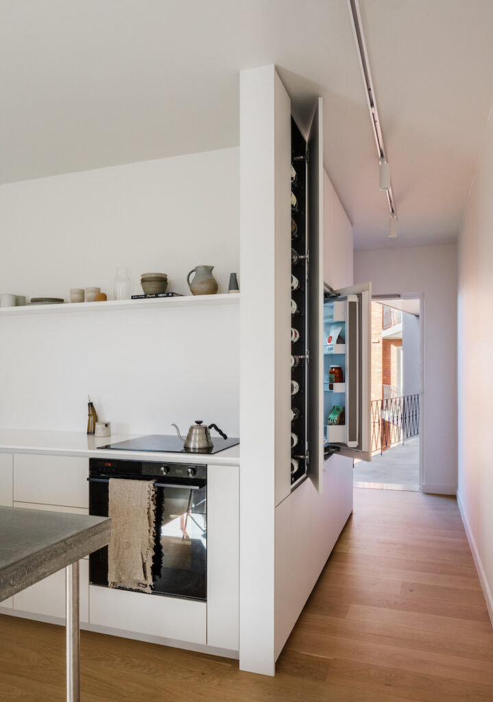
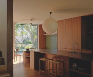
Lots of little tricks were also used to improve the functionality and appearance of space, and many of those are in the kitchen. Now located in the centre of the apartment and facing the dining area, it is designed like a piece of furniture. “I like kitchens that don’t feel like kitchens, particularly when they are right next to living spaces,” Brad says.
The island has a concrete benchtop and 1960s-inspired joinery and is raised on metal legs so the floor flows beneath it. An unconventional amount of space between the island and the wall allows for circulation and for a larger island. “Working in small spaces you can throw out the rule book. I didn’t have the luxury of 900 millimetres, so it’s 550 millimetres, which is not a typical dimension, but it creates better circulation in and out of the kitchen,” Brad explains. There are also no overhead or full-height cupboards. Instead, the entrance hall functions as part of the kitchen with the fridge, pantry, wine storage and laundry all concealed behind joinery.
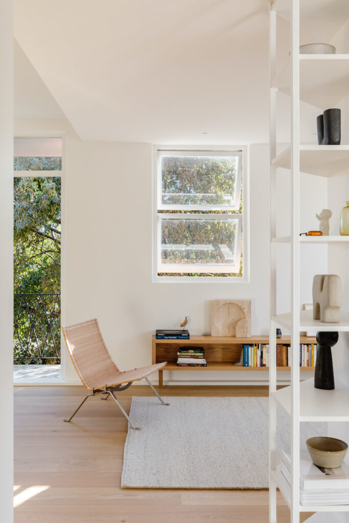
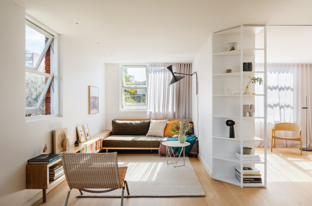
The living area is now in the north-west corner, previously the kitchen. It has a city view through the balcony alongside the dining area, and the low-profile built-in timber sofa and bookshelf are designed to maximise the 2.4-metre-wide space. “They maintain the 1960s aesthetic and are raised, like the island, so the floor flows through. All these little subtleties accumulate to create a much better sense of space,” Brad says.
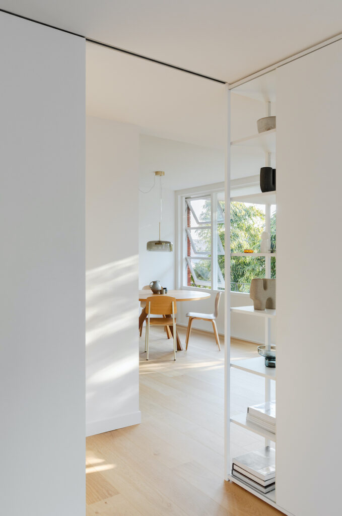
Similarly, the open and angled floor-to-ceiling shelves at the end of the wall dividing the living area and bedroom allow for greater light, openness and sightlines. This unit serves a second purpose – the wardrobe door slides across one side, and the bedroom door slides to meet it, closing off the room. In the second bedroom, built-in cupboards and bedside tables frame the bed, and an alcove with a mirror enhances the sense of space.
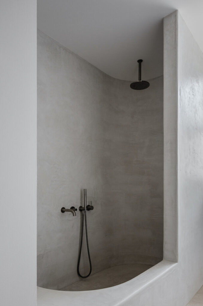
The bathroom is across the hallway from the bedroom but feels like an ensuite because it is so close. Wanting to avoid grout in the bathroom, Brad designed the vanity and combined shower and bath in Moroccan render. “I have wanted to try Moroccan render but didn’t want to take the risk on a client’s bathroom in case it didn’t work out,” Brad says. It certainly did work out. Combining the shower and bath frees up space so the bathroom doesn’t feel small or tight, and the sculpted form and grey textured material has an outdoor, spa-like quality, not typical of an apartment bathroom.
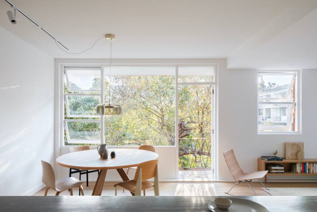
This outdoor quality is consistent throughout the material palette, as Brad selected materials that have a light, beachy, earthy, natural feel to evoke the sense of outdoors. “It’s more about creating that feeling of calm and escape that you get being outside, rather than mimicking the outdoors,” says Brad. This ambience is enhanced by the leafy green view through the dining room windows, with the trees also screening and providing privacy from the neighbouring houses.
In addition to the ideas that Brad has tested and developed through his architectural projects, he says one important lesson is “to invest in a good quality builder and robust materials so it’s easy to live with and will last.” And since Brad and Jade’s apartment is now home to three with the arrival of their baby girl, the clever design and durable materials are more important than ever.
Specs
Architect
Brad Swartz Architects
Builder
Align Constructions
Location
Cammeraygal Country. Cremorne, NSW
Passive energy design
The apartment was completely reorganised around passive design. The living spaces are relocated to the north-west corner, replacing the old kitchen. Through the relocation of the hallway, light to the living areas is further improved and cross ventilation drastically increased.
Materials
The existing building is double brick and all existing internal walls are painted brick. All new walls and ceilings were timber framed and sheeted in plasterboard. All walls and ceilings were painted in Dulux “Natural White”. Joinery is Laminex “Chalk White” and “Sarsen Grey”. The built-in bench seat and bookshelf is solid oak and oak veneer. The bathroom micro-cement finish is Mortex “Natural”.
Flooring
Unfinished 190 mm European Oak boards by Havwoods in Loba Invisible Protect throughout (other than the bathroom). Honed Tavira limestone supplied by Sareen Stone is used in the bathroom.
Heating and cooling
The existing double-brick building and effective cross ventilation removes the need for artificial cooling aside from ceiling fans in the main bedroom. In winter the north-facing orientation and location on the middle floor of the apartment building reduces the need for heating.
Hot water system
Hot water is from an 80 litre electric tank.
Water Filter
Whole house filtration system by Puretec (WH2-55).
Tapwear
Icon fittings and fixtures in Brushed Platinum by Astra Walker.
Lighting
The apartment uses low-energy LED lighting. Feature lighting is Jube Pendant by Vistosi supplied by Mondoluce, Lampe de Marseille designed by Le Corbusier, licensed through Nemo and supplied by Mondoluce. Earth Light by Anchor Ceramics and 12 Series and 13 Series switches by Zetr.
