Pop Up
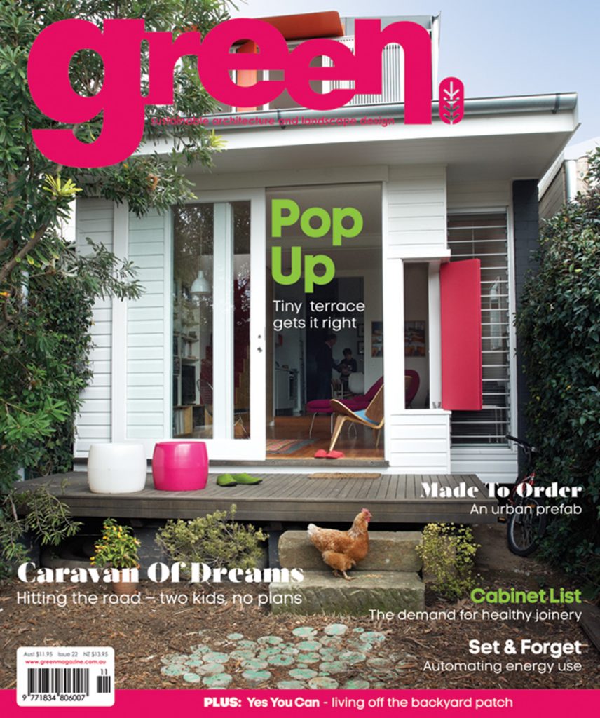
A renovation of an inner-city Sydney terrace by its architect owners, Peter Rush and Heidi Seemann, has produced some surprising results working with only a minimal budget and the existing bones of the house.
“We’ve tried to make the space dynamic with the simplest of effects,” says Peter of the 1910 terrace they bought twelve years ago. What helped them achieve their goal was the site’s northerly orientation on one side and the high ceilings, which keep the spaces voluminous. “With terrace houses, their orientation can be pretty random. We’re in a row of fourteen and every second terrace has a good one so finding the right house was half the job.”
Having such a specific site orientation meant that, with good planning, light could be brought into as much of the interior as possible, and not just flood the back. On arriving at the house, though, you would be forgiven for thinking it had not been altered at all as the street frontage and two front rooms have not been touched. It’s not until you step down into the dining/ kitchen space at the end of the hallway that the house suddenly opens up and fills with light and modernity.
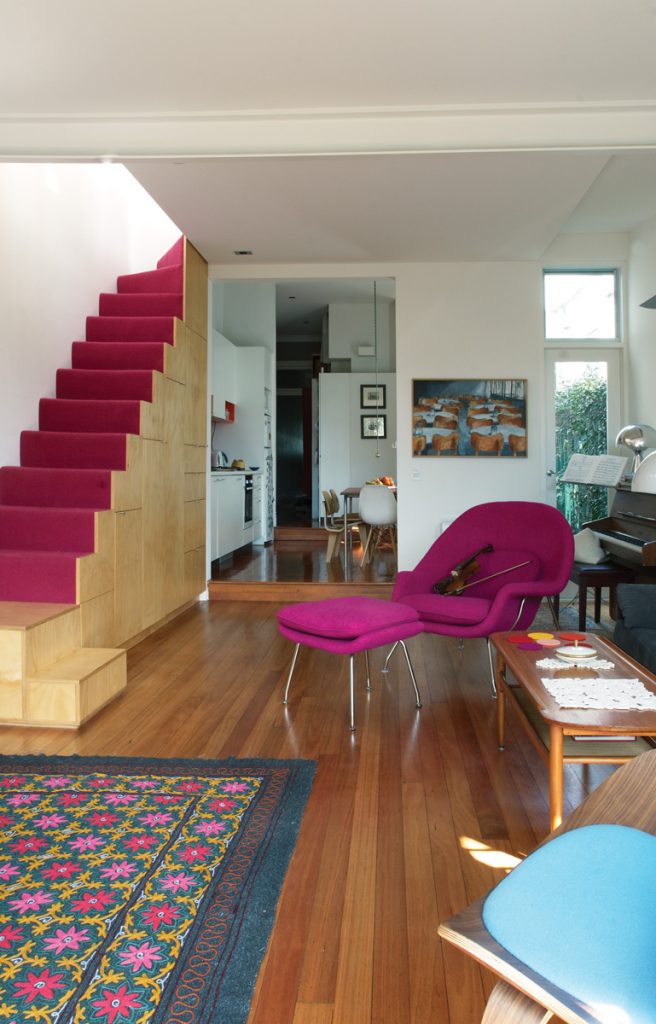
Not wanting to “fight the skeleton of the house”, as Heidi says, the emphasis was on maximising volume rather than area, so only 30 square metres was added to the original 90. This helped reduce demolition waste and lowered construction costs. They didn’t level the floors and retained the original Kauri floorboards despite the fact they were riddled with rot and borer. “We couldn’t bring ourselves to rip up such beautiful timber,” explains Peter.
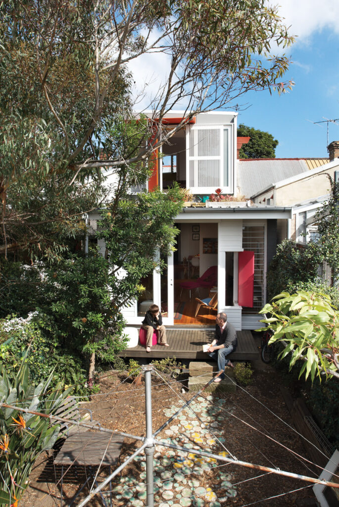
While they do have plans to do up the front rooms and develop the roof above them in the future, the first part of the renovations consisted of removing the old galley kitchen, toilet and laundry (which was getting all the sun), extending the back area to the side boundary by 16 square metres and turning it into a living space. “This made a huge difference as it’s no longer a train carriage,” says Heidi.
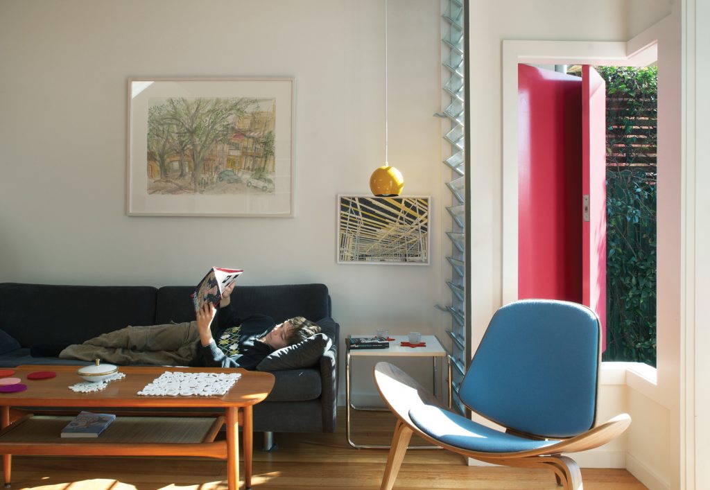
To capture the light, and to add ventilation and maximise the space, they added louvred windows and a large glass sliding door. They made a corner panel, painted fuchsia, double up as a window – a surprising effect that changes the space when fully open.
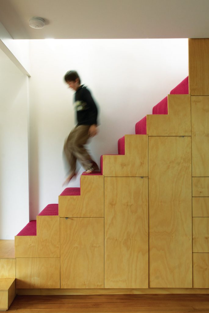
The new floors are Blackbutt to complement the Kauri floorboards and the stair joinery is Hoop Pine. By building a plywood box stair with an evenly distributed load, they avoided having to put in footings or make structural changes, and this allowed them to gain much needed storage space as well.
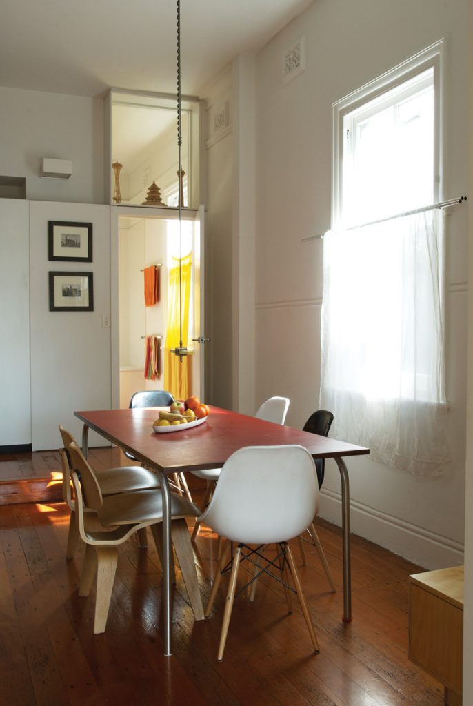
A new bathroom/laundry was added in the old living room space in the middle of the house and the original dining space became the new kitchen/dining with the removal of a fireplace. Terraces are renowned for their poor acoustics due to shared floor joists and lack of fire walls, so Heidi and Peter decided to invest in a firewall on the southern boundary wall next to the stairs.
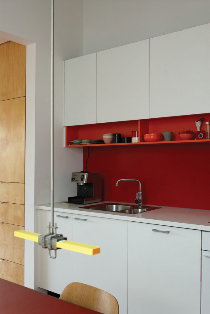
The couple’s inherent sustainable lifestyle is no more evident than in their choice of furniture – much of which was found roadside and those in need of repair were put back together by Peter. What is most striking about this house, though, is the use of bold colour, often in unexpected places. The pink corner panel may have been chosen ten years ago but they loved it so much they replicated the colour for the kitchen splashback and the carpet, and added splashes of orange and yellow to make the house even more vibrant and sunny.
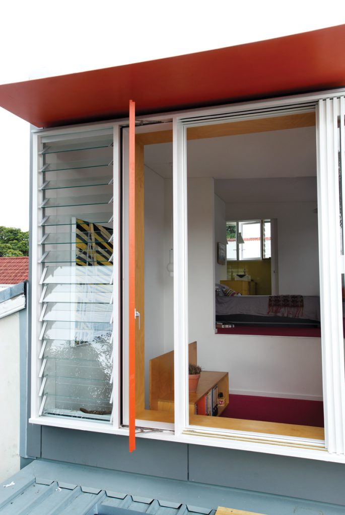
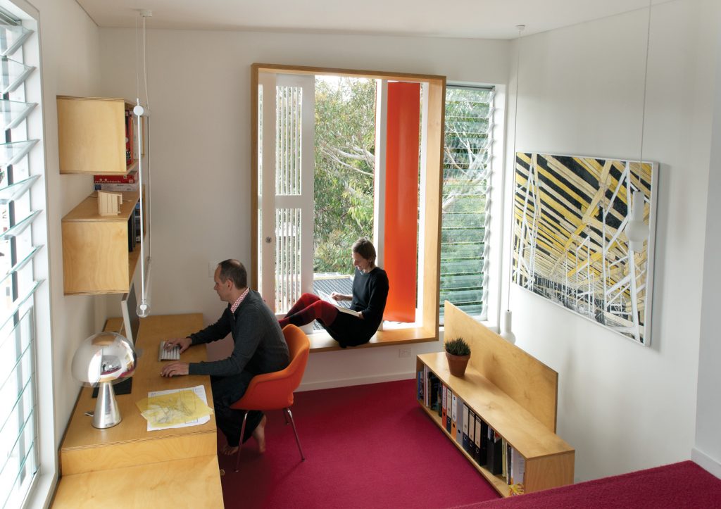
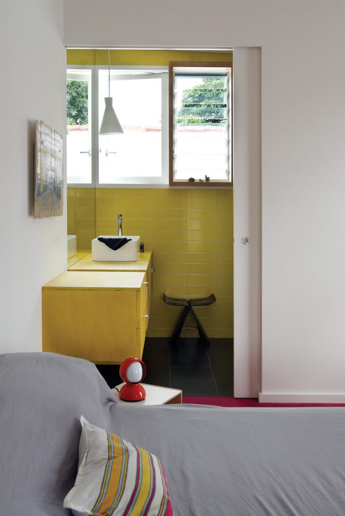
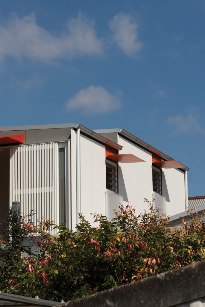
This is carried through into the upstairs addition consisting of the master bedroom, ensuite and study, where custom-made orange aluminium awnings, orange-painted panels, hot pink carpet and a bright yellow tiled bathroom with a water-resistant yellow-stained Hoop Pine vanity add spectacularly to the already light-filled space.
“It was easy to get light in [here] so we didn’t want to overdo it,” says Peter of the two louvred windows on the north side. The addition of the floor-to-ceiling east-facing window offers stunning views of the neighbouring rooftops and eucalyptus tree as well as access to a rooftop garden.
Still a work-in-progress, the garden with its mix of succulents and coastal-type plants will, when finished, create its own micro- climate which in turn will add insulation to the roof and help reduce the glare. Although designed to be looked at rather than inhabited, standing in it offers a unique view of the neighbouring rooftops.
As we take in the rather Mary Poppins’ type view, Peter shows me how they managed to add an extra “skin” to the exterior of the upstairs addition that provided an inexpensive and easy way to control the radiant heat and remove the need to add large eaves. A fibro-cement external lining, protected by breathable waterproof sarking on a frame on the outside of the wall (to allow ventilation), prevents the heat of the sun radiating into the interior when it hits the wall.
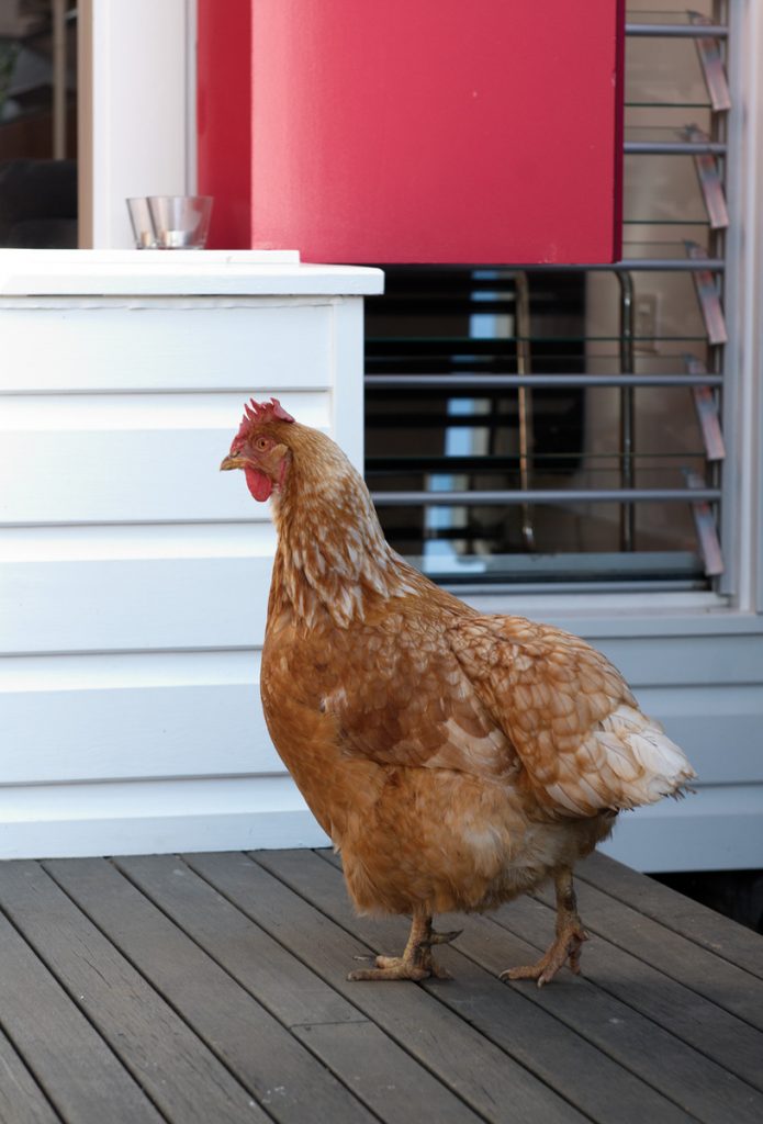
Coming down from the roof, Peter and Heidi take me to the back garden, where their last remaining chicken makes itself a dirt bath, and out into the laneway. It is here that you can fully appreciate the couple’s work – from their thoughtful use of the existing footprint and its bold but simple contemporary design that doesn’t sacrifice function. The new addition springs out into the sky like a colourful box with many openings.
As Peter says, “You’ve got to be able to have your ‘coolness’ satisfaction factor but also make sure it responds to its location, purpose, place and the environment. It’s got to tick all the boxes.”
Specs
Architect
Seemann Rush Architects srarchitects.com.au
Structural Engineer
Simpson Design Consulting Engineers simpsondesign.com.au
Builder
Create Construction createconstruction.com.au
Site
4.5 m wide, 1602 m site area. 302 m additions increasing house to 1202 m.
Walls
Walls include a stand-off naturally ventilated fibre cement external lining, fixed to vertical battens onto a standard timber stud frame with polyester batts and protected by Proctor Wrap HP breathable waterproof sarking.
Floors
Australian wool carpet on the stairs and first floor addition with 14.5 mm felt underlay made for Bridgestone by The Smith Family from old clothing and blankets.
Joinery and stairs
Australian plantation Hoop Pine, cut and made on site by carpenter.
Floorboards
Preserved existing NZ Kauri floorboards and added Blackbutt and plywood, finished with Livos ARDVOS Universal Wood Oil. Bathroom plywood vanity unit finished with Livos KALDET Transparent Linseed Oil Wood Stain.
Heating
Rinnai Energysaver heater is flued and suitable for all rooms including bedrooms.
Roofing
Metal roof decking planted using Elmich VerisCell lightweight modular drainage cell.
Garden
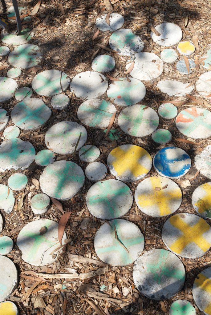
Garden pavers are salvaged concrete cylinders from the hydraulic core drilling of an apartment building development.
