Point of Reference
A Melbourne renovation adds cosy, family friendly spaces and lots of visible skyline to a weatherboard terrace by using thoughtful glazing and varied volumes pulled together visually and thematically by a “datum line” roof.
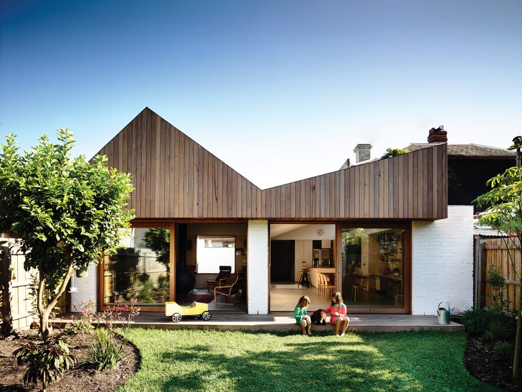
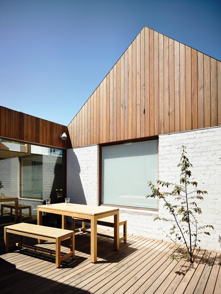
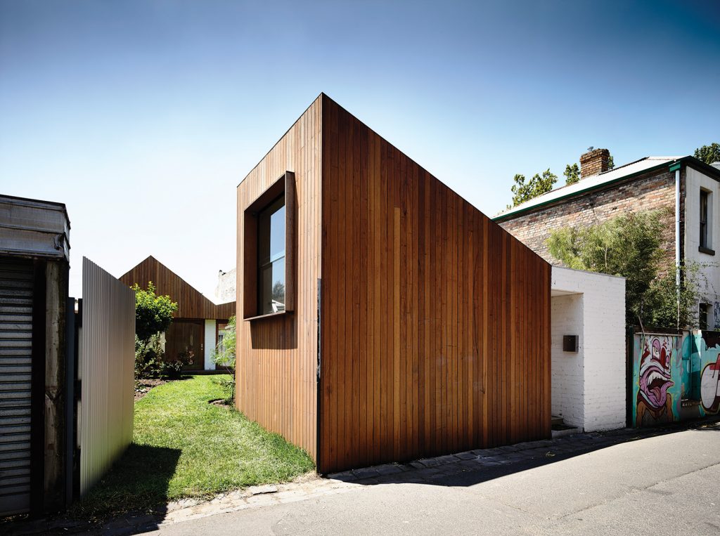
Architects Rob Kennon and Emlyn Olaver dubbed this inner-city Abbotsford terrace “Datum House” after the distinctive roofline of its rear addition. As a reference point it not only differentiates old from new within the home but emphasises the constant shifts in volume and ceiling forms throughout, which inject light, space and sky views into a series of snug, interconnected rooms. Internally, the datum line is marked by plasterboard above and pale, waxy ply walls below. Externally, from the south-facing rear garden, the datum line reads as painted bricks below and shiplap cladding above. It’s a simple idea Kennon says came early in the design process and proved crucial in creating visual cohesion.
“I think those sorts of decisions early on, even though they sound sort of academic, in a sense actually bring the building together,” Kennon says. “You make some rules to start with and that gives (the design) a cohesiveness.”
“It probably makes a lot more sense of these differing roof forms,” adds Olaver. “Whereas if it was all the same … it might feel a bit weird that we’ve got a skillion here and a different shaped gable in the other room.”
The owners bought the south-facing Victorian terrace close to Collingwood’s old stomping ground, Victoria Park, in December 2011. Originally from England, the pair had been living in New Zealand for several years. Although new to Melbourne they were quickly taken with the neighbourhood, particularly the park-side location and the thriving local community of nearby Abbotsford Convent.
They met Kennon through his real estate agent cousin, who had helped them get their bearings early on in the house-hunting process by showing them around various inner city suburbs. Once they’d settled on Abbotsford they enlisted Kennon’s help in creating a sustainable family home capable of adapting as their daughters – then aged seven and four – grew.
The straightforward brief involved a rentable, self-contained studio space with its own separate entrance, and a home with an organic feel, separate living and meals areas, and a sense of proximity to the girls rather than an adult’s “retreat”. The owner says they briefly considered adding an upper storey but decided against it, keen to avoid both air conditioning and encroaching on the rear garden. With a 405-square-metre site at their disposal they felt confident they could add the functionality required at ground level.
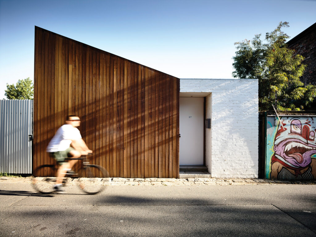
The original double-fronted house was a deceased estate, unrenovated and in pretty poor condition, with wonky walls that met the ceiling at odd angles. Kennon and Olaver retained the original weatherboard façade, front veranda and “bones” of the front four rooms. They sanded and re-polished the original floorboards, insulated the ceiling and walls, and added built-in robes to the bedrooms.
In the master to the left of the central hallway they concealed a new ensuite behind timber joinery that reads as a full-width robe, using space from what was once an additional bedroom. The remainder of this cavity was re-purposed as a small home office. The girls’ bedrooms remain largely untouched, save for painting, decorating and the removal in one of a central hearth and mantelpiece. The simple arched fireplace remaining now serves as a handy storage nook for toys.
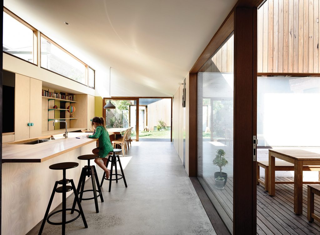
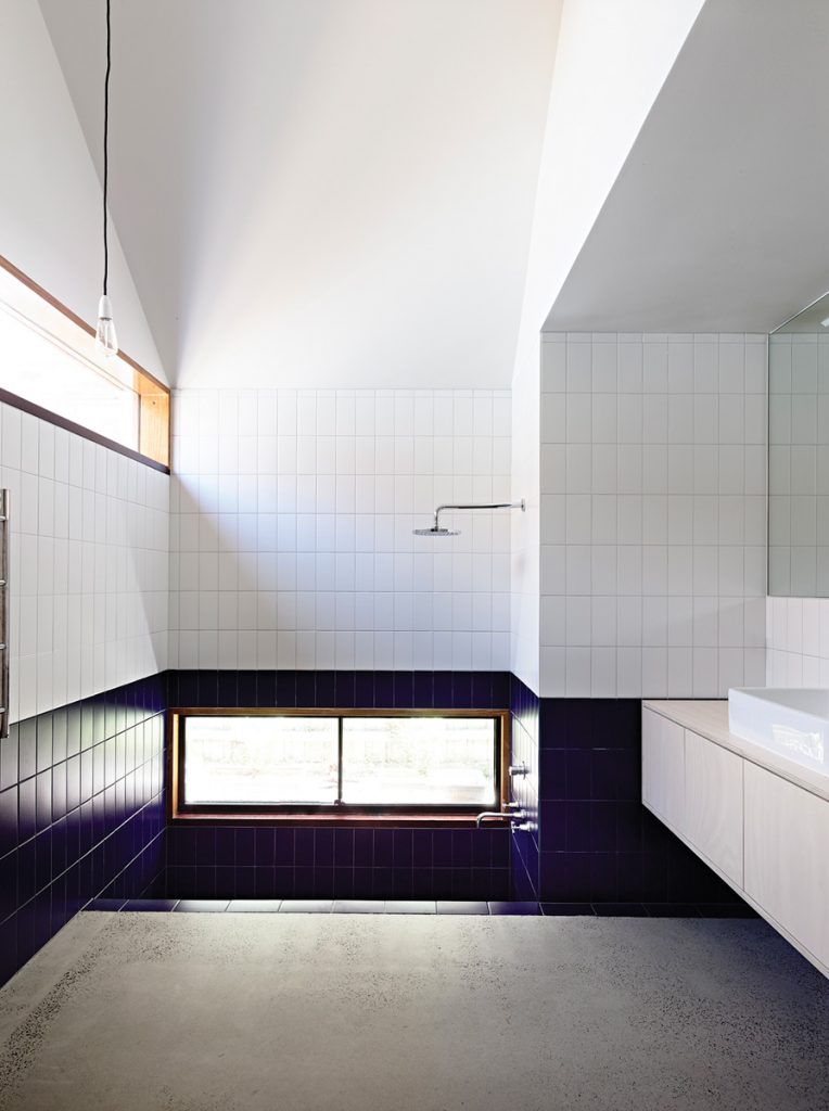
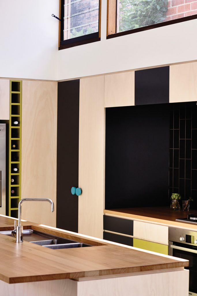
Beyond the four original rooms there’s a transitional zone with a relatively low ceiling. This opens up at the light filled centre of the new 182-square-metre house via a dramatically sloping roof and carefully framed vistas of garden, sky and treetops. Along the eastern wall runs a simple timber-and-tile kitchen topped with clerestory windows and a small bank of louvres that help vent hot air in summer. Directly opposite the kitchen is a small courtyard deck with access to the street. As well as providing a second, informal entrance to the house it floods the central core with light. It also provides lovely vistas to surrounding rooms, including a cleverly designed bathroom featuring high-level glazing (allowing shower users to gaze skywards) and floor-level glazing offering garden views to those luxuriating in a sunken bath made long enough to accommodate the whole family.
Adjacent to the kitchen is a generous dining area complete with a custom-built joinery unit that acts as a “kids’ office”, where the family can work on art and craft projects in the heart of their home without pressure to pack things away. The entire space opens onto a rear deck and garden via massive sliding glass-and- timber doors and feels extremely spacious, thanks in part to the voluminous ceiling forms and to the light, bright plywood walls. Olaver says a combination of pale stain and hardy wax gives the walls and the Victorian ash benchtops durability as well as freshness.
“We always wanted to get the feel of having ply in the house but we didn’t want it to be overly ‘woody’, if you know what I mean,” Olaver says. “The owner had a very particular aesthetic about it, which we really liked working with. There was a massive sampling process to get this final colour.”
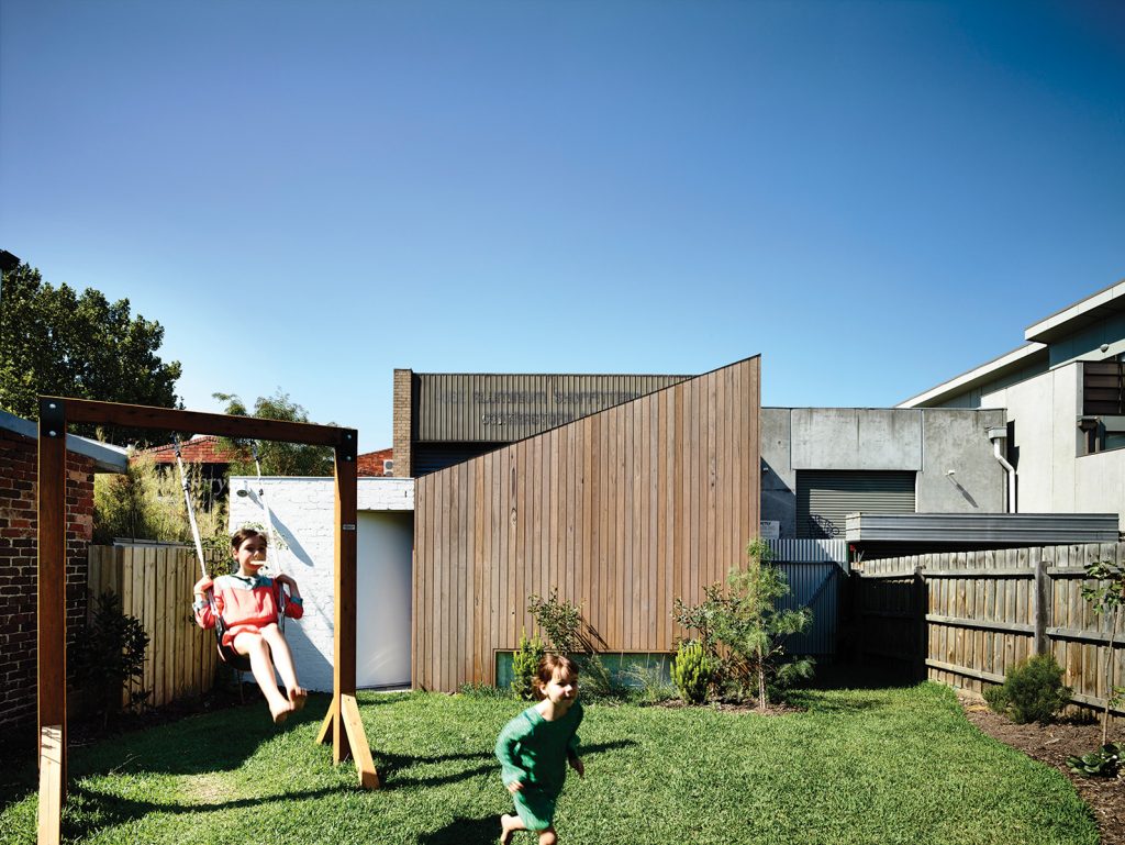
Opposite the dining area, concealed behind a moveable plywood wall, is a cosy living-cum-music room with a tall, asymmetrical cathedral ceiling and views out to the rear garden and the skillion- roofed studio beyond. Suspended in one corner is a monumental cast-iron fireplace that can rotate 360 degrees. It’s an atmospheric and fun feature in a home already made toasty by a hydronically heated concrete slab floor. It can be used to heat the living room alone, the living and dining spaces combined when the internal walls are opened, and even the exterior deck once the full-width glass-and-timber doors are rolled back and the fireplace rotates 180 degrees.
“We tried to create a spatial experience as opposed to being tricky with materials,” Kennon says of the project. “We had a concept and we followed it through.” Building in sky views was especially important on an inner city block surrounded by neighbours on all sides. For the owner, the result is a pleasure to inhabit. “I love that sitting room,” she says. “I don’t know if it’s the cathedral ceiling but there’s something about it that feels very reverent in there.”
Specs
Architect
Rob Kennon Architects
robkennon.com
Builder
Project Group projectgroup.com.au
Passive energy design
To reduce the embodied energy of the project a small footprint was maintained and the existing Victorian dwelling restored rather than demolished. Ensuring sufficient light and solar gain was paramount on a south-facing block. Inserting a courtyard on the west side of the house brought northern light into living areas. A clerestory window over the kitchen tracks the sun through the morning and, coupled with the courtyard, ensures light and warmth penetrate living areas throughout the day. The house has effective cross flow ventilation via large sliding doors with fly screens.
Materials
A concrete slab was used for the extension, providing thermal mass and reducing the workload for the integrated hydronic heating. Internal wall linings and joinery are made from low-VOC, sustainably sourced Australian hoop pine plywood. Low-VOC Whittle Waxes was used to seal plywood and timber benches.
External cladding was sustainably harvested plantation silvertop ash hardwood. Recycled bricks were used, both for their aesthetic quality and to extend their lifecycle. The brick works with the concrete slab to increase thermal mass.
Glazing
Windows and doors are timber framed with double-glazing and Comfort Plus glass. High louvre windows are used in the kitchen and dining rooms. West-facing glazing is protected with external blinds to reduce solar heat gain in summer.
Insulation
The roof is insulated with Bradford R6.0, glass wool thermal. There’s bulk insulation to new walls: R2.0 glass wool and foil.
Heating and cooling
Passive solar design features including northern orientation, external shading and effective cross ventilation reduce the need for heating and cooling devices. In winter extra heat is provided by a hydronic slab and panel heating as well as a wood fireplace.
Hot water system
The solar-boosted gas hot water system is a Solarhart Kf Series.
Water tanks
A 5000L in-ground concrete water tank was installed to feed garden irrigation, laundry and toilets.
Lighting
The house uses low-energy and LED lighting throughout.
