Nesting with Style
With architect Ben Callery poised to start his own business, he knew the renovation of his own Northcote “nest” needed to do a lot more than simply meet the needs of his young family.
When Ben Callery, his wife Brigitte and their daughter Evie bought a weary Victorian on a corner block in a sweet little pocket of Northcote eighteen months ago they were like many young “refugees” from Brunswick: looking for flexible space for their growing brood. When a friend’s father put his place on the market they snapped it up, lured in large part by a six-metre- wide laneway running along the northern boundary. Although it attracted plenty of foot traffic, the lane also guaranteed unobstructed solar access for a dark little “rabbit warren” crying out for renovation.
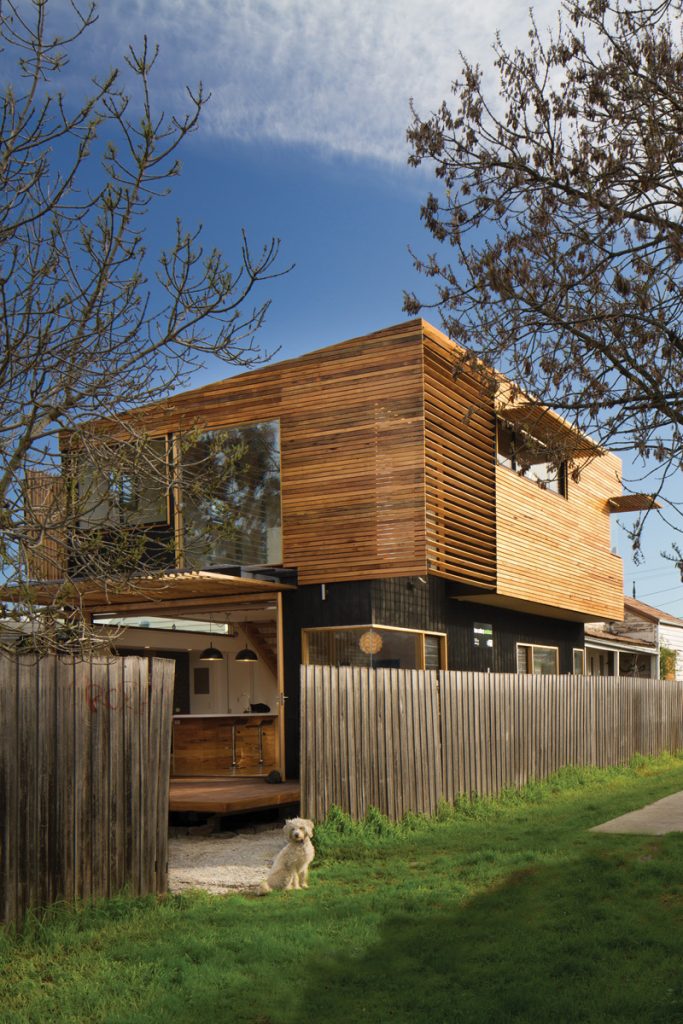
Callery knew the front three rooms were in reasonable condition and could be revived without much fuss. The shabby exterior would eventually need work, but not before a rear, cantilevered addition was created to transform the interior into a light, airy family home with low embodied energy, a flexible floor plan and pockets of “selective seclusion”.
“There were really horrible lean-tos – a disgusting kitchen, tiny bathroom and laundry,” Callery recalls of the original house. “You wouldn’t have even known the backyard existed, it was a rabbit warren to get through all of them. And then this huge shed and a tiny backyard and outdoor toilet.” Beyond that was a massive two- car garage that would eventually become surplus to requirements.
Callery undertook the 12-month build three days a week around his day-job, with help from his dad and several friends. During this time the family crammed themselves into the original rooms at front of the house. Younger daughter Ruby was born part-way through construction. It’s not, he concedes, a strategy he’d recommend to clients, but it definitely made building more convenient and kept a lid on costs.
With a decade of sustainable design under his belt, Callery was about to start his own practice. So whatever he and Brigitte decided to do to their place needed to meet the family’s changing needs while showcasing his design approach and avoiding the temptation to cram in every good idea he’d ever had. The key was a lightweight, well-oriented, heavily insulated construction low in embodied energy and quick to respond to Melbourne’s dramatically changing temperatures. “Everyone seems to think (thermal mass) is some sort of panacea for sustainable design, which is fine, but this was an opportunity for me to think about doing it another way with lightweight materials,” he says. “While mass can help maintain stable temperatures it still does usually require energy input for heating, and has significant embodied energy.”
Eschewing ensuites, the pair opted for several similar sized rooms upstairs and down (all with 1.5–2 metres of built-in storage and close proximity to central bathrooms on each floor), designed to perform varied functions over time: bedroom, study, living rooms, play spaces. The ground floor rooms at the front of the house may eventually become bedrooms for the girls, who for now share a room upstairs. A home office/piano room downstairs will probably become an adult’s living room once an upstairs study is fitted out. An upper level play space beside the girls’ bedroom could be enclosed should the need arise. The varied possibilities are keeping things fresh as well as flexible. “You don’t have to put a label on everything, do you?” Callery says.
At ground level the original dining room was sliced in two, making way for a laundry and small bathroom that in turn made it feasible for the family to stay put throughout the renovation. A central hallway was extended into the heart of the home, addressing a quirk of the old place that meant accessing the rear garden via a side door facing the lane and side deck.
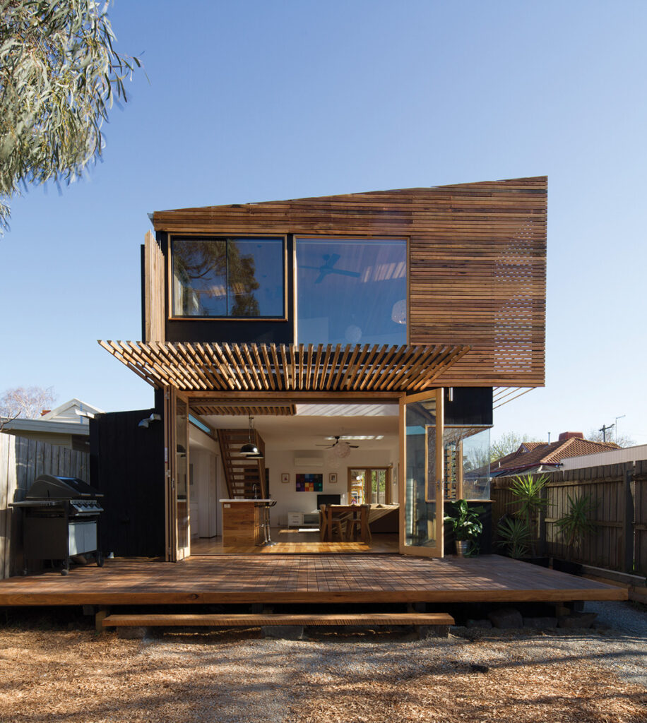
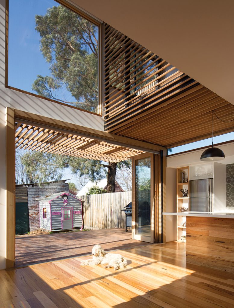
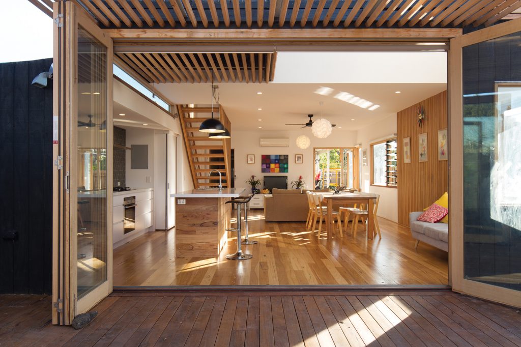
Brigitte was keen not to simply default to the standard open plan kitchen-dining-living room configuration at the rear of the house. With a generous 7.5-metre-wide site and ample northern sun at their disposal the pair had plenty of options. They designed a rear living space that opens onto an airy, double-height void that’s carefully orientated, glazed and cross-ventilated to flood the space with natural light, warmth, breezes and views of the surrounding trees. Varied hardwoods – recycled, re-milled, salvaged, radially sawn and sourced from seconds warehouses – add visual warmth and appealing textures and imperfections.
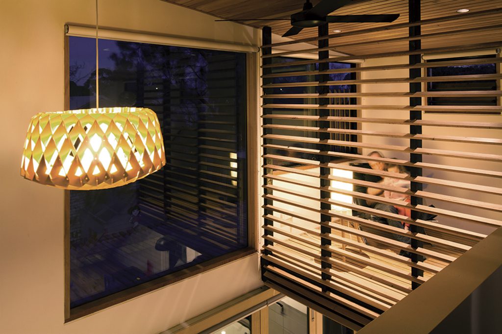
Within the void at ground level are a rear dining space and adjacent kitchen, tucked deliberately into the back corner for sightlines throughout the house and easy access to the full-width timber deck and garden. Above is a slatted timber study that seems to float, nest-like, amongst the trees. Callery says it was designed to provide selective seclusion from the activity below and from the girls’ bedroom and play space opposite. “What I was trying to create was somewhere I could work after hours, or where the kids could do homework,” he says. The last thing I want to do is be the sort of person who locks themselves away in a room, away from the rest of the family. I want to be part of the family all the time, and be able to work in that environment.”
Specs
Architect and builder
Ben Callery Architects
bencallery.com.au
Passive energy design
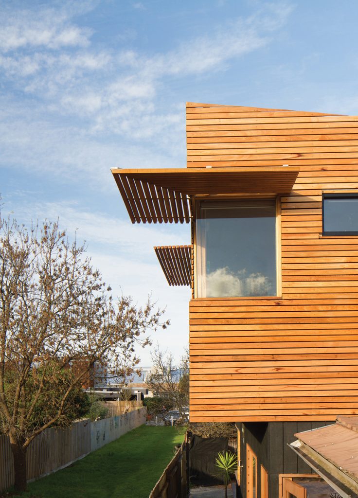
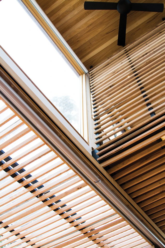
The roof rakes dramatically northwards to maximise solar gain. The angled external timber louvres block out summer sun while letting winter sun penetrate. The upper floor cantilevers to create floor space and provide sun shading to rooms below. Cantilevered awnings to the north, east and west provide
sun and rain protection and augment the sense of “floating” upstairs. The north-facing, two-storey void facilitates deep solar gain, important in Melbourne’s cold winters, and creates cross-ventilation for hot summers. The south-facing glass louvres on the upper level are oriented to catch the prevailing cool breezes over the top of neighbouring rooftops. The louvred timber privacy screens and the full height louvred timber balustrade create seclusion but are also angled to function
as baffles directing these breezes downwards into living rooms below.
Materials
Much of the timber is recycled, including Victorian ash floorboards re-used in a bathroom vanity. Most timber that isn’t recycled is locally sourced, radially sawn hardwood milled in a low-wastage manner by Radial Timber Sales. Discards, “seconds”, returns and out of spec material were also used. External cladding at ground level is Shadowclad plywood grooved cladding, finished with Quantum Aqua Oil Ebony stain. First-floor cladding is Shadowclad plywood pre-primed cladding with hardwood slats on top. External hardwood slats and sun shading awnings are made with radially sawn Silvertop Ash finished with Quantum Quantec wood preserver. External Decking features radially sawn Yellow Stringybark with Quantum Quantec decking finish. Internal wall and ceiling lining is radially sawn Silvertop ash finished with Quantum Invisiseal. Window frames are kiln dried Victorian hardwood. Doorframes are finished with Quantum Timber Plus.
Flooring
Floors are recycled, re-milled Victorian Messmate finished with Bona Traffic.
Insulation
Wall insulation is Earthwool R2.5 batts with 80% recycled content. Ceiling insulation is Aircell Glareshield plus Earthwool R5.0 batts with 80% recycled content. Floor insulation is R1.5 polyester roll.
Glazing
Double-glazed, low-e coated (comfort plus) glazing is used for all windows except louvres and butt jointed glass corners, which are low-e coated only.
Cooling
Universal ceiling fans and Fujitsu Reverse Cycle air con.
Heating
Custom hydronic heating.
Lighting
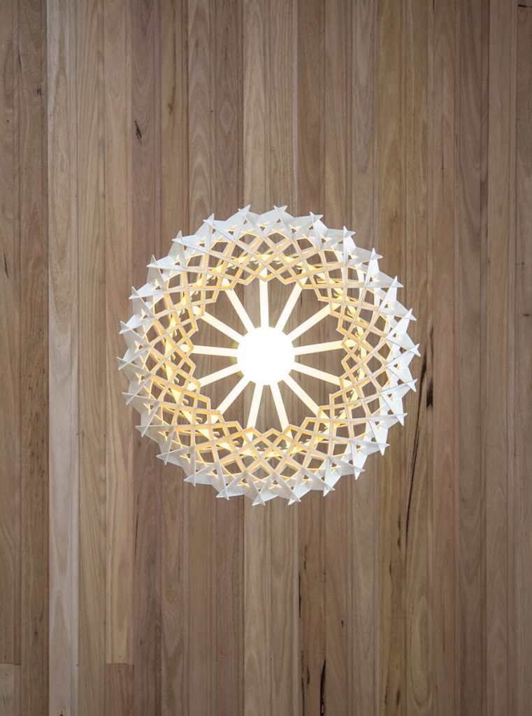
Low energy LED and compact fluorescent lighting.
