Narrow Victory
Creating a fully flowing family home from a dark Fitzroy terrace disconnected from its north-facing rear meant careful reprogramming of its five-metre-wide site.
Afamily of four happily rusted onto its inner city Carlton Gardens community in Melbourne, with kids nearing their teens and in imminent need of more space, were facing a tough decision. Would they renovate a cramped, 1880s terrace to improve light, functionality and indoor-outdoor connection or simply start again on a bigger block further out?
“‘Make it work for us for the next twenty years’ is a brief we get a lot,” architect Andrew Maynard says. “We become this sort of circuit breaker. People invite us into their decision- making process. It happens more and more: ‘Come and
have a look. Are we leaving, are we moving out to Reservoir, or are we staying here?’ So we have to work through some options to see if we can make it (happen). We work through the economics of it as well. How you spend … capital is a sustainability issue.”
Maynard and his partner, Mark Austin, were confident they could meet their client’s fairly modest brief: an extra bedroom, a more functional kitchen, retreat space for adults, and living and entertaining spaces that flowed seamlessly between indoors and the north-facing garden that all agreed was a prized asset. Retaining the best of the original home – which was in surprisingly good nick – was important too, particularly a central art room, views to a neighbour’s magnificent gum tree to the north, and a lightwell containing a seven-foot Japanese maple as tall as the double-storey house.
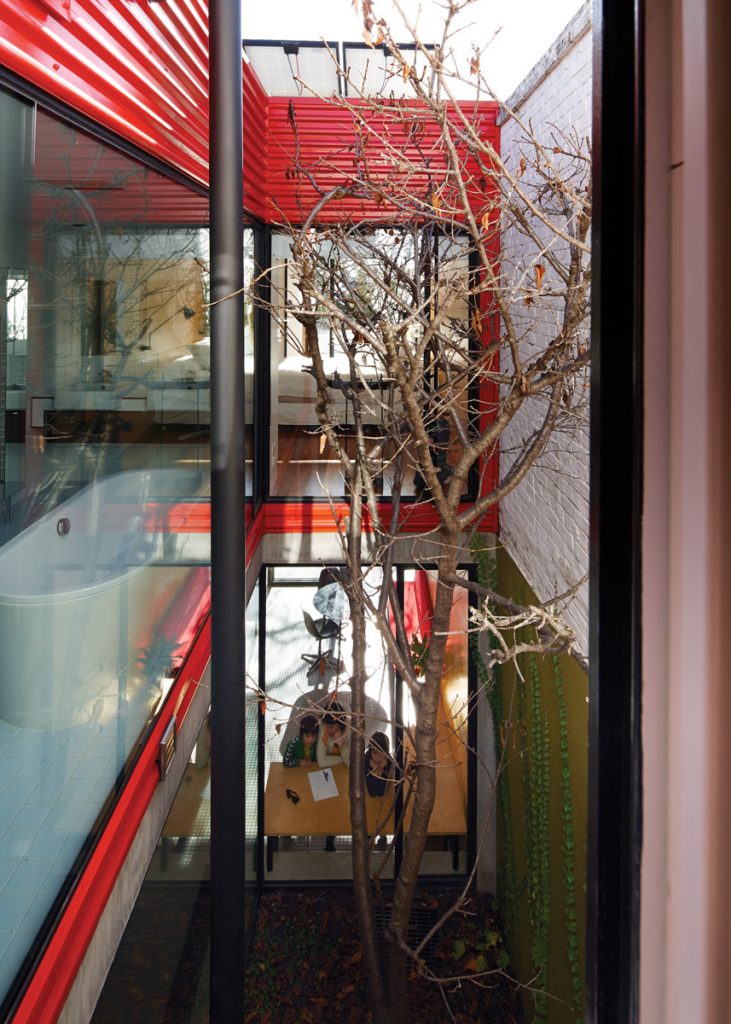
Maynard and Austin describe the lightwell as the family’s “intercom”, allowing constant conversation between rooms and storeys. They were as keen as their clients to use it as a central feature of the new design.
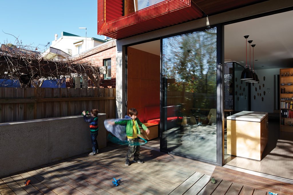
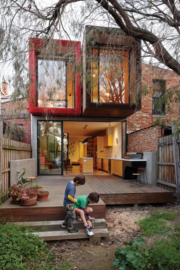
To achieve all these requirements on a 208-square-metre site just five metres wide and surrounded by a mix of small, mostly un-renovated terraces, workers cottages and factories, by simply grafting on a monolithic, modernist box was not an option. From the timber deck at the rear, the renovation now reads as a collection of little boxes, cantilevered in places to cut out summer sun and encased in red corrugated iron as a nod to the neighbourhood’s old factory roofs.
“One thing we’re always reluctant to do is build just one big, aggressive architectural box on the back of a house,” Maynard says. “All around this area it’s in pretty original nick. There’re all these little brick lean-tos. There isn’t much new architecture around there and there isn’t much on a big scale. So we’ve tried to make it a bit of a Tardis, where it’s made out of smaller bits. We’ve tried to defy logic a bit.”
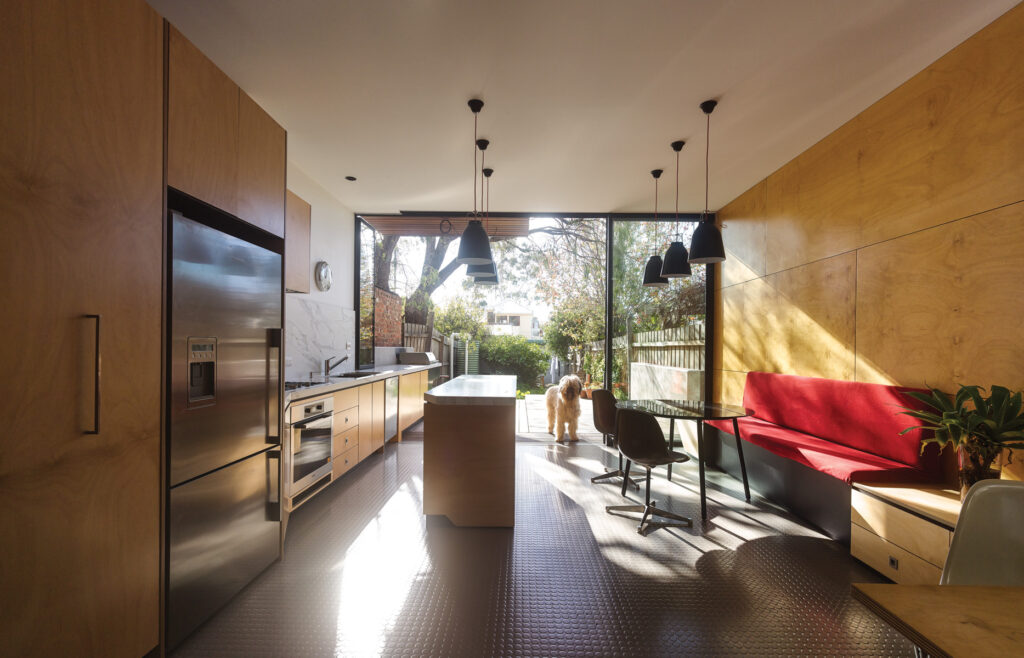
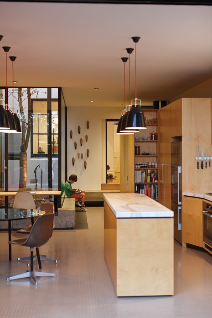
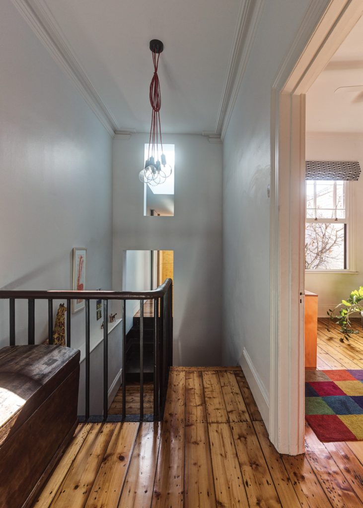
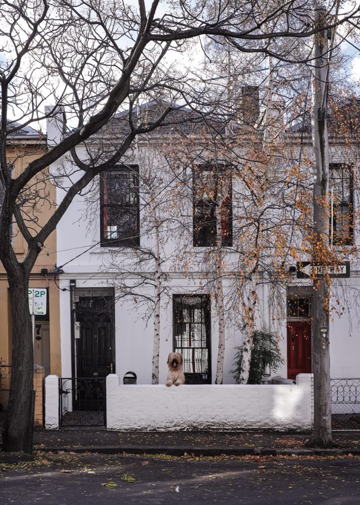
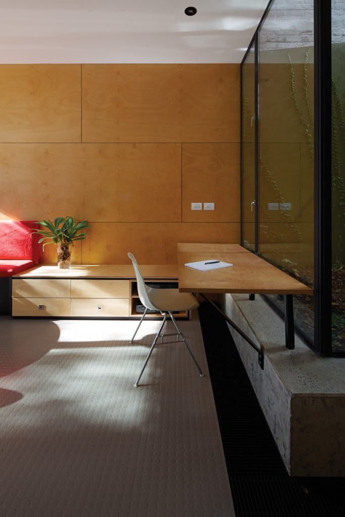
A heritage overlay on the property created no hardship. At the front the team elected simply to repaint the rendered exterior and retain original rooms and the staircase. The back of the old place was demolished, replaced on the ground floor with a long, narrow living, dining and kitchen space that extends all the way into the garden. It’s a deliberately modest affair with built-in banquette seating, a desk to one side for study, and full-height glass sliding doors to separate the interior from the garden as required. A super-long kitchen bench juts out of the house onto a timber deck. It’s capped with a built-in barbeque and finished in marine ply to protect it from the elements. Inside, back down the corridor, a new laundry and bold, bright red bathroom are concealed inside a plywood box.
Upstairs is a new and relatively palatial master bedroom offering glorious views over the garden towards next door’s towering spotted gum, and across greater Fitzroy. Internally, site lines extend throughout the upper storey via full-height internal glazing, through to the children’s bedrooms, a sumptuous bathroom
also with an exterior wall of glass and, naturally, to the stunning lightwell that ties the entire design together.
Now expanded, encased in double-height glass that makes it visible throughout and between floors, and ringed at ground level with concrete bench-style seating that provides a delightful spot to read or chat, the lightwell and its miraculous maple are the undeniable stars of the show. It’s a practical feature that illuminates the formerly drab interior, improves aesthetically on the old internal “intercom”, delineates old and new sections of the house, and absorbs the various changes of level that were a hallmark of the old place.
“We always try to play with these level changes when the brief and the site and the client allow it to happen,” Austin says. “But it is hard to do. It’s got to make sense both functionally and in terms of the site.” Maynard says the clients are delighted with their newly found access to northern light, and the interaction between house, timber deck and garden at the rear. For him, though, the “Tardis” treatment of new spaces as unobtrusive collections of objects is a highlight, and an idea he’s keen to explore further in the future. “We’ve avoided doing ‘masculine’ architecture,” Maynard says. “That stuff that just goes, ‘I’m here, everybody else can just get stuffed’.”
Specs
Architect
Andrew Maynard Architects
maynardarchitects.com
Builder
TCM Building Group tcmbuildinggroup.com.au
Passive energy design
The rear faces north and the overhang of the first floor and the reveals of the upper-level windows provide sun shading to the interiors. Cross ventilation is provided to both the upper and lower levels of the addition. The build also includes the highest R-value insulation available (for cavity depth installed), solar hot water and panels, and water tanks.
Materials
The ground floor features a concrete slab on ground. The first floor is timber. External walls have block cavity veneers to the external boundary walls. There’s metal cladding to upper level (painted spandeck) and spotted gum shiplap timber external cladding. The roof is made from clip-lock metal deck roofing. Steel-framed windows with double glazing are used throughout.
Internal walls and ceilings are painted plasterboard or AA grade hoop pine veneer plywood with oil finish. The bathroom features ceramic wall and floor tiles,
Flooring
Pirelli rubber flooring salvaged from the original house is used on the ground floor. There’s an oiled steel plate stair and steps and, on the upper level, spotted gum floorboards finished in oil.
Insulation
Knauf Earthwool was used in the roof (R6.0) and walls (R2.0 HD). Slab edges are insulated with R2.0 Isoboard XPS extruded polystyrene rigid foam board.
Glazing
The house uses steel-framed windows from Skyrange Engineering and Viridian Thermo-tech clear DGUs.
Heating and cooling
The home has no air conditioning. There’s hydronic heating throughout: panels on the first floor and trench heating at ground level.
Hot water system
The house uses a solar boosted gas hot water system.
Water tanks
In the garden are twin Aquasteel corrugated Colorbond rainwater tanks.
Lighting
The addition uses low energy and LED lighting.
