Modest Gains
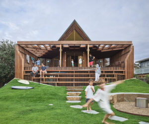
Designed with a certain nostalgia, this new weekender takes the best of the fibro shack ideal – simple amenity in a beautiful location – and interprets it with contemporary materials and the essentials of sustainable design.
No-one seems more surprised than architect Andrew Maynard that a deliberately modest brick extension in Northcote has recently earned him a swag of award nominations including short listing at the World Architecture Festival in Barcelona. Originally envisaged as a showcase of ethically sourced timber by clients with a background in the timber industry, Maynard’s design morphed into a celebration of the humble brick when a building covenant on the property proved intractable. The architect says it’s far simpler than his usual deeply layered work and represents his “greenest house so far”.
It’s fortunate that Tassie-born, Melbourne-based Maynard gets a kick out of dreaming up exciting possibilities for bog-standard products like bricks. Despite the undeniably high thermal performance of the humble clay brick, especially when paired with high performance insulation, it’s rarely a “star” of contemporary sustainable design. Indeed, if Maynard’s clients had had their way, it would have been timber rather than brick that was showcased in the recent renovation of their heritage-listed Californian Bungalow in Melbourne’s inner north.
The couple had worked in the timber industry “and even if the people they were employed by weren’t necessarily always doing the right thing, Anna and Cam were keen to do the right thing,” Maynard says of his clients. “So they came to us under the premise of ‘yes we want a sustainable house but we also want it to be a sustainable house that shows how timber can be used ethically: farmed, recycled’. So we ended up designing this beautiful timber box for them.”
When Maynard began work on the project in June 2009, his clients were keen to redress their existing home’s dislocation from its huge north-facing backyard with some spectacular established trees. This was a result not only of the original design but a typical 1940s addition that placed wet areas in brick lean-tos at the back of the house, visually cutting off living quarters from garden. The brief was a renovation that linked indoors and outdoors, introduced open-plan living and dining spaces, modernised bathroom and laundry, added an extra bedroom and, with an extra storey, maximised elevated views south to the city and east to the Dandenong Ranges.
Much to Maynard’s relief his clients understood the principles and importance of good passive solar design and were committed to keeping the house smallish and the garden large. Keen also to reduce their ecological footprint, they were even prepared to forego the ubiquitous ensuite to save space and keep plumbing streamlined.
The clients’ vision for an addition that celebrated timber was always dependent on their being able to negotiate their way around a building covenant applied to 100 houses in their street, which required homes to remain predominantly brick and roofs to be tiled.
“It’s aspirational,” Maynard says of the covenant. “It’s 100 years old, so people were knocking up weatherboard houses and this was meant to be the posh street in Northcote. But it’s never been removed because just negotiating with 100 people … is impossible. And Cam did try to fight it. But I just eventually said, ‘Look, I understand you want to do something that shows how ethical timber can be, but we can do both here. We can do something really interesting with the fact that we’re knocking down a whole heap of brick. Why don’t we make it more about a sustainable agenda, not just about timber?’”
For Maynard the planning restrictions imposed on the site produced creative challenges he relished. “Res Code is always hanging over you – setbacks, overlooking,” he says. “But I always actually treat that as sport, I quite enjoy that.” Ditto the intractable covenant demanding a predominantly brick structure. “When Cam was annoyed about the covenant I was thinking about all the cool things I could do with it (brick),” Maynard says.
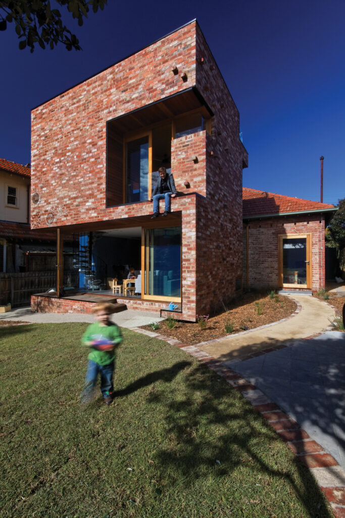
The architect’s solution was to retain the rooms at the front of the house, knock down the lean-tos at the rear and re-use the bricks to create a simple “box” at the back of the house and attach it to the original hipped roof. The new structure reads clearly as an addition but Maynard says being forced to use brick actually helped him tie “the material language of the new structure back into the original house“. It also reduced waste, landfill and the need for transporting materials from off-site. Brick could have made for a heavy looking structure but one of Maynard’s trademark graffiti “tattoos” on the façade lends it delicacy and lightness. So too do timber and glass “cutaways”, which not only improve solar access but splice the design with carefully selected views into and out of the interior.
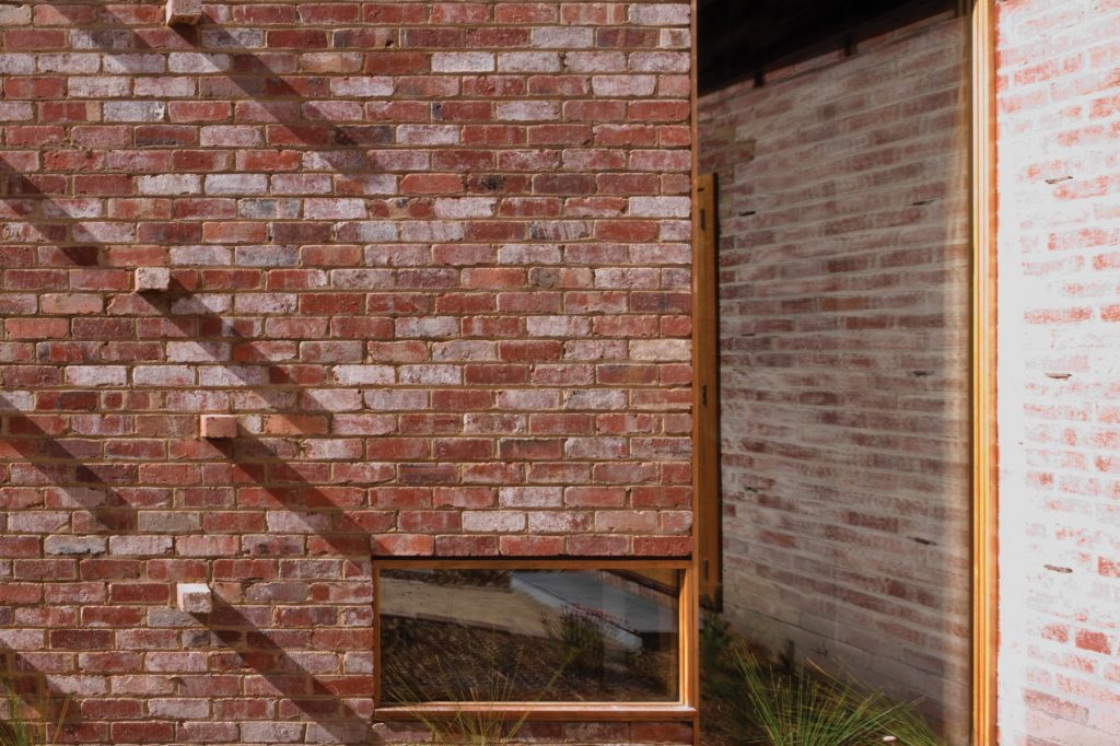
“Passive solar gain was a really important feature of this house but it’s also an exploration of brick,” says Maynard. Keen to see how a plain material could be used as an embellishment, he created a pattern of turned-out bricks along one wall.
He describes the protruding pieces as “grab points” that will allow the garden to grow upwards, adding thermal mass as well as visual appeal. Interested also in playing with the perceived impermeability of brick, he created a solid, raw brick box and effectively cut out sections using contrasting materials like reflective glass and warm timber edging to expose the “skin” inside. Indeed, viewed from the rear the whole lower storey looks like it’s been cut away, making the level above seem to float.
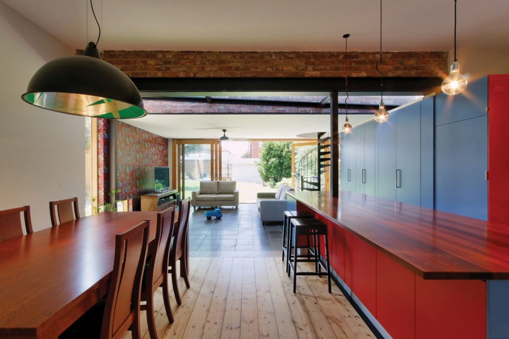
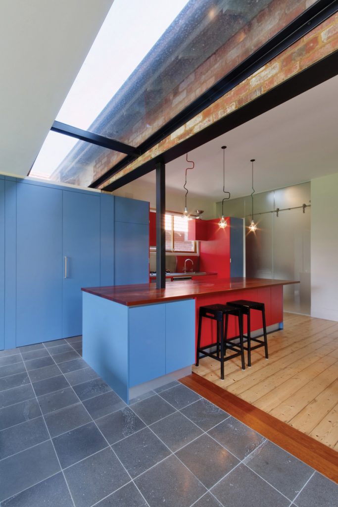
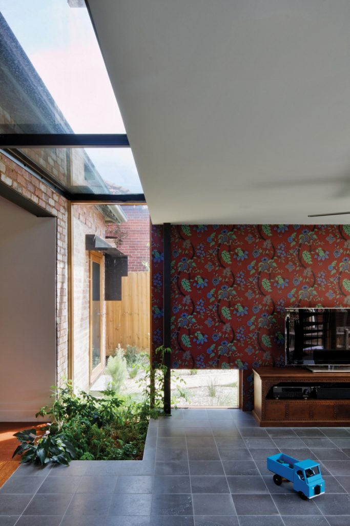
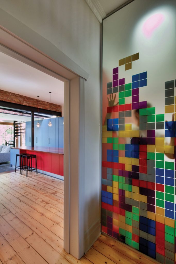
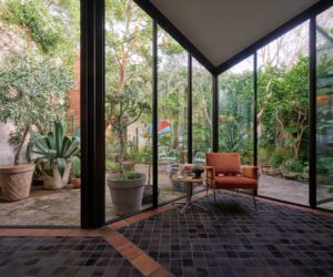
In keeping with the “small is green” philosophy applied on this job, the interior is deliberately small-scale and simple. On the ground floor there’s a compact kitchen, dining and living area punctuated by glass cutaways in ceilings and walls that link indoors with the garden outside. An additional cutaway in the bluestone floor houses a small, unexpected internal “garden”, which is currently sprouting tomatoes. Centrally located wet areas are screened for fun using semi-translucent glass embellished with vibrant “tiles” of adhesive colour. Maynard says the idea was to allow human figures to be read as shadowy movement. It’s a cheeky touch some clients would have baulked at. “Once it was all done Anna and Cam went in and they actually did ‘dropping the daks’ tests with one of them standing here looking at it,” he recalls with a laugh. “Eventually they deemed it was a bit too open so Anna went and got these great … Tetris stickers, so it’s got Tetris cascading down. You can still see through it, but not quite as much.”
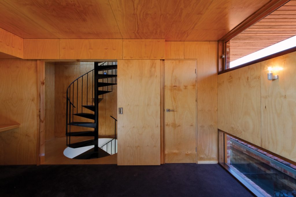
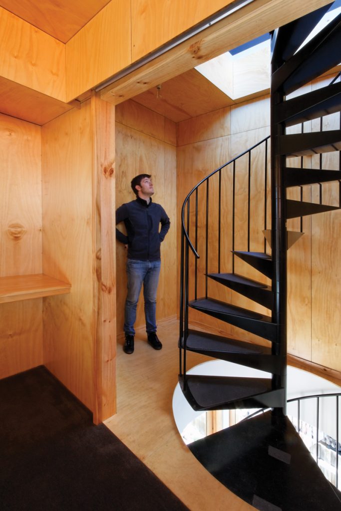
On the upper level a master bedroom finished in simple plywood capitalises on those lovely vistas. There are long panels of glazing at ceiling and floor level, black carpet (one of many small gestures towards passive solar gain throughout the house), a walk-in robe where an ensuite might have been, and sliding plywood doors out to a spiral staircase of black powder-coated steel, which links both levels literally and visually. Thanks to the carefully placed glass cutaways the staircase “reads” throughout the entire building, rising up almost like a structural post, according to Maynard. Its flat blackness offers another striking contrast to the rawness of the surrounding brick and plywood, and its open tread allows natural light to permeate
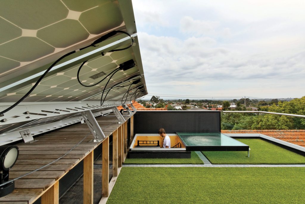
all around it. It is shaded from above by a service deck housing an array of eight solar panels that generate enough energy to power the house year-round and contribute energy to the grid during summer. Covered in synthetic turf to form a thermal blanket, the deck also offers spectacular 360 degree views.
Maynard enjoyed including some hazily defined spaces like a stepped deck leading subtly from the house to its sloping garden. “I really like playing with edges of things so you can inhabit the edge,” he says. “I always think that’s where the human animal wants to be. But if you can blur that boundary you don’t have to make that conscious decision of, ‘Right, I’m going outside now’, you just find yourself outside.”
But it’s the modesty of this design that pleases him most. It’s an approach that’s at odds with the “deep layering” he describes as a hallmark of much of his work, and it’s not one he expected would scoop awards. “I thought it would fly under the radar,” he says with a grin. But the interest it’s generating from media and colleagues alike could be read as a vindication of Maynard’s belief that genuine sustainability owes less to fancy gadgets than good passive solar design that reduces waste and celebrates simplicity. “We could have brought in the most efficient products from Germany,” he says. “But I wanted to do something green that resisted gimmickry and consumption as a way of getting there.”
Specs
Architect
Andrew Maynard Architects
maynardarchitects.com
Builder
TrimBuilt
trimbuilt.com.au
Materials
Red solid clay external bricks were recycled from the demolition. Some additional bricks were sourced locally from Paddy’s Bricks. Internal plywood from Austral Plywoods was 6 mm Boral BC premier wood high grade smooth, which was lightly sanded and finished with clear seal.
Kitchen joinery was designed by Andrew Maynard Architects and made by Kitchens for Trade. It features a stainless steel benchtop, brushed aluminium kicker and cupboard doors and drawers with a laminate finish. The staircase was constructed by Enzie Spiral Staircases using steel finished with black powder- coated paint, with matching balustrade and vertical uprights. The honed and sealed bluestone floor in the living room was supplied by BAM. A lockable metal roof hatch made from Colorbond was insulated and installed with thermal perimeter seals.
Finishes
Internal walls were finished with Dulux Berger Breathe Easy Low VOC paint.
Insulation
Walls were insulated with R2.0 Tontine thermal and sound batts recycled (85%) polyester batt insulation and aluminium sarking. Ceilings use aluminium sarking over purlins under roofing. Tontine R4.0 thermal recycled (85%) polyester batts between purlins were used over ceilings and to the first floor.
Electricity
All electricity required to run the house is supplied by eight grid connected 1.6 kW PV panels, with the inverter located on the roof.
Heating and cooling
Due to careful passive solar design the only heating required in winter is provided by an existing gas heater. Cross ventilation and ceiling fans provide cooling in summer.
Lighting
Cable Jewellery pendants were designed by Volker Haug.
Water
The water-harvesting system servicing toilets and garden includes a bladder installed to sub-floor of the original house.
