Less is More
Adaptable, intuitive and interactive joinery has liberated space in this two-bedroom apartment in Manly, Sydney.
For Adriano Pupilli, architecture is about creating a healthy environment that has a positive impact on people’s lives. And with smart space planning and intuitive storage solutions, his practice, Adriano Pupilli Architects, has certainly achieved that in this two-bedroom apartment in Manly, Sydney. The formerly dark, claustrophobic and cluttered share house is now a light, spacious and adaptable family home.
Carol Saab and Ryan Hunter formerly lived in a 40-square-metre one-bedroom apartment, and while they didn’t have much stuff at the time there was no doubt they would quickly accrue it with their baby on the way. As Adriano’s neighbours, the couple had a good sense of his design ethos and approach and they engaged him to renovate their art deco apartment. “Adriano was big on maximising storage wherever possible,” says Carol. “He knew we were going to need it.”
Adriano’s principle concept centred on creating generous open space – “room for life to unfold,” he says – by affixing as much as possible to the walls and grouping all utility services in a central core.
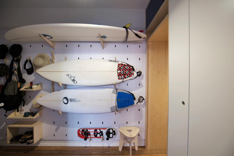
A storage wall at the entrance of the home has been designed to keep surfboards, skateboards, running shoes, baby accessories and everyday essentials off the floor and in one convenient location.
The digitally fabricated wall – like a “reinvented pegboard” – is made from sustainably sourced plywood and has a series of holes for lightweight hooks, shelves and compartments to be inserted and moved as needed. “It’s become quite a feature and talking point,” says Adriano. “Ryan loves that the boards are the first thing guests see when they arrive.”
Between the entrance and living area, Adriano created “the portal” – a deep and functional timber-lined passage that accommodates a laundry, hides the utilities of the house and conceals shelving for shoes. The portal also creates a sense of transition and marks the arrival into the open-plan living space, the room in which family life, activities and gatherings take place.
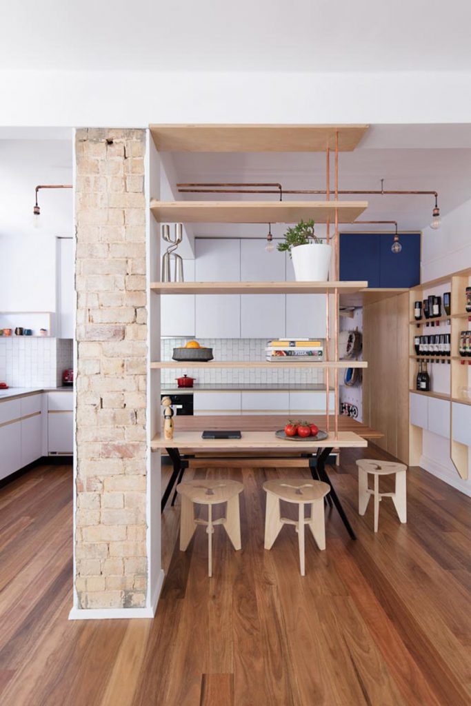
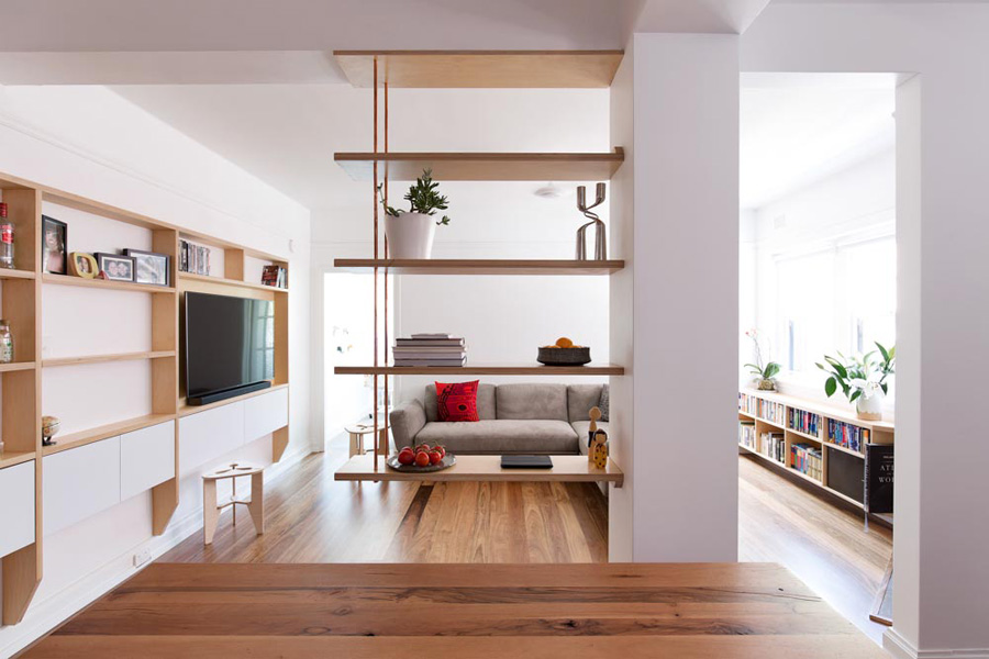
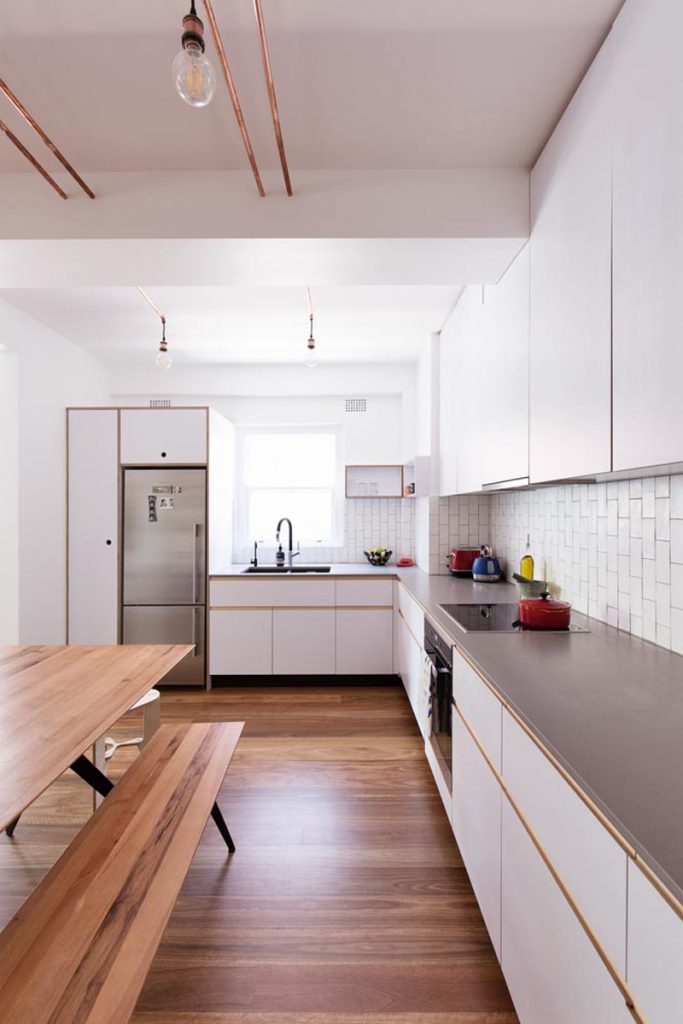
The removal of two walls has transformed the formerly dim and compartmentalised rooms into one light and open area accommodating a large kitchen, dining area and lounge. A timber and copper suspended shelving unit in the centre brings a sense of division without closing off space, reducing natural light or limiting visual connections. “What you take away is often what you really give to a project,” Adriano explains. “In this case taking out the mass and heaviness of the walls really liberated the home.” It also vastly improved the natural light and ventilation, with only ceiling fans needed, even on very hot days.
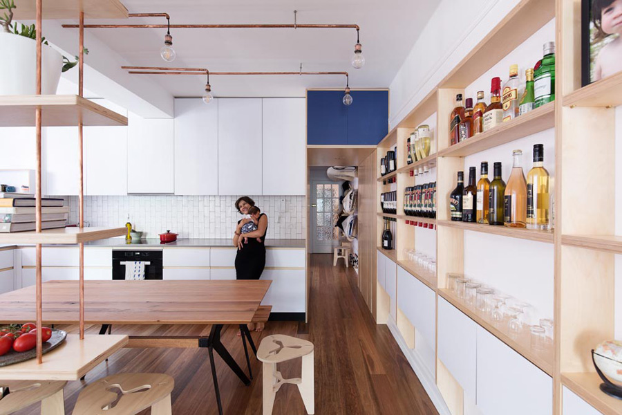
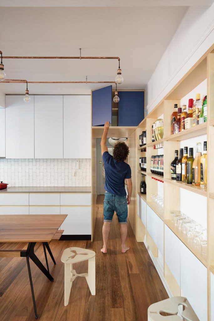
Finely crafted joinery on one full wall of the living space provides what Adriano refers to as “the activity wall”. The FSC birch plywood joinery has been designed to store wine bottles, glasses, DVDs, the television and other media. Cupboard doors conceal wiring and a moveable surface serves as a bar when needed. The joinery also means minimal furniture is required, which enhances the sense of space, keeps things off the floor and makes it easier to clean.
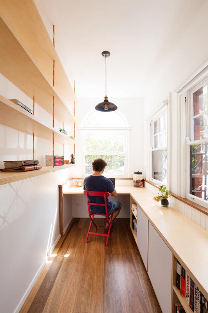
A built-in bookcase on the opposite wall extends from the living area into the home office where it transforms into a desk. “Adriano understood the balance of functional and beautiful. We love the lines and the symmetry, and the joinery is seamless throughout,” says Carol.
Despite the modern additions, the art deco character of the apartment remains with the original brick fireplace and one side of a brick column exposed. The copper lighting fixture that runs along the kitchen ceiling (to avoid chasing into the slab above) is also in keeping with the era as well as the apartment’s contemporary feel. “We thought why not make it something interesting? So we introduced a material that tells a story and tarnishes over time,” Adriano explains.
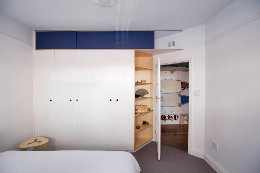
The chamfer wall in the master bedroom also retains the apartment’s art deco heritage. Angled open shelves echo the chamfer, while built-in cupboards – in both bedrooms – have navy blue sliding panels that can be repainted should Carol and Ryan wish.
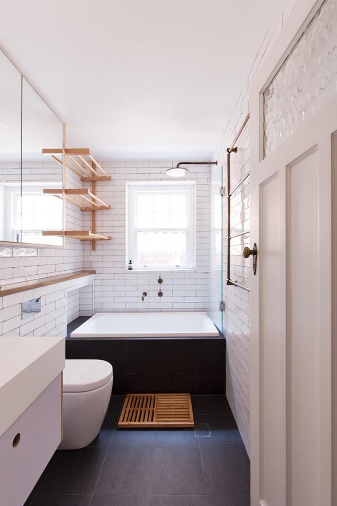
The bathroom is also cleverly designed with a fold-down timber rack for drying wetsuits, swimsuits, running gear, snorkels and clothing, draining directly over the bath.
Ryan and Carol’s baby boy Monty was born just two weeks after they moved into their renovated apartment. And now with adaptable, interactive and changeable elements, it is a home in which the family of three can easily live and grow. The suspended shelf can be altered; joinery can be redesigned; and cupboard doors can be repainted – and all without intervening within the space or structure. “It’s a balanced mix of old and new and neutral enough that we won’t outgrow it. But if we do, it’s very easy to change,” Carol explains.
“I think they really like the adventure of seeing what can come out of the space,” says Adriano.
Specs
Architect
Adriano Pupilli Architects
adrianopupilli.com.au
Builder
Mark Nicholls
Joiner
Brookvale Joinery
Concept
Built less to live more, this project takes away rather than adds. All utility is moved to the perimeter of the rooms and a central service spine containing laundry, kitchen and storage frees up the rest of the home for living. Adaptable joinery with folding, flipping open surfaces allows the residents to personalise their home.
Passive energy design
Located on the south-east corner of an art deco apartment block the design needed to overcome the difficulties posed by the south orientation and lack of northern light entering the living spaces. By removing walls and doors and building highly see-through furniture into the walls, the house successfully bounces light deep into the floor plan and reduces the need for furniture.
Materials
Birch plywood sourced from sustainably managed forests, FSC, joinery, E0 low-voc emissions. Copper piping used for lighting and shelf supports to create patina and textural interest. Dulux Wash and Wear low-VOC paint. Recycled art deco door sourced for the master bedroom and study door removed and placed on front bedroom.
Flooring
Spotted gum floating floor with cypress pine flooring beneath retained to achieve additional insulation. OSMO Polyx Raw clear finish.
Glazing
Existing double-hung timber windows retained, sanded back and painted.
Heating and cooling
Natural gas connection points in strategic locations to allow for portable gas heaters in winter. Ceiling fans installed with LED lighting to cool in summer.
Hot water system and plumbing
Common gas hot water system for the apartment block. Water saving devices fitted to all taps and appliances.
Lighting
LED lights used throughout. Copper work to kitchen lighting by the builder in consultation with the architect and client. This was done as a clever way to avoid the expense and risk of chasing new lighting conduit into the ceiling slab. Achieving light where it needs to be and providing some visual interest and material texture.
