Lantern House – Bayside Albert Park Terrace
A series of high-impact design interventions have transformed this terrace, making use of every millimetre.
Mornings in this pocket of bayside Albert Park in Melbourne are quiet and calm. Apart from the shoe stomping from the odd panting runner and the few local dogs being walked by owners along the sand, the bay with its distant flashing lights and shipping lanes is still and glassy.
This calm before the storm, as it would seem, is promptly replaced by a hubbub of various modes of transportation zooming by, not more than a few metres from the sand bank. On the other side of this busy main road is the outer perimeter of a leafy residential area with minimal front setbacks, wide streets, and significant heritage built fabric.
Topology Studio were commissioned to design a renovation of one of ten identical two-storey Victorian terraces built in the late 1800s, primarily to address the inherent challenges of the home as it straddles a residential neighbourhood and a main vehicle thoroughfare.
“At the time we purchased the house, our second bathroom and laundry were in a separate add-on, as was common in turn-of-the-century terrace houses, connected by a fibreglass-roofed passage. Although the connecting back kitchen/dining area faced north, there were no windows on that side, only a west-facing window onto a neighbouring brick wall,” explains the client, whose design brief steadily grew from a mere ‘update’ to a considerable alterations and additions project.
Still, with a floor area of no more than 27 square metres for the addition and 38 square metres for the alteration, the extent and scope of the project focused on high-impact critical design interventions that maximise a relatively small budget.
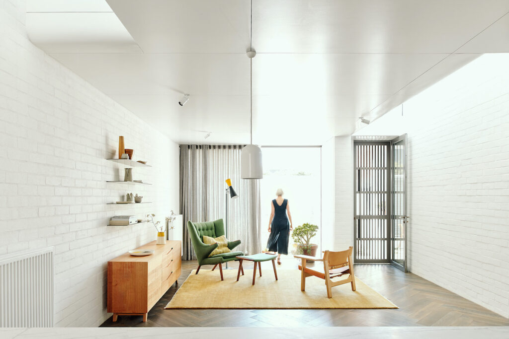
Lacking a sense of refuge in the front garden, both from the road noise and prevailing winds, the home was rearranged to provide dual orientations. The principal rooms of the original house address the bay and the ever-changing view while the new portions of the house entail a second sheltered orientation to the north.
“We saw an opportunity to reorganise the plan to engage with the garden and improve the sense of entry when arriving at the rear of the property by reorientating the home to engage with the lane,” explained Topology Studio directors Amy Hallett and Darren Kaye.
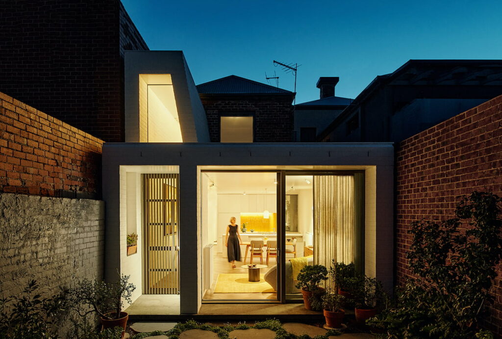
The garage roller door opens to reveal a diagonal pattern of permeable concrete paving under foot. This type of porous paving allows stormwater to percolate into the soil between the gaps and hardy grasses to grow beneath any parked vehicle. A garden with a vegetable patch, a place to relax in the sun, a seat for a morning coffee, an enclosure for garden tools, tank water storage, and a spot to park the car: it’s clear this little urban backyard is working hard to accommodate many concurrent functions.
The massing of the house directly responds to the built adjoining context. Cheek-to-cheek, an architect’s skill is often tested in navigating stringent planning requirements and amenity impacts to neighbours. In this case, the ground level additions abut and are no taller than the neighbouring wall on the west boundary, with the roofline swelling upwards to meet the two-storey dwelling on the east boundary. All-in-all, the envelope is respectful of daylight access and perceived building bulk from the perspective of the people on the other side of the brick fence.
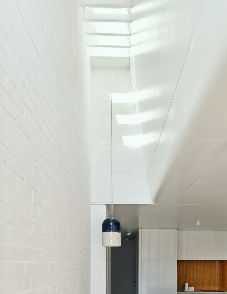
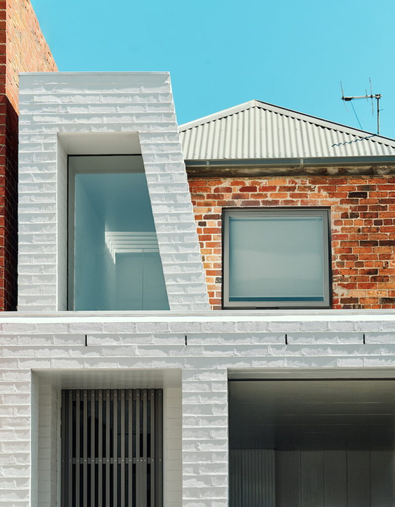
The entry sits beneath Lantern House’s namesake – a peculiar trapezoidal-shaped vertical clerestory form, as if a lantern was carved out of the white-painted brick exterior shell. The front door is concealed beyond a breezeway batten gate with flywire, allowing for secure cross ventilation and night purging (via the operable skylight) during the hotter months.
Restricting the additions to a functional yet compact floor area ensured that the budget was not overly stretched, prioritising locally-sourced fittings and quality building materials that were easy to maintain, and stand the test of time. Availability during the recent pandemic was also a consideration.
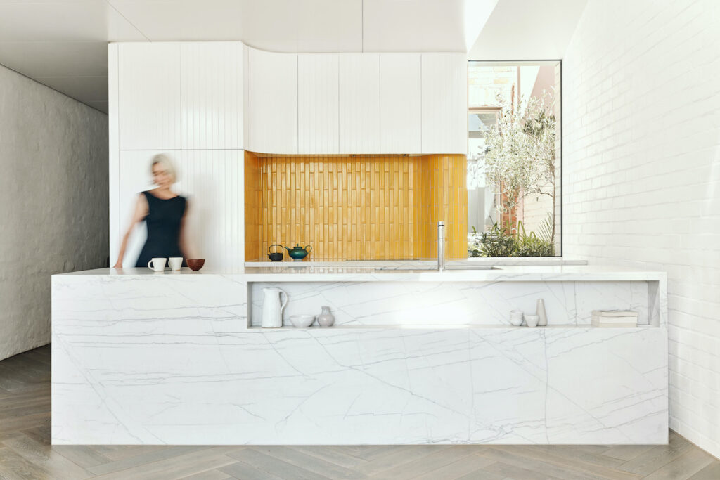
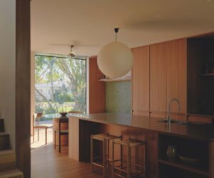
Hand-painted ply-lined cabinets are a charming departure from the sterility of typical factory-applied two-pack MDF kitchen joinery. Touching up the inevitable ding is but a lick of paint away.
An enduring maker’s mark, the very same visible brush strokes seen on the cabinetry appear even more visible overhead as daylight flooding in bends around a curved ply-lined ceiling. These radiused surfaces soften the boundary between the bright incoming light and the penumbrous shadowy underside of the ceilings.
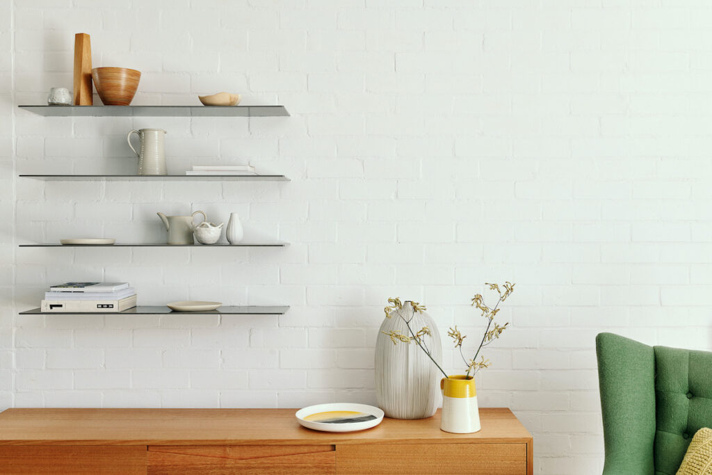
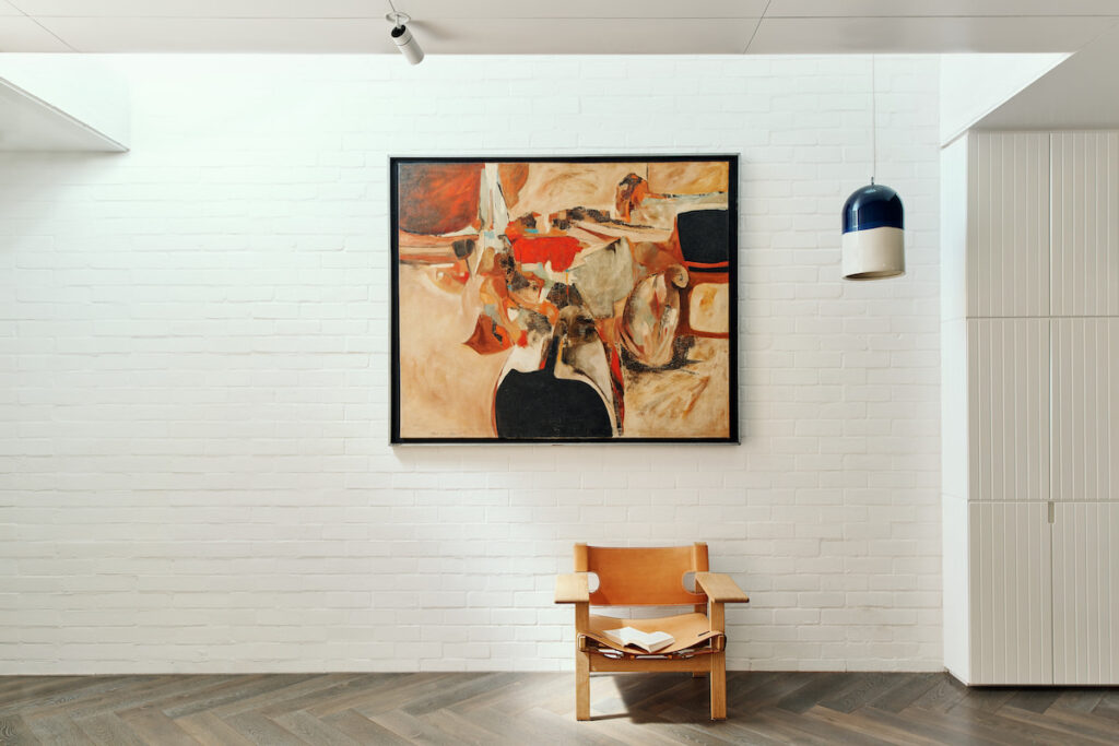
Masonry walls are also painted with the very same white brush strokes. Given the narrow site width, a combination of existing and new insulated double-brick walls were constructed along the old ‘wonky’ property boundary lines. Clever use of joinery shelving and herringbone pattern timber flooring cleverly camouflaged the misaligned boundary walls, making use of every available millimetre.
Externally, the painted brick walls are pointed but this is only limited to the lateral mortar joints, an intentionally horizontal detail visually balancing the vertical stepped brick lantern. These small touches demonstrate a nuanced understanding of inherent material limits, and how contemporary forms can comfortably and sympathetically exist side-by-side with the local heritage vernacular.
Specs
Architect
Topology Studio
Builder
Cassina
Location
Boonwurrung Country. Albert Park, Vic.
Passive Energy Design
The addition orients the new kitchen, dining and sitting area to the sheltered north-easterly aspect. Low-level winter sun warms the insulated double brick masonry walls while deep reveals provide sensible shade to the northern façade in the summer. Clerestory windows bring daylight deep into the floor plate, balanced by secondary windows to the light court. The porch provides cover on entry and allows the doors to be left open for ventilation in humid rainy weather. The operable skylight high in the lantern and the small clerestory window exhaust warm air drawn from low-level through the screened windows and doors. Good cross ventilation that captures the reliable sea breezes means that air conditioning is not required.
Materials
The concrete slab has a royal oak herringbone flooring. Recycled bricks were used with new bricks where crisp edges were required, both internally and externally. Existing walls were bagged and new ones just painted, externally the facade is tuck-pointed and painted. The ceilings and lightweight walls are sustainably-sourced hoop pine plywood with hand-painted finish. All paints are low-VOC. Use of plasterboard is minimised. Sourcing local products is always a good idea in terms of sustainability and, when building during a pandemic, even more so. The tiles for the splashback were handmade in South Melbourne by The City Tiler. There are subtle variations in the hand-painted plywood joinery. Avoiding factory-applied finishes means that joinery can be repaired. The kitchen benchtops are natural stone to avoid the health issues associated with silica. The external threshold is Bamstone bluestone from Port Fairy, the same material that paves the rear lane and forms the undulating sea wall that runs along Beaconsfield parade in front of the house. A rainwater tank collects water for irrigation. Grasscrete paving enables parking onsite without reducing permeability.
Glazing
All new windows and doors are double-glazed and timber-framed by Binq to passive house standard. All have insect screens which are essential to the success of natural ventilation.
Lighting
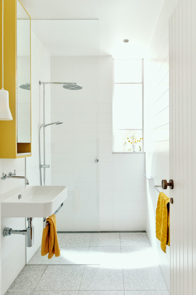
Pendants are made in Collingwood by Porcelain Bear, the bathroom pendant is by Ross Gardam. LED lighting is by Ambient, and general and art lighting is by Euroluce.
Heating
The radiators are oversized so that they can be converted to an electrical supply in the future.
Garden
The garden will supply fruit and vegetables. Flowering natives encourage pollinators.
