Inner Country
The architects were briefed to be bold and they’ve delivered, taking inspiration from the working class shed ‘out the back’.
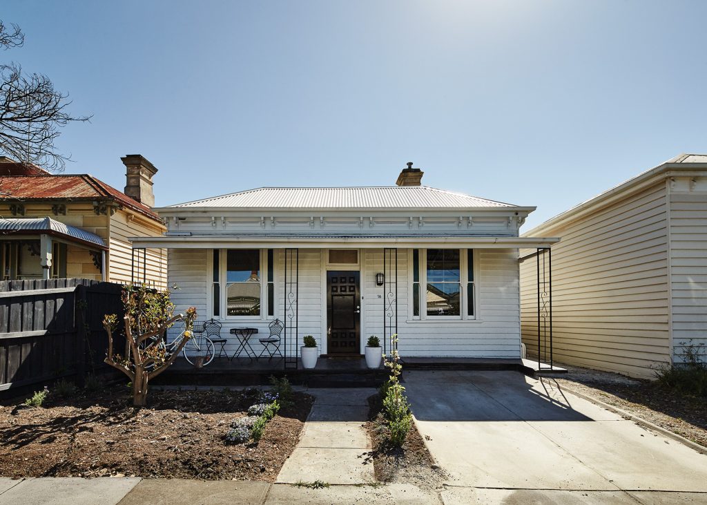
From the street, this modest workers cottage sits comfortably at the end of a row of six, the facade now carefully restored, detailed completely in white, save for the strips of green glass and the dark door. Located in a traditional working class area of inner Melbourne, it hails from the time of small home-based manufacturing enterprises. A little sign hanging out the front would invite the passers-by to come around the side or out the back to the shed, to the micro businesses that peppered the community.
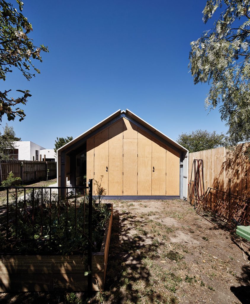
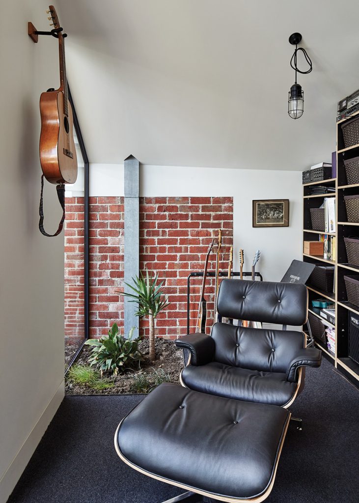
The contemporary home business calls more for an office, and the architectural response for this renovation was generated by such a need. The design draws from the traditional manufacturing shed at the back. The home office, or in this
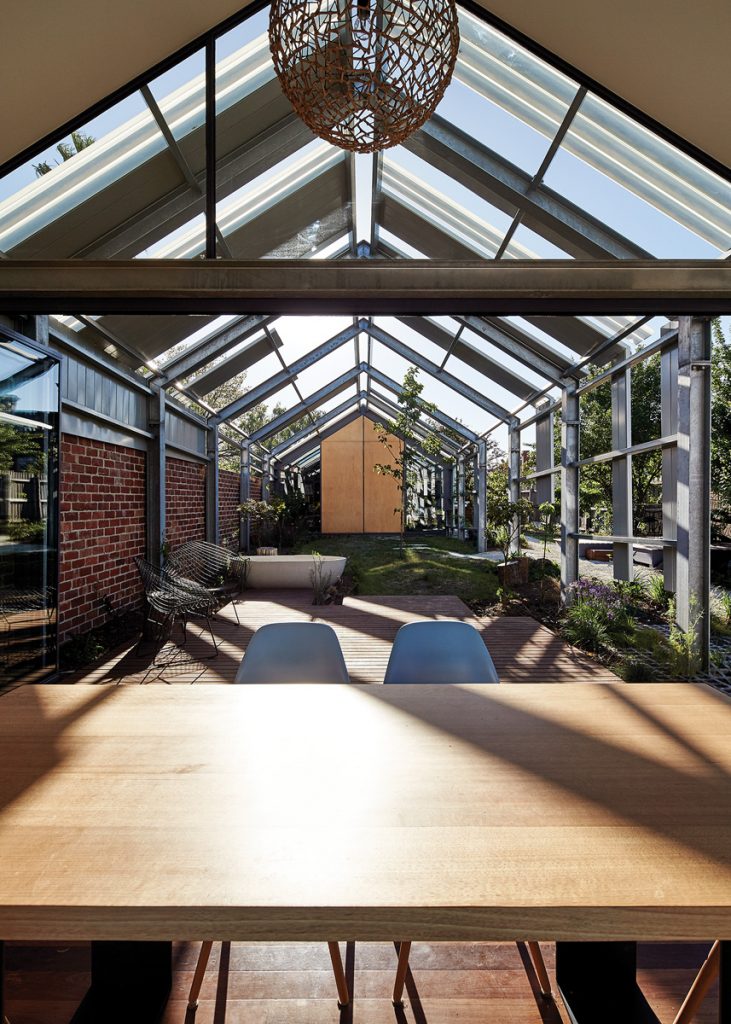
case the studio, has been both integrated into the house and discretely separated, positioned at the far end of a peeled back version of the vernacular shed.
The clients wanted a house that blurred the line between inside and out: a place that hinted of the country, a space to work. Above all, they wanted something unique. So the architects were briefed for a bold architectural statement. “We wanted a designed outcome,” says the client, “a house full of surprises.”
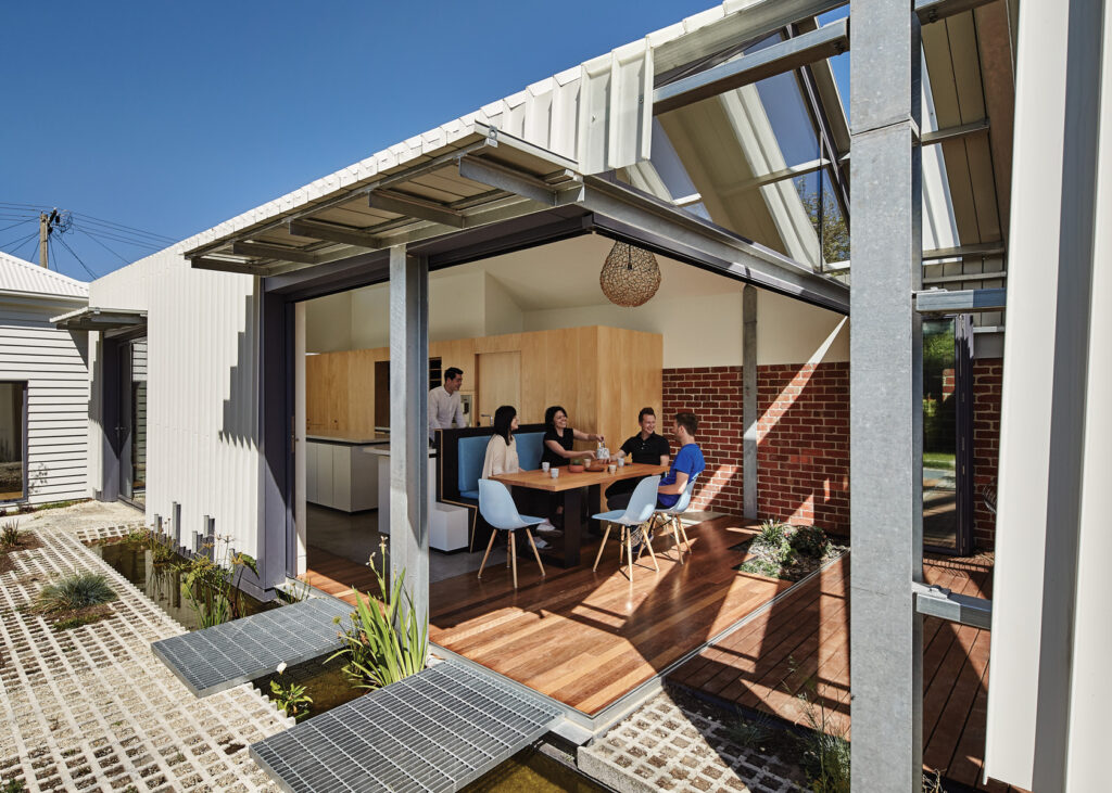
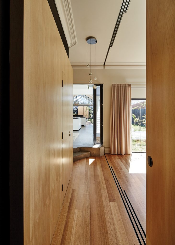
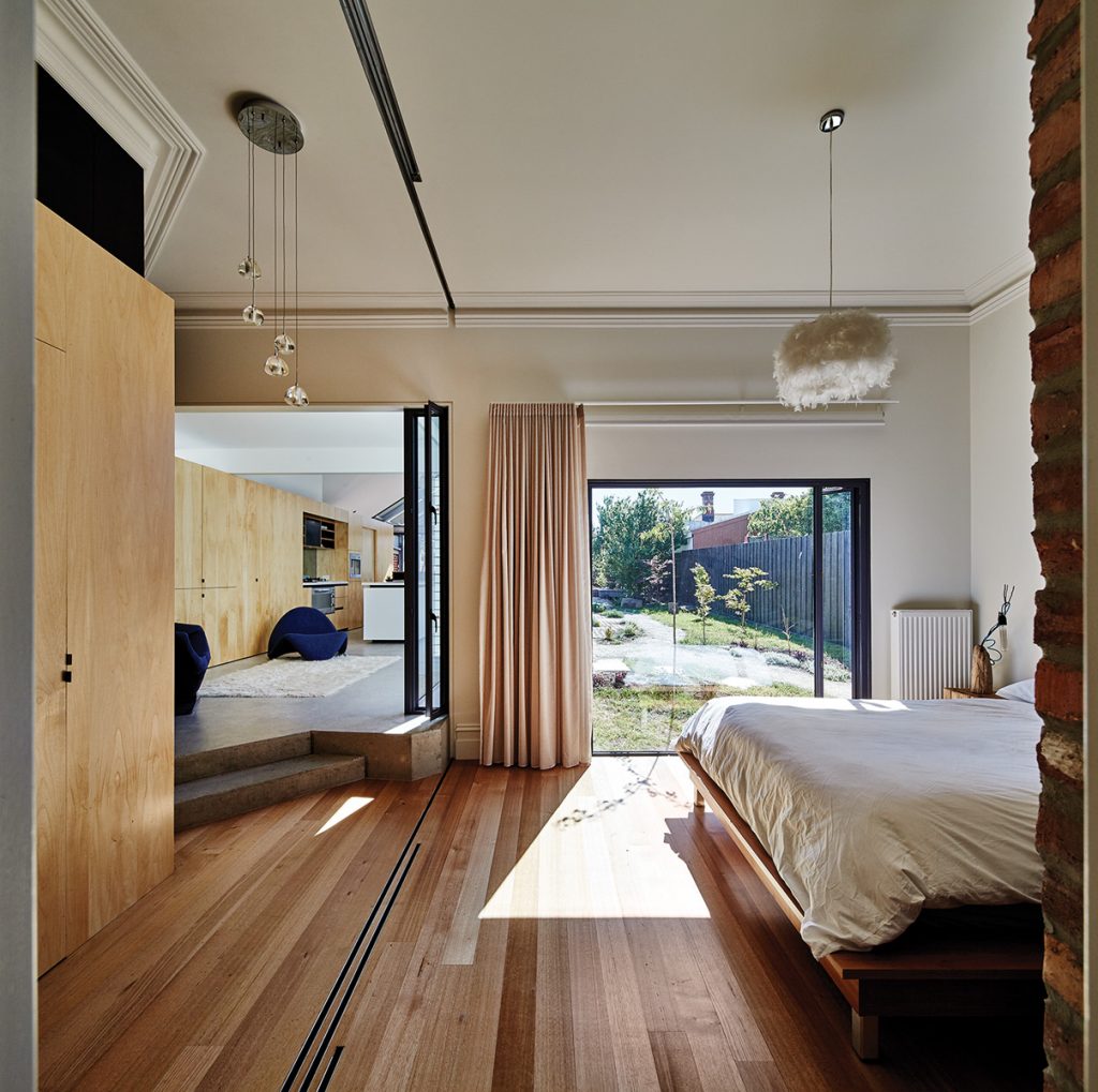
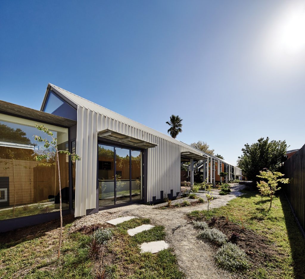
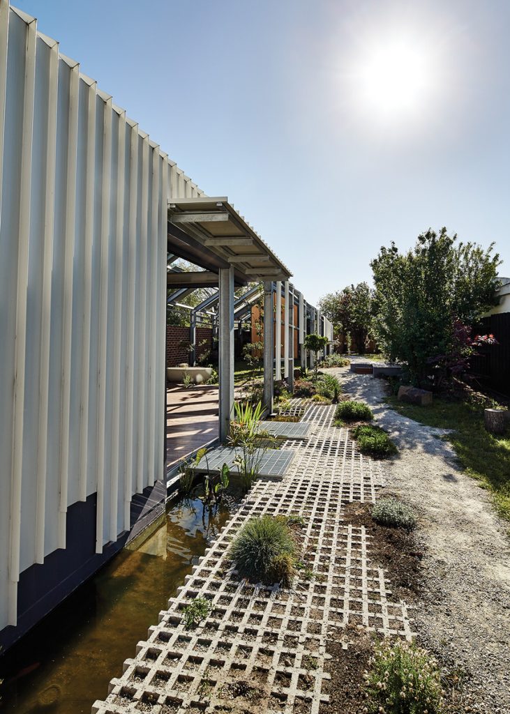
As you step inside from the front door, the vista passes through both the internal and external spaces of the house. The long narrow east-west addition stretches out behind the original cottage, almost to the rear boundary. A white steel skin lifts and folds over a steel portal frame that runs the length of the new extension, over a garden, and beyond to the studio tucked away at the rear. Floor materials are continuous inside to out, brick walls are carried past the skin of the building so that it is hard to tell where the house finishes and the garden starts.
The house, with its existing fabric, compact internal footprint and deceptively simple form, takes a low tech approach to energy use. There is no air-conditioning; for cooling it relies instead on the thermal mass of the concrete slab, shading, and cross-ventilation. Glazed walls can be pulled back, so that the garden becomes an extension of the dining space. A gas hydronic heating system runs through the new slab and panels in the existing front rooms, but the client says they are hardly needed – the house very effectively captures the warmth from the winter sun.
Rainwater from part of the roof is collected and re-used internally. The northern side of the sheer metal shed-like structure directs the rest to sunken ponds and rocky drains.
This natural landscape between and within the portal frames is quite magical. In a quirky response to the planning requirements for heights of boundary walls, the decision was made to slope the boundary wall from four metres down to three along the length of the building. The ground naturally rises to the rear of the property, generating an actual perspective and emphasising the illusion of depth.
This halfway space between the two buildings, within the peeled back frame of the shed, is the place for the journey from home to work. Psychologically quite important, it’s a response to the gentle love-hate relationship between work and home.
The client makes a connection between environment, mental efficiency and output. “Architecture can change your state of mind. I look at the work that I’m doing and the speed at which I get to good ideas … and the house helps.” It puts him in a different frame of mind. “Ultimately that’s what’s so nice about this house – it’s very calm and restful. It helps me meditate.”
Specs
Architect
Andrew Maynard Architects
maynardarchitects.com
Passive energy design
During early stages of discussion with the client, the architects were asked to demolish most of the house and replace it with a large two-storey “sustainable” dwelling. But no matter how sustainable, a new house would not be justified given the carbon debt.
The final design incorporates the usual ESD features that all good architecture should: passive solar design, abundant insulation, huge water tanks, rainwater-flushing toilets, white roofs to reduce urban heat sink and cooling demands, double glazing to all new windows, low VOC (where possible/reasonable), and veggies mixed throughout other planting (say No to plant segregation!). Most importantly, as with all Andrew Maynard Architects projects, they have worked hard to convince the owners to have (and do more with) less while also keeping/reworking the old rather than replacing. The house is mostly oriented to the east/west, with the length of the house exposed to the north to take advantage of passive solar gain. Overhangs shade the windows from the summer sun to the north, and the “stripped shed” structure between the kitchen and studio provides shading from the evening sun. In winter the sun can penetrate well inside the living/kitchen/ dining room, warming the floor slab and internal brick walls. Windows and doors are positioned for effective cross-breezes. The clients are delighted with how the house provides such comfortable living with low energy use year-round.
Materials
The addition has a concrete slab, clear sealed for improved thermal mass with hydronic in-slab coil heating. The main volumes are of highly insulated, lightweight, mainly timber framed construction. External cladding includes recycled brick from Paddy’s Bricks, who are locally based in West Melbourne where the bricks are all cleaned by hand and are carefully graded for building or paving. No chemicals are used in the process. The interiors feature hoop pine plywood sheet and plasterboard sheet lining. Paints are low VOC. External cladding includes Colorbond Longline metal deck cladding, Ampelite polycarbonate sheeting.
Flooring
Clear sealed concrete floor slab. Timber floors are kiln dried hardwood in Victorian Ash and Spotted Gum.
Insulation
The roof is insulated with R6.0 Earthwool thermal insulation. There’s bulk insulation to walls: 90 mm thick R2.5HD Earthwool thermal insulation sheet to external walls, plus Earthwool sound control batts to all internal walls for improved sound insulation. The concrete slab is also insulated to the sides and underneath.
Glazing
Windows are steel-framed double glazing.
Heating and cooling
Glazing is oriented towards the north with awnings projecting to shade from winter sun and to the west with external shading provided by the steel-framed structure and cladding between the kitchen and studio. Effective cross-ventilation removes the need for artificial cooling. In winter the new slab receives plenty of sun, reducing the need for additional heating by a hydronic system with in-slab coil and panels throughout the rest of the house.
Water tanks
Rainwater from roof areas is directed to Colorbond Slimline water tanks, which provide water for toilet flushing, washing machine and garden irrigation.
Lighting
The house uses low energy LED lighting throughout.
