In The Raw
A former printing press has maintained its quiet industrial presence in the neighbourhood thanks to a thoughtful conversion by Steffen Welsch Architects.
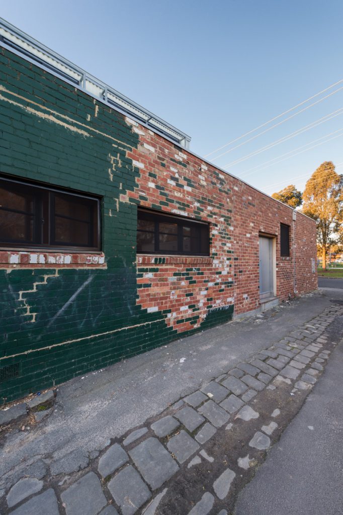
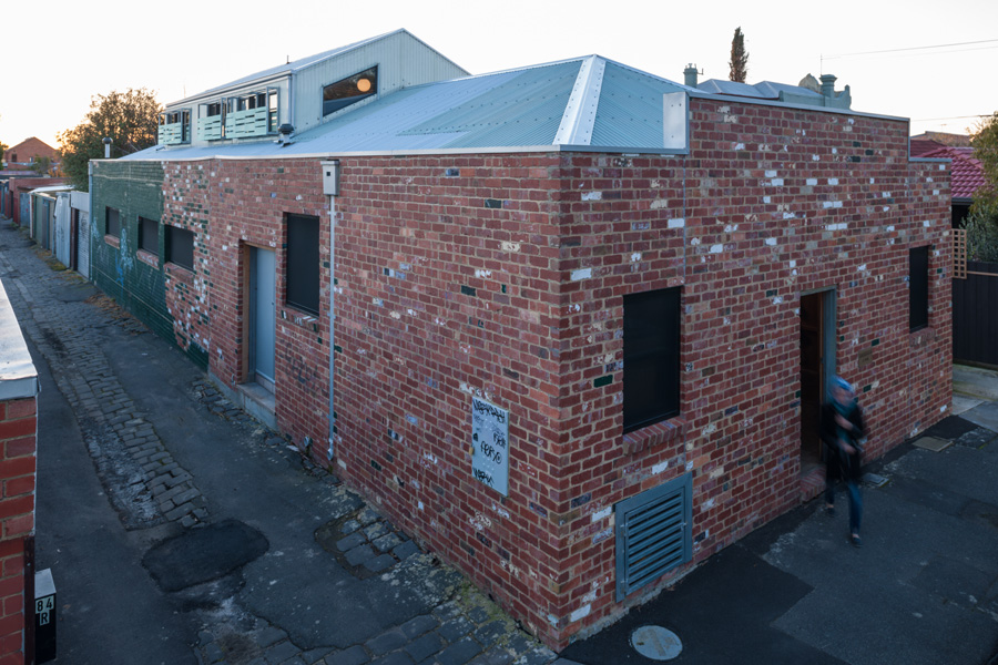
In Melbourne’s inner-north stands a dilapidated factory overlooking a teeny park. Large arches in the external walls of the single-storey brick building suggest a former life as horse stables, although when the couple bought the property it had long housed a printing press. They were drawn to the building’s history, character, material and textural diversity, and were keen to see these retained and celebrated in the building.
The couple enlisted Steffen Welsch Architects to make good the warehouse for the next chapter in its history. Steffen and his team set to work investigating a number of options. The challenge, explains Steffen, was how to incorporate best practice design and thermal performance on a modest budget into an aged structure, while retaining the building’s “spirit of place and contribution to the community”.
To meet this brief, demolition – albeit partial – was unavoidable. “We had to demolish some of the existing structure, unfortunately, for safety reasons,” the owners note. But the design team made the most of what they could. “The original roof trusses were reinforced and incorporated into the renewed structure,” explains Steffen. “The building we re-assembled with materials salvaged on site to make it structurally sound and more thermally efficient. We took down most of the walls, cleaned the bricks and put them back together again, reducing embodied energy as well.”
Through this process came the design narrative Steffen describes as “modest insertions and additions to accommodate the new program”. The approach was to minimise fiddly detailing and introduced structures – walls and ceilings – and keep to lightweight, affordable materials. This respects the existing structures while helping to keep the project to its modest budget. “Because of the budget, we worked this project much like we would a commercial project,” says Steffen.
The couple wanted their new home to include two studios (music and art), an open-plan kitchen, dining and living room, a laundry, two bedrooms, and a bathroom and downstairs WC. These the design team accommodated via the “insertions” into the brick frame of the structure. There’s a ground floor and a first floor, both built with the simple construction techniques and materials.
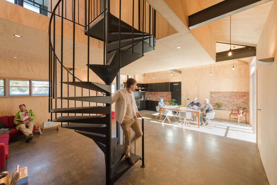
The first floor houses the two bedrooms and shared bathroom. It has low walls and cathedral ceilings “reminiscent of European converted roof spaces – a sheltered retreat”, says Steffen. This new first floor is supported by a steel frame and accessed by a feature spiral staircase from the ground floor, which also allows light penetration deep into the living areas below. Translucent light-green polycarbonate panels feature. The “privacy screens really add to the quirkiness, complementing the panels and adding a kind of softening to the four-square lines below,” say the owners.
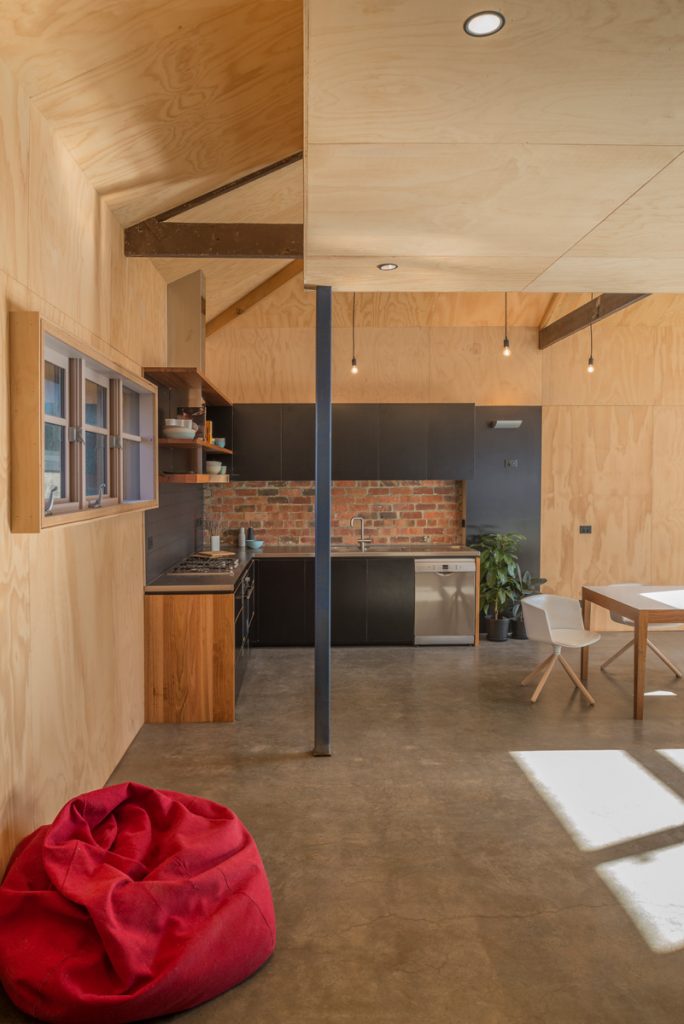
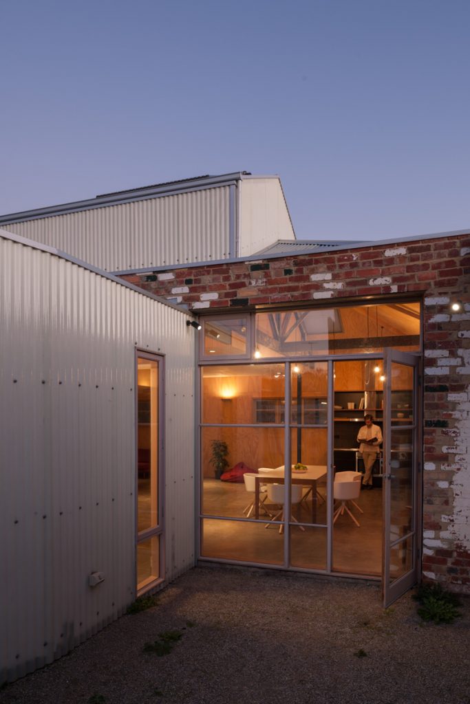
These “four-square lines below” make up the ground floor plan with the studios, open-plan lounge, dining and living room with small corner kitchen, and a lean-to laundry. To counterbalance the expansive ground floor warehouse shell, the design team introduced spatial variety: a lowered ceiling creates compressed space for a cosy living area, while lofty cathedral ceilings over the dining area connect inside with out, opening to the leafy courtyard and the sky.
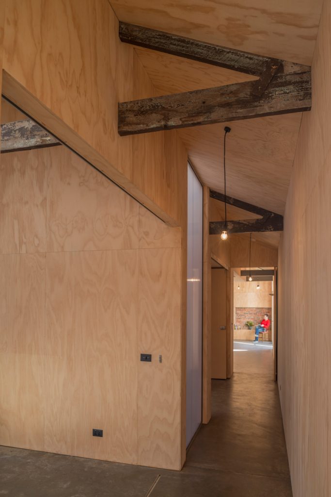
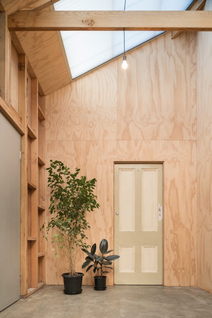
The building has no street setback. Its impenetrable brick façade with original solid metal-clad front door is ideal for privacy and security, but less than welcoming to visitors. To get around this, Steffen’s scheme introduced an internal threshold or lobby. Upon entering the metal front door, visitors are bathed in soft light coming through insulated polycarbonate sheet roofing. High-level northfacing windows guarantee privacy but emit sunlight deep into the house. Bike and coat storage is also accommodated.
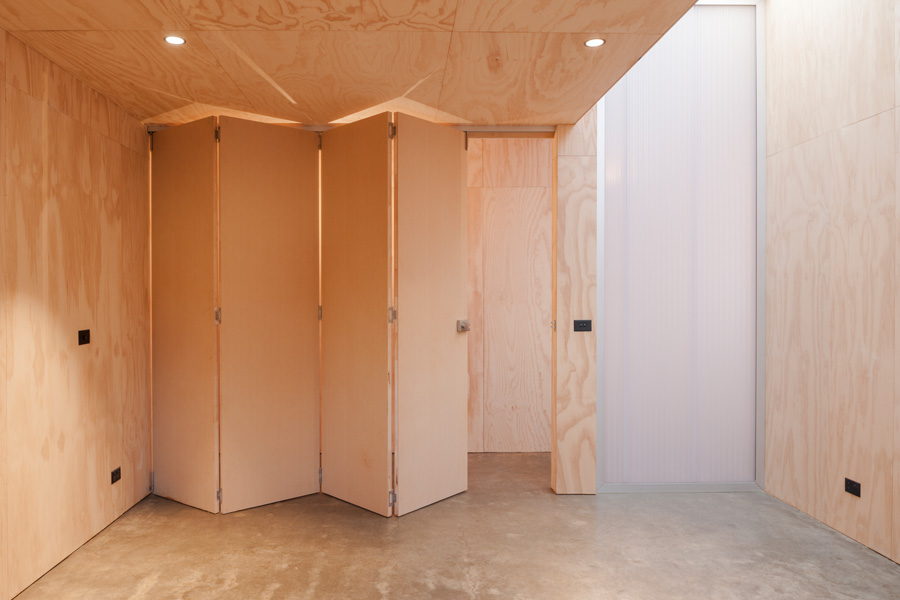
Through this lobby are the two studios with the music room opening with large bi-fold doors to extend the space for performances. Here, too, insulated polycarbonate roof panels create a balanced and soft natural light – idea for an artist’s studio – and express separation between the old cathedral ceiling and the new design insertions.
One of the more unique features of this project is its approach to the finishing touches. Doing away with what can be an almost obsessive desire for project perfection (as manifest in the detailing and finishes), Steffen describes this home as more of a living organism. “It’s ready for use: simple finishes, low cost, low maintenance and non-precious,” he explains. “We didn’t want to overmanicure the surfaces,” add the owners.
Materials were left rough or unfinished. The concrete slab has a steel trowel finish, the plywood panelling walls were left unfinished, while the polycarbonate ceiling is a straightforward application of an off-the-shelf material. The black formply kitchen has stainless steel benchtops and both raw and black-painted brick splashbacks.
Alongside the desire to create a home that is “non-precious” and perhaps a more accessible and refreshing architecture, the home doesn’t skimp on insulation, with double glazing and other features that make it comfortable and affordable to run year round. It achieves a six-star energy efficiency: no mean feat for a warehouse conversion.
Specs
Architect
Steffen Welsch Architects
steffenwelsch.com.au
Builder
Grattan Group
Energy Rater
LID Consulting
Low impact design
The Printing Press pursued strategies that acknowledge that sustainable design does not exist in isolation. A low impact building can be both cost efficient to build and operate. A building that ‘fits’ is expected to be used appropriately, maintained and less likely to be altered and demolished. Re-assembling with materials salvaged on site, a compact building with less material and labour significantly reduces embodied and future operational energy. Sparse use of materials and compact design allowed to construct for approximately $1800 per sq m.
Passive energy design
The residence was designed to passive solar design principles that considered zoning, orientation, solar control, ventilation, thermal mass and insulation. During its lifetime heat transfer through the building skin and therefore the operational energy for heating and cooling will be low due to its small external surface. The compact and highly insulated building fabric allowed the introduction of insulated polycarbonate roofing which was essential for providing appropriate natural light into the studios.
Materials
The approach was to retain the spirit of the original fabric, and the brief for a functional, low-cost and low-maintenance residence drove the choice of materials. This project was conceived as a nonprecious, easy to use and modest dwelling that does not try to make a statement. Inside plywood panelling is unfinished (it also provides a backdrop for the old roof trusses). The ceiling lining is polycarbonate, the kitchen, black formply with stainless steel benchtops. Old brickwork is treated thermally like a window and ‘framed’ with insulated plywood walls on the inside. Plant-based paints and oils. On the exterior old painted brick walls were left where possible. The insertions and additions are to contrast the heavy and highly textured brick shell – translucent light green polycarbonate was chosen for its lightweight qualities and simplicity.
Flooring
The concrete ground floor has a burnished trowel finish and is sealed with plant oil The concrete mix is 30% Flyash to 70% General Purpose Cement. First floor Europlank Midi engineered floorboards with pre-finished matt lacquer finish.
Insulation
The roof is insulated with 240 mm thick Bradford Gold R5.0 ceiling batts and 50 mm thick R1.3 glasswool blanket. Bulk insulation to plywood walls: 90 mm thick R2.5 and white polyester insulation to translucent walls: 90 mm thick R1.5.
Glazing
Timber framed double glazed windows and doors with Low E glazing. Velux double glazed skylight.
Heating and cooling
Hydronic heating panel system integrated with solar hot water and gas boosted heating system. Hot water is provided by a Rinnai gas boosted solar hot water system with 20 Apricus evacuated solar collectors.
