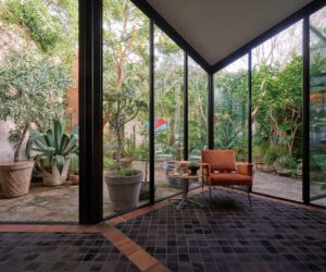
modern dugout
A nook at home or industrial open plan, in the city or the bush – the modern office is a place of inspiration and flexibility.
The beauty of the nine-to-five is leaving for home after a long day’s work. But what if the office could come to
you? In recent times we’ve seen the lines blur between workplace and home-space, thanks to a raft of clever features that allow us to create, craft and collaborate with far greater flexibility than ever before. So whether it’s a nook in your home or a spot in your backyard, there are plenty of opportunities to promote productivity and enhance happiness. And there’s not a beige wall, nor a
fluorescent light, in sight.
Breathe Architecture
99 Designs
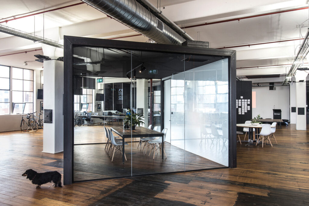
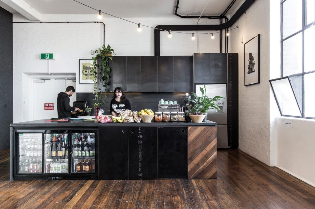
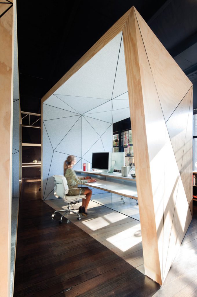
This project converts a heritage building into an office for a young design company based in Melbourne. For Breathe Architecture, the fit-out represents their ideology of simplicity and functionality, while for 99 Designs, they could work and play within a large industrial space. With the office adjacent to the Richmond train line, the key priority was acoustic and spatial separation. The solution was to divide the 750-square-metre space into programmatic zones and then insert two acousticallytreated, steel-framed pods, which also allows the space to retain its original openness and character.
Photography: Andrew Wuttke
Nest Architects
Harold Street
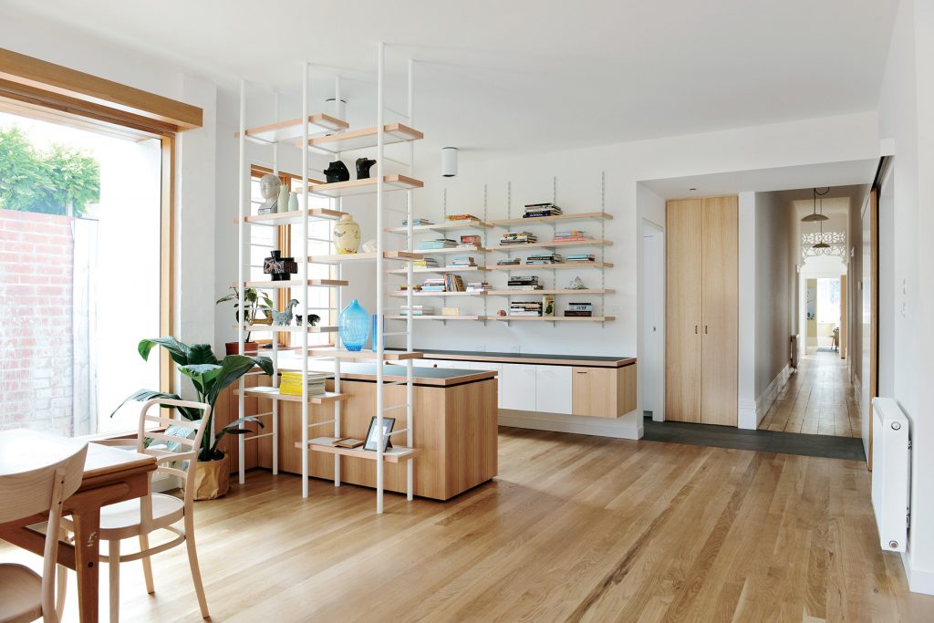
This inner-urban house extension in Melbourne features separate His and Hers offices. Hers comprises an open zone as part of a new rear kitchen, living and dining zone, while His is a completely separate room. Each caters for their work in the medical profession. Architect Emilio Fuscaldo says the open zone had to “walk the line between a real office and just another part of the living space”, which is achieved with ladders and open shelving, offering a “modicum of privacy but with sight lines too” so the owner can look up and be part of the house.
Photography: Lauren Bamford
Takt Studio for Architecture
Studio Thirroul
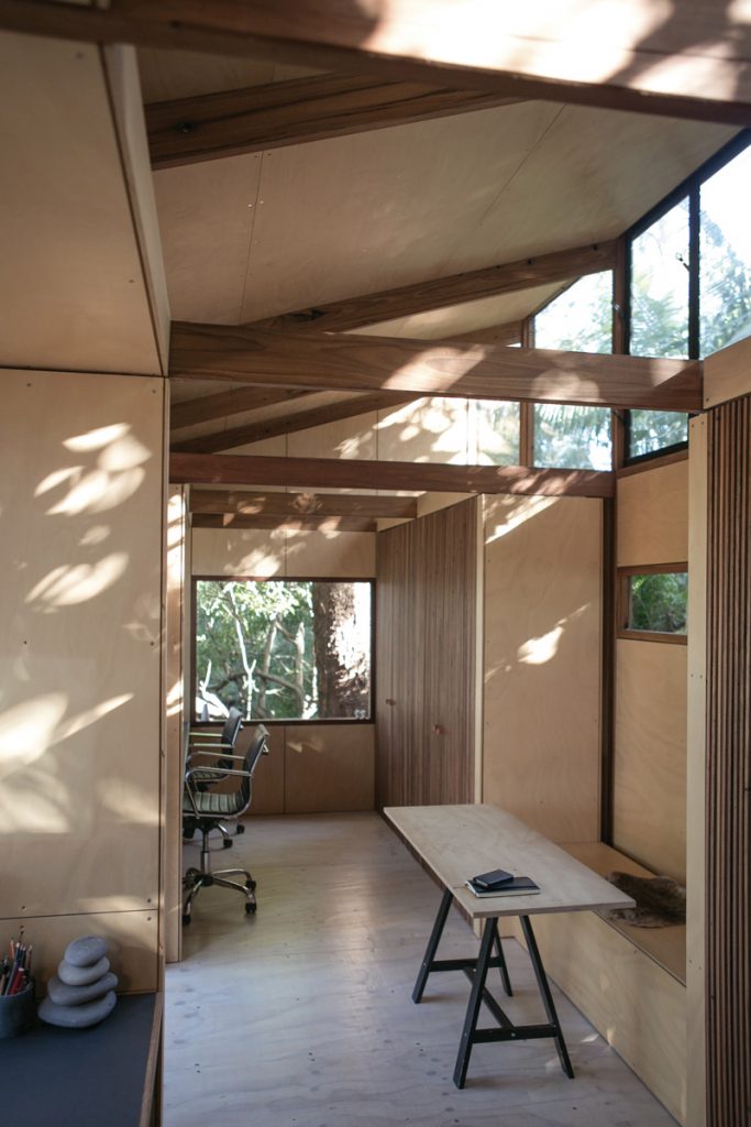
Takt directors Brent Dunn and Katharina Hendel packed up their self-designed and self-built modular studio in New South Wales. With the help of the local footy team they reassembled it two suburbs away on a new block, positioned on the rear escarpment just eight metres away from their main house. Built from recycled Australian hardwood electricity poles, the studio is clad externally in galvanised steel with exposed fixings, and comprises two work benches, entry and a central meeting/model making room. While the studio serves as a prototype for future modular design work, for now their focus is on building a new deck for it.
Photography: Lauren Bamford
FMD Architects
Brighton Joinery
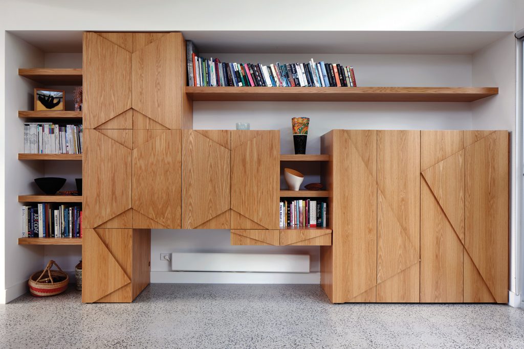
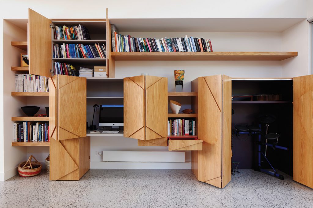
Designing joinery for an unused end of a living room offered architect Fiona Dunin the potential to incorporate a smattering of personality to spice up her client’s clean and white modern home. From afar, the simple rectilinear design is layered with timber featuring shelving, asymmetrical triangles and shapes. Up close, it opens up and folds out to reveal a nook for a drum kit, another for a sewing machine and crafting, and internal layers revealing splashes of soft grey, deep purple and striped red. Simply pack it up and close the joinery ready for the next jam or crafting session.
Photography: Richard Whitbread
Matt Gibson Architecture + Design
Compulsive Productions
Flexibility was the key for this new film production studio in Melbourne. By creating a multi-faceted workplace with flexible arrangements for a range of tenants, the owner not only could maximise rental revenue, but could also provide a platform for cross-pollination, increased exposure and new work opportunities to emerge. While work to the outside shell was limited to enhance sustainability, there’s plenty going on inside where existing spaces were made to feel bigger. Custom pods can be opened or shut off with curtains, and there’s masses of natural light, low embodied energy and smart material use.
Photography: Shannon McGrath
Tribe Studio Architects
Eskimo
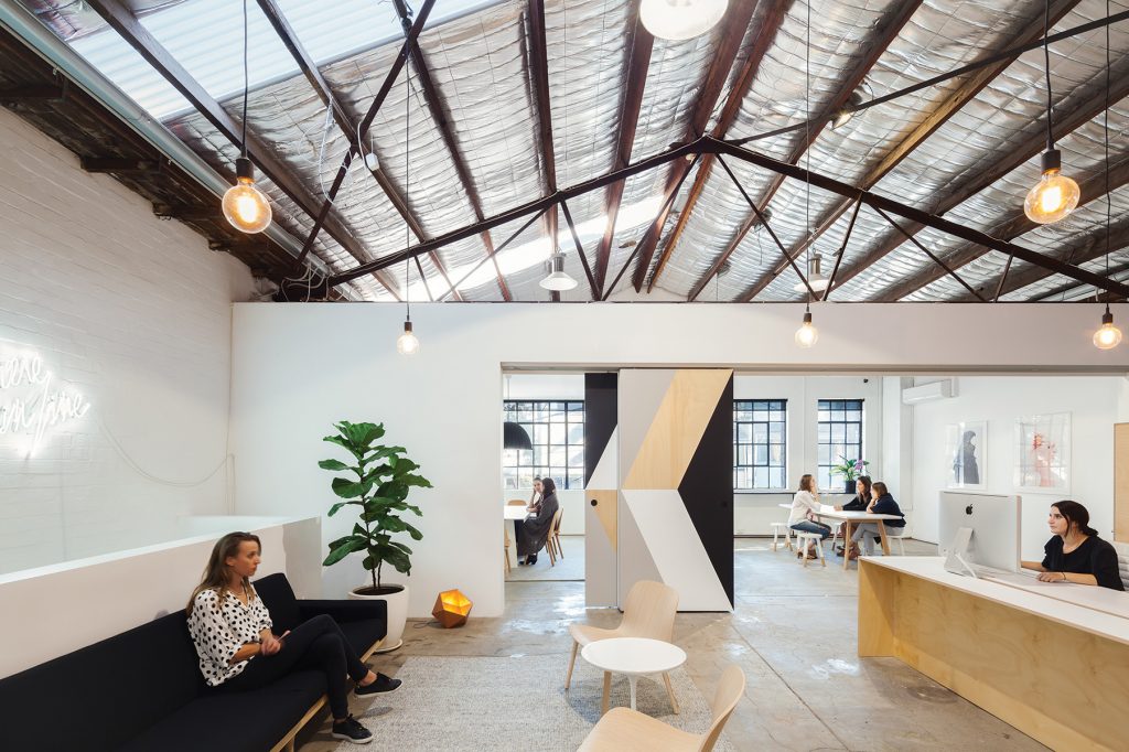
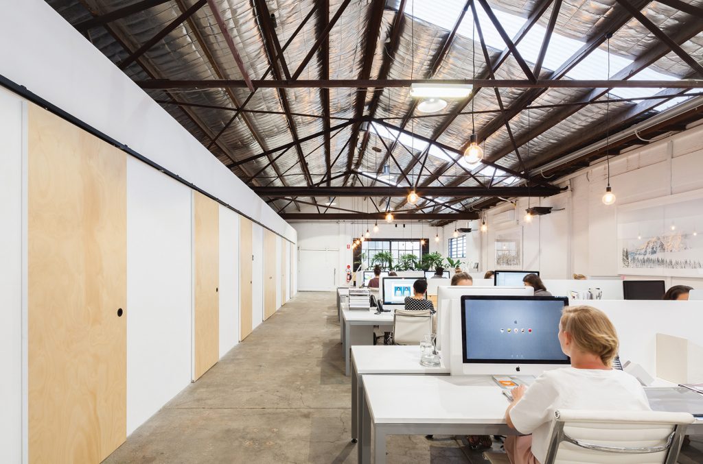
Graphic design practice Eskimo engaged long-time supporter Tribe to rework a big tubular warehouse in Surry Hills, Sydney, for their new office. “The outcome needed to represent the Eskimo brand,” says Tribe associate director Miriam Green. Offering two meeting rooms, a central foyer and openplan office space, it now swims in natural daylight and ventilation with an array of pods and amenities. Warmth is added through a large sliding plywood door, which features a graphic by a staff member who won an in-house design competition. The palette is restrained too, enabling the practice to evolve as they continue working and creating within it.
Photography: Katherine Lu
Red Architecture
RA Design Studio
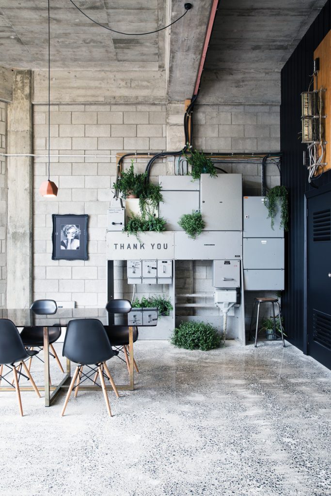
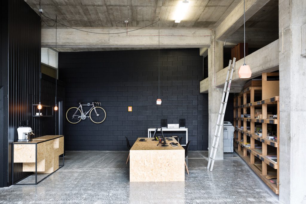
Discreetly nestled in an alleyway in Hamilton’s CBD (NZ), Red Architecture’s new office is a small, empty 1960s warehouse. “We realised we had found a space that unless you were a store or service person, you would \ not have seen or had access to it,” says architectural designer Tane Cox. The brief was to change the interior to a creative space for making and experimentation, which is achieved through a utilitarian and robust palette of materials. Its finishes convey an impression that the space is almost a tool in itself as part of the making process, and results in an interior that feels delightfully undiscovered.
Photography: Larnie Nicolson
