Focus
Workspace design, done well.
SECLUDED
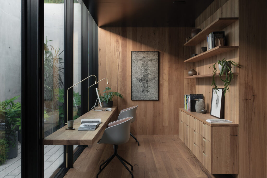
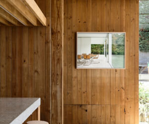
“Our clients came to us with a desire for their bedroom, bathing space and study to all form one secluded retreat within the home,” reflects director of Edition Office, Kim Bridgland. Elaborating on this concept, Edition Office made the spaces circulate around a concrete stairwell, each with its own private courtyard framing the three tree canopies on-site. In the study, a large, overhanging peppercorn tree casts lively shadows across the concrete walls of the courtyard over the course of the day. Here, gentle light creates a meditative atmosphere that is furthered by the neutrally toned blackbutt timber interior. A four-metre wide sliding door promotes flow between outside and interior realms.
BREAK AWAY
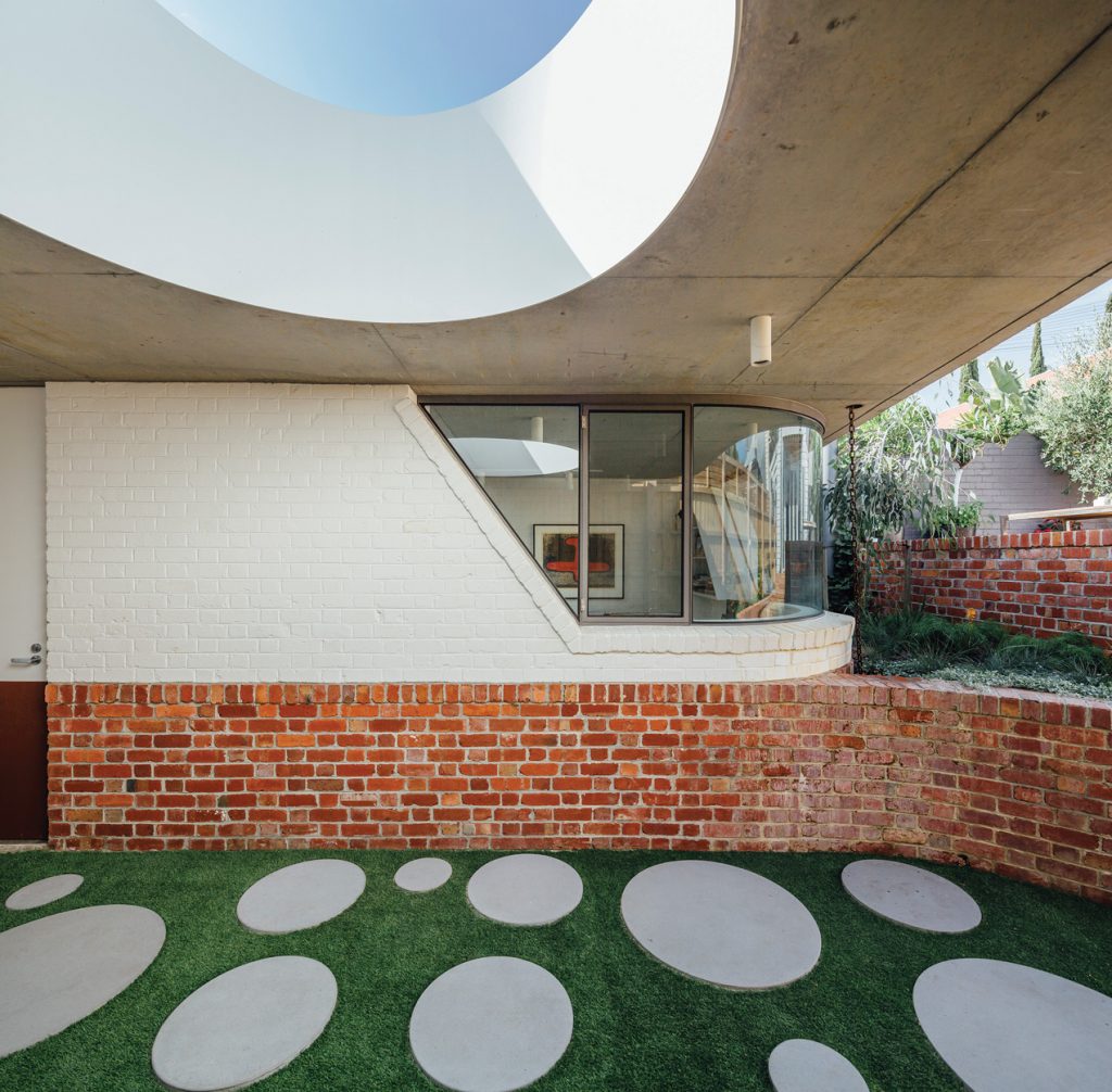
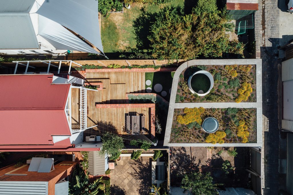
This small studio for a professional couple and their children draws on the materiality of the adjacent laneway, contrasting against the weatherboard cottage with which it shares a block. A green roof with a skylight rendered in curved concrete provides insulation, temperature regulation and a sense of excitement – which Pleysier Perkins studio director, Berit Barton notes is a result of “… the client’s openness to having a bit of fun … allowing us to be playful and come up with an unconventional approach to a backyard studio”. Within, a palette of burnished concrete and reclaimed brick ups the sophistication factor.
REFRESH
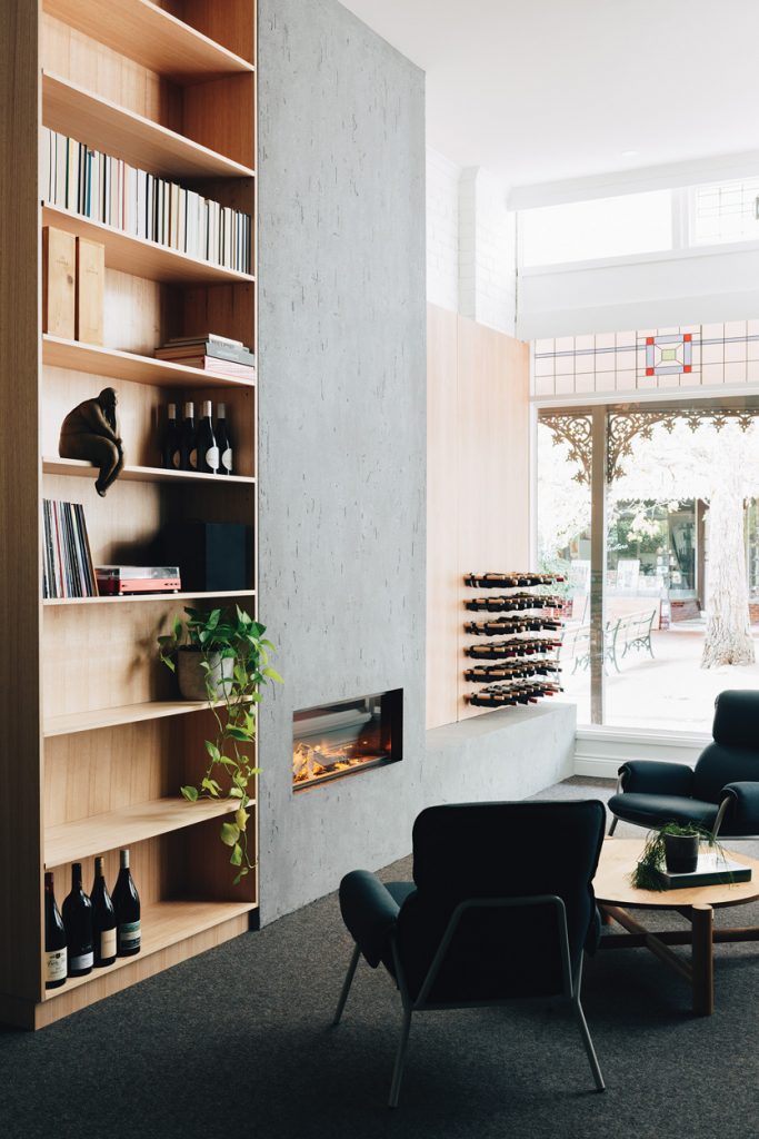
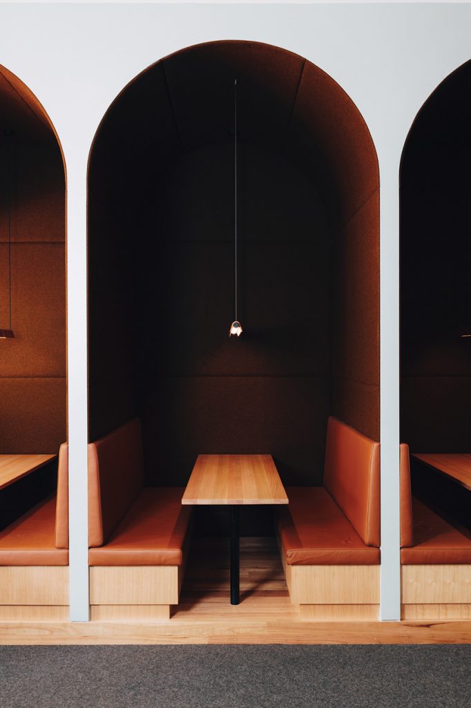
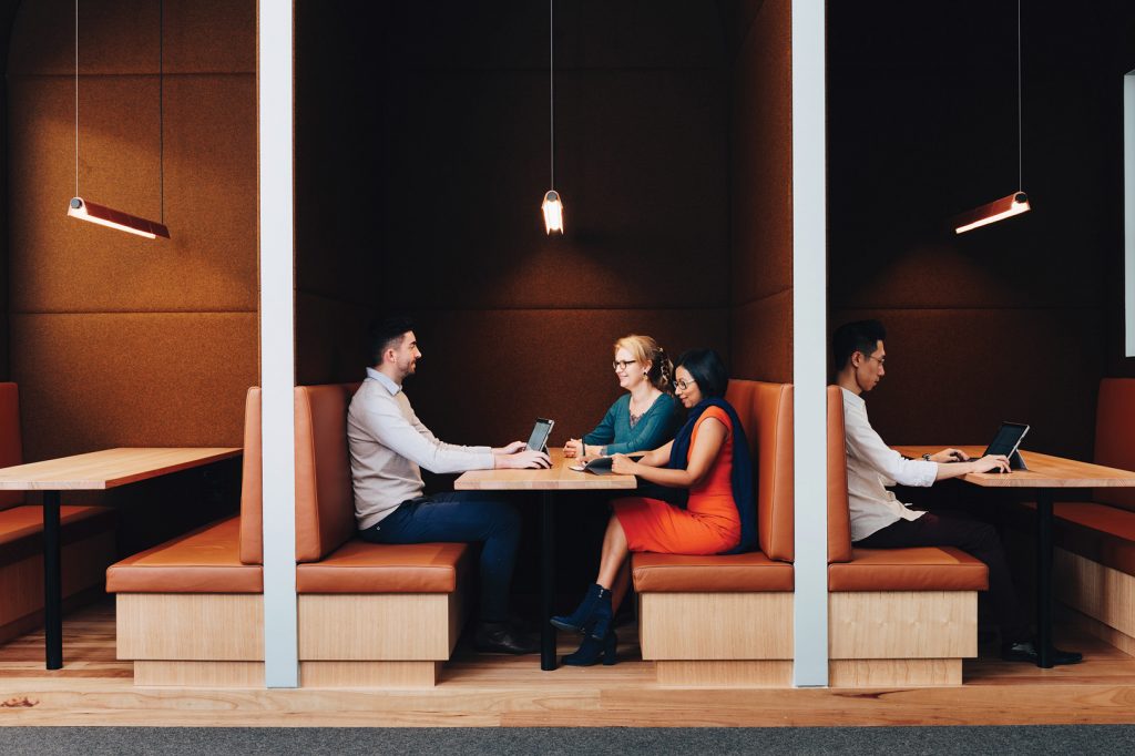
This office in Canterbury, Victoria, has been transformed for the second time by Hearth Studio. “A challenging aspect of the project involved dealing with a space that was facing the public, as well as working with the decisions we had made for the space back in 2017 for stage one,” explains Director, Sarah Trotter. Stage two called for a “complementary and playful” extension to the original premises that was multi-functional, configurable for different working arrangements with acoustically sealed private space and a lounge area including a display for the client’s wine collection. The genius of this design is that it distils a complex brief through effective programming, clean lines and rich materials. For example, a series of felt-lined arched booths enables private or group work while referencing the building’s original brick archway.
SYNERGY
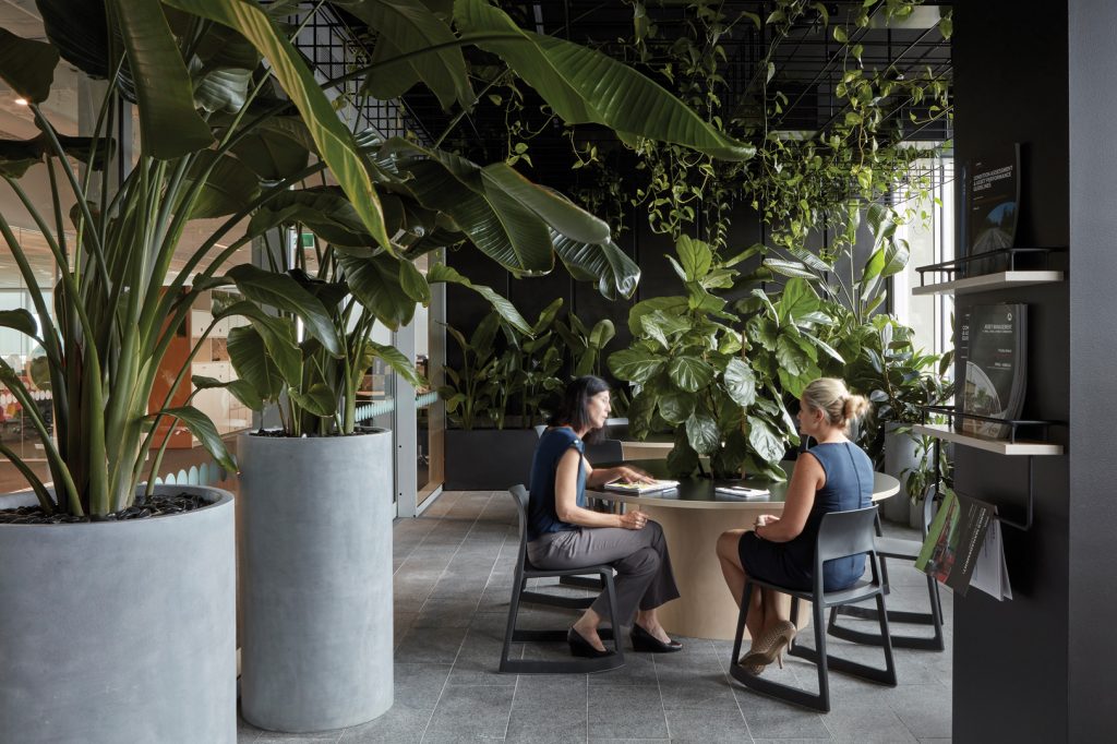
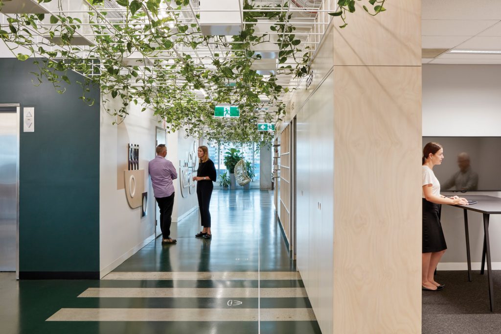
Cox Architecture’s design of Cardno’s APAC North Headquarters was as much about physical change as cultural. “The fit-out explores notions of ‘community’ by distilling city planning concepts: introducing active streets, parklands, engaging neighbourhoods and a metaphorical town hall,” Cox Architecture observes of the project. Colour is carefully selected as part of this approach: the stripped-back building fabric is finished in white for shared public spaces and black for intimate “park” spaces. Graphics also play a role in defining spaces – way-finding symbols are etched into the floors and walls and an overlay conceived by Tony Gooley Design enlivens the workplace atmosphere.
BIT BY BIT
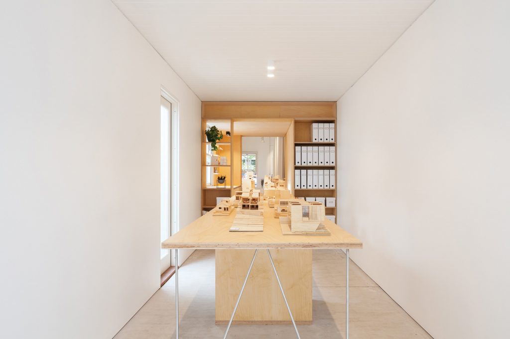
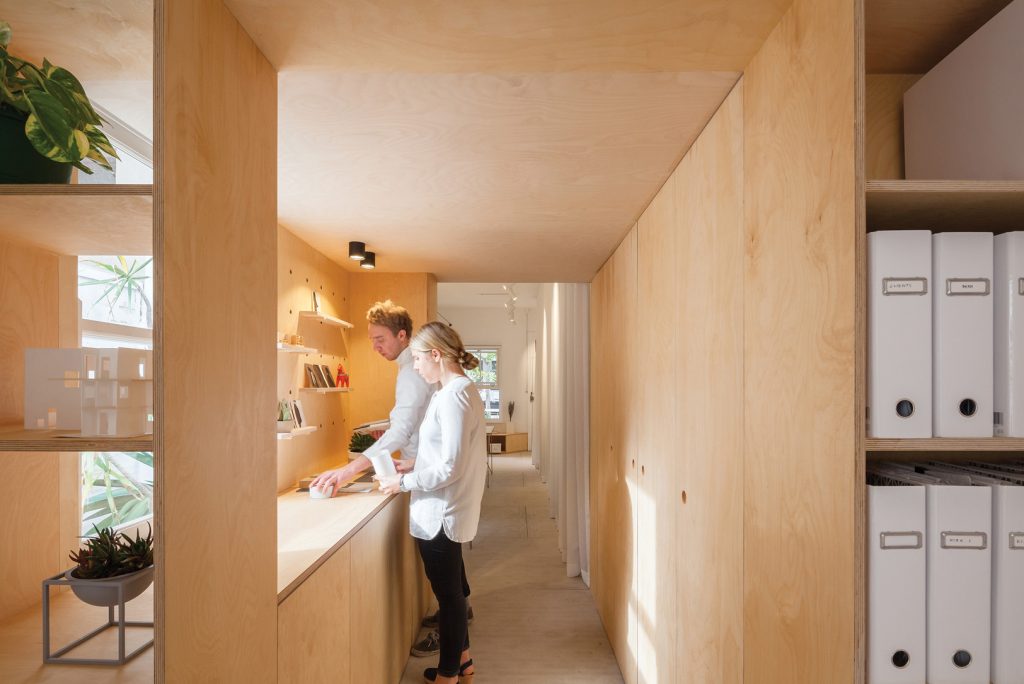
Marston Architects’ workspace in Manly, Sydney, is set within a heritage-listed terrace house. While the external façade was restored with original features, Marston Architects clearly seized the opportunity to experiment with the interior – devising two zones separated by a “plywood utility box” containing a concealed kitchen and storage. Timber runs throughout the eastern zone (made up of four workstations) and the western zone (with 900-millimetre-high bench for model making, drawing and meetings). The narrow site ranges from 2.4–2.8-metres-wide, so simple materials were selected to avoid cluttering the space, including stainless steel desk legs, a white linen curtain to conceal storage and compressed sheet floor to visually tie everything together.
NEW WAVE
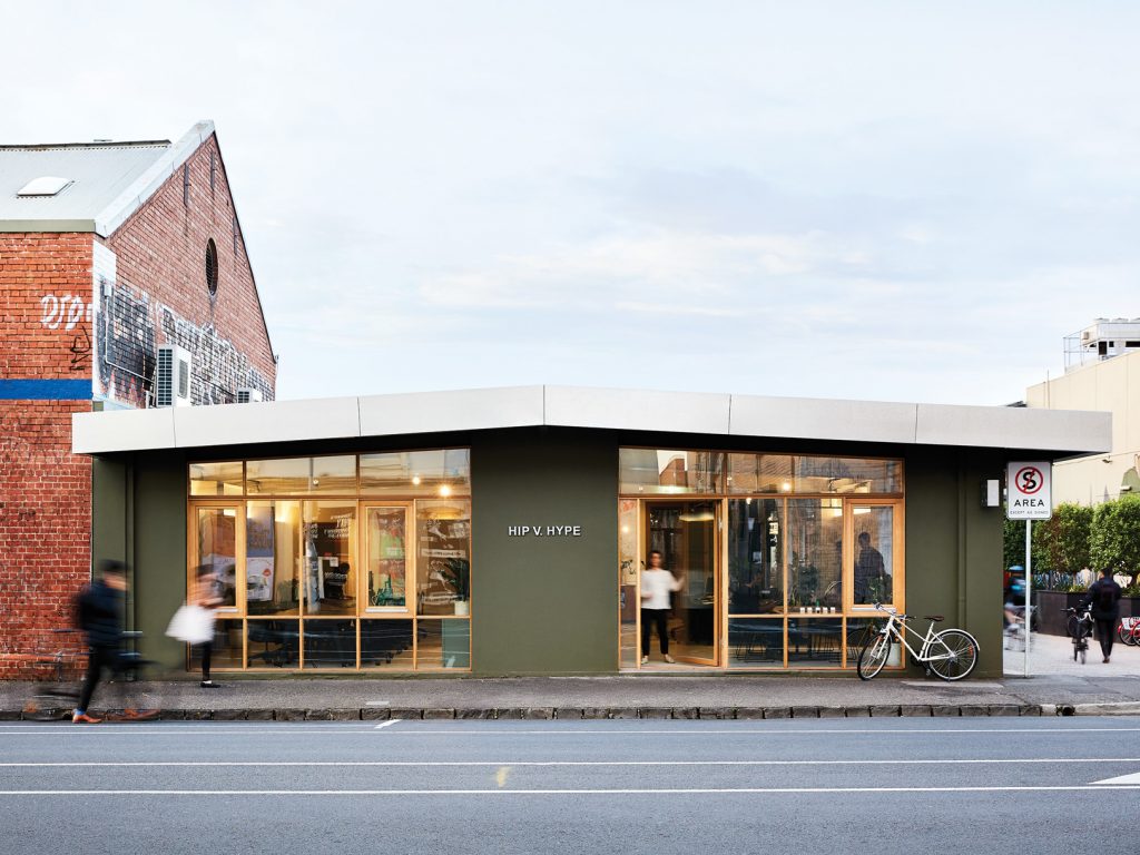
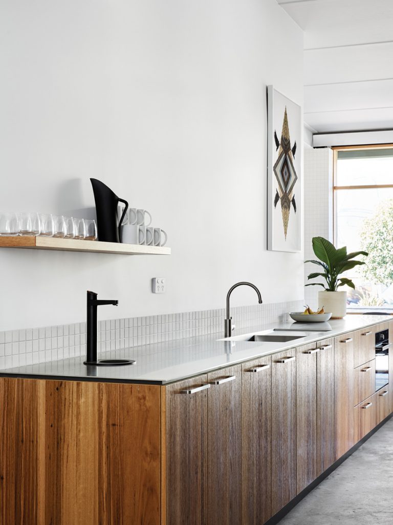
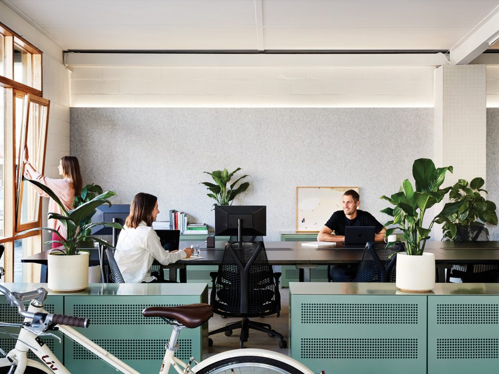
The Barkly Street Collective – designed and enabled by HIP V. HYPE – represents the vanguard of co-working in modern times: “… a shared workspace for creative professionals seeking to create projects, design products and provide services defined by substance, genuine interaction and meaning.” Located in Brunswick, Melbourne, this open-plan project comprises 24 desks and unites a workshare, product showroom and flexible event space. HIP V. HYPE selected products, materials and service providers that align with the values of quality, durability and low environmental impact such as Cantilever Interiors, who hand-built the kitchen locally. Quite naturally, also, there’s no on-site car parking, but “plenty” of bike spaces. “All in all, it comes down to trying to create space which connects to place and the natural environment as much as possible,” comments Founder, Liam Wallis.
LIMITLESS
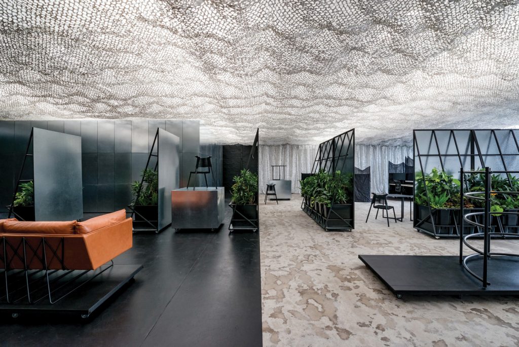
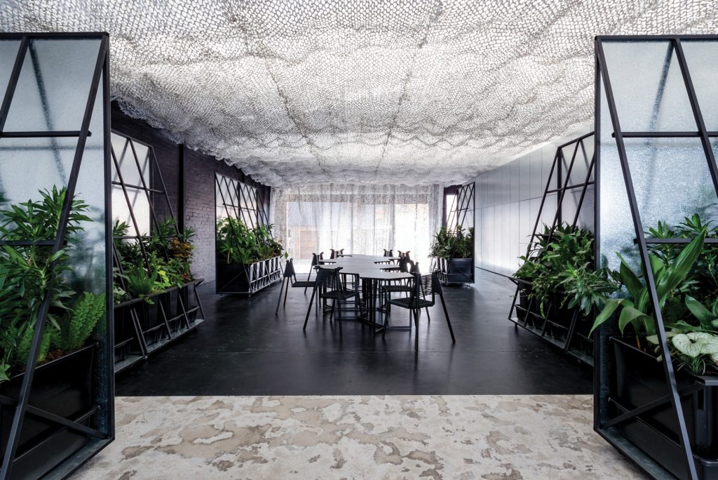
It should come as little surprise that a project titled Space & Time is highly experimental. Designed by Russell & George, the space is deliberately fluid courtesy of customised design elements including white nano mesh typically used in greenhouses. “The project crossed disciplines of architecture, interiors, product design, industrial design, hospitality. It is a futurist project attempting to offer an alternative solution to how idle space[s] in our cities are used or rescued and how we businesses are created and housed,” explains Director, Byron George. Almost all of the elements were built on-site in a workshop and everything is on wheels to make the space completely reconfigurable. Raw galvanised steel cladding throughout makes for a striking contrast with abundant planting included to improve indoor air quality.
