Exercise in Efficiency
Penny Fuller and Jad Silvester’s reconfiguration of their 40-square-metre one-bedroom apartment was an exercise in efficiency. The architects, who lead their own practice, Silvester Fuller, made dimensional improvements and utilised visual tricks to maximise the space functionally and visually.
The apartment is in the Aquarius building designed by Harry Seidler & Associates and built in the mid-1960s. Fuller and Silvester lived in the apartment overlooking Rushcutters Bay in Sydney for three years before renovating so they could get to know the shortcomings and potential of the space, and to appreciate the difference before and after.
The apartment is laid out with the living space facing north-east, and a split-level staircase to the bedroom pod that projects south-west. The original apartment had a separate room for the kitchen at the rear of the living space and an internal bathroom beside it. The kitchen wall extended beyond the staircase, creating a misalignment of walls at the entrance, and the entry space outside the bathroom and kitchen proved unusable, except for access.
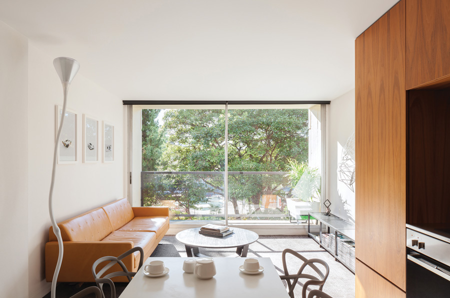
Fuller and Silvester reconfigured the apartment by switching the location of the kitchen and bathroom, thereby creating an open kitchen, and shaving the wall back to align it with the stair and entrance. “It’s like a puzzle and the longer you spend testing the layout and tweaking the design, the more space you can unlock,” says Silvester. “By moving the kitchen we unlocked a new space for dining and made the living area larger.”
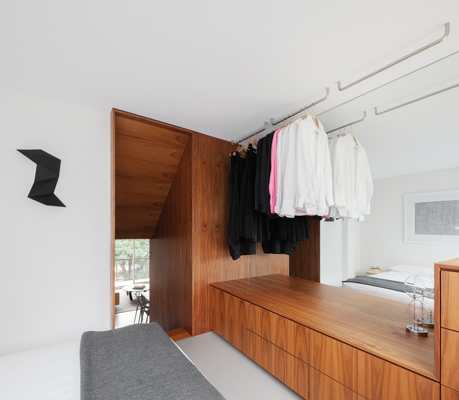
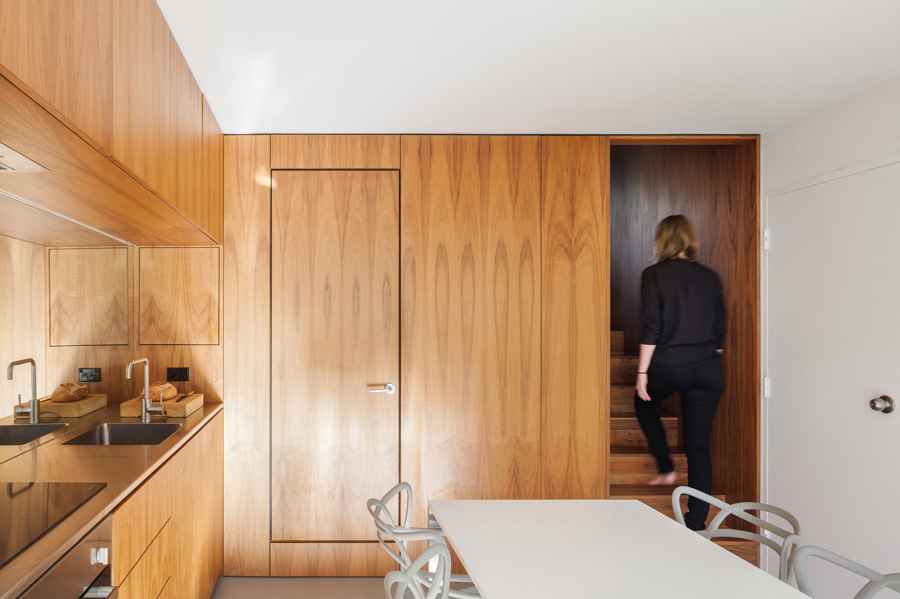
The architects designed all-encompassing American walnut timber veneer joinery to house the kitchen, conceal the bathroom, wrap the staircase and provide storage in the bedroom. Visually, it connects the functional and practical spaces of the apartment, and provides a backdrop for the otherwise neutral palette of the living and dining rooms, and bedroom.
The timber joinery partially extends along the eastern wall of the living space to define the kitchen. It provides storage above and below the bench, as well as for a dish drawer to the left, with refrigerator in the cupboard above and an elongated panel to the right for wine storage. The existing risers influenced the placement of appliances, the oversized sink is deep and the mirror splashback enhances the sense of space.
The timber-veneer door along the back wall opens to the sunshine-yellow bathroom; Fuller and Silvester selected the colour for its psychological qualities. “Getting a good night’s sleep and waking up refreshed is vital for wellness,” Silvester explains. “Yellow is an energising and positive colour to wake up to, and we could afford to choose a bright colour when the rest of the apartment is so calm.” It is also a nod to Harry Seidler’s use of colour: many of his buildings featured bold murals and artworks, and the original Aquarius apartments came with golden-coloured curtains.
Custom yellow fixtures blend with the Symonite composite wall panels. The basin is long, instead of wide, to fit the compact space, and is the optimal size for washing hands and brushing teeth, and the hanging toilet visually extends the epoxy floor.
Next to the bathroom door, another door – barely visible – conceals a shallow pantry, which makes use of the space between the wall and shower.
Wrapping the staircase in timber veneer gives the appearance of greater separation between the living area and bedroom and emphasises the transition in between. Joinery extends along the bottom of one wall with clothes rails above. The room is more open without ceiling-height joinery, and the mirror enhances the natural light and spaciousness.
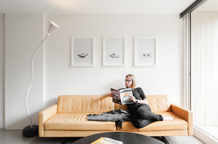
As in the bathroom, Fuller and Silvester use colour-on-colour and tone-on-tone throughout the apartment. “We think it calms the space visually,” says Silvester. There are grey dining table, chairs, coffee table and rug on the grey marmoleum floor, and white wall hooks, photograph frames and a Dion Horstmans sculpture on the white wall.
Ceiling lights have been removed to create smooth, clean surfaces. In their place, a single floor lamp bounces light off the ceiling to sufficiently illuminate the living area, and wall lights in the bedroom can be focused upward or downward. The north-east orientation floods the apartment with natural light and the sliding glass door allows for ventilation throughout.
Fuller and Silvester renovated their 40-square-metre apartment to test how efficient and comfortable they could make it. “Switching the kitchen and bathroom was effectively a small change – although it required a lot of design time and thinking – but it made a massive difference,” says Silvester. “Now we know it can work and we take that knowledge into our other projects.”
When it comes to small apartments, Fuller and Silvester demonstrate that design matters more than size. The architects have since shared their plans with other apartment owners in the Aquarius building who also wish to achieve the same successful outcome.
Specs
Architect
Silvester Fuller
Builder
Think Projects + InsideOut Projects
Passive energy design
The apartment benefits from a north-east aspect that allows good access to sunlight in the winter. Whilst in the summer, the surrounding vegetation together with motorised, retractable blinds by Helioscreen shade the living spaces when required. Care was given to retain the original operable windows, positioned across both levels of the split level floor plate, enabling particularly effective natural cross ventilation. The favourable aspect of Aquarius means that for much of the year, the glazing also allows the apartment to be flooded with daylight. As a consequence of the orientation and shallow plan, the apartment requires no air conditioning, relying solely on natural, cross ventilation.
Materials
Material choice within the apartment is pared back to a very simple palette. Bright white walls and ceiling are offset throughout the living and sleeping areas by a soft grey floor in natural Marmoleum over a natural cork underlay.The bathroom is given the appearance of a singular wet zone by wrapping in a single colour, yellow poured epoxy flooring and colour-matched large format Symonite composite wall panels. One singular joinery element, made from American walnut veneer articulates all storage and work areas, concealing the wet areas and providing a visual threshold between living and sleeping spaces.
Heating and cooling
The apartment is naturally cooled by cross ventilation, with no requirement for air conditioning. Shading and privacy is provided by retractable screens in summer as well as generous protection by the nearby trees. In winter the living room floor and masonry walls capture good levels of sunlight, removing the need for any additional heating.
Lighting
Minimal lighting is used within the apartment, reflecting the designers’ view that most apartments are unnecessarily over-lit. All internal ceiling lights were removed, replaced with floor and wall mounted fixtures which bounce light off the clean ceiling surface above. Within the working zone of the kitchen joinery LED strip task lighting is used, low-energy fittings were chosen and supplied by the client.
