Eat And Play
Kitchen spaces have reclaimed their place as the heart of the home in the past few years, proving to be more and more flexible – with that in mind we’ve explored six designs brimming with versatility.
Those Architects
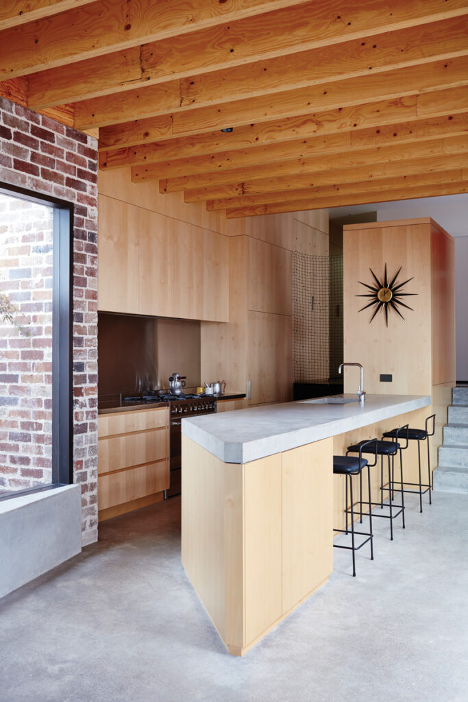
Beginning life as a small, semidetached dwelling, Maroubra House may have been well constructed but, having been built more than 70 years ago, it wasn’t well equipped to house the young family soon to inhabit it. Rather than utilising the standard solution of creating a boundary-to-boundary two-story dwelling,
Those Architects opted for a ground level addition that wraps around a north-facing courtyard – reconnecting the interior to its exterior. Looking over the courtyard the galley-style kitchen is linked to the living and dining areas of the home by a concrete bench that extends the full length of the living space. The bench affords out-of-sight storage as well as providing additional seating for the living area. Honest, cost-effective and low-maintenance materials were used throughout: bricks recycled from the original house, exposed plywood ceilings and matching plywood joinery with polished concrete floor and benches.
Specs
External: Recycled brick, painted steel, polished concrete benches, blackbutt decking.
Walls: Recycled brick, polished concrete benches, white-set render, hoop pine plywood panels.
Flooring: Polished concrete, black stained timber floors.
Joinery: Hoop pine plywood, concrete and stainless steel benchtops.
Lighting: ALMA general lighting, Cult pendant light.
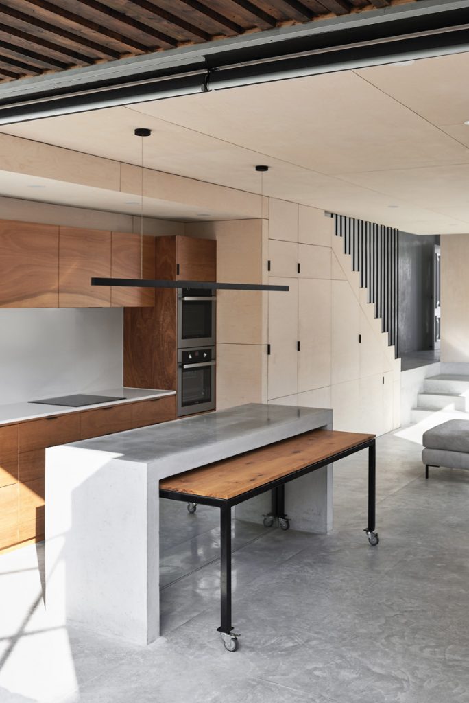
Ha Studio
Located on a small corner block, this project by Ha Studio originated as a tiny weatherboard cottage. The renovation was a game of “cat and mouse”, according to principal architect Nick Harding, as the client wanted an intimate dwelling that would shield its inhabitants from public view, while still connecting to its neighbourhood.
Old is fused with new in this renovation as the kitchen and dining areas move seamlessly from the lounge before opening into a courtyard. Introducing the interiors outward onto the side street is an operable batten screen coupled with a sliding window, allowing the space to engage with the streetscape while benefitting from natural ventilation and daylight. Meanwhile vertical timber boards and battens subtly blend with the sheer concrete mass and existing weatherboards in a visual play of textures.
Specs
Walls: Cypress timber screens.
Flooring: Sunken in-situ concrete base.
Doors and windows: Operable batten screen coupled with a sliding window that opens onto the courtyard.
Day Bukh
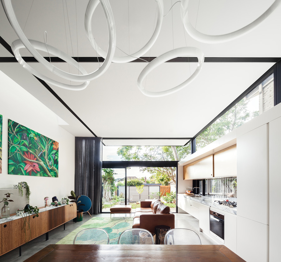
Embracing the art of playfulness, this kitchen is driven by themes of creativity and sustainability. The alterations and additions to the original semi-detached home were inspired by the traditional childlike idea of a gable-roofed house, and how that translates into purity of form and order of structure within a piece of modern architecture.
The appeal of this home is easy to identify; each space is open and malleable, providing the kind of flexibility that only a free-flowing house can offer. The kitchen and living space reflects this clearly with a clever utilisation of space and light that immediately draws the eye.
Specs
Walls: Low-E glass splashback.
Benchtop: Artedomus Calacatta Oro Extra.
Cupboards: Eco Core birch plywood.
Dining: Koda, Halo Circular.
Built-in oven: Miele H2661 BP.
Hot water system: 315L Solar Ark 20tb array with an electronic booster.
SpaceCraft Joinery
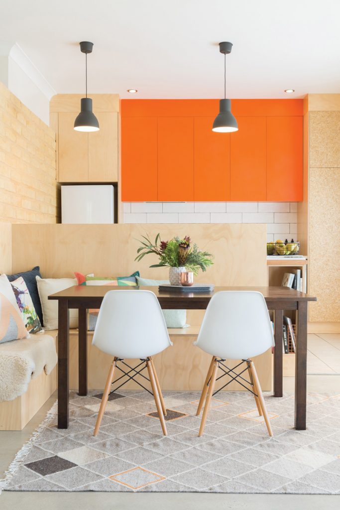
Some people are all talk when it comes to environmental responsibility but the clients for this project definitely don’t fit into that category, and to their relief, neither do SpaceCraft. The brief wasn’t simple, beyond their nonnegotiable environmental necessities they wanted to turn their kitchen into a midtwentieth century, modern style space with lots of storage in an ergonomic design – because it wouldn’t be fun if the area weren’t tiny.
The compact dimensions of this project meant the space had to be managed meticulously, so clever storage solutions like placing drawers inside the pantry and using the back of the island bench as a seat for the dining nook were great results. To capture that clean, streamlined Eamesera style – and eliminate the need for buying handles – SpaceCraft also notched out finger pulls and gave the overhead cupboards a gorgeous orange hue to finish everything off with the perfect pop of culture and colour.
Specs
Flooring: Existing tiles from original kitchen.
Doors and windows: 16 mm hoop pine plywood.
Cabinet internals & pantry door: 19 mm Novofibre – all other door fronts finished in water-based low-VOC finish.
Lighting: Ikea, Hekter.
Studioplusthree
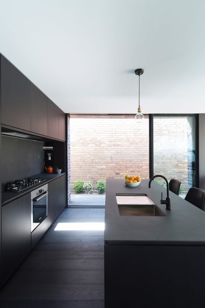
Llewellyn House began as a derelict but typical example of the Federation style that was prevalent in Australia at the turn of the twentieth century; but thanks to a transformative renovation and extension, the property is now the perfect, modern, light-filled living and rehearsal space for its musical owners.
One of the biggest changes to this property in Marrickville was the removal of the rear portion of the building, which was replaced by an open-plan kitchen and lounge space that looks onto the garden. Dark and light interplay as glazing on two sides allows natural light to pour into the darkly furnished space, while the kitchen itself features smooth porcelain worktops, French polished timber veneers and bespoke joinery that provides prized storage in the compact space.
Specs
External: Dry-pressed recycled brick with glossy black steel.
Built-in Oven: Bosch
Flooring: Tongue ‘n’ Groove timber floors.
Doors and windows: Alspec aluminium sliding doors.
Architect Prineas
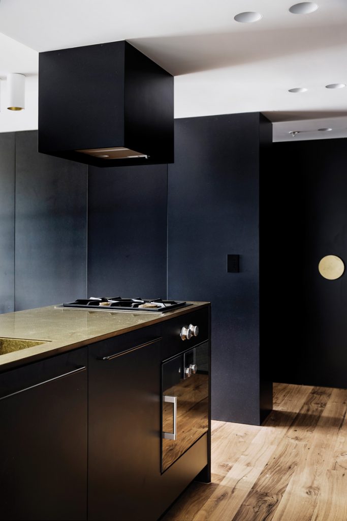
Glamorous is the only word to appropriately describe this alteration by Architect Prineas. The project is a refurbishment of a circa-2000 apartment within the 1915 Wolloomooloo Finger Wharf that provides a more generous connection to its harbour views and a more elegant solution to unite the interior to the balcony.
This open-plan kitchen strives for a level of intimacy and ambiguity where a door can be a wall and wall can be a door. Within the language of screens and walls, dark panelling and gold accents such as the kitchen bench create a luxurious theatrical motif without discouraging a number of settings for living to take place.
Specs
Flooring: Salvage, European French oak.
Joinery: Valcromat, matt coated black.
Sink: Custom, brass to patina.
Sink Mixer: Vola, One Handle Mixer, Dark Gold.
