Born Again
A landmark modernist home in Brisbane is given a new lease on life through an empathetic and considered restoration.
Bardon House occupies a ridge-top site in the leafy suburb of Bardon at the foothills of Mt Coot-tha, Brisbane. It was constructed in 1971 and was realised during a “burst” of output by local architect, Gavin Litfin, which occurred between his Masters Degree in City Planning (UQ) and his Research Masters in Environmental Design (YALE). Conceived in the spirit of regional modernism, it remained a treasured family home until its sale in 2014. Despite its deteriorated state, thankfully it was saved from demolition by an enlightened buyer and two very capable architects, Lachlan Nielsen and Morgan Jenkins, of practice Nielsen Jenkins. Their collective commitment to its restoration and refurbishment, completed in 2017, has ensured it remains a familiar landmark for future generations.
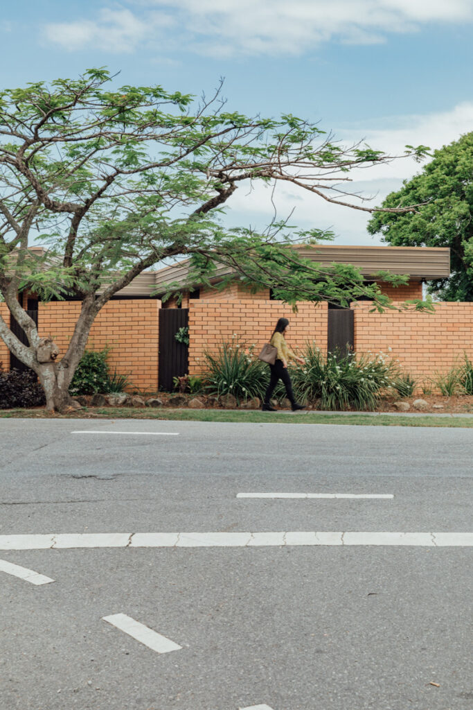
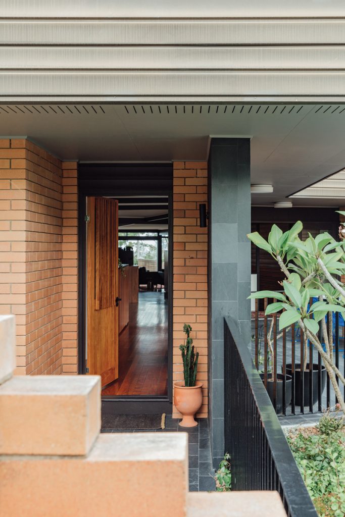
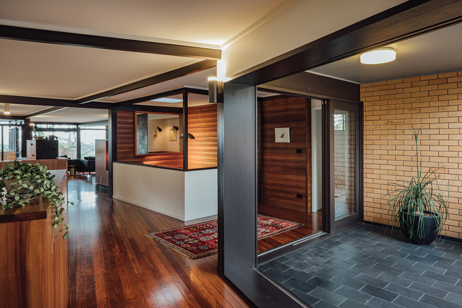
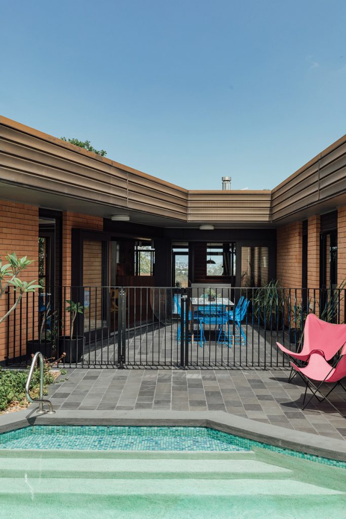
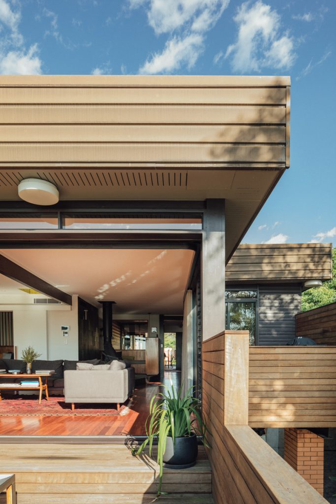
The flat, low-slung roof appears to sail over the orange masonry garden walls, which are the first suggestion of the building’s predilection for modernist architecture. Beyond these, an intimate garden courtyard and pool promote a relationship between indoor and outdoor space, echoing the sensibilities made famous by seminal modernist architects like Rudolf Schindler and Richard Neutra. An orthogonal plan with exposed roof beams, floor to ceiling openings and the extensive use of glass further strengthens its architectural pedigree and, importantly, allows the building to exploit its setting by framing views of the surrounds and encouraging the natural flow of breeze and sunlight.
One of the most striking things about the design of the original house is the simplicity and rigour with which the planning diagram is realised. Taking its cues from splayed site boundaries, two building wings, one long and one short, meet to create a ‘Y’-shaped plan. The journey to the narrow end of the ‘Y’ coincides with the moment the site falls steeply below foot – a clearing opens in bushland and frames, behind glass, an astonishing view across the neighbourhood to the horizon and city skyline in the east. An equal and opposite condition is experienced at the intersection of the ‘Y’, where gaze is thrown toward the west, revealing the unmistakable silhouette of Mt Coot-tha.
When Nielsen and Jenkins arrived at the project the architectural integrity was somewhat compromised by its state of decay. To solve the problems of serious water ingress, they replaced major building components, including box gutters, downpipes, roofs, windows, doors and both verandas. In the interior, they concentrated their efforts on removing superfluous layers that were obstructing movement and view pathways; partition walls at the entrance lobby and kitchen for instance.
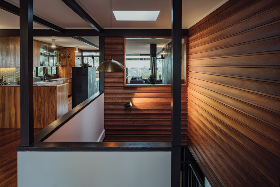
They made new openings to improve spatial connections; as well as a larger opening between bedroom, living room and window to frame the view from the living room over the staircase out to the mountains. New skylights were introduced to the roofscape to improve natural daylight inside. The masterstroke, however, was lowering the veranda so as to ensure that the balustrade did not hinder the long view from the living room.
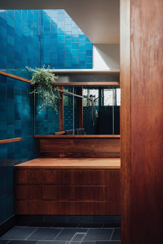
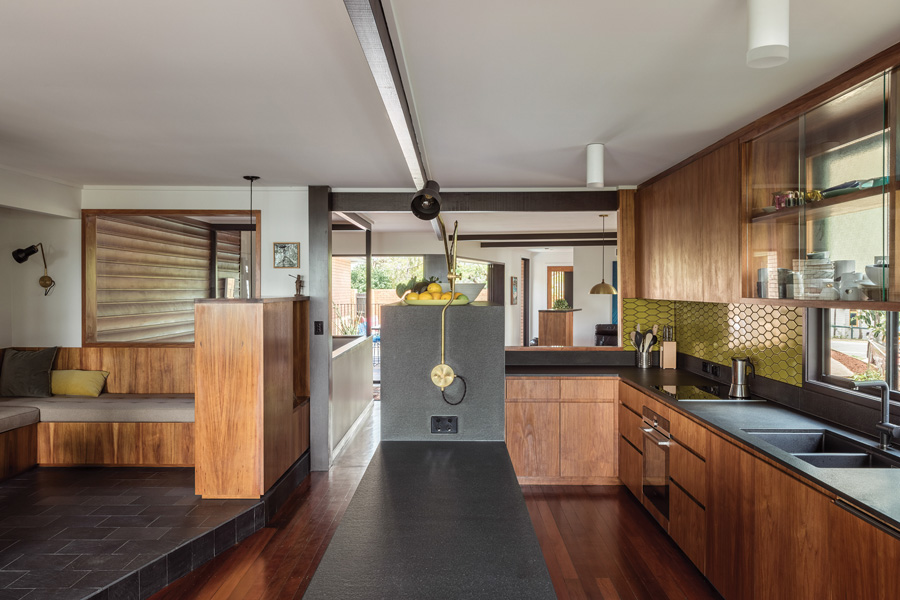
The design deftly weaves together old and new, expressing its genuine dedication to mid-century influenced joinery, furniture, finishes and fixtures. The comprehensive blackwood timber joinery elements incorporated in the kitchen, bathrooms, study, sitting room, fireplace booth and bedrooms drew upon Nielsen Jenkins’ experience both as proficient joinery designers and cabinet-makers. They designed stand-alone units to establish “hard edges to open-plan rooms” in ways that subtly reinforce the existing axis. The boldly coloured ceramic tiles, sourced from Heath Ceramics, California, as well as the numerous brass lighting fixtures, also from the USA, further embellish the home with authentic mid-century styling.
In managing the significant portion of the project dedicated to repair, the architects’ approach was suitably uncompromising. By contrast, in dealing with new interventions made to the interior, their hand was consciously restrained. To the credit of both owner and architect the building footprint was not increased, room relationships were preserved and the material palette was tastefully and appropriately reimagined. The genius of what Nielsen Jenkins brought was their deep understanding of and appreciation for the beautifully choreographed moments Litfin had conceived. “For us it was about reinforcing a few opportunities we felt hadn’t been fulfilled [in the original design],” Nielsen says. “We had an understanding of what Gavin was trying to achieve but we didn’t want to over-complicate it or do something that wasn’t true to the diagram.”
In unravelling the history of this very special house, a great deal more than just architecture was learned. Untold stories about the history of the neighbourhood emerged and “two degrees of separation” were established between the daughter of the original architect and a friend of the new owner. Through this project, young architects Nielsen and Jenkins connected with Litfin, the original architect, who offered his mentorship as a means to continue the generosity shown to him in his early career in the 1970s. The legacy of this heritage project will continue to reverberate across the city, through mind and matter, for many years to come.
Specs
Architect
Nielsen Jenkins
nielsenjenkins.com
Original architect
Gavin Litfin
Builder
Stewart Harris Constructions
Passive energy design
The original design of the house by Gavin Litfin had worked off two simple geometries which result in small east and west elevations and maximise north and south faces. The plan of the building is allowed to stay thin through a large courtyard to the west with large overhangs, and means that breeze is constantly being drawn through the house. The new work allowed more openings to this central courtyard resulting in this effect being amplified further.
Materials
The ground level has a concrete slab, clear sealed and saw cut for improved thermal mass. The main volumes have been highly insulated through the floor and ceiling in the renovation which has improved the thermal performance of the house dramatically. The cavity brick of the exterior of the building has been left largely untouched from the original house design, but performs well as a thermal insulator when combined with the cooling of the ventilation strategies. New joinery throughout the house is sustainably sourced Tasmanian blackwood with a Danish oil finish. All paints used throughout the project are low VOC.
Flooring
The coloured concrete floor slab downstairs is helicopter finish with a penetrating matt sealer. The original timber floor upstairs has been resealed in water-based polyurethane. The floor tile throughout the project is a black slate from The Marble Merchant and the coloured tiles are all handmade ceramics from Heath Ceramics in San Francisco.
Insulation
The roof cavity is insulated with R6.0 Earthwool thermal ceiling insulation and Insulbubble reflective insulation sheet/sisalation to the roof. There’s bulk insulation to walls: 90mm thick R2.5HD Earthwool to external walls, plus 75mm Earthwool sound control batts to all internal walls for improved sound insulation. The suspended timber floor has been lined with 6mm FC sheet and insulated with R6.0 Earthwool thermal ceiling insulation.
Glazing
All windows have been replaced; windows are powder-coated aluminium and Breezway louvres, and doors are paint grade timber framed.
Heating and cooling
The house has split system AC which is used only on very rare occasions to control humidity when there is literally no breeze. The direction and scale of the openings of the house catch any breeze that is on offer, and the thin plan allows very effective cross ventilation. The house can be shut down very effectively in winter and is heated by a central wood fireplace that spreads warmth throughout both levels.
Lighting
The house uses low energy LED lighting. Wall lights are from Rakumba and the brass wall lights and pendants are from Allied Maker.
