Blank Canvas
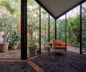
It’s not often an architect is given completely free rein when it comes to designing a house, but an interesting St Kilda subdivision in Melbourne’s inner south offered Fiona Winzar just that. Her playful response to a small, park- side site so charmed her clients they decided to sell their existing home and move right in.
When graphic designer Miriam Bereson and her husband Adam Nissen, who has studied both architecture and environmental science, bought their run-down, heritage listed home in East St Kilda back in 2002, its position beside a small but well loved back- street park filled with towering, majestic gum trees was an obvious drawcard. They had renovated locally before and were happy to do so again. “I really love spaces … and for some reason I gravitate towards derelict places, places that are just not loved at all,” Miriam says cheerfully.
The problem was that, even after renovating, the site still lacked access to the degree of natural light Miriam craved. “We were living in a home that was facing north to a park but because we’re on the south side of the street the huge back garden that we had really didn’t get a lot of light,” she recalls. “And so all I saw when I looked out to the back garden was mortgage and debt. Given that we have a park next door, and as much as I love gardens, I wasn’t getting the trees or anything. The whole concept was I wanted a tree house, to be part of the eucalypts.”
Miriam and Adam decided to subdivide and build an environmentally efficient “tree house” for some other lucky soul to inhabit. Finding inspiration in the warm, natural, unfussy interior of a nearby café – Las Chicas in Balaclava – they approached the architect, Fiona Winzar, about designing their place. “I liked the fact that it had angles to the place, I liked the feel, I liked the textures,” Miriam says. “She was my first port of call and she kind of got what I was talking about.”
Miriam says they considered building for themselves from the start. “The question was, do we build something and on-sell it to somebody, or do we live in it, and we couldn’t make up our minds from the beginning which way to go,” she says. Eventually they commissioned Fiona to create a sustainable house-and-land package to sell and, much to her delight, gave their architect complete creative freedom with the design.
Fiona saw an opportunity to showcase what can be done to increase density successfully in inner city suburbs, close to great infrastructure. “To be living in a more compact kind of way in the inner city is really the critical thing, I think, in this project,” she says. “The site area is just one-third of the size of the original house block (but) contains a new house whose space and amenity is superior to that of the original house.” But she knew the site also presented myriad complications. Planning was a potential nightmare: aside from the obvious challenge of creating a flexible home, which feels expansive, there was a 180-square-metre, subdivided site, not just close to the original house but also to the neighbouring park. “First, a covenant had to be removed to allow for two dwellings on the lot,” she says. “There was also a Special Building Overlay relating to flood. Finally, a Heritage Overlay added complications to the usual planning permit and energy rating requirements.”
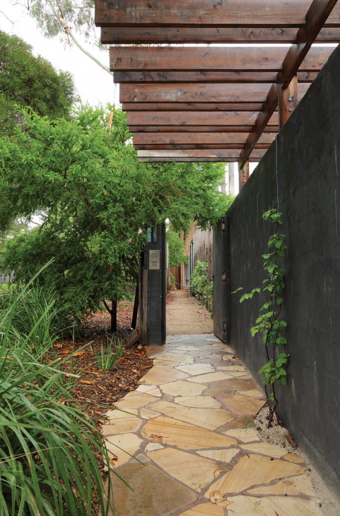
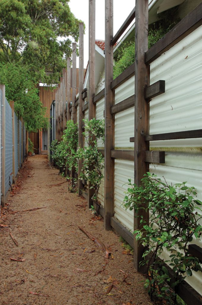
“Where you‘ve got that many bureaucratic hurdles it can be a very draining process,” Fiona concedes. But with plenty of experience pushing planning constraints to the limit and clients “willing to go through that ride” she settled upon a dramatic, tri-level design using zero set-backs on three sides. The final design provides 250 square metres of space plus a small courtyard at the front and a private entrance through a concealed “green tunnel” that runs alongside the park.
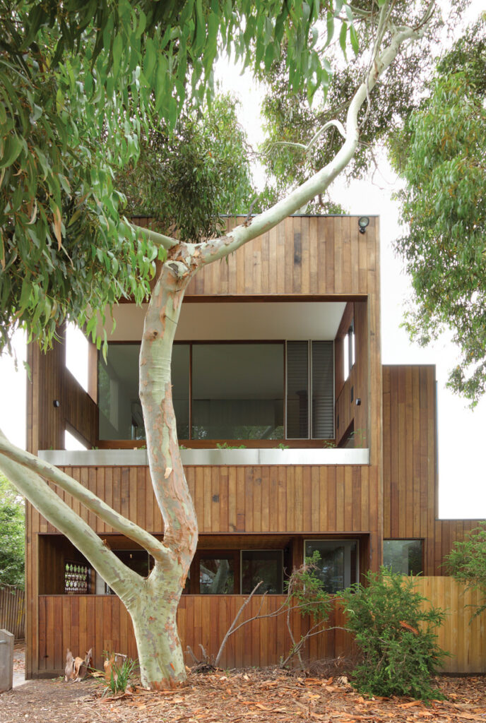
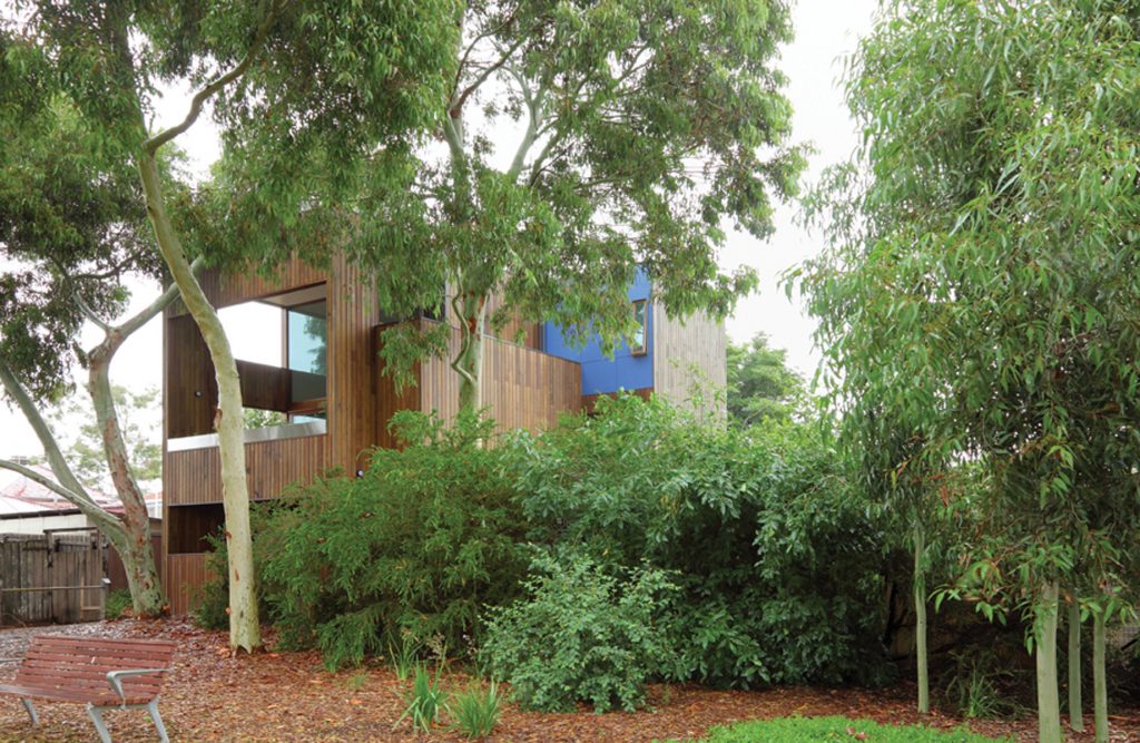
At the centre of Fiona’s initial design, literally and figuratively, were those stunning borrowed views to the park’s 12–14-metre- tall eucalypts. Living areas were to be clustered on the first floor to capitalise on vistas. Three bedrooms, two bathrooms and car space were accommodated over the ground- and top-floors but with enough flexibility to meet future owners’ needs. Despite its 9-metre height the house would be a presence discrete from the park, sitting comfortably alongside multi-level neighbours and camouflaged by vertical ship-lap cladding of Silvertop Mountain Ash from Gippsland, stained to match the surrounding trees.
For Miriam, Adam and their children Sidra, now aged nine, and Isaac, aged three, Fiona’s concept became a temptation too sweet to resist. Half-way through the project they decided to sell their existing house, move into the new one and make a few changes to the compact floor plan (including adding an extra bedroom). Fiona concedes this added time and complexity to the process – she recalls much reconfiguring of rooms on the ground floor in particular, as well as adjusting the building envelope and obtaining two amended planning permits along the way. “I’ve got mountains of files of all that admin you’ve got to do, the collateral,” she says with a laugh. “The build itself was not so complicated, it’s where you’ve got variations being created along the way that (you) stretch time.”
The end result is a home that offers seemingly endless flexibility as well as jaw-dropping views not simply over trees but around them.
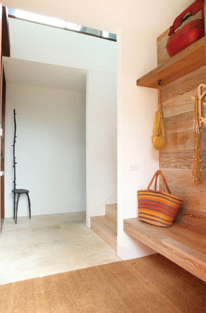
On the ground floor are a wide entry hall; storage space concealed behind 1.5 m x 2.6 m sliding timber doors painted turquoise (a testament to Miriam’s flair for bold colour seen in small touches throughout the house); two bedrooms, one of which opens onto a delightful enclosed timber deck overlooking the park; and an improbably glamorous combined laundry-bathroom. The latter was introduced as part of the new design to save space but it works like a charm and feels light and spacious thanks to glossy white surfaces, a lightly textured Travertine stone floor, a lusciously curved, white- tiled feature wall cleverly concealing a toilet, a 1.4-metre tall glass shower screen, and a long, white Corian laundry bench top that’s scratch-proof and warm to boot. At the rear of the ground floor there’s a garage-studio space that Miriam and Adam plan to use as a master bedroom while their kids are young before eventually migrating to the top-floor loft.
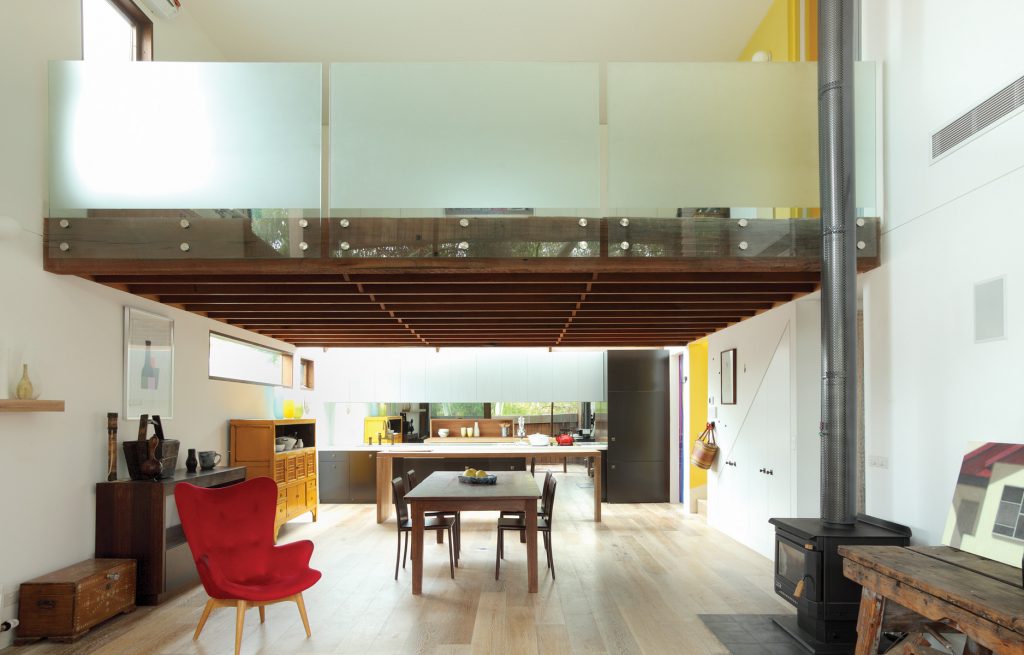
The voluminous, mainly double-height first floor level is comprised entirely of living spaces. A small family office-cum-music room at the top of the stairs (with more concealed storage behind large sliding doors) opens onto a central dining area. Overhead there’s a low-slung timber “ceiling” that’s actually the base of a mezzanine level designed to accommodate the master bedroom but which currently acts as a loft-cum-play space for the children.
Made from timber beams recycled from an old bridge, the mezzanine “box” is a chunky, ’70s reference that nods both to a love of the era shared by the owners and their architect and to the timber cross-braced ceiling of a St Kilda icon: The Stokehouse restaurant. It also serves to focus attention on the double-height openings at either end.
To the south there’s a simple kitchen, topped with massive, angled, double-glazed, timber-framed skylights. Initially Fiona designed a cheaper solution using translucent polycarbonate that would have offered dappled light, but Miriam saw the potential for opaque, dramatic views and found some extra money to allow full width glazing. To the north there’s a compact living area that opens onto an enclosed timber deck like the one downstairs. Surrounded by gum trees stretching skywards, and with the sounds of birdsong and of laughter drifting in from the park outside, it’s a delightfully playful and atmospheric space.
On the top level there’s the master bedroom-cum-loft with ensuite and void overlooking the living spaces below and with stunning views of its own. This can be closed for privacy using more of those massive sliding timber doors.
Despite the extra work involved in tweaking her initial design to meet her clients’ changing requirements, Fiona admits she was secretly delighted when they opted to nab the place for themselves. In fact, she was hoping they’d do it all along. “They trusted me to come up with something really good that they could sell off, but in my mind I was saying to myself that I want this to be so good that they’d move in,” she says. “They’re very ’70s … very much of that time, and I am too but I probably don’t live it still as much as they do. So there’s a real ’70s feel in the detailing and you get that sense when you look at the interior. I used them absolutely, I pretended they would be my ‘real’ clients. It was a bit of stealth or hopefulness on my part. And finally they came around.”
Specs
Architect
Fiona Winzar www.winzar-architects.com.au
Builder
Sapa Construction Services Pty Ltd [email protected]
Joiner
Allcraft Joinery [email protected]
Passive energy design
The house is oriented north with double-height glass to the first floor living level. The double-height glass is set back from a semi-enclosed verandah detailed to precisely control the sun’s angles. In summer the living level and the deck are shaded. In winter the sun can penetrate the living level. Windows and doors are positioned for effective cross-breezes.
Materials
The ground level has a concrete slab for thermal mass. The main volumes are of highly insulated, lightweight construction. The interiors feature expressed laminated and recycled timber beams and the external skin is clad in renewable timber ship-lap cladding. Windows and doors are timber framed with double glazing and comfort glass.
The design provides comfortable living with low energy use year round.
Flooring
Imported, machined-timber flooring features a pre- treated 6 mm solid timber veneer with ply substrate: “Smoked and Limed Oak” from Royal Oak Floors/ Harper & Sandilands.
Insulation
The roof is insulated with Bradford Gold High Performance R5.0, glass wool thermal. There’s bulk insulation to new walls: 140 mm thick R2.0 glass wool and foil. The ground floor is insulated with 50 mm Styrofoam under-sheet to the concrete slab.
Glazing
The house features timber-framed, double-glazed windows and skylights by Redwood Joinery. “Breezeway” louvres and Viridian Comfort glass are used on north-facing windows and on sliding doors on the ground-floor and first-floor decks.
Heating and cooling
Passive solar design features including northern orientation, external shading and effective cross- ventilation reduce the need for heating and cooling devices. In winter extra heat is provided by a hydronic slab and panel heating as well as a slow combustion wood fireplace. The house is also wired for fans for possible use in the future.
Hot water system
The solar-boosted gas hot water system is a Solarhart Kf Series.
Water tanks
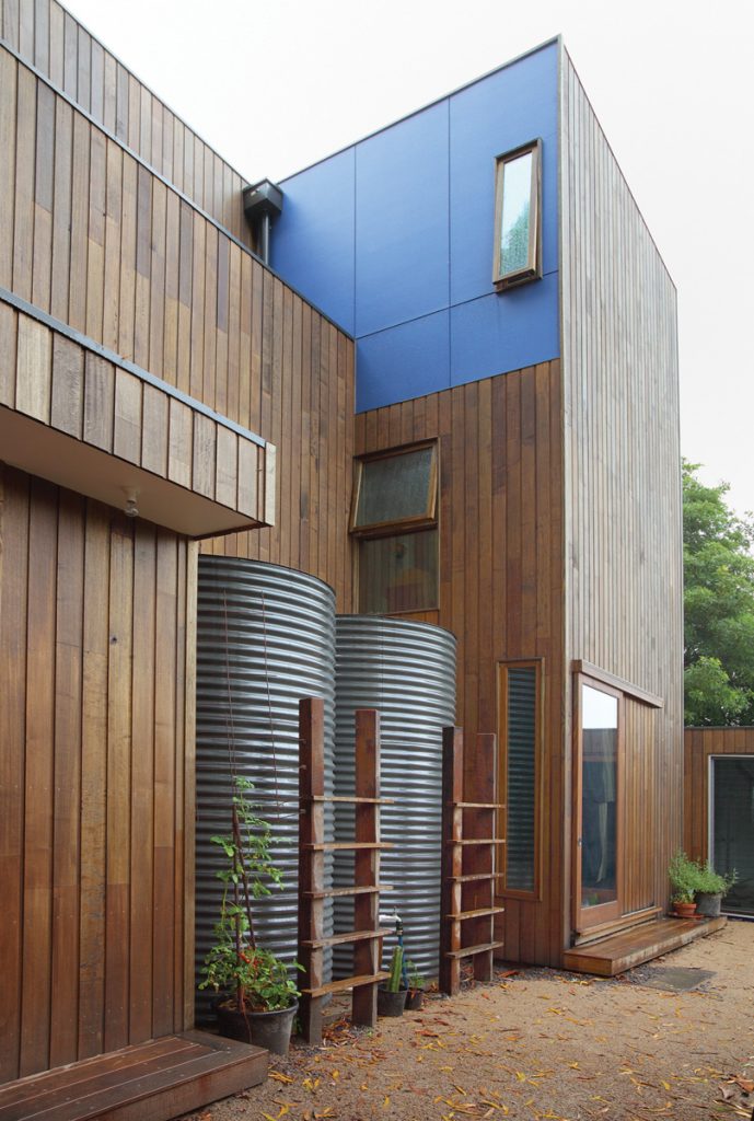
Twin Aquasteel corrugated Colorbond rainwater tanks combine to service toilets and garden using a Vada pump. The tanks were custom sized and have a combined capacity of 6000 litres.
Lighting
The house uses low-energy and LED lighting from Mondo Luce. No recessed downlights are used.
