Beautiful Tricks
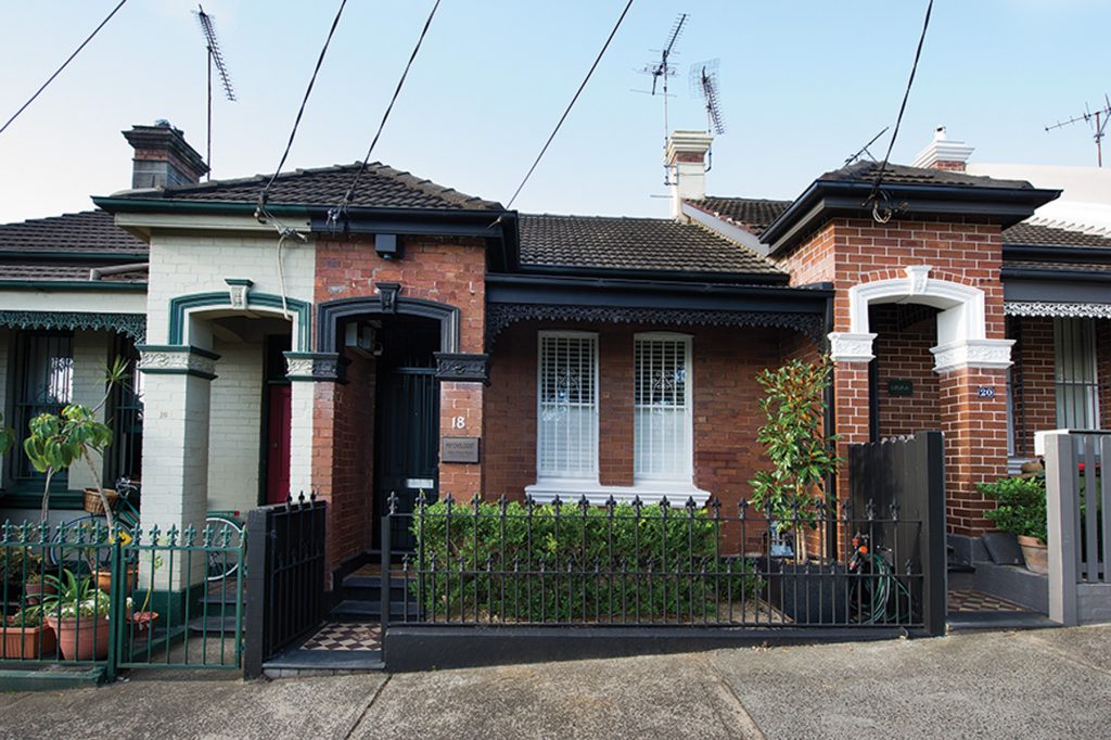
With little going for it except its inner city location, this Victorian terrace needed some serious work. Architect David Boyle’s brilliant redesign creatively employed a number of tricks to solve some fundamental problems.
Renovating old houses in the inner-city usually means working with a number of constraints. There’s the age of the building fabric to deal with, and little, if any, room to move on what is usually a narrow, tight site. There are issues of overlooking and overshadowing, and the need to improve light, air, aspect and space. Older suburbs, too, are generally protected by strict planning controls designed to preserve heritage streetscapes.
This single-storey Victorian terrace house in one of Sydney’s densely populated and desirable eastern suburbs was affected by all of these constraints. To add further complexity, the block sloped down from the rear northern boundary to the street, which created a severe problem of damp at the front of the house. And towering behind the succession of jerry-built lean-to additions at the rear of the house was an old, 10-metre-high warehouse building, built hard to the boundary.
“The house was pokey, and dark, and oppressive,” says the owner. She pauses while searching for more adjectives to describe the house’s depressing state. “And dank and damp,” she adds. “Now the light inside is unbelievable in comparison – well, there’s no comparison to what it was. The light is the spectacular thing about this house. David has just transformed it.”
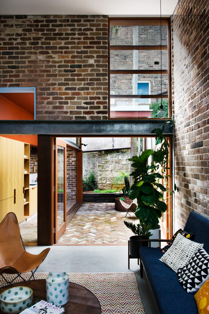
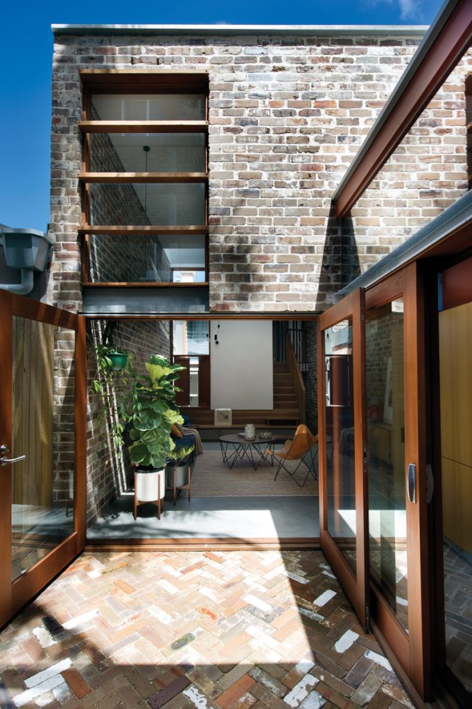
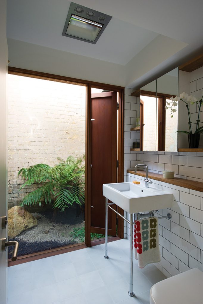
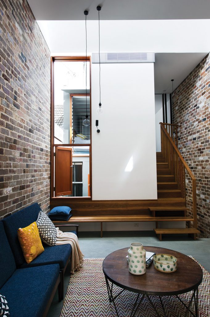
Architect David Boyle has indeed transformed this house, scooping light into its centre via a pitched skylight that slices across the midpoint of the roof – a distance that’s far enough away from the tall warehouse to catch winter sun. The sunlight streaming in through it bounces off the central white panel of the southern interior wall and back across the new living area into the rear courtyard garden. It’s like a gigantic sun reflector. Some of the sunlight also filters down through the open stairwell into the front hallway. High-set windows in the living room allow yet more light to wash across the ceiling. And banks of glazing in both the kitchen and the downstairs bathroom, opening onto two courtyards, not only illuminate those rooms, but also blur the boundaries between indoors and out.
“You look at the house from the outside and you can’t imagine what it is going to be like inside, but it is really surprising,” says David. “When you walk into the house all of the spaces are interconnected, and air and light passes from room to room. There’s a blurring of the boundaries, of the limits of each particular space, so the house feels bigger than it actually is.”
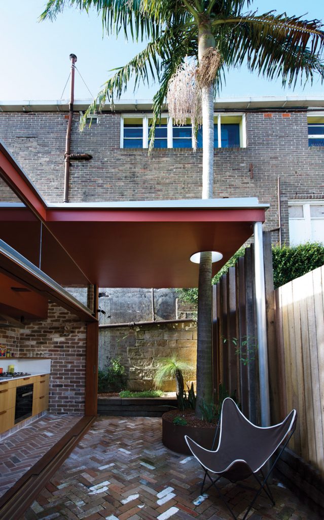
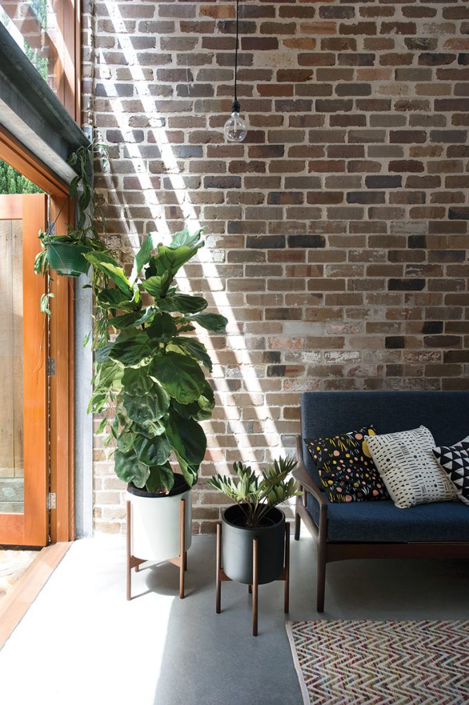
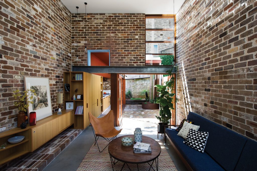
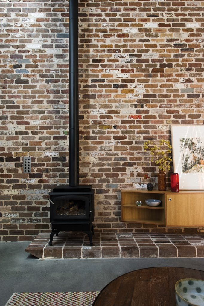
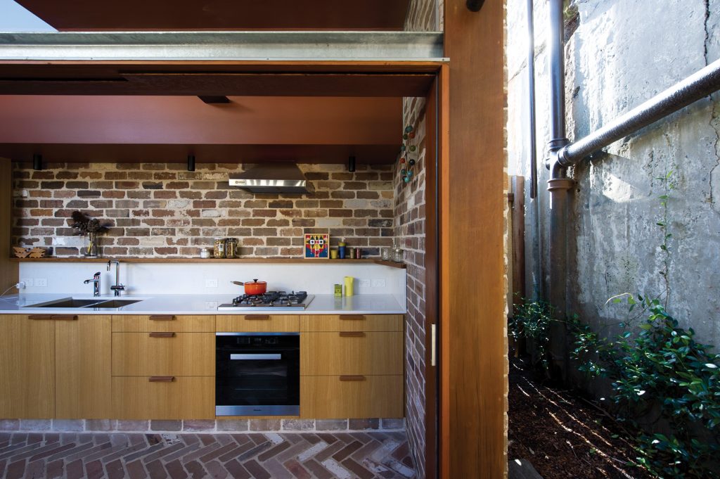
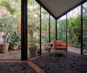
Another trick David employed to not just blur the boundaries, but also visually expand the space, was to use the same building material inside that can be seen outside. Recycled bricks – most salvaged from the demolished sections of the house – feature in the large, double-volume living area, where they clad the walls and form a hearth for the pot-belly stove. In the kitchen, which leads off the living area, they clad an end wall and also pave the floor in a herringbone pattern that continues out into the courtyard.
“The bricks are a very important element in terms of the overall design, and giving the house a sense of stability and solidness,” says David. “But I used them for another reason as well. Because the neighbouring warehouse is built of brick I wanted to use bricks in the house to visually link it with the boundary wall. When there are similar materials in view you tend to read it all as one space, and that helps to also make the place look bigger than it really is.”
So the issues of light and air and space were addressed. But another issue sometimes found on tight, landlocked sites – that of no focal point or distant aspect – has also been resolved. When David visited to do his initial site measure he noticed two features in the overgrown back garden that he wanted to keep and highlight. One was a mature Bangalow palm, and the other was a section of sandstone blocks that formed the foundation for the warehouse wall.
“So I designed the building in a way that used those two elements to create a strong focus from within the house,” says David. “When you’re sitting on the sofa you can see the top of the palm tree through the upper window, and you can also see the sandstone blocks below.”
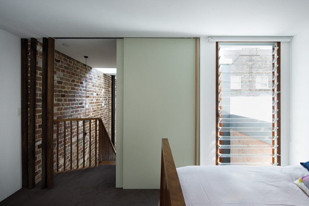
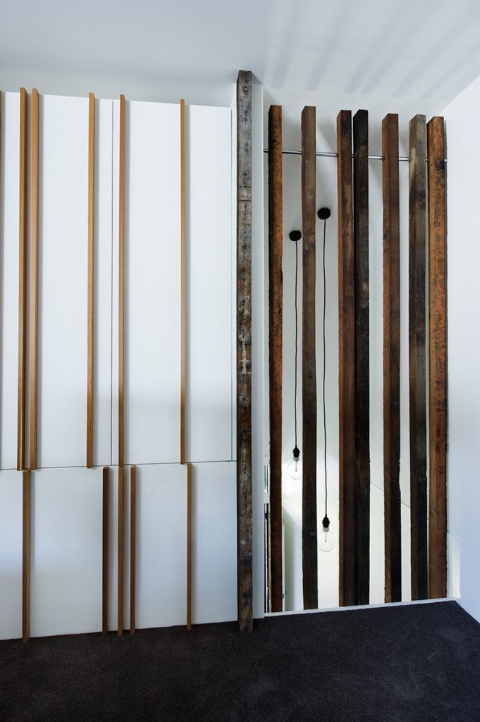
Hardwood stairs from the living area lead up to a master bedroom and a compact ensuite bathroom. Diagonally opposite a full-height louvred window in one corner is a floor-to-ceiling opening overlooking the entry hallway. Screened with several lengths of undressed timber, also salvaged during the demolition, the opening provides a sense of airiness and release in that corner, as well as cross-flow ventilation.
“I wanted really nice joinery and interesting features, which are characteristic of David’s work,” says the owner. “The whole place is now carefully and beautifully detailed, ventilated and lit.” Brief answered.
Specs
Architect
David Boyle Architect
davidboylearchitect.com.au
Builder
Jigsaw Constructions Pty Ltd, Eliot Bale
Joiner
Eastcoast Joinery
Stair and built-in seat
Rossmore Carpentry
Passive energy design
Passive ESD principals underpin the design. A series of voluminous interlinked spaces have been added within the available building envelope. Like a giant three dimensional puzzle, the boundaries of the spaces are blurred and connections to outside prioritised. Living spaces have been relocated to the rear with access to northern light with an appropriately sized and shaded high level window to the living room.
An internal courtyard to the eastern boundary provides aspect to the bathrooms and northern light to bedrooms. It also provides direct cross ventilation to the living room, with operable windows on the northern and southern walls. Incorporation of a high ceiling to the living room, which extends over the mezzanine bedroom to the entry, improves natural ventilation and encourages breezes throughout the whole house, assisted by internal openings between rooms. Concrete slab on ground and brick walls improve thermal performance of the building envelope and aid in thermal lag.
Materials
Where possible natural materials have been used and left in their natural state, thereby minimising maintenance and re-painting, and offer a robust and thermally efficient building fabric. The restrained material palette includes concrete, brickwork, timber and painted plasterboard. The majority of the brickwork was salvaged from the demolition and recycled. Additional recycled bricks were sourced to complete the walls and paving. Hardwood joists have been salvaged for use as screens throughout the house.
Flooring
The existing pine timber flooring has been retained and repolished in the front section of the house. The concrete slab to the living room is burnished and finished with a clear penetrative sealer. Recycled brick in the kitchen floor visually connects to the courtyard and blurs the boundary between inside and outside. Recycled bricks also face the kitchen kickboard, which extends as a plinth into the living room to house the fireplace and visually unify the spaces. The stair, balustrade and bench seat are constructed from solid Australian hardwood blackbutt. One hundred per cent wool carpet is used in the upper level bedroom.
Insulation
Timber external walls to the courtyard are insulated with Tontine R2.0 bulk. Austex R2.0 Greenstuf ceiling batts.
Glazing
The house features custom timber-framed single-toned glazed windows and doors. Breezway louvre windows are used in the skylight and upper level bedroom. Solid timber casement panels to the living room courtyard window maintain privacy.
Heating and cooling
A freestanding gas heater in the living room acts to heat the whole house due to the high ceiling and use of surrounding materials which absorb the heat during the day and slowly release the embodied heat at night. Two small Daikin 8KW single phase reverse cycle bulkhead air conditioning units have been used and these have been zoned to provide heating and cooling to the front room and the living room when required. This tempers the extreme peaks during summer and winter.
Hot water system
A new Rinnai instantaneous gas hot water system is used.
Water
Stormwater is collected to a piped detention system under the house, gravity fed to the street.
Lighting
The high level skylight and incorporation of a central courtyard provides natural daylight to every room in the house, which minimises the use of artificial light during the day. At night, a combination of LED, compact fluorescent and halogen are lights used.
