Two From One
When the owner of a weatherboard in Marrickville, Sydney, wanted to renovate she had to face a tough decision. The house was too frail to add onto, but the block was large, so she decided to team with architect David Boyle to build not just one but two houses.
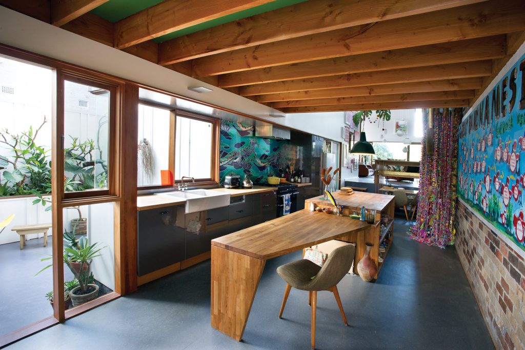
Making a cup of tea in her cosy kitchen that looks out onto a sunlit side courtyard and back through to a generous split- level living space, the owner muses, energetically, as she seems to do everything, on the long but ultimately rewarding process of creating two houses on her block.
“There was one house on the site. It extended out the back with jerry-built add-ons and it had a huge side yard. Adding on was too dodgy. So the decision was: I stay and borrow to make the money out of the block and pay the loan using rent from next door. Basically
I wanted two houses, one for me and my two children, who are sometimes here and sometimes not. I wanted the houses to have different interiors, but the same aesthetic and materials.”
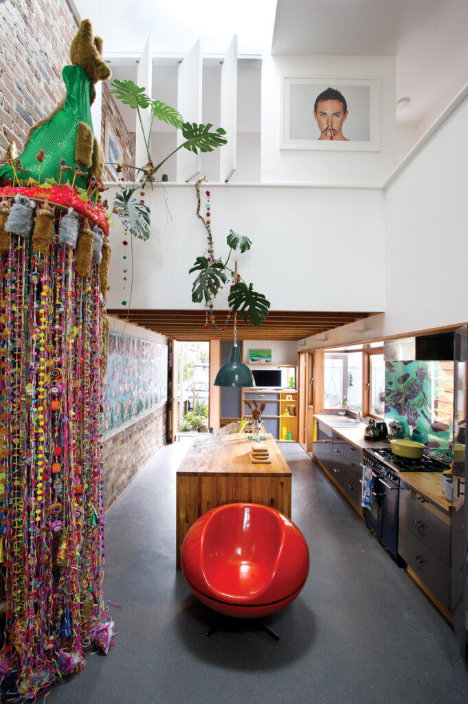
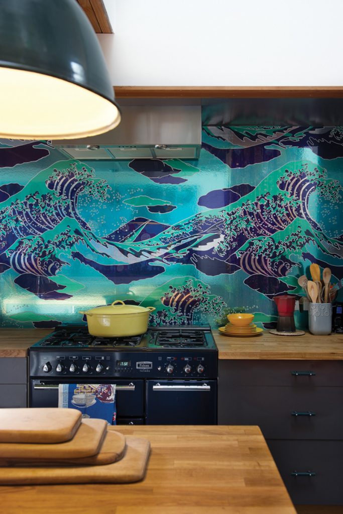
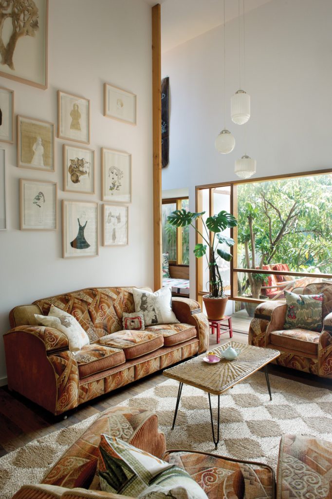
As well as undertaking her own significant personal contribution to urban consolidation, she came to her architect with a detailed wish list. Critically, her home had to fit a witty contemporary art collection 25 years in the making, mainly works on paper but with at least one large playful sculpture. Plus for years she had been “bowerbirding” items – like wave wallpaper she imagined as a splash- back – for just this moment.
Early conversations focused on what council might allow. Boyle says there were dwellings in the street narrower than her existing house, so from a council perspective they had the opportunity to subdivide and maintain the stereoscope. Council said “no” to free- standing homes though, directing them to build two houses with a shared party wall.
“As we were in control of the width, we decided to allocate more space to her block than the neighbour,” Boyle says. “While the neighbouring home is conventional in floor plan her place is like a large gallery space, because she has such a large eclectic art collection.
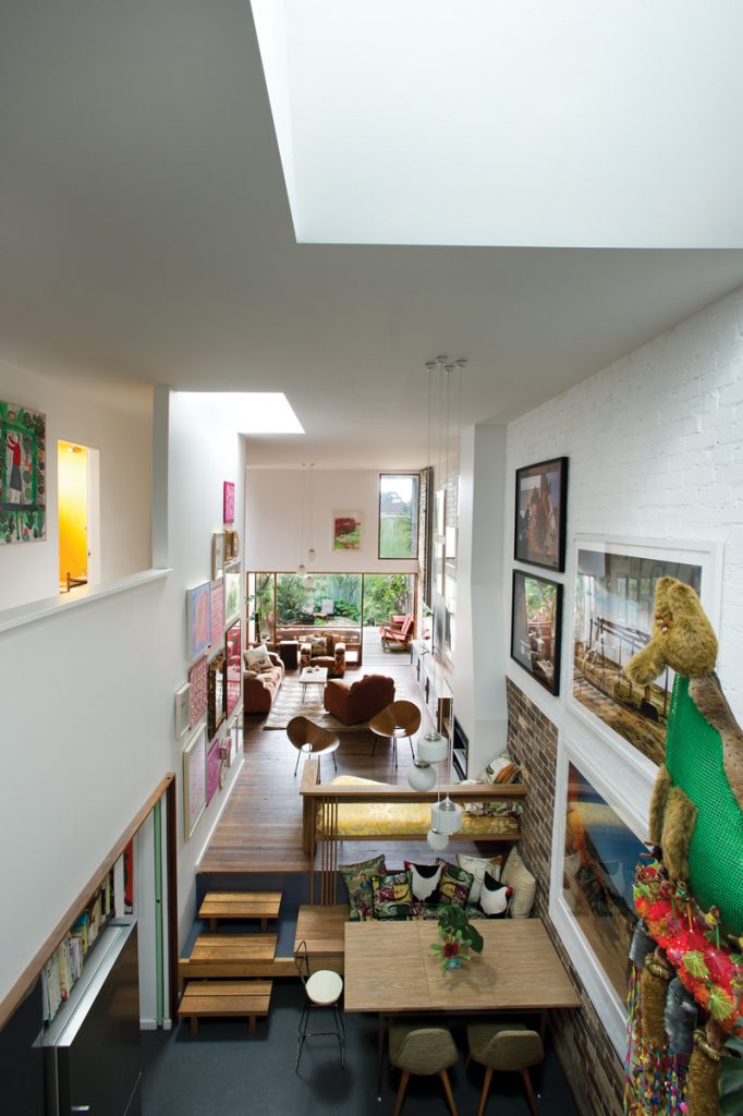
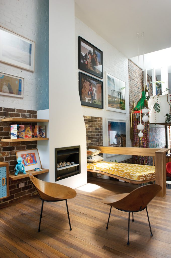
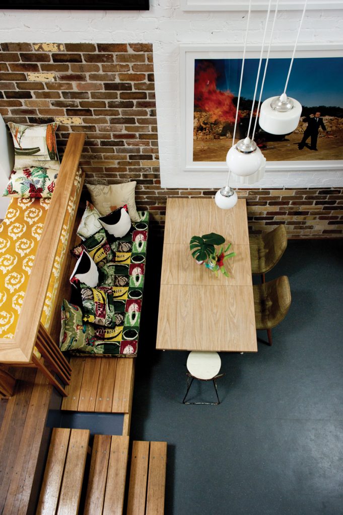
“Her living room space starts right at the front of the property and extends back in three zones, to give her wall space and expand the sense of size of the house. The kitchen is a low space – she had a really long painting she needed to fit in – beyond that is the dining, a big double-height space, then a little mezzanine, a fireplace and a lot more wall space.”
“It is the split level of the sixties and seventies,” the owner says. “It makes it feel much more spacious than it would if it was all on the same level.” Part of her brief to Boyle was in fact to draw on the Modernist aesthetic. “I wanted a Modernist house but in a terrace house, an impossible ask, yet he has delivered on it,” she says.
Another request was to have her own bedroom on the ground floor, and her children’s upstairs. Hence her bedroom is slotted in beside the living space, so when she is there on her own the house operates on just this level. “It is adaptable, depending on who is here and who is not,” she says.
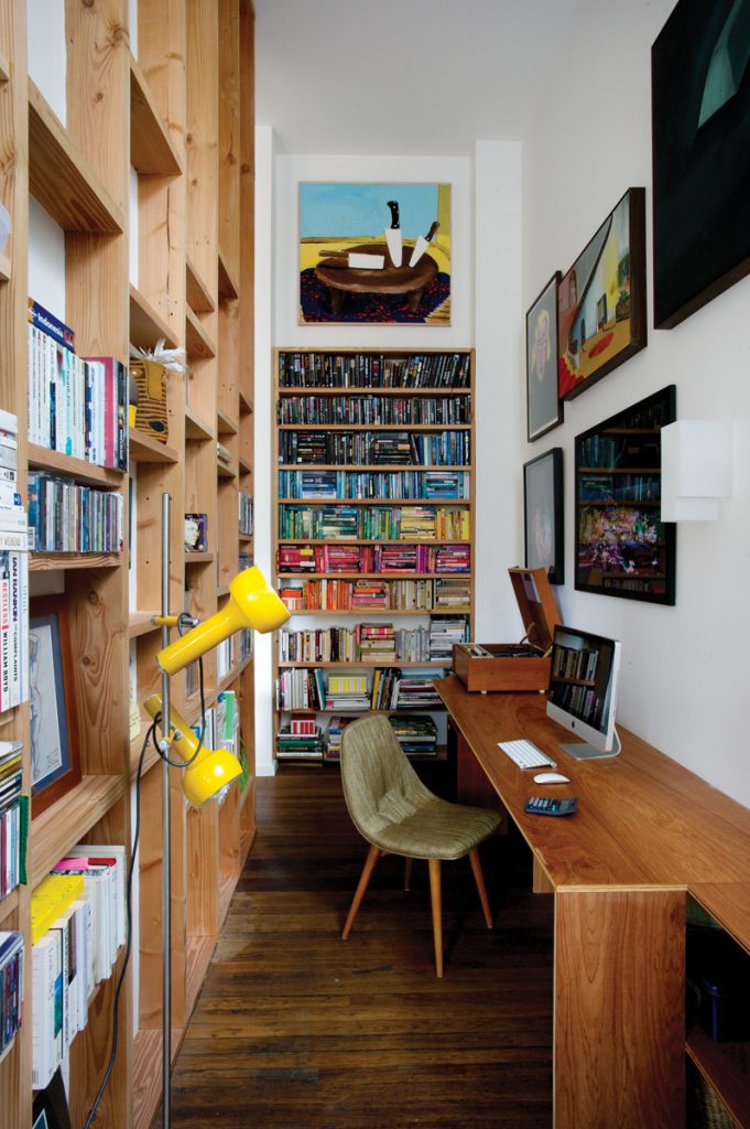
Her office is likewise downstairs, a sliver of space running beside the sitting area which opens out onto the rear deck.
“He is so clever,” she says, walking into the surprisingly airy space. “It is only two and a bit metres wide and I don’t feel I have walls bearing down on me.”
The wall she is talking about is unplastered, with ad hoc shelving for storage and display. A window seat is at the northern end of the study, also providing a sense of space.
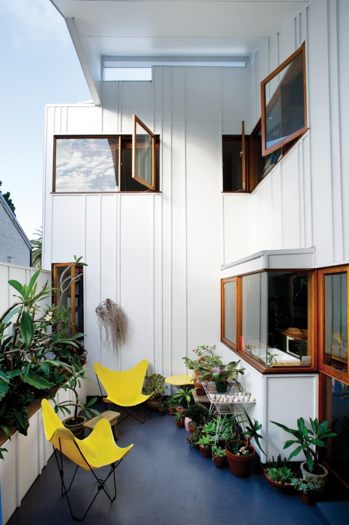
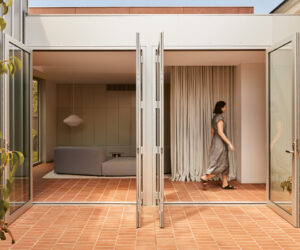
“All the windows have been carefully arranged to capture views and light and encourage cross ventilation as much as possible,” Boyle says. “And there are skylights bringing light into the living space. There are also cut-out spaces, recesses in the building, with large overhangs and they act to protect the façades from excessive sun. There is a large shaded rear deck facing north, and another covered outdoor space off the kitchen, which doubles as a carport if needed and shields western sun.”
Because the house is under a flight path, mandatory acoustic requirements have enhanced environmental performance too. “It means once the house is closed down and a plane goes over, you can hardly hear it,” Boyle says. “And that adds to the thermal performance of the building in terms of heat gain and loss.”
Choice of materials has delivered another textural layering of interiors as well as more environmental gains. Bricks were salvaged and recycled from the original house and more were brought from the local area to build the common party wall. “We also used a lot of exposed timber and, in the kitchen and living areas of both houses, we used timber flooring recycled from the old Leichhardt toy factory. The other floor finishes are the coir carpet and marmoleum, which have good sustainable qualities because they are re-used.
The owner recycled a few items from the old house too, such as brickwork from her children’s games of hopscotch, now at the entry of the house, and a collection of lights, hanging in the central void. “I just like that there are things around here from the old house, no one knows it but me, but it is kind of comforting,” she says.
Her contemporary art collection fits the new house snugly too. Boyle painted a white template on the exposed brickwork, creating a gallery-like backdrop. It and the other walls are crowded, though not too crowded, with art. An artist friend helped hang “and was very disciplined” she says.
“We were really developing the blank canvas for her to value- add in terms of the interior design and artwork,” Boyle muses. He has certainly succeeded. Professionally his work has been given a high commendation from local council, an Australian Institute of Architects state award plus inclusion on the national shortlist. His client too is daily delighted at his realisation of her own gutsy vision.
“To cede big creative ideas to someone else is difficult for me, but with David it really worked,” she says. “There was a good meeting of minds.”
Specs
Architect
David Boyle Architect
davidboylearchitect.com.au
Builder
H2H Developments wb3d.com.au/h2h
Landscape
Logic Coastal Landscapes logiccoastallandscapes.com.au
Urban consolidation
This project involves the subdivision of the block into two Torrens titled lots, and the construction of two semi-detached houses, thereby reducing lot size per house ratio. The project acts as a model for small scale urban consolidation at a scale that is sensitive to the existing streetscape housing pattern, built form and neighbourhood amenity.
Passive energy design
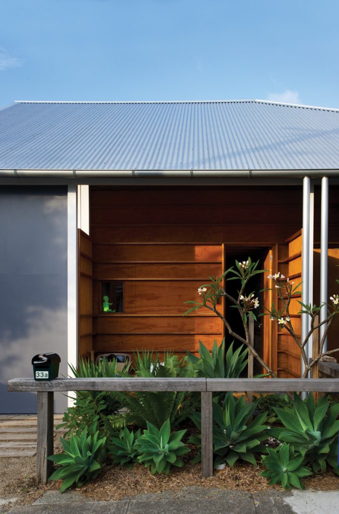
Passive energy design principles underpin the design for the house. A series of cut-outs in the façade provide shading to principal window areas. These include the entry verandah, the covered terrace adjacent to the kitchen and the rear deck. These spaces act as thermal buffers to the northern and western aspects of the house.
The floor and ceiling levels have been modulated to create a series of interlocking spaces yielding to the aspect and light to maximise the perception of space. Cross ventilation is achieved through operable windows on opposing walls and through the mezzanine hall and bedroom. The house is heavily insulated and double-lined internally and externally. Glazing and a series of skylights in the central space ensure adequate levelsof natural daylight minimising artificial lighting.
Materials
The ground level has a concrete slab for thermal mass and an insulated elevated timber floor to the living room and upper level. Bricks have been salvaged from the demolished house and re-used to construct the common party wall.
The main volumes are of highly insulated, lightweight construction. The interiors feature expressed Oregon timber beams and walls to form bookshelves. The cladding is a double layer of fibre cement wall boarding with timber cover battens. Walls to the entryveranda are clad in a double layer of plywood claddingwith western red cedar cover battens. Windows and doorsby Tosca Joinery are timber framed with upgraded glazing to meet acoustic requirements. Sashes close with acoustic seals which also minimises thermal leak. The design provides comfortable living with low energy use year round. Recycled timber floors have been used in the living area, Forbo marmoleum in the kitchen and coir carpet for the upper level.
Flooring
Recycled timber floors have been used in the living area, marmoleum in the kitchen and coir carpet for the upper level.
Insulation
The house is heavily insulated with CSR Bradford batts to meet acoustic requirements.
Heating and cooling
Passive solar design features including northern orientation, external shading and effective cross ventilation reduce the need for heating and cooling devices. In winter extra heat is provided by a Jetmaster gas fireplace in the centre of the living room.
Water tanks
Rainwater tanks are installed under the elevated rear decks and the water is re-used in the house with overflow connected to an on-site stormwater retention system.
Lighting
The house uses recycled and vintage pendant lights (salvaged from the existing house) grouped together to zone living spaces. Wall lights are a combination of compact fluorescent fittings and halogen.
