Linked
The central idea for this two-storey addition was inspired by Japanese courtyard houses that are, like this Sydney cottage, tight for space.
Seamlessly combining a worker’s cottage with a contemporary addition is rare. But architect Ed Davis has done just that. In updating an early twentieth-century semi in Sydney’s Inner West, he has combined recycled materials that sympathetically marry eras, with a design that uses minimum energy to keep his clients comfortable year-round.
From the street front, you would not know there had been a renovation. The Byron Bay-based architect explains how he balanced the retention of much of the original house with a new two-storey rear addition: “The front of the house is untouched, so from a council approval point of view, you can’t perceive any change to the building from the street.”
Certainly the house was in dire need of re-invention. When Davis first met with its owners, his step-brother and builder Jacques Dezarnaulds, and his aesthetically savvy wife Kate who now works in the art world, the house was small, dark and partially falling down.
“It was a tiny house, with two bedrooms and a traditional side passage,” Davis recalls. “It was dark and dingy with a couple of undersized rooms with low ceilings and all that nasty stuff at the back. So we just kept the front two rooms and a bit of the front roof.”
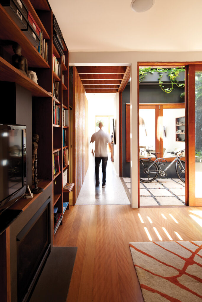
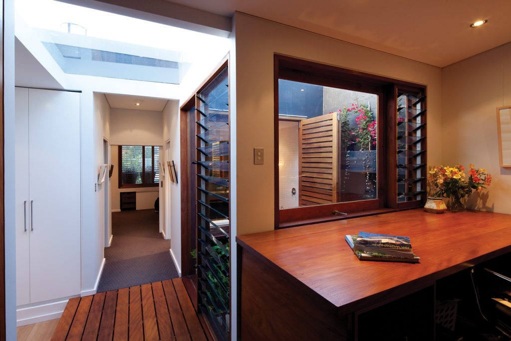
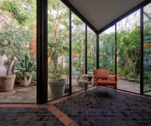
You do not need to walk far into the old worker’s cottage to witness the change. Beyond the comfortably proportioned hallway and tidily revamped front room (where a bookcase now fills the old fireplace), the house opens up into a breezy twin living space linked by a leafy courtyard.
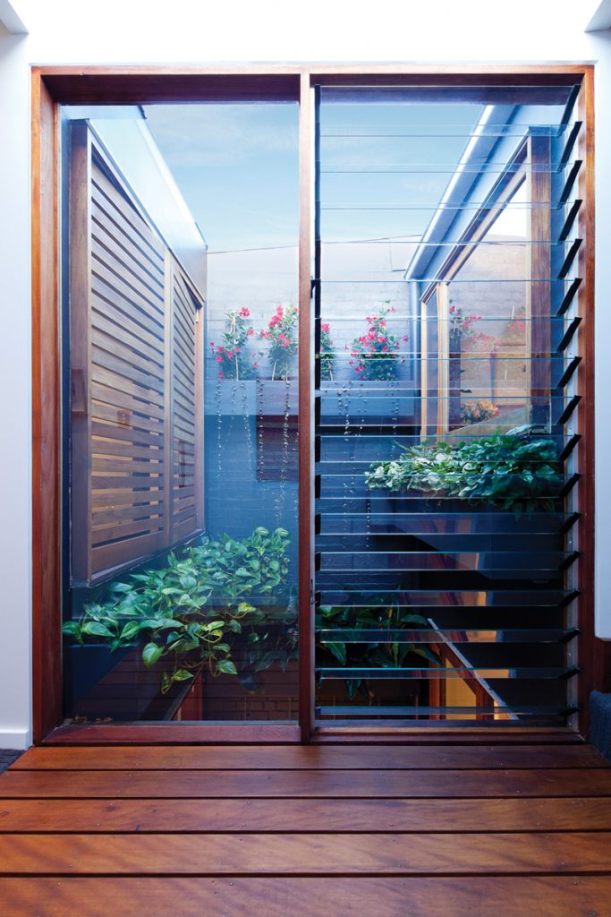
This courtyard runs all the way up into a void on the upper floor, where a timber bridge links the original attic bedroom and a study on the landing, with a new bathroom and north-facing bedroom at the rear. In coming up with this central idea for his design, Davis says he combined a request from the owners for a green wall, with his own fascination for Japanese courtyard houses, particularly those built on tight sites.
“When I started designing, I started with this space,” he says, standing in the diminutive courtyard which now has vines cascading down its upper walls. “It was all about the scale and proportions. We couldn’t afford much space, but it had to work.
It was a critical dimension, 2.4 by 2.2 metres; it is tiny, but when you open up to the space and you make use of the vertical space, with light coming through, it is a much bigger volume.”
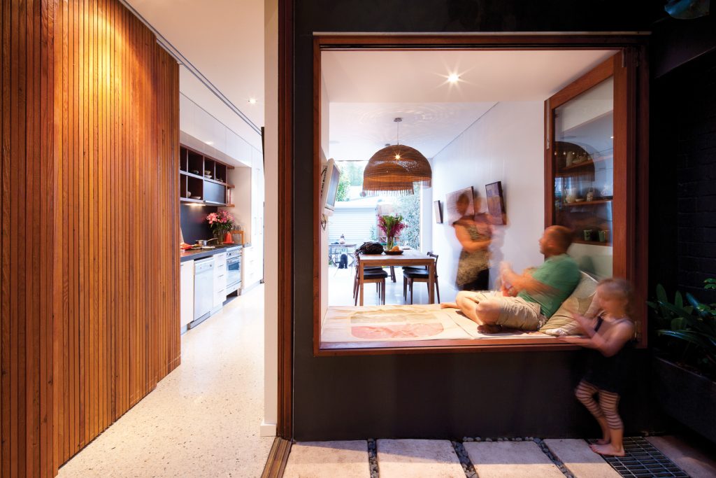
The courtyard, which has a daybed on the northern side, now links the old and new living spaces all the way through to the rear garden. It is a natural gathering spot for the couple and their young children and gives both living and dining rooms a delightful sense of light and generosity. “The daybed was important, it was a kind of an interstitial space,” Davis explains. “It gives them another living space. And there is storage underneath it too, all the kids toys are kept under there.” “It is the most used part of the house,” Dezarnaulds adds. “When we are in the kitchen we generally sit there.”
The choice to build around a courtyard had a pragmatic benefit as well. “The whole concept was to have it joining the old and the new and it does that very well,” Dezarnaulds says. It also assisted in the building. “For some reason this old cottage was built out of square and we built the new section square to the boundary, so the courtyard made the construction process easier.”
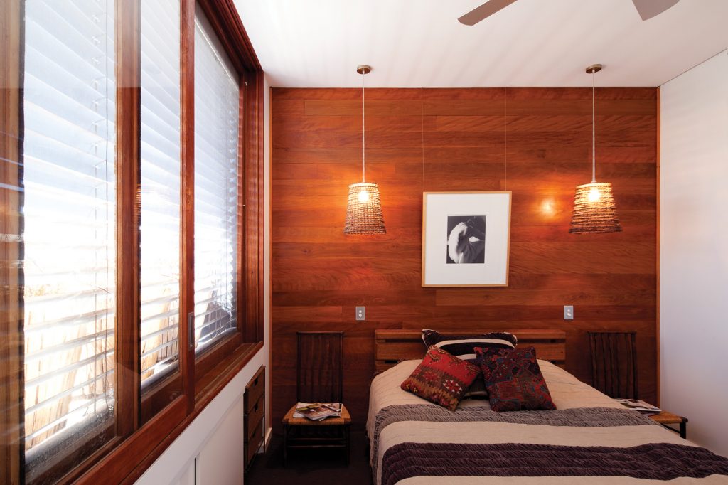
Like the courtyard, which is the spatial lynchpin between the old cottage and the addition, the palette of materials Davis used – in particular the timber that is a key material in the original house – helps give visual unity. “We blended it with materials but it (the new work) is contemporary in scale and the way everything works,” Davis says. “There is timber right throughout the addition, whether it be doors, shelving … There is this reference there to the old, even though it is a new element.”
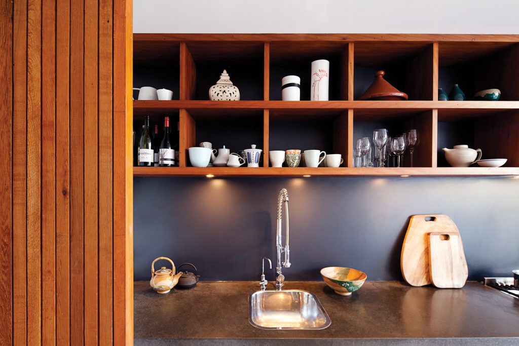
One elegant example is the screen system Dezarnaulds designed for the new galley kitchen. The floor to ceiling cedar screens, made of timber recycled from the joists in his father-in-law’s decks, roll across to conceal the laundry and, when required, the kitchen. Davis says it was a specific request from Kate that she be able to screen off the kitchen when entertaining. The screens deliver the added aesthetic benefit of providing a textured wall to the dining area and, at night, lights shine through the slats to create a lantern effect.
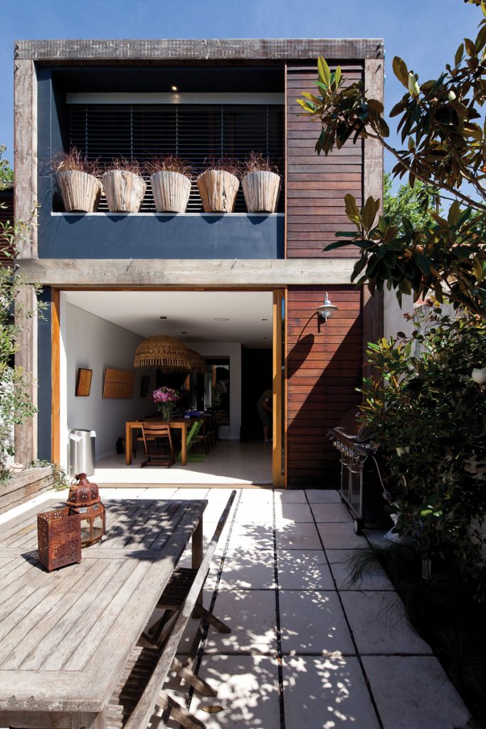
In this contemporary kitchen-dining room, which opens via stacking doors to a rear garden landscaped mainly with native plants, the floor is another warm raw material. It is a waffle concrete slab, incorporating water tanks and hydronic heating which keeps the family cosy through all seasons.
On the upper level, full insulation and the chimney effect of the central courtyard similarly serve to keep the house comfortable year round. The courtyard, in combination with the bridge – made of slatted timber so light and air moves through it – serve to vent hot air up and out of the house.
“Even opening the attic bedroom window we get a breeze,” Dezarnaulds says. “Warm air rises up through the middle, through the courtyard and the bridge too. It is basically a light and air well. It is the lungs of the building and it allows it to breathe and gets air into every room.”
The new and the old now work perfectly for the family. The renovation has added another bedroom and study and, probably more importantly, a generous living space in which the owners can keep an eye on their children. It is now a house filled with light and fresh air, designed to be playful for both generations.
Specs
Architect
Davis Architects davisarchitects.com.au
Builder
J2 Constructions j2build.com.au
Passive energy design
Central courtyard acts as a natural thermal chimney drawing warm air up and out of the entire ground floor. The slab on ground level provides thermal mass and passive heating to living spaces in winter.
Large areas of operable glazing to central courtyard provide cooling in summer and do not receive excessive solar gain. Operable shading devices fitted to north-facing façades on both ground and first floor to reduce solar gain in summer and to permit sun access in winter.
Internal first floor breezeway also provides cross ventilation and natural exhaust of hot air. Designed to accomodate photovoltaics but not yet installed.
Materials
Natural polished concrete floors (rear of the house) – the mix was just as it came from the plant, a light colour with exposed aggregate finish. Timber tongue and groove flooring of recycled Brushbox throughout.
Natural wool carpets to upstairs bedrooms. Bathroom floor tiles – Natural Bluestone from Eco Outdoor. Bathroom sinks – custom-designed Bluestone from Eco Outdoor.
Insulation
Ceiling insulation (between ground and first floor) R2.5. Roof insulation min R3.5 all over and above the requirements set out in the BASIX Report.
Glazing
Timber doors and windows, with natural oil stain finish. Standard laminated glass from Pilkington Glass.
Heating and cooling
Jetmaster Gas Fireplace in dining room. Located near the 8 main internal stair, it has the potential to heat the upstairs level also. Hydronic underfloor heating.
Ceiling fans installed in all bedrooms.
Hot water system
Solar hot water units (roof mounted), instantaneous gas back-up boosted.
Water tanks
2500-litre water tanks are built into waffle pod slab under the main living area. These also assist to cool the slab in summer.
Lighting
Pendant feature lighting made by the owner – [email protected] Low-energy light fittings installed throughout. Indirect and concealed lighting to wet areas.
