
The 39th Dulux Colour Award Winners
IMG LINK


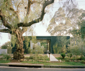
Project: Melbourne Place by Kennedy Nolan. Award: Winner - Commercial Interior - Public & Hospitality
IMG LINK

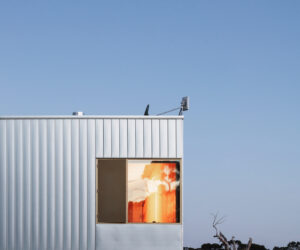
Project: Lava Flow by Pac Studio. Award: Winner - NZ Grand Prix also Commendation - Residential Interior
IMG LINK

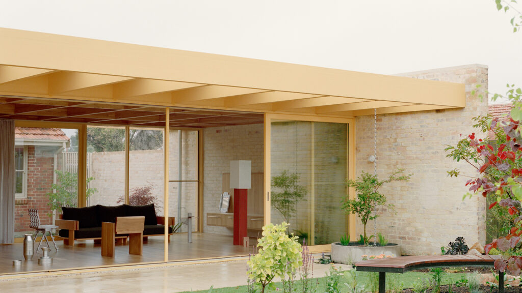
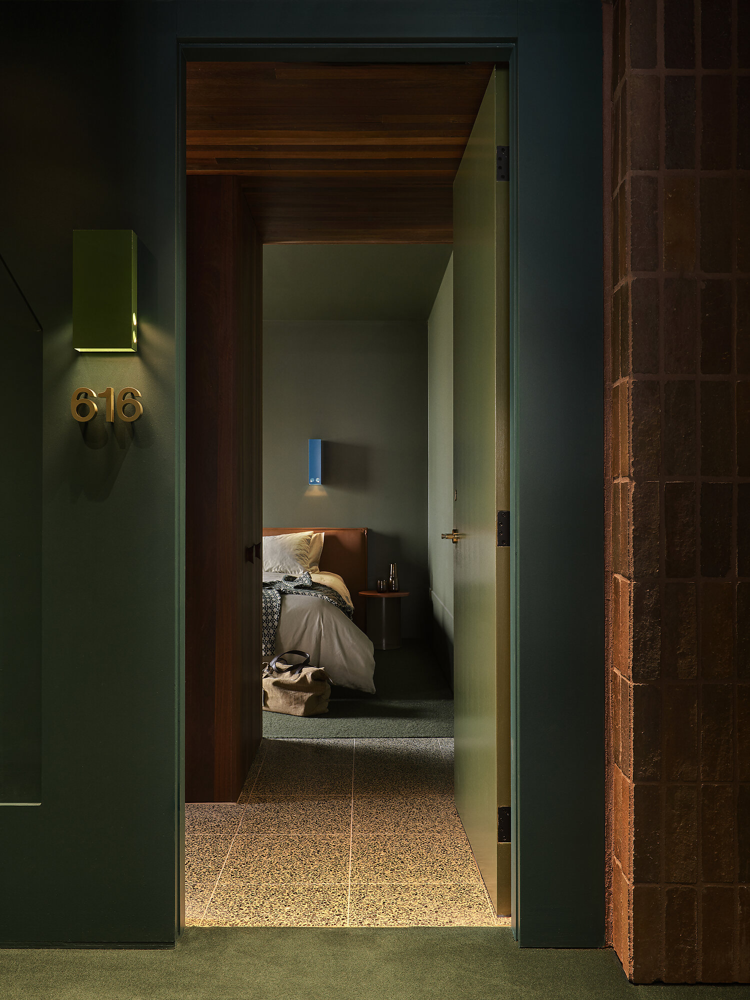
Project: Comma - Byron Bay by Duet. Award: Commendation - Commercial Interior - Workplace & Retail
IMG LINK
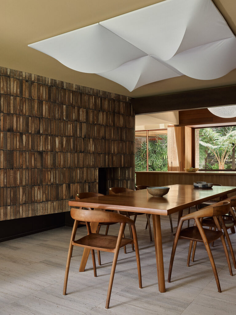
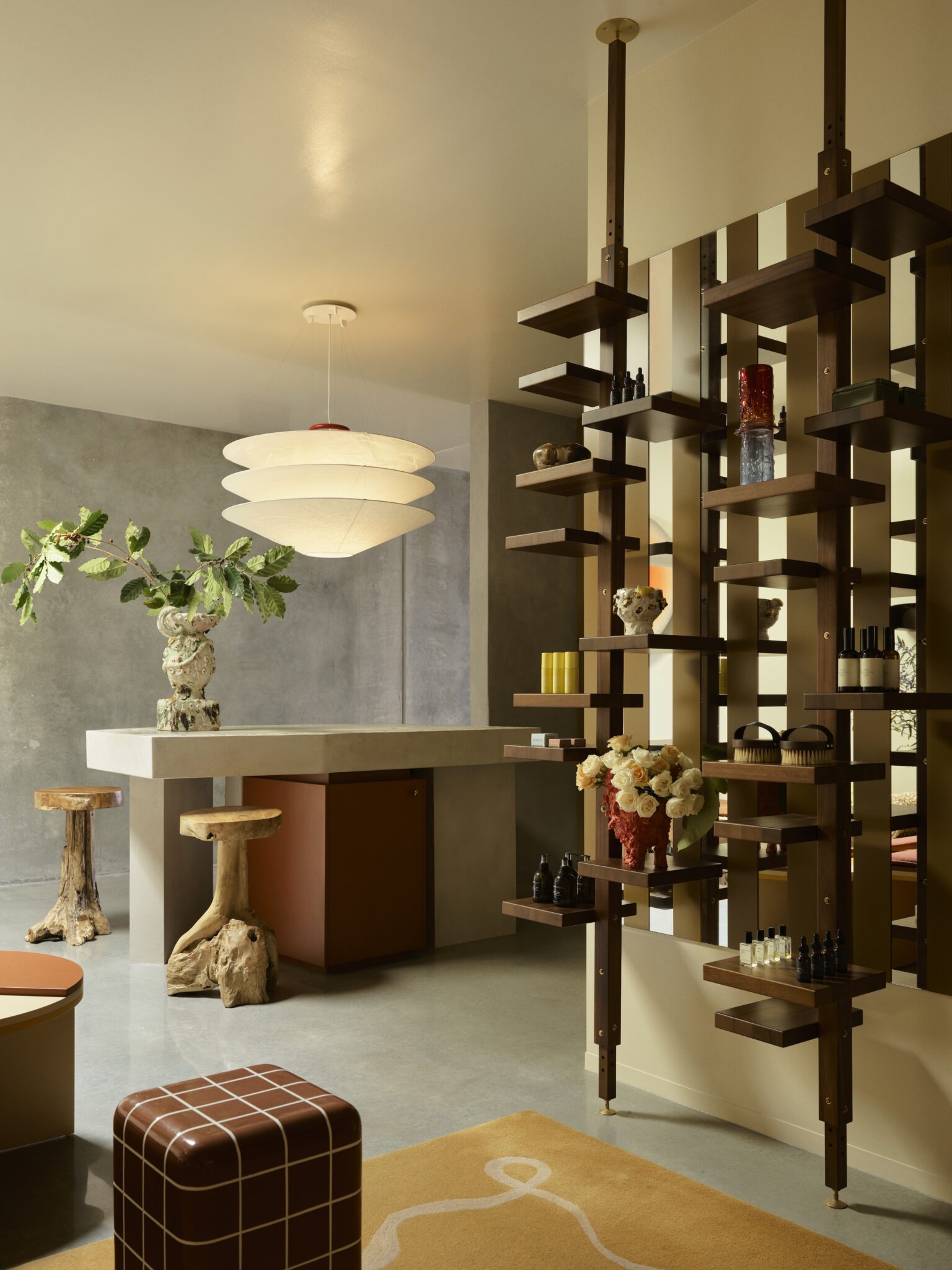
Project: Buon Gusto by Studio Shand. Award: Commendation - Commercial Interior - Workplace & Retail
IMG LINK

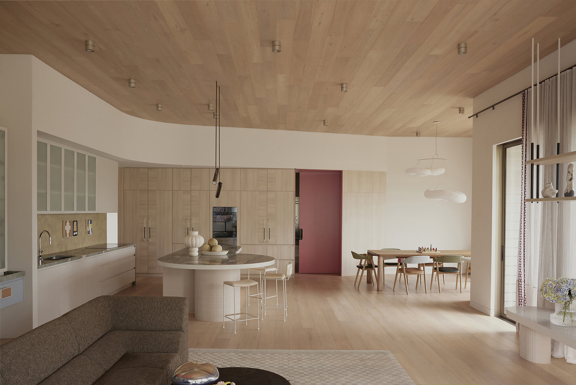
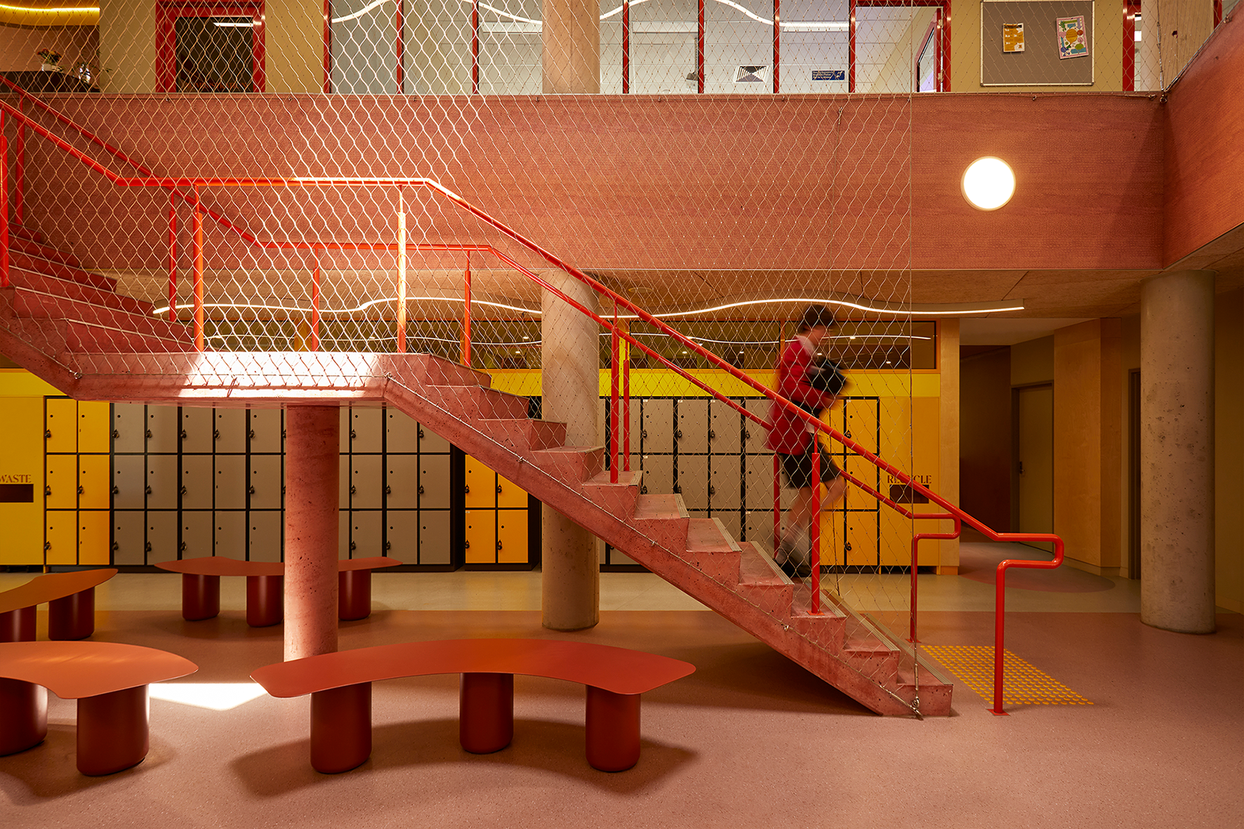
Project: Auburn High School Senior Centre by WOWOWA Architecture. Award: Commedation - Commercial Interior - Public & Hospitality
IMG LINK
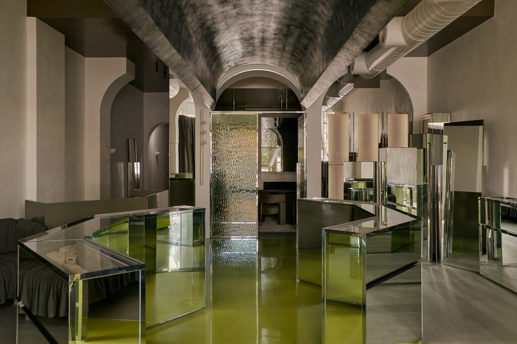
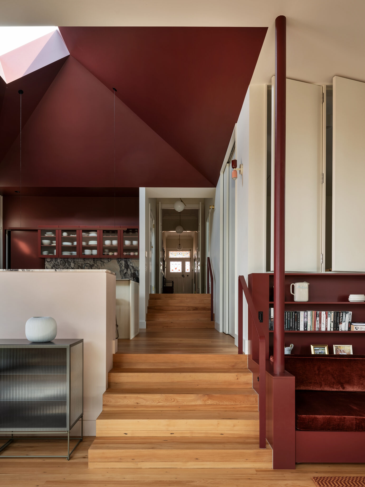
Project: Sarah&Sebastian by Richards Stanisich. Award: Winner - AU Grand Prix Winner - Commercial Interior - Workplace & Retail
IMG LINK
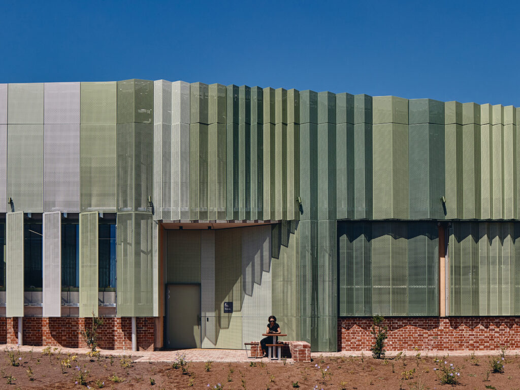
Project: Northern Memorial Park Depot by Searle x Waldron Architecture. Award: Winner - Commercial & Multi Residential Exterior
IMG LINK
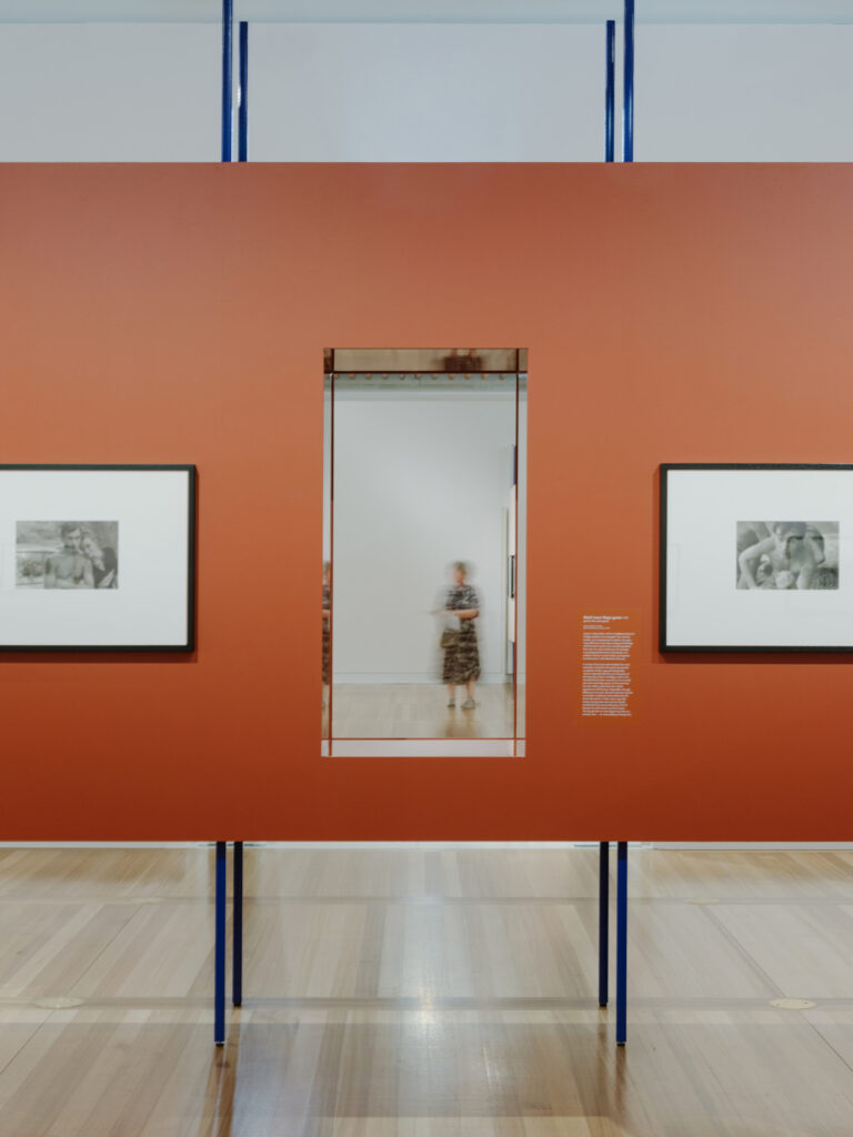
Project: Carol Jerrems: Portraits by Youssofzay Hart. Award: Winner - Temporary or Installation Design
IMG LINK

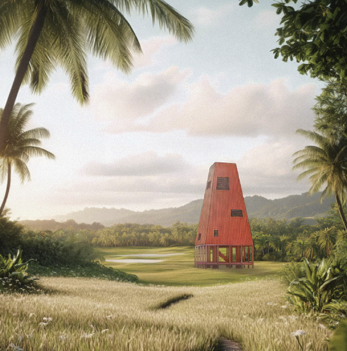
Project: Pataka Korero Fale o Tala A Storehouse of Narratives in Samoa by Will Chomchoei, The University of Auckland. Award: Winner - Student NZ
IMG LINK
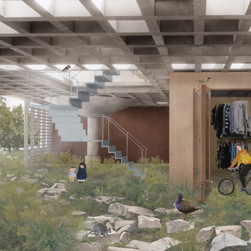
Project: Landscape of Co-existence by Angela Xu and Georgia Reader, University of Sydney. Award: Winner - Student AU
The winners of the 39th Dulux Colour Awards, one of the longest running architectural and design awards programs in the region, have been announced at the National Gallery of Victoria.
Recognising the most inspired and transformative examples of colour use in the built environment, the prestigious Dulux Colour Awards are synonymous with excellence and innovation. This year’s winners, chosen from projects across Australia and New Zealand, push the boundaries of established genres and defy previously accepted norms to astound and delight with their complexity and ambition.
“It never ceases to amaze us how conceptually courageous and strategically sophisticated the colour schematics are, year on year,” says Andrea Lucena-Orr, Dulux Colour and Communications Manager. “Our aim with the Dulux Colour Awards is to reveal and reward the ultimate exemplars of architectural innovation using Dulux Colour as a central design device, therefore highlighting its unique potential to transform our built environment.”
This year’s Grand Prix winners epitomise these goals, and represent somewhat of a pattern emerging, namely the use of a single colour as the pivotal and defining design strategy. Although this may seem to be more straightforward conceptually than composing a complex palette, such chromatic restraint requires a remarkable degree of courage, understanding and precision to be well executed and both projects embody this, albeit in distinct ways.
The Sarah & Sebastian Armadale store by Design Practice Richards Stanisich, Australia’s Grand Prix winner, takes Dulux Delta Break – a striking green and juxtaposes it with reflective surfaces within faceted jewel-like spaces to elicit an ethereal effect of floating under a shimmering sea. Its relevance as a highly original, timeless and transformative interior transcends its retail genre, thus embodying everything the Dulux Colour Awards strive to represent.
NZ’s Grand Prix winner, Lava Flow by Design Practice Pac Studio, is powerful and bold, with undeniable graphic punch. Its volcanic red ceiling and skylight, a dramatic red hue – Dulux Silo Park – referencing Auckland’s geographic context, represent the inverse of expectations with startling impact, highlighted by a contrasing soft white. This clever interplay of dark and light frame movement and shape perception that enriches the experience. “The project demonstrates the architect’s conviction and understanding of colour as a determinant of mood and identity.” says Lucena-Orr.
Rule-breaking and genre-defying colour usage is evident across all categories this year, with some particular directions to note. One is the unconventional application of contemporary colour on heritage projects, not only to distinguish old from new or to refurbish for longevity, but to provide contextual connection, to manipulate spatial relationships, and to fundamentally reimagine historic value. Another theme that arose across categories was the softening of traditionally ‘hard’ building typologies. Take for example, an industrial depot within a memorial park, whose exterior was softened through the graduated greens adorning its perforated metal facade.
For more on all winners:
More green updates