Wild Glamour – Bringing 1950s Hollywood Hills to Melbourne’s Suburbs
The glorious views might be across Melbourne but, as a love letter to the 1950s, this house brings some unmistakable Hollywood Hills to the suburbs.
Hollywood Gondwanaland. With a brief like that, how can you go wrong? Akas Landscape Architecture, Green Sheep Collective and a creative couple with design nous, clear vision and open minds have transformed this disconnected Pascoe Vale brick veneer into a thermally-efficient mid-century gem. Its big views, personality and Gondwanaland garden are designed to keep morphing along with its inhabitants.
Dubbed 50/50s House, this house exemplifies the cumulative power of small, carefully considered, beautifully executed interventions on a large hilltop rabbit warren. It reconnects a garden-loving family to the spaces they share and a lush habitat that energises them.
To be clear, this project was no designer-led rescue operation. The double-storey abode was ageing and disconnected in parts but cool as hell thanks to intact mid-century charm and the design smarts, eye-catching collections and green thumbs of owners Gina McColl and Dave Joiner. Their teenagers Alex and Oliver were still in primary school when the couple began planting lush vegetation and plotting a joinery-led renovation with an upper-level outdoor dining space off the west-facing kitchen that would capture killer views and stunning sunsets.
By the time Gina’s architect sister introduced them to former colleague Shae Parker McCashen of Green Sheep Collective (who led them to Anthony Sharples and Alistair Kirkpatrick, then both of Akas Landscape Architecture), they had 10 years of observations around site conditions and a crystal-clear brief for a dynamic dialogue between house and garden.
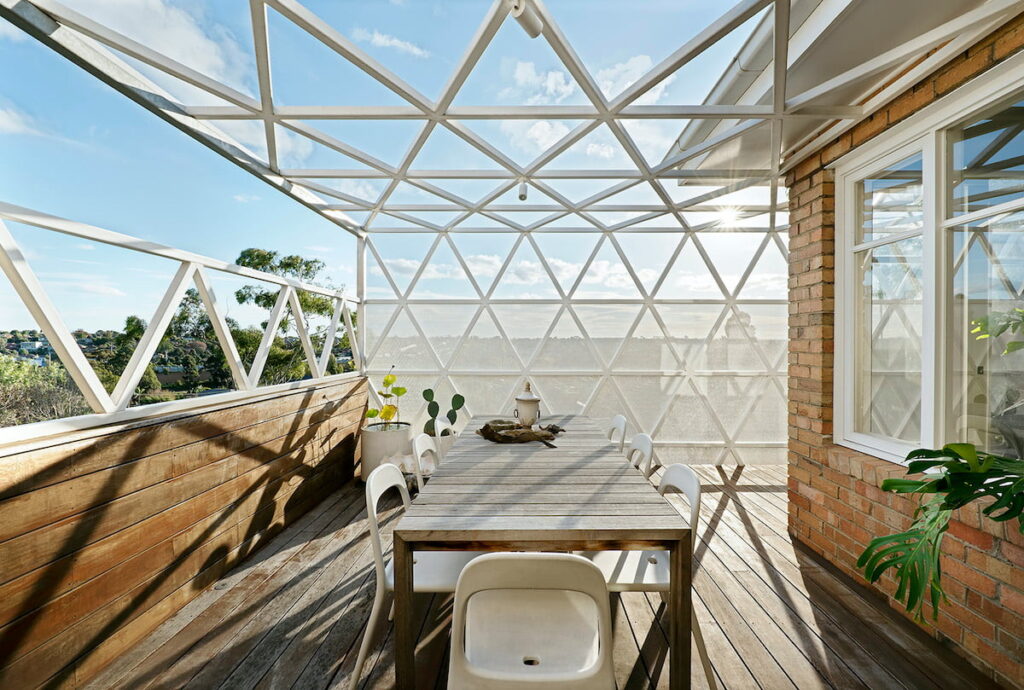
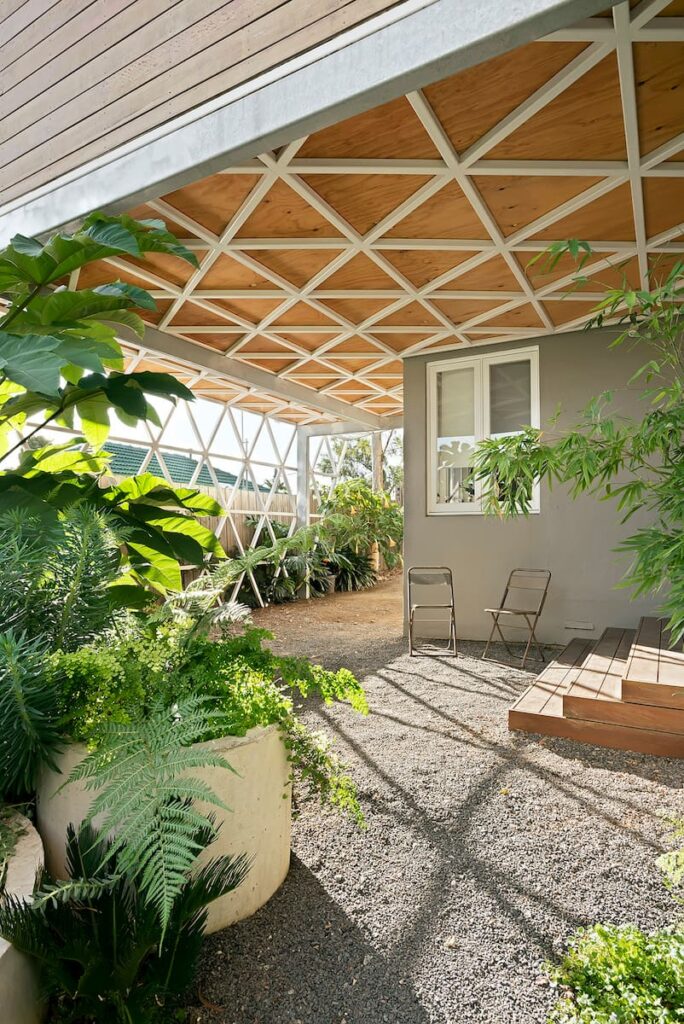
Gina says the relationship between Shae, Anthony and Alistair helped all involved to embrace the steep site’s pros and cons. Direct connections into the rear garden from an upstairs deck wouldn’t fly, but bird’s eye views sure would. “The brief to both designers involved a lot of talk about how we wanted the garden to be incorporated,” she says. “We had umpteen conversations about ensuring the driveway and carport was something that would enable greenery to grow. We always wanted it to be a vine-covered house. That was also part of the sustainability of the design because we have this unbelievably hot west-facing site three-quarters of the way up a very steep hill. So the pergola deck was designed to install an exterior air-conditioner, really … we’re growing grapevine on it, so in another two years it’ll be a beautiful wintergarden open to the sun in winter and covered in thick green vines in summer to give us shade and cool.”
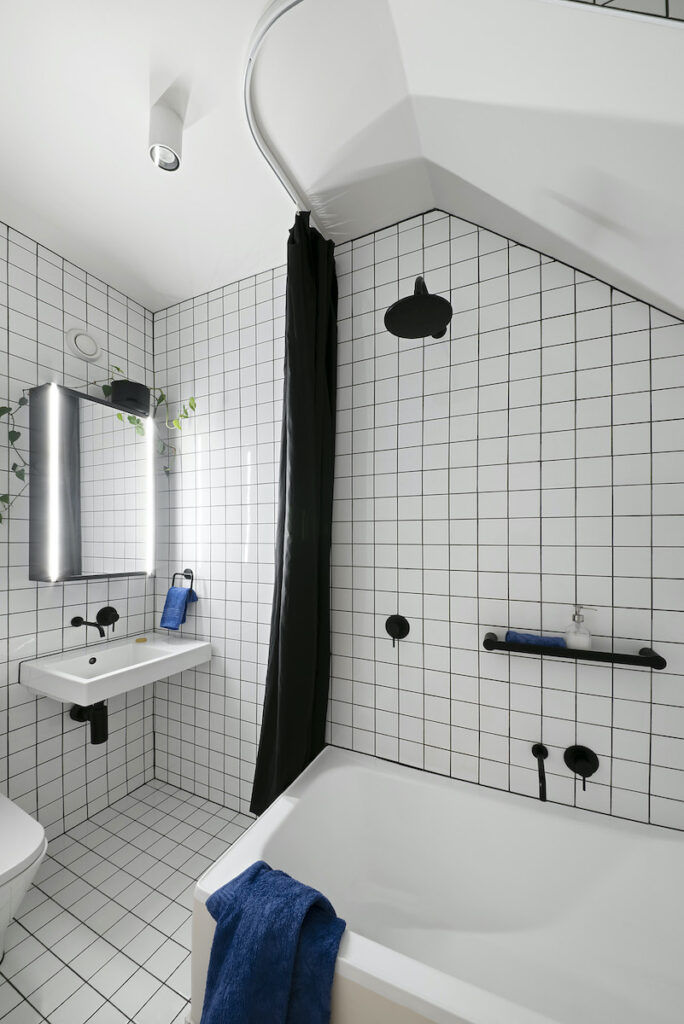
Inside there was a clear need to rationalise the floorplan. “Getting from the front door to the kitchen involved going through four rooms, which meant laying out your furniture really inefficiently,” Gina says. Storage was a priority, including bookshelves for a large collection to which the avid writers calculated they add one and a half metres of books annually. Garden views and connections throughout were a must. Ditto downstairs connections between kids’ bedrooms, a bathroom in need of refreshing, laundry and an external storage room made derelict by poor drainage.
“Every room was at a different level,” Gina adds. “It was inconvenient, and it made the house feel higgledy-piggeldy. All the extensions and additions were owner-built, so they were ad hoc and underspecified. The stairs were far too steep and far too narrow, the electricals were insulated in sticky tape, and the gas was piped through a garden hose. No shit.” On the upside, previous owners, including one with a penchant for chunky concrete planter boxes, had left a legacy of lovely mid-century detailing worth celebrating.
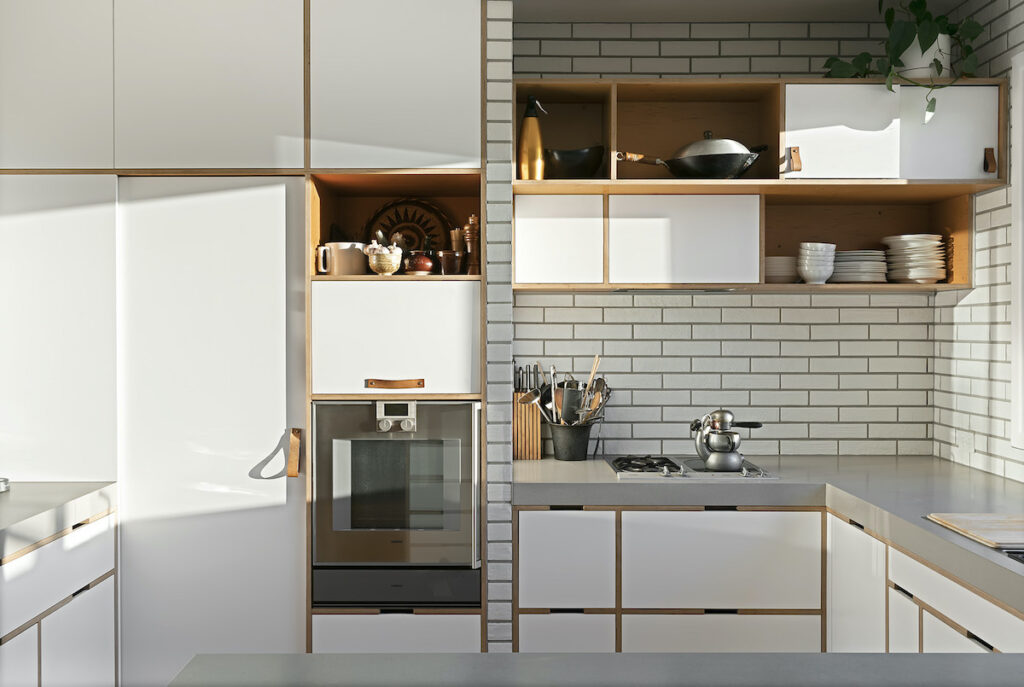
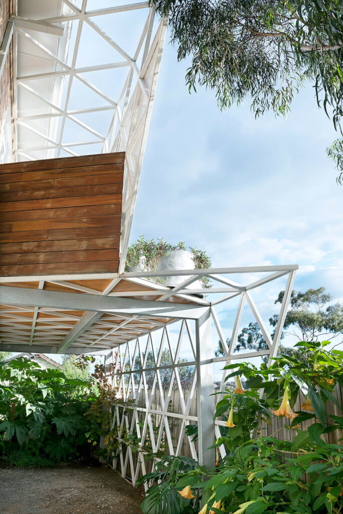
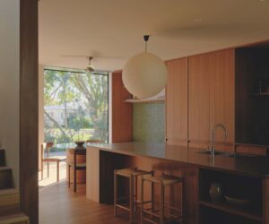
Green Sheep Collective’s subtle response adds a world of thermal and spatial efficiency and only four square metres to what’s now a single, beautifully cross-ventilated building envelope thanks to extensive downstairs levelling and drainage works. Upstairs, meticulously detailed joinery throughout showcases Gina and Dave’s books, sculptures and art and delineates living, dining and office space reconfigured slightly by the removal of one wall. New high-performance glazing adds to thermal comfort year-round, as does the distinctive triangulated pergola structure with upper-level deck and carport below that functions as a double-height framework for deciduous vines.
Shae concedes this element took some finessing, but with access points from two living areas it’s a much-loved indoor-outdoor space that’s heavily used year-round. “Gina and David didn’t want mock fifties design, but something that was unique and fitted with the existing house,” she says. “The triangular concept itself is relatively simple but getting the geometry to work across multiple purposes and codes while fitting with the existing proportion took a lot of refining.”
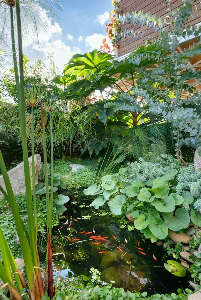
And so, to Hollywood Gondwanaland, the eye-catching brief Gina emailed Akas. “I interpreted this as glamorous, overgrown and a bit wild,” Anthony recalls. The extended brief? “Retain the existing infrastructure, keep plant selection minimal with lots of repetition, and create a garden would grow with grace,” he says. “Apart from that, Gina and David were completely open to our ideas, which is always a lot of fun.”
“We introduced one-metre-wide cuts into the concrete paving and turned these into emergent garden beds, creating privacy and a green screen effect on the boundary,” Anthony says. The aforementioned concrete planters were incorporated and, in places, inverted for seating. “I felt very inspired by Green Sheep Collective’s renovation and the way they worked with the old and seamlessly weaved in the new,” he says. “We wanted the garden to follow the same ethos.”
Nowhere is this more apparent than in places where a reduction in materials has created opportunities where normally additions would have been used. “What was once an area void of use became a space for a firepit, surrounded by bamboo and other lush plantings. There’s an abundant pond as habitat for local animals, topography that conceals and reveals, and a lush planting palette that includes locally indigenous, native and exotic plants,” he says. And with hard materials chosen specifically to hero the plants, the concept is a wild space you could feel blissfully lost within.
Specs
Architect
Green Sheep Collective
Builder
James McBride and Associates
Landscape Architecture:
Anthony Sharples and Alistair Kirkpatrick of Akas
Location
Wurundjeri Country. Pascoe Vale, Victoria.
Passive energy design
Creativity was required to respond to the steep site and primarily west-facing living spaces. Internal walls were removed to reduce circulation space and introduce adequate cross-ventilation and flexible living. The balcony structure supports the growth of deciduous vines to help shade the home in the hot summer months.
Materials
The design preserved valuable embodied energy by retaining the whole original building and increasing the footprint by less than 4m2. This significantly reduced the volume of demolished materials as well as the use of new materials. The small infill concrete slab used Readymix “Ecomax” concrete, with reduced embedded CO2 compared to Ordinary Portland Cement (OPC). It also uses recycled industrial waste including slag and fly ash. All timber inside and out is either recycled, sourced from an ethical plantation, or third party-certified sustainable timber.
Preference was given to paints, sealants and adhesives proven to be low-VOC. This included wet-seal “Enviro-coat” waterproofing and Dulux “envirO2” paint. Where it was feasible to incorporate it into walls, Auspoly recycled polyester thermal insulation was used.
Flooring
The kitchen and dining rooms feature cork flooring tiles, a naturally renewable material harvested from the bark of the cork oak tree. This is removed without harming the tree, allowing the bark to grow back every few years. It is also a biodegradable product that will naturally break down in the environment once disposed of. The living space retained and rejuvenated original hardwood flooring, increasing its longevity and further reducing the embodied energy of the original building.
Glazing
All windows were replaced with double-glazed, clear low-E-coated, argon gas-filled, thermally-improved aluminum windows from Rylock.
Heating and cooling
All habitable spaces were brought into one continuous envelope to increase thermal efficiency, adding less than 4m2 to the building area. Cross ventilation was improved by opening up the previously segregated kitchen, dining and living spaces, reducing the need for mechanical cooling systems. Shading was brought to the western windows in the form of a balcony structure that supports the growth of deciduous vines, keeping the hot summer sun out while letting the winter sun stream through. The whole site has been significantly landscaped with extensive planting, reducing external thermal mass to minimise the urban heat island effect.
Water tanks
Existing rainwater collection system and tanks were repaired and consolidated.

