Bach to Basics
A tiny St Andrews beach house creates a ‘deluxe yurt’ for a young family keen to be thrown together and experience the elements.
“We wanted to do something different that wasn’t your standard three-bedroom home – a juxtaposition to what we had in town,” says Rachelle Kelly of the 105-square-metre bach (pronounced ‘batch’) beach house at St Andrews on the Mornington Peninsula, designed for her young family by Wolveridge Architects. “Also to be outdoors, and forced together into a simpler way of living. Forced outdoors into nature regardless of what the weather’s doing, to really unwind from the city and be connected to the coast.”
Her partner Stuart Ablethorpe, a keen surfer, spent childhood holidays on the peninsula in no-frills 50s fibro shacks and at 18 moved to Balnarring, quick as a flash. Over the years he, Rachelle, their friends and their children Frankie, now 11, and Izzy, 13, have spent as much time around here as possible. And though the couple wasn’t officially house-hunting back in 2014 when Stuart spotted a secluded bushy block for sale down a dirt road in St Andrews, they were galvanised by it immediately. “It was a beautiful natural bowl and we just fell in love with it,” he recalls.
Years of camping on the 5000-square-metre site in a sheltered spot among the tea trees freed them up to build something simple and restorative when the time eventually came for a little more plumbing than their beloved yurt could offer. (The yurt remains on-site for friends and potentially themselves when their new beach house is rented out). “We enjoyed the experience of the yurt so much we just wanted to replicate it but in a more deluxe manner,” Stuart says. “With a flushing toilet and shower and kitchen,” Rachelle explains with a grin.
Their research into alternative small home models led them to New Zealand’s understated, ‘only as large as you need’ bach house concept and to Will Smart, New Zealand-born Associate at Wolveridge Architects. Will drew on memories of his own family’s bach when creating this place with Director Jerry Wolveridge, Project Architect Eliza Holcombe-James, and builder Mark Cleary of Everclear in Mount Martha.
“I actually thought Stu was a Kiwi when he rang me,” Will recalls. “I’ve got three sisters so we had six of us in a bach house that was probably smaller than 100-square-metres,” he says. “You could … yell through the walls: ‘Who wants pancakes for breakfast?’ or ‘let’s go for a ski’ or whatever. There was no privacy, there were no luxuries of the city … you had to walk outside to go to the toilet.” Clients and designers alike were steadfast in their shared vision: a simple, economical form connecting people and place and celebrating the luxuriousness of beautiful materials (and an inside loo).
The land’s bushfire rating dictated a central location, rather than their secluded southern campsite hidden from the road. But the clients were keen to maintain the camping vibe. Hence a brief that included driving in towards an undulating wall of green on arrival. Outdoor cooking, eating, reading and gazing into fires and night skies for as long as possible before the weather forced everyone inside. Plenty of space for friends to keep camping alongside. Fuss-free set ups and pack ups to maintain the quick, easy commute.
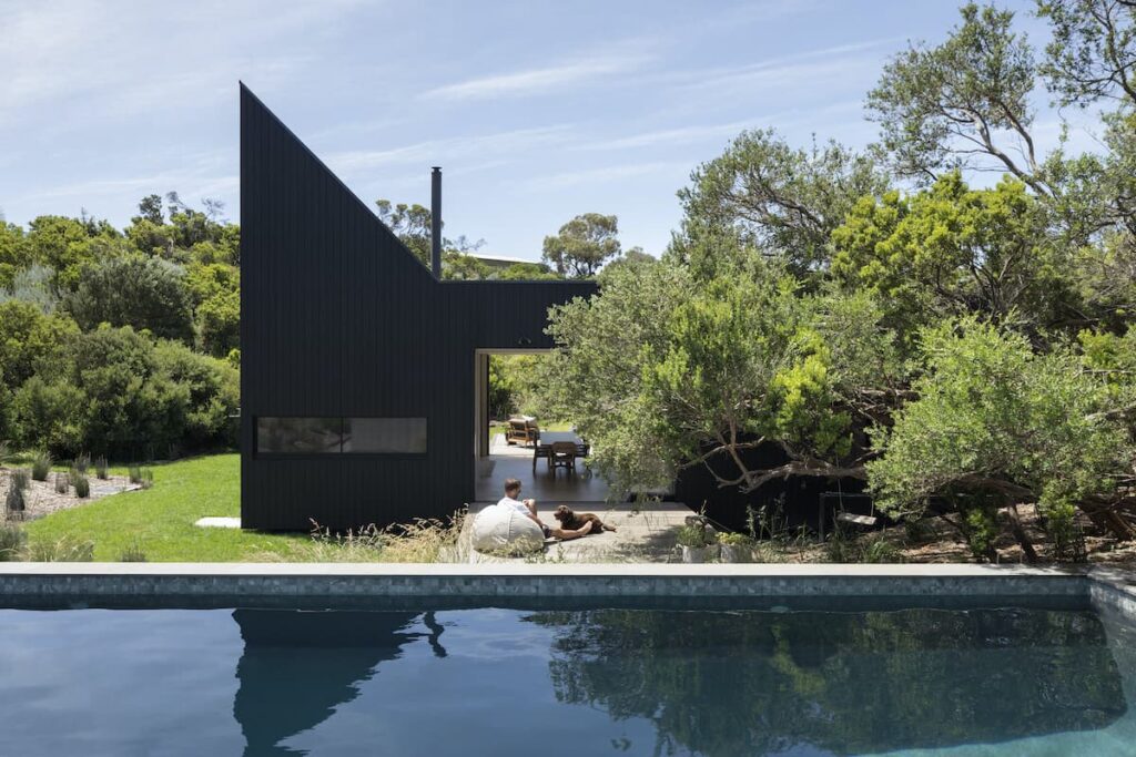
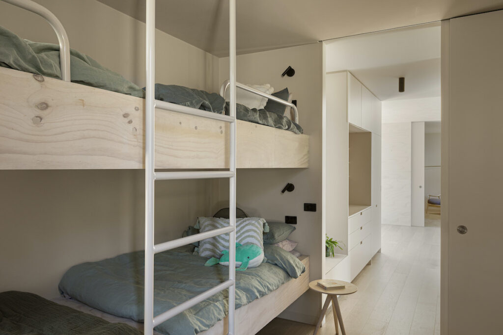
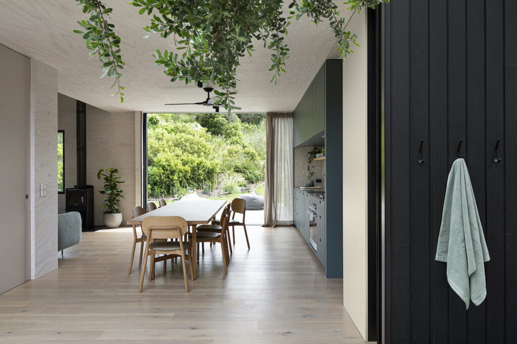
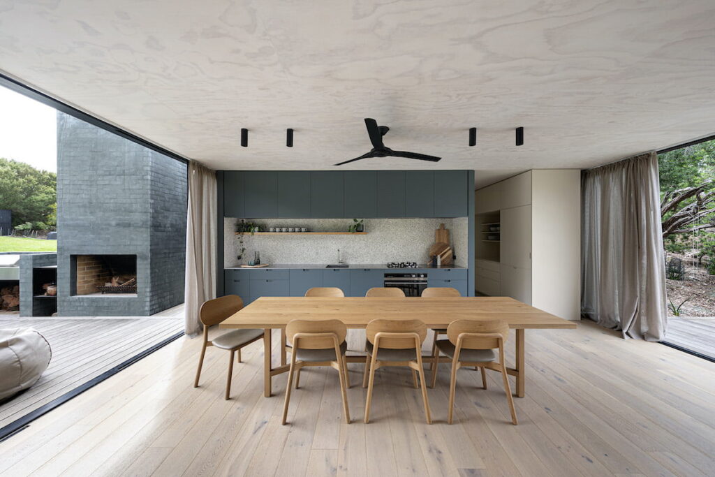
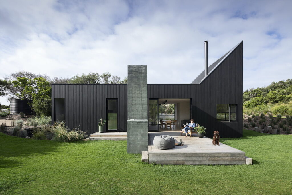
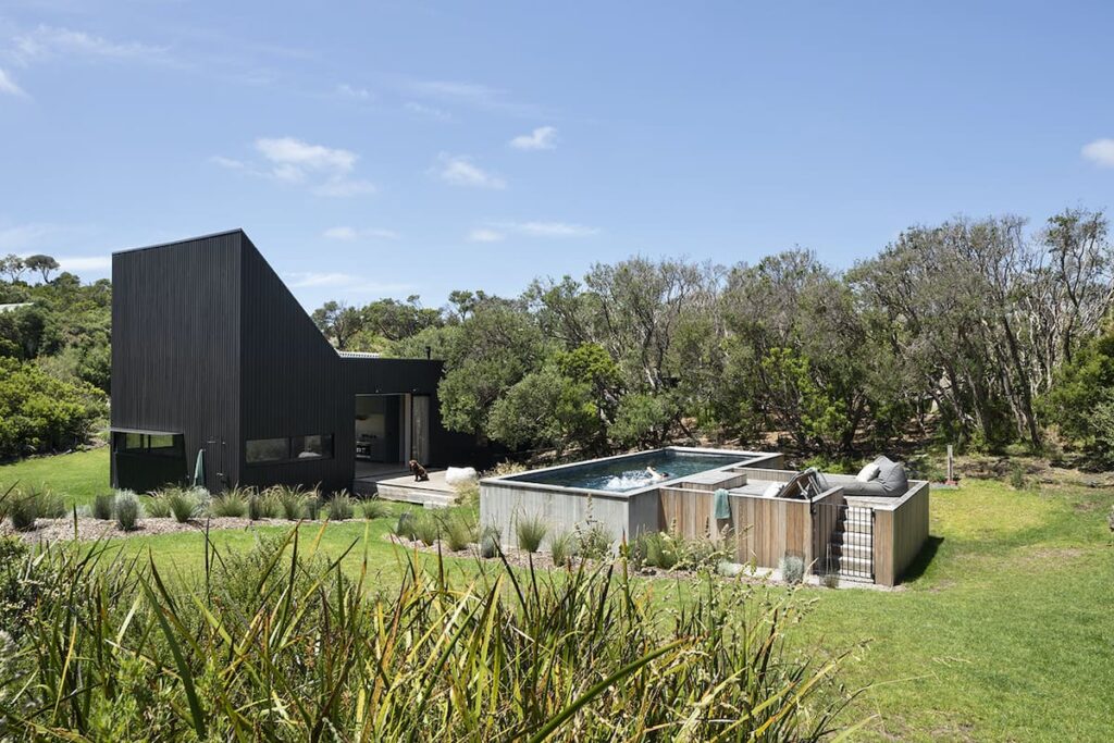
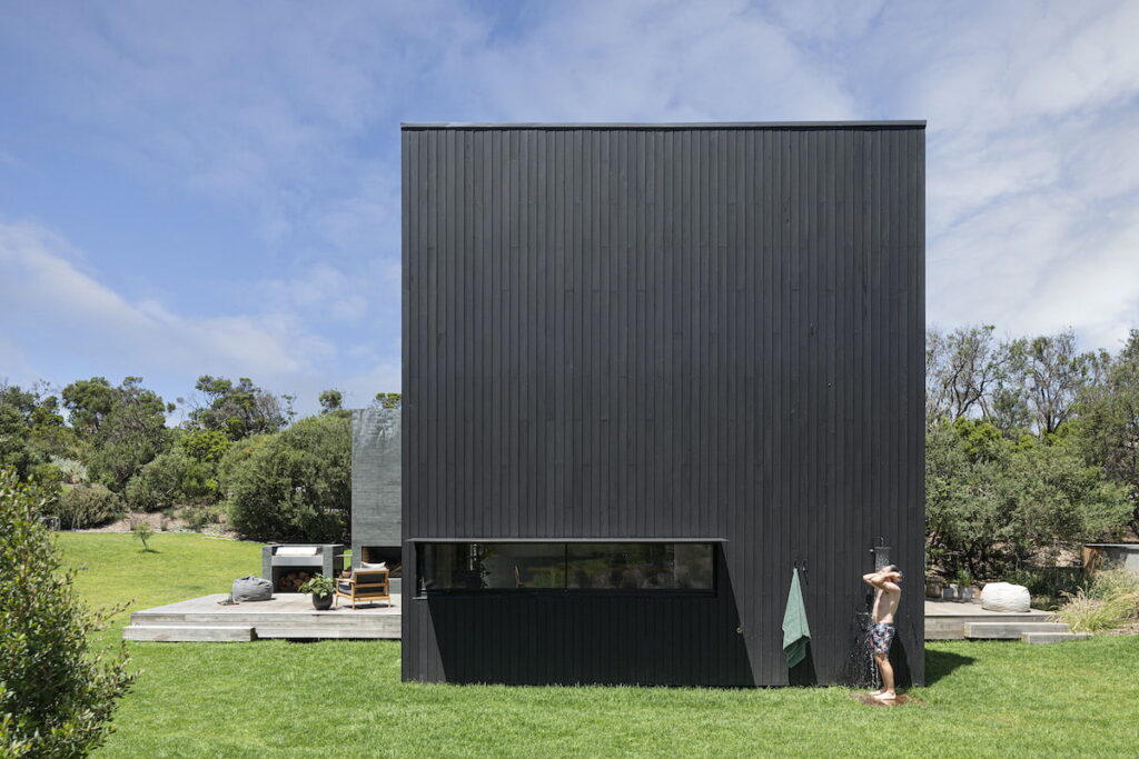
Will and Jerry sketched out similar options and refined the design over time. A compact rectangle clad simply in black-stained blackbutt and painted; bagged brickwork is sited in the southern section of the bushfire envelope to maximise views and solar access. There’s a central services core for efficiency, with living and dining areas to the west, bedrooms to the east, and decks opening up the entire place expansively to the north and south. The latter is a nice touch designed as a subtle nod to the local jetty. There’s a bunk room for the kids, a luxe take on the old-school beach house bathroom/laundry/toilet combo (whose doors allow up to three people to use this zone simultaneously), and massive recessed glass sliders out to the decks, pool, barbecue, fire pit and outdoor shower (with hot and cold water, thank you very much). What more could you want?
“Typically, we’ll have breakfast and spend the morning on the north deck,” Stuart says, before following the sun to the south deck in the afternoon. “It’s a really incredible feeling of expanse when the doors are pushed back and it’s like this one big, long entertaining area, inside and out,” says Rachelle.
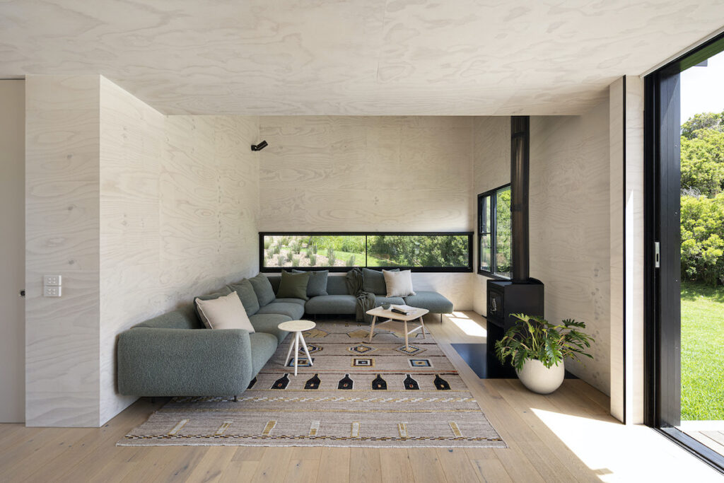
A partially raked roof that rises to 4.5 metres at its apex above the living room creates a similar sense of expansiveness vertically within the interior. “There’s a lot of vegetation … and as you look up to the west, the site contours up quite steeply,” Will says. The roof form is a playful expression of this. It was almost filled with a kids’ loft or home office at one stage but the less-is-more mantra steered the group back on course. It’s a soaring volume that makes the snug home work in all weather, even when it’s closed up to the wind and rain.
“The house bends and moves with the seasons, and the amount of people who are there,” Rachelle says. “It’s almost like a really well-made ship. It has to be moved and played with and shaped, but that’s the joy of it. It’s moving with the elements all the time.”
Specs
Architect
Wolveridge Architects
wolveridge.com.au
Builder
Everclear
everclear.net.au
Location
Boonwurrung Country. St Andrews, Vic
Project focus
From the outset, this project was about stripping back to essentials. If sketches ever got too large or detailed, we asked ourselves what was really necessary for a weekender that’s about eschewing the luxuries of city living. This informed the simplicity of the floor plan, compact but functional spaces, and restrained material palette. While the end-product is a bespoke architectural project, it is intentionally understated and restrained.
Passive energy design
While the siting was pre-determined by bushfire constraints, orientation was more flexible. The main built form was positioned for optimal solar gain and privacy from a driveway shared with neighbours. With no air conditioning, all areas were designed to incorporate at least two opposing windows, tuned for cross ventilation. With the exception of a low slot window for a seated view out to the tree canopy, openings to the western façade were avoided to exclude the hot afternoon sun. The central spine containing the kitchen and dining spaces extends north and south to connect the home to the outdoors. This offers year-round opportunities to open up to or shelter from the sun.
Materials
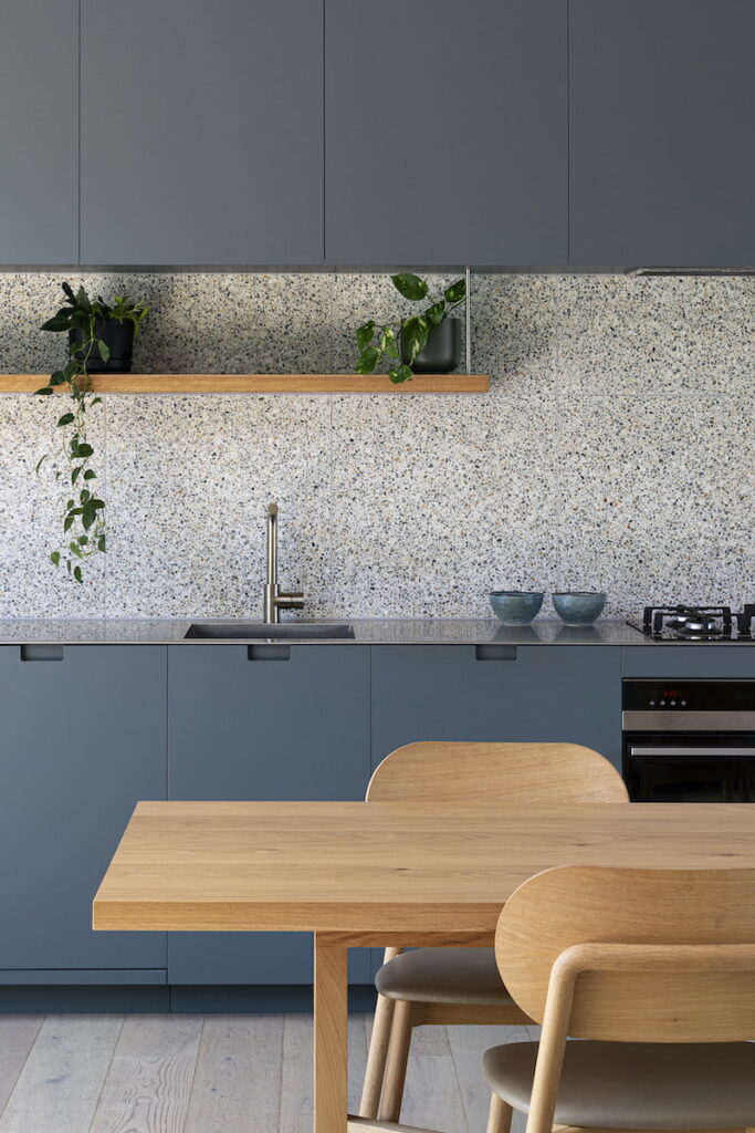
The built form is consciously simple, not dissimilar to a container dropped on–site. However, the west end of the building is intended to respond to the topography of the site by sweeping up at a 45° angle, generating some drama externally and – perhaps more importantly – lofty internal volumes. Externally, the building is clad in black stained blackbutt timber. Recycled, bagged and painted bricks provide a privacy veil and a visual contrast to the cladding. Internally, the public spaces are lined in lime-washed hoop pine ply, and the landscape is referenced via the matte green kitchen cabinetry. As you enter the private spaces, a blush paint provides warmth and complements the plywood.
Flooring
Engineered oak floorboards are from Scandinavia Floors.
Glazing
Glazing is thermally-broken AWS frames with argon-filled double glazing.
Heating and cooling
Passive solar design features including northern orientation and cross ventilation reduce the need for heating and cooling devices. No mechanical cooling is used in the design aside from ceiling fans which assist with cross ventilation in summer. Heating is provided by a Nectre combustion wood fireplace, with an inline fan/exhaust system in the roof zone that draws heat from the living space to the bedrooms when required.
Hot water system
The house uses a Bosch Optiflow professional internal room-sealed continuous flow water heater.
Water tanks
Below-deck rainwater tanks combine to service toilets and garden.
