Neighbourhood Watch
Architect David Vernon has packed as many kid-focussed features as possible into his transparent new Elwood home, including a cricket pitch lawn, a shop-style play nook and racing circuits.
David Vernon credits green as one of several inspirations behind the new family home he designed recently for a generous inner-city corner block in bayside Elwood. He’d built his last home in nearby East St Kilda slowly, by hand, over a couple of years, eking out as much livable space as possible from a tiny 250-square- metre site ringed on all sides by tall neighbouring properties. The design scooped a 2009 Australian Institute of Architects (Victorian Chapter) Award and graced the cover of green in early 2010.
Later that year Vernon was one of thirteen architects approached by the magazine to design and build a 3D model of a compact inner urban home for its Scale vs Status exhibition at the State of Design Festival in July. By December he and psychologist partner Rachel Chiodo found themselves pushing these ideas further after buying a run-down old house in Elwood on a block of similar size.
“It got us thinking,” Vernon recalls. “Whilst it was a different … project … it certainly set up (the question), ‘A 450-square-metre site, how do we deal with that?’”
As client, Vernon allowed himself six months to explore various options, including turning over a third of the block to create a neighbourhood “common” (which he concluded was problematic for resale), an elaborate plan for three tiers of garden and terracing (prohibitively expensive), and a prefabricated dwelling.
“But we very much wanted to get the benefit of having some thermal mass – slab on ground, you get the sun coming in, warming the place up, and … re-used bricks,” Vernon says. “Obviously when you go prefab it’s a more lightweight build.”
Renovating the existing house or its various outbuildings was never on the cards due to their poor condition.
The brief was “maximising the land use for all aspects: garden and play space and enjoyment, not feeling that we’re hemmed in”. The couple wanted subtly delineated spaces inside and out that each member of the family, including children Sam (now five) and Nelly (18 months), could enjoy separately and together. Coming from
a 145-square-metre home they didn’t hanker after an ensuite or “adults’ retreat”.
With future needs in mind, they opted for a sizeable fourth bedroom on the ground floor that currently serves as Vernon’s home office but could eventually be the master bedroom. Building with a “loose fit, long life” philosophy, the current master on the upper level features a removable joinery “wall” (plus a cut-out corner window with kick-arse views and a balcony floor that will serve as a cantilevered planter box), making it easily transformed into a second living space.
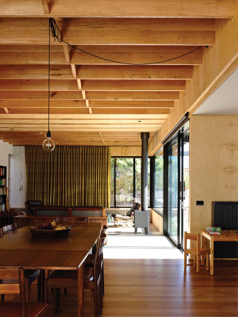
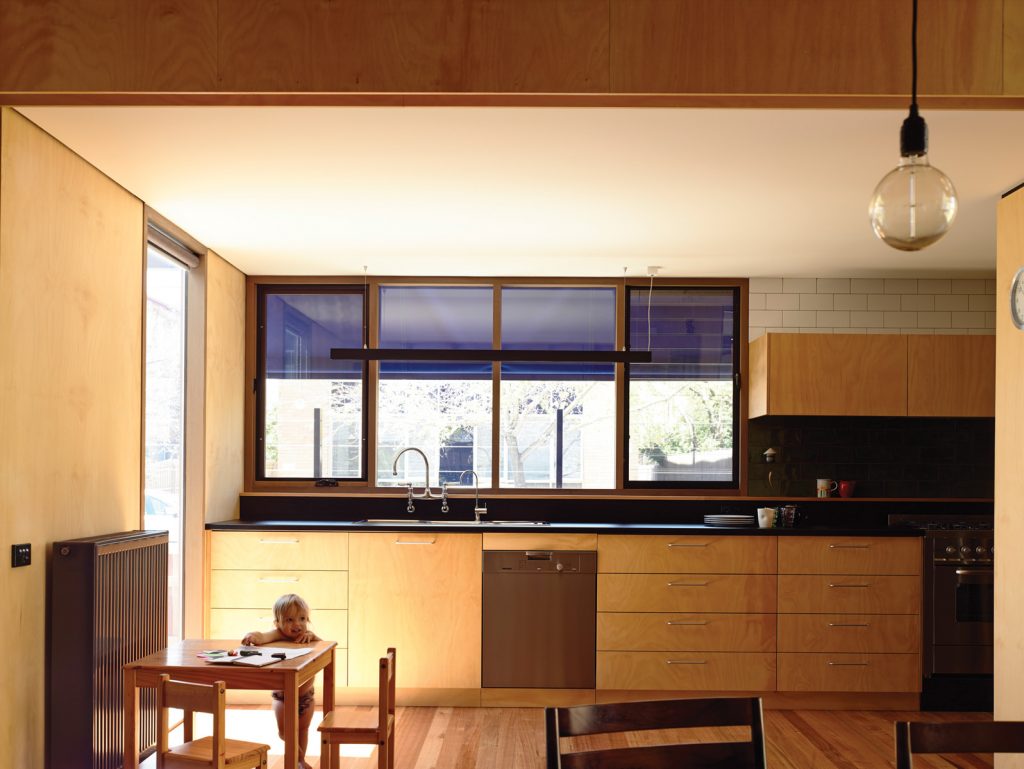
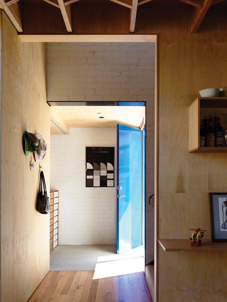
Twelve months in a rental property without a kitchen island bench had shown Chiodo the benefits of forgoing this to accommodate a central dining table for shared family meals. A single step up from living room to dining area stops balls and other toys in their tracks. It also gives the generous central living space, with its exposed timber bracing, garden views and a small wood fire with internal flue for extra heat, a cosy, den-like feel. The galley- style kitchen accommodates a small laundry opposite the pantry.
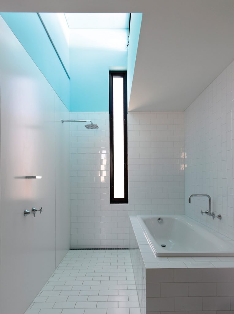
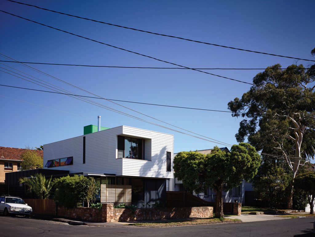
A simple but sizeable upstairs bathroom is topped with a thermal chimney expressed externally on the roof as a boxy, bright green “lantern”.
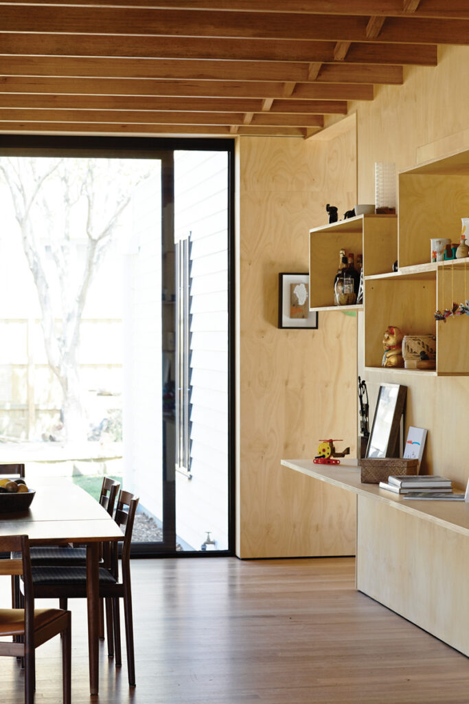
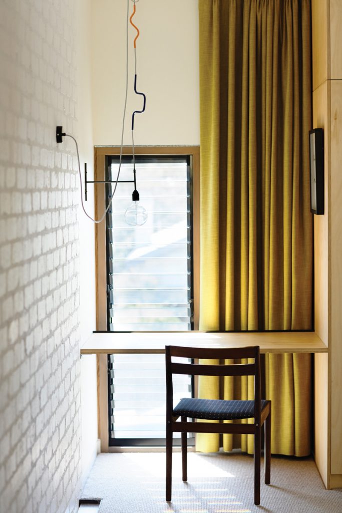
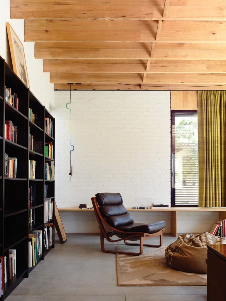
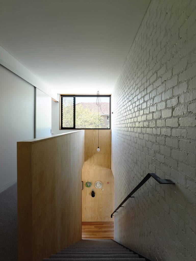
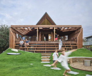
For children Sam and Nelly and their many visitors, house and garden offer plenty of kid-sized nooks and crannies to explore. Vernon says the inclusion of racetrack-like circuits inside and out for running off energy are proving popular. These include a series of small decks at the rear such as “the lily pad”: a circular timber platform designed on site by Sam during construction to wrap around a massive magnolia tree. In addition there’s a car space- cum-cricket pitch embedded in the front lawn, a small table tucked at the end of the upstairs hallway which Sam has claimed as his private desk, a low-level toy storage and play space off the main living room with a wide counter that makes it ideal for all sorts of imaginary play, with easy access to side and rear exits to spill out into the garden. A low bookcase near the fireplace has taken on the role of window seat for quiet reading time.
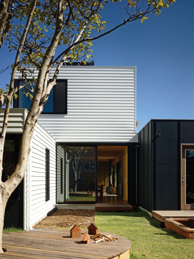
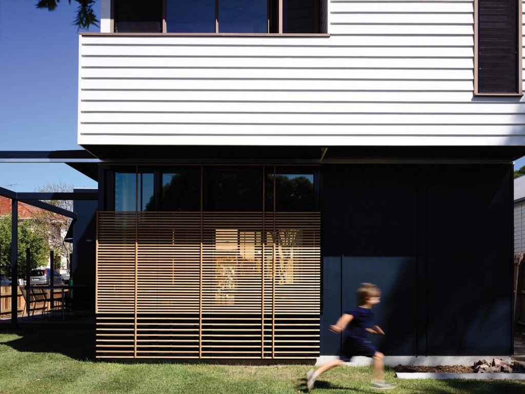
Mindful of the prominent corner location, Vernon aimed for a design offering a suitable “urban gesture” to both street and neighbours – many of whom have lived in the village-like pocket for decades. Hence there are generous setbacks on all sides and a front entrance pushed to the back of the western wall towards the rear home office. From the street the façade reads like stacked boxes. On the overhanging upper level it’s all white weatherboard; below and to the side are dark charcoal boxes of cement sheet, linked by a series of green buffers: small gardens and decks at the front, east side and rear. Vernon says the design is a nod to both the modernist box and the weatherboard homes and 1960s cream brick flats around it. The choice of materials, honestly expressed, was born of a desire to bookend both streets fittingly.
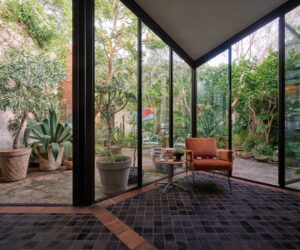
Bedrooms are concentrated upstairs for privacy. At ground level there’s a degree of enclosure via large established trees, retractable external shade screens, a box-like kitchen to the east with limited glazing to the street (and provision for a garden deck on its roof) and a clever sliding steel screen just off the living room. This will eventually be covered in creepers to create a wall of vegetation that can be used to lend more privacy to outdoor entertaining nooks like the small nearby BBQ deck. But there’s a deliberate sense of transparency between house and street thanks to low stone and timber walls at the north-facing front and east side of the property, and clear sightlines between living and dining areas and the surrounding gardens and decks.
The owners concede not everyone would feel comfortable with this degree of openness but for them it’s a fun route to casual sociability – as well as a guarantee Sam sees the school’s walking bus coming. “Dave and I love the connection with the street,” Chiodo says. “We loved it at (our old place), we put a sandpit in the front garden and we lived out there, and all the kids in the street used to come and play. It’s such a nice thing to have that connection to the community. A lot of people would feel a bit exposed but we sit out there having barbies and talk to people walking past. It’s ace.”
Specs
Architect
David Vernon
vernon.com.au
Builder
Mark Projects Pty Ltd
Passive energy design
The house is mostly oriented to the north and east with glazing to the ground floor living area. The upper floor overhangs and an external pergola provides summer shading. In winter the sun can penetrate well inside the living room, warming the floor slab and internal brick walls. Windows and doors are positioned for effective cross-breezes. The design provides comfortable living with low energy use year-round.
Materials
The ground level has a concrete slab, clear sealed and saw cut for improved thermal mass. The main volumes are of highly insulated, lightweight, mainly timber-framed construction, with limited steel work and an internal brick veneer skin with recycled pressed red bricks. The interiors feature expressed laminated timber beams, hoop pine plywood sheet and plasterboard sheet lining to the upper floor. Paints are low VOC. Whittle Waxes finish is used on the kitchen, bedroom and bathroom joinery.
External finishes include Baltic pine timber weatherboards with compressed cement cladding and recycled face brickwork. Concealed Zincalume roof sheet is fixed to all roof areas.
Flooring
The clear sealed concrete floor slab is saw cut. Timber floors are kiln dried hardwood in mountain ash. T&G flooring on ply sheet underlay is used on the slab for the kitchen, dining and laundry areas. The upper level floors and stairs are covered in 100% wool carpet over 25 mm plywood sheet flooring.
Insulation
The roof is insulated with R6.0 Earthwool thermal insulation and Insulbubble reflective insulation sheet and sisalation. There’s bulk insulation to walls: 90 mm thick R2.5HD Earthwool and polastic thermal insulation sheet to external walls, plus 75 mm Earthwool sound control batts to all internal walls for improved sound insulation. Expanded polystyrene insulation sheet has been used for all external reverse brick veneer walls.
Glazing
Windows are powder coated aluminium and western red cedar timber framed, with Viridian low-e clear double glazing and Breezway louvre inserts and awning/casement windows.
Heating and cooling
Glazing is oriented north/east for winter sun, and external shading is provided by retractable screen blinds for summer as well as a steel-framed pergola. Effective cross ventilation removes the need for artificial cooling aside from ceiling fans in the three bedrooms upstairs. A raised roof skylight over the upstairs bathroom dubbed “the green lantern” acts as a thermal chimney throughout summer, expelling hot air from inside and providing additional ventilation. In winter the living room slab and internal brick wall on the ground floor receive plenty of sun, which reduces the need for additional heating by a hydronic gas-boosted system with slab and panels. There’s also a small slow combustion wood fireplace in the living room with an internal duct for extra heat, which runs through the first floor and out through the roof.
Hot water system
Hot water is provided by a gas-boosted solar hot water split system: an Apricus tube collector with storage tank and Rinnai gas booster.
Water tanks
Rainwater from all roof areas is directed to a 22,500 litre in-ground concrete tank, which provides water for toilet flushing, washing machine and garden irrigation.
Lighting
The house uses low energy LED lighting from Inlite and feature lights from Volker Haug.
Energy
A 1.96 kW grid connected solar power system has recently been installed.
