The Dulux Colour Forecast 2020
IMG LINK

Dulux Colour Forecast 2020 – Comeback palette. Styled by Bree Leech. Photographer: Lisa Cohen
IMG LINK
Dulux Colour Forecast 2020 – Cultivate palette. Styled by Bree Leech. Photographer: Lisa Cohen
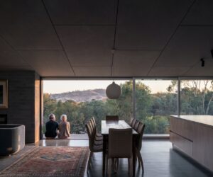
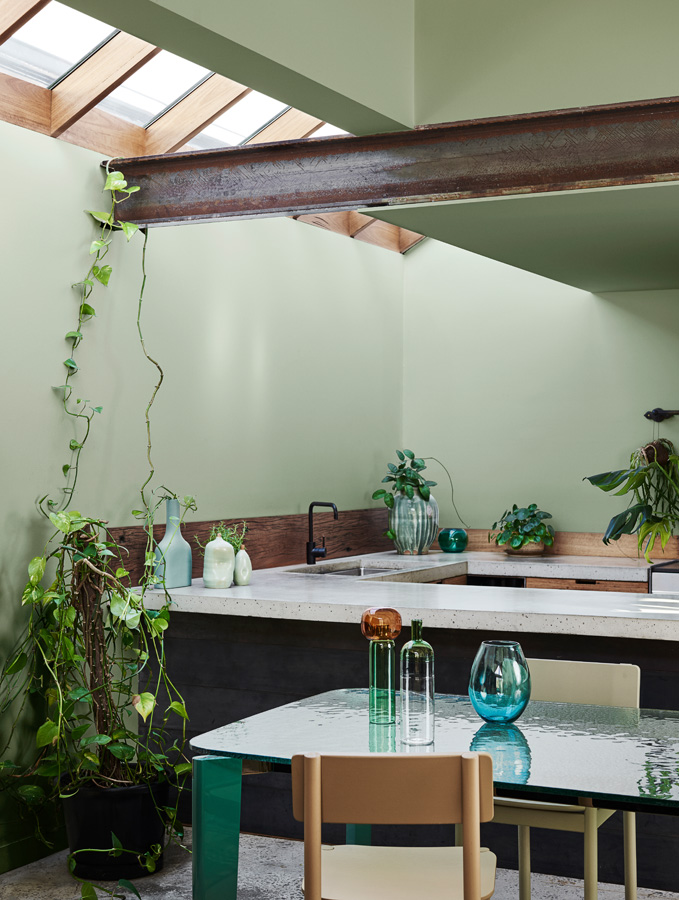
IMG LINK
Dulux Colour Forecast 2020 – Grounded palette. Styled by Bree Leech. Photographer: Lisa Cohen
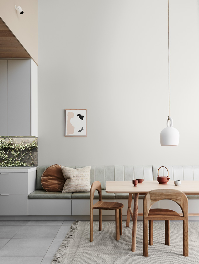
IMG LINK
Dulux Colour Forecast 2020 – Indulge palette. Styled by Bree Leech. Photographer: Lisa Cohen
The Dulux Colour Forecast 2020 palettes represent the essence of 21st century trends at a pivotal point in time, not only in design terms but in a global context. Entrenched in the digital age, the pace of life is ever-increasing but, at the same time, there is a growing appreciation of the importance of personal wellbeing and the health of the planet. People are seeking greater connection to the natural world, deriving comfort from nostalgia and enjoying a degree of escapism, all of which are expressed in the spectrum of hues curated for the new season.
The Dulux Colour Forecast 2020 has evolved from extensive research, drawing inspiration from international sources, such as the Milan Design Fair (Salone del Mobile), as well as examining current lifestyle trends and concerns, and the way they, in turn, influence design. Dulux Colour and Communications Manager Andrea Lucena-Orr explains that it is a highly collaborative team approach undertaken with forecaster Bree Leech, and in consultation with the European Division of the Colour Marketing Group. “It is an exhaustive process, analysing the factors that influence design directions and the development and use of colour,” Lucena-Orr says.
Their findings highlight an increasing need for calm, connection and comfort in this chaotic tech-driven era, alongside a desire for self-expression and empowerment, which are expressed in four distinct palettes, plus a key palette of additional highlight colours. Together they have been distilled into one unifying theme: Essence.
Defined as the “intrinsic nature or indispensable quality of something”, Essence embodies the soul, ethos, nature and heart of our individual and collective experiences. “Inspired by the wellness movement – not only our personal well-being but also our environment – Essence pushes back against the chaotic pace of life, reducing it to a greater state of calm,” Lucena-Orr explains.
It places a focus on authenticity and transparency, and these qualities underpin each of the new palettes – Grounded, Cultivate, Indulge, and Comeback – in a variety of ways. “Colourwise, it translates to a more tonal palette this year; the colours are mostly muted and there’s a natural feel, balanced out by selected striking accents and saturated hues,” says Lucena-Orr.
The Grounded palette demonstrates this emphasis most literally, with colours pared back to their core essence. Minimal tonal variations and an earthy focus promote comfort and familiarity, in an aesthetic that allows natural textures to come to the fore. This was evident in the Milan showrooms, where textiles of heavy bouclé or shearling and roughly refined stone finishes indicated a return to the appreciation of natural beauty and a world in which sustainability is a given. “It is a natural soft and subtle palette that helps to create a sense of light, calmness and relaxation in any space,” explains Lucena-Orr.
Continuing the theme of earthiness, with an emphasis on warmth and luxury, the suite of hues in the Indulge palette promotes escapism via immersive, romantic interiors.
Picture lush fabrics on voluptuous forms, and drapery softening interior edges. Tactility remains a focus, with a decadence and depth to inspire lingering as an antidote to the daily rush. “It is our richest and most colourful palette,” says Lucena-Orr, who saw Arper, Moroso and Studio Pepe echoing the theme during the Milan Fair. “Its warmth and sophistication are derived from deep earthy tans and corals and can be injected with the racy ‘Red Rebel’ for a passionate twist.”
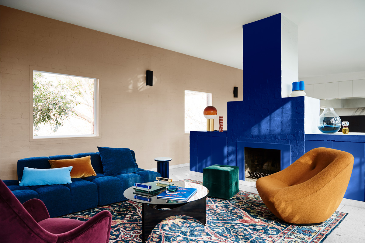
Inspired by the centenary of the Bauhaus movement and the reissuing of classic pieces by major design houses, Comeback is a palette that embraces nostalgia and fuses it with contemporary references. Requiring a degree of confidence, it encourages personal cultural expression through the eclectic, elegant layering of the past and present.
Its hues provide what Lucena-Orr describes as “a refreshing change”, particularly the spectrum of blues and teals, colours that also stood out at Design Week, where Yves Klein blue, for instance, was not just a highlight it was in full flight on large structural surfaces. Strong, contrastingly warm reds and deep yellows complement, giving more than a nod to the graphically bold Bauhaus.
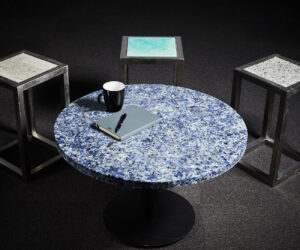
Coming full circle, the fourth palette returns to nature and the essence of life. Cultivate combines botanically inspired, calming shades of green with a sprinkle of highlight colours that echo the harmony of the natural world. Complementary design elements feature transparent materials, such as coloured glass or iridescent resins, and a restrained Japanese–inspired aesthetic that subtly wove its way through the styling elements of Zanotta and Arper in Milan.
In a departure from previous years, the 2020 Dulux Colour Forecast sees the addition of a highlight palette, offering a limited range of four key colours: primary blue, 70s fuchsia, orange-red and acid yellow. These highlights are designed to disrupt the order of things, allowing personalisation of the major four palettes through bespoke applications and unique expression.
These new-season palettes demonstrate the transformative effect of paint, with a spectrum of hues that specifically reflect the global trends at play as we move into 2020. Distilled to their essence, they specifically acknowledge the primary human needs of authenticity, comfort and connection to the natural world, while allowing self-expression, empowerment and a touch of escapism.
More green updates