The Future, Now
At some point in our lives, most of us have probably spent time working in an office. Whether situated in the home or in a public space, offices are physical sites of productivity and socialisation. Here we take a peek at the work of architects and designers who’ve abandoned tired stalwarts such as fluorescent lighting, rockhard chairs and awkward water coolers. The offices of the future are here, now.
Slack Office, Melbourne
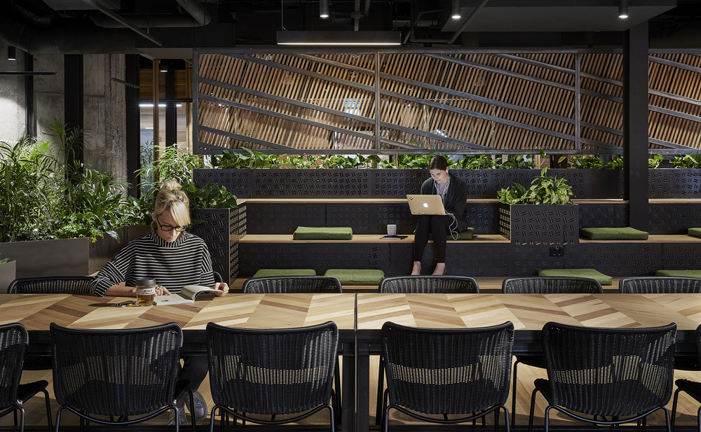
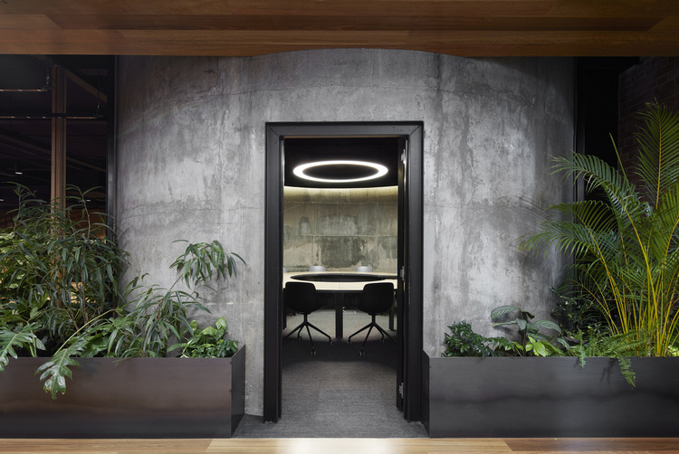
“Intersectionality” was at the core of Breathe Architecture’s design approach when creating an office for tech company Slack. The office is housed in the historical Maltstore building, which was constructed in 1904 for the Carlton United Brewery. The uniqueness of this site encouraged the architects to experiment with the communion between industrial, digital elements and natural, personal touches. Breathe embraced the quirks and complexities of these binaries in their office design. Slack wanted to reference its egalitarian workplace culture, so the architects made no private office space; instead, they created 70 communal workstations, a series of private phone booths, and breakout spaces including bleachers, a cafè and a “whisper chamber”. In an additional flash of genius, Breathe ensured that elements of their fit-out were easily removable at end of life for future reuse. For example, the locally sourced, recycled Tasmanian oak floorboards are top nailed, not glued. Breathe were mindful to feature plant life in their design; and a veritable cornucopia of greenery is interwoven throughout the space.
Claisebrook Design Community
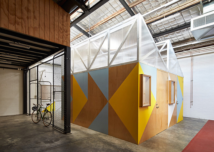
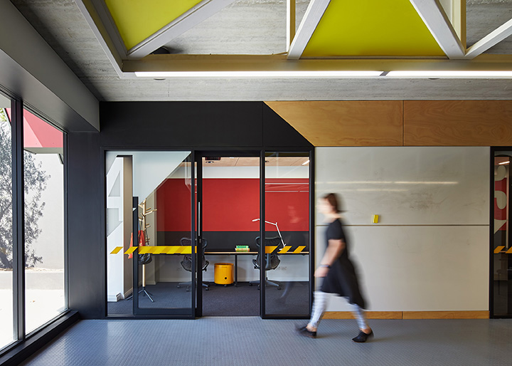
The Claisebrook Design Community project began when the client decided to transform a warehouse, formerly used for his family business, into a locus for creative innovation. The east Perth building went from a nondescript warehouse to a thriving, adaptive space for co-working and entrepreneurship. The reincarnation of the site was done with careful consideration of its new spatial requirements. CODA Studio, now merged with COX Architecture, designed the front of the warehouse to serve as a co-working space, while the rear of the property contains individual pods for private work, workshop facilities, a kitchenette and a communal gathering space. The interior aesthetic is a vibrant blend of industrial materials and bold, colourful graphics influenced by the work of Australian urban landscape artist Jeffrey Smart. The modus operandi of the Claisebrook Design Community is to interact with and draw inspiration from the outside world, so the design also included a café that is now open to the neighbourhood.
Garden Pavilion
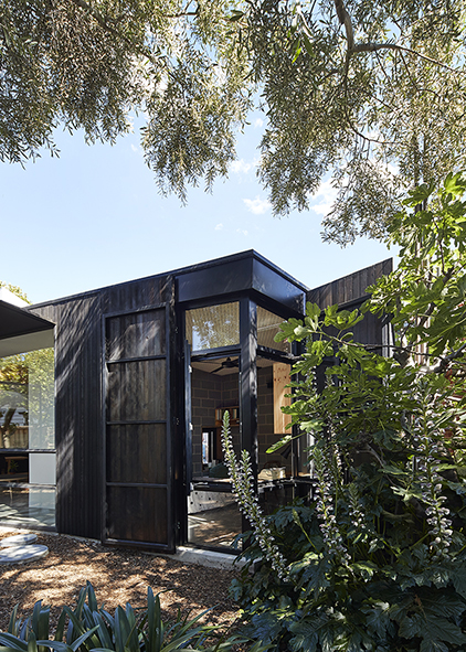
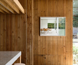
BLOXAS’ Garden Pavilion answered a complex project brief with empathy and esprit. Their client has a chronic sleeping disorder, and so the home’s design needed to be congruous with particular spatial and atmospheric requirements. Thus, Garden Pavilion’s home office serves two roles: a dynamic workspace and a peaceful environment in which the client could sleep. BLOXAS took advantage of the site’s curved footprint to imbibe the established garden vista and to refract sound and control heat gain. To further their design strategy, BLOXAS included perforated, acoustic ceiling panels, heavily insulated walls and double doors with customs seals to maintain strict acoustic conditions. The design meliorated the sanctuary vibe by including manually operated, timber-clad shutters charred using the process of shou sugi ban. BLOXAS has created a soothing, multi textural sensory experience that also serves as a working space.
The Stella Collective
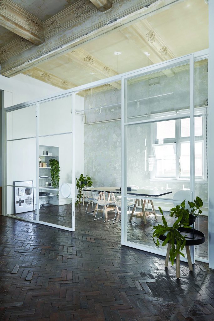
Melbourne-based interior design studio, The Stella Collective, set up their new digs in a pretty extraordinary spot. Their office is located in a 100-year-old former department store known as the Conway building on Melbourne’s bustling Chapel Street. Inspired by the site’s proud history, The Stella Collective took a reverent and respectful approach to designing their office space. The workspace is an insertion that can be removed without interfering with the original structure of the building. The Stella Collective’s four designers share two communal desks and a meeting area that is elegantly sectioned by glass panel walls, to optimise abundant sunlight. The refinement of the monochromatic office interior allows the Conway building to take centre stage, and its soaring decorative ceilings and opulent parquetry flooring are most certainly deserving of the spotlight.
Yoke Yoga Studio
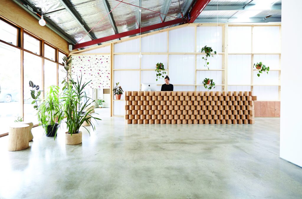
Folk Architects have transformed the former Zeally Bay Bakery in Torquay into a shared facility for the Yoke Yoga studio, a wellness centre and community space. During the design process Folk Architects resolved to emphasise the distinct character of the existing warehouse, so partition walls and parts of the ceiling have been removed to expose its raw, unadulterated form. The new entry, reception, yoga and community spaces are all gently demarcated by timber and polycarbonate joinery. The interior of the reception area is bathed in natural light, enhancing the elegant textural palette of concrete, timber and plants in the space. In a playful touch, the entry desk is made of cork blocks, which are usually used as yoga props. Folk Architects installed a semi-translucent screen behind the reception to unify the working zone with its surrounding community and activity spaces, in direct response to the yoga values of connection and compassion.
Perimeter House
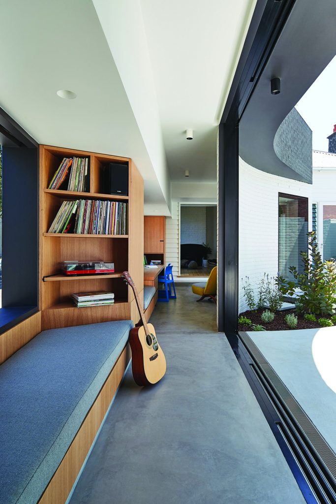
Make Architecture imbued the design of Perimeter House with finesse and acumen. The Abbotsford project is surrounded by factories, businesses and warehouses in a predominately industrial area. The challenge of connecting the existing heritage cottage to the new living areas was resolved using an activated threshold space into which the home study was incorporated. The concept behind the study of Perimeter House was to create a place for work in a communal context, ultimately bringing the family together. Here, the kids can do their homework and their parents can do their “life admin” – in each other’s company. The timber veneer study is a sophisticated complement to the crisp masonry brick wall on one side, and the weatherboard wall of the existing cottage on another. In Perimeter House, Make Architecture delivered a study that unites not only architectural elements, but also those living within the home.
The Home Office
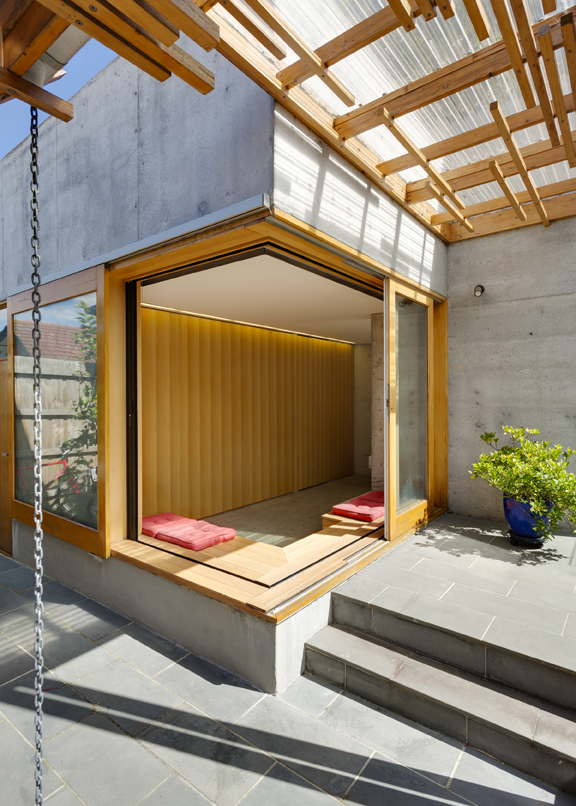
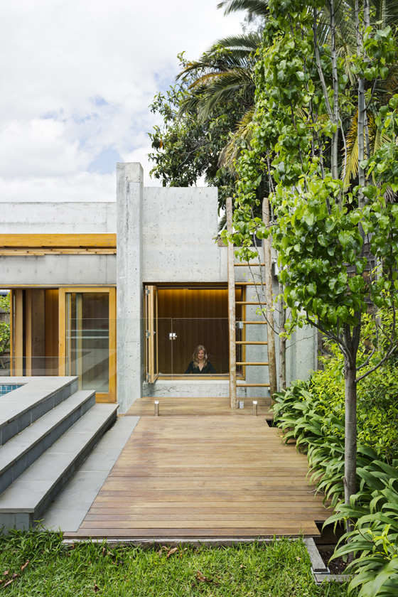
The Home Office by Ande Bunbury Architects is small in size but big in utility. A separate building in a residential backyard, the Home Office also serves as a games room, pool house, bedroom, art studio, relaxation space and DJ booth. The structure also incorporates a hidden bathroom, tool shed and rooftop deck – it’s the architectural equivalent of a one-stop shop. To ensure that the Home Office could accommodate such a broad range of uses within its bounds, Ande Bunbury Architects looked to inspiring examples of modern Japanese residential architecture in densely packed Tokyo. The Home Office was formerly a single car garage with limited access. During construction, all materials were carried down a pathway beside the main house to reach the site. The Home Office is testament not only to the architectural potential presented by small spaces, but the breadth in form and function of home offices.
