Splash
Our pick of bathrooms for all climates, shapes and sizes, designed and built for longevity.
Customised
This bathroom is part of a layered addition and fit-out to Baird Cuthbert Mitchell’s 1977 Low Energy House, which won an AIA Energy Efficient building award in 1980.
Set among Victoria’s coastal bushland, the house is filled with character – a thoughtfully detailed home for a young family of five. Its nuanced modern iteration, undertaken by Clare Cousins Architects, takes care to retain its heritage while creating abundant access to functional outdoor spaces.
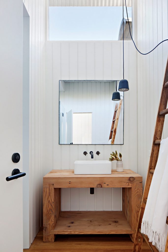
The building’s original interior, including the strawboard ceiling and cedar shiplap cladding, has been whitewashed to rationalise the design throughout the home; inside the bathroom this brings about a sense of light and space that would otherwise be lost, which is then aided by the original clerestory windows that bathe the room in natural light.
The entire bathroom is punctuated by fine details, such as the custom timber vanity and a pendant light by Anchor Ceramics, which invite a closer look and encourage a more tactile and intimate relationship with the home.
Specs
Basin
Caroma Cube 500 Above Counter Basin.
Tapware
Astra Walker Icon+ tapware
Vanity
Timber – custom built.
Lighting
Anchor Ceramics “Potter Light” pendant.
Grand Central
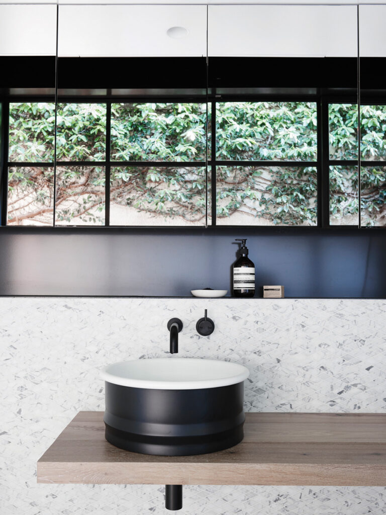
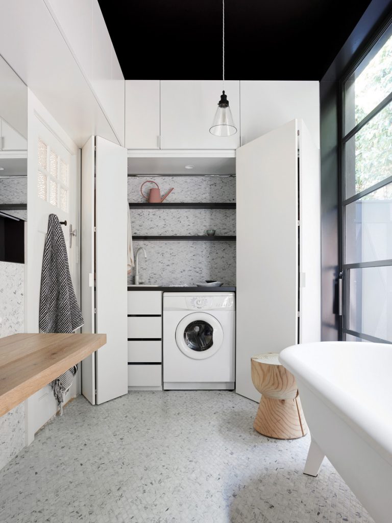
Though not the first place most people would think of, the bathroom is the perfect room to play with ideas of margins – which is exactly what Northbourne Architecture + Design did by combining the existing bathroom and laundry of this home to create a European, “grand central” type of space.
The simple, yet contrasting, palette of black, white, stone and timber is inspired by the owners’ art collection, with the addition of mosaic tiles to add softness.
Breaking down ideas of thresholds, the bathroom takes on a limitless feel through the considered harnessing of reflections and colour. A large steel window with sliding doors has been carved into the existing wall to harness natural light, frame the freestanding bathtub, and draw in the lush green ficus vine on the rendered wall adjacent.
The ceiling and top part of the walls are painted black so the upper limit of the room is difficult to identify; the hidden laundry sits behind frameless concertina doors. Concealed storage hides behind those doors, as well as floating above the shower, toilet and vanity – disguised as building elements rather than cupboards.
Fully recessed mirror cabinets reflect the outside in, again blurring the boundaries of space.
Specs
Basin
“Vieques” basin by Patricia Urquiola from Agape. Sussex Scala mixer and outlet from Reece.
Shower and bath
White “Ottocento” bathtub from Agape. Chrome “Teknobili Plus” overhead shower from Reece.
Walls
Diamond-shaped Carrara marble mosaic tiles from Academy Tiles.
T edwardian
The wonderful clients for this Edwardian house are incredible design thinkers, one working on the film Ted (hence the renovation’s title) and the other a graphic designer with an eye for colour.
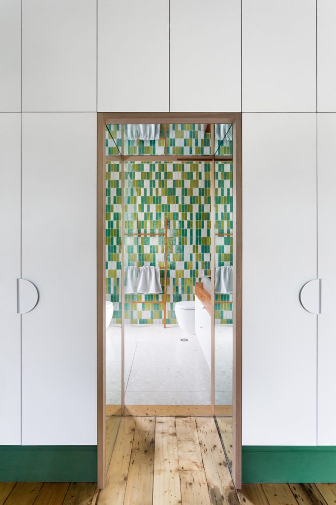
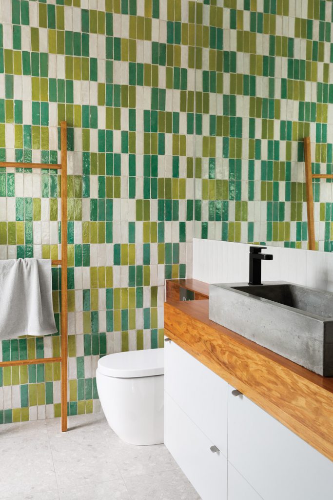
Within the playful emerald green master bedroom is an impressive wall of fullheight joinery neatly tucked between the existing cornice and sculpted skirting boards. Asymmetrically located is a thick, mirrored threshold leading to a dazzling ensuite with a mottle of colourful handmade Moroccan tiles.
Spanning the length of the space is a custom vanity unit with an integrated toilet. And sitting on the handcrafted blackwood timber top is a client-cast concrete basin. Surrounded by greenery inside and out, this light-filled bathroom is a radically conservative brand of taken for- granted trickery and conceptual nuance – just like the house it resides in.
Specs
Basin
Mare basin mixer “Matte Black” from Rogerseller.
Toilet
Roca Meridian back to wall pan from Reece.
Walls
Moroccan tiles in “Off White”, “Pistachio” and “Sea Green” from Byzantine Design.
Shower
Raindance Connect 240 Showerpipe from Rogerseller.
A Pavilion Between the Trees
It’s impossible to discuss this bathroom without first mentioning the structure in which it resides. Semi-detached from the main house, the small pavilion is intended as a place of rejuvenation and intimacy.
Entry to the pavilion is provided via the extension of an exiting central corridor from the main house. This central “boardwalk” splits the ensuite areas into two distinct spaces before peeling away into two circulation paths.
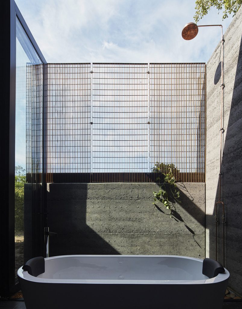
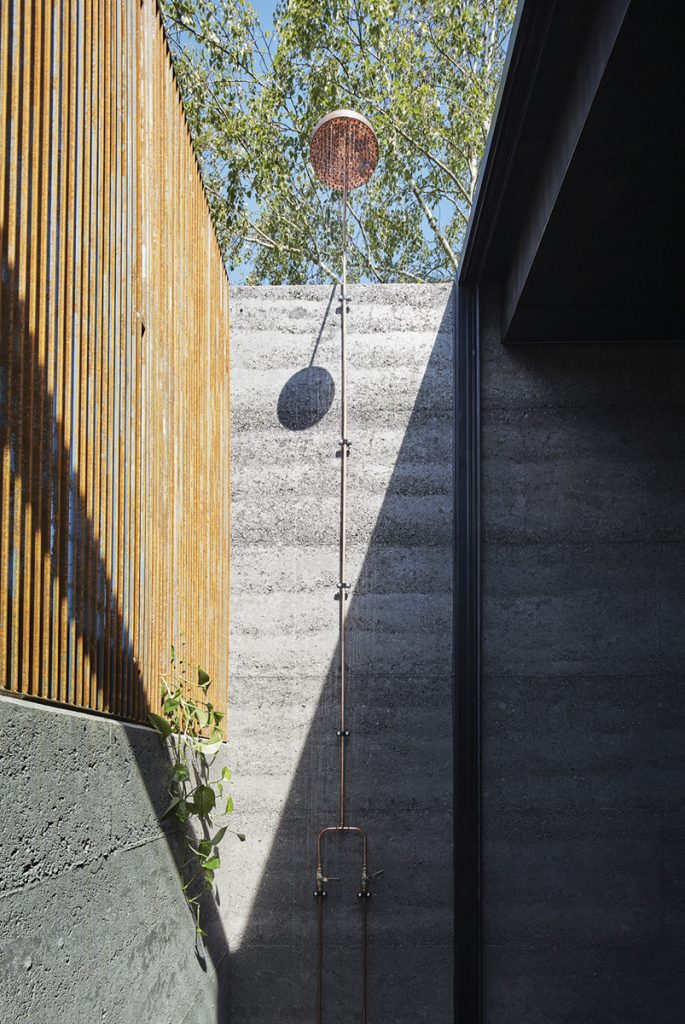
The bathing area of the ensuite incorporates both an indoor and outdoor shower, as well as a bath on the threshold of the internal–external building line. Large full-height folding glass doors open to include the narrow external courtyard as a part of the bathroom space, giving it a direct connection with the garden.
A half-height, rammed earth wall and a steel mesh screen provide privacy from the expansive property beyond without interrupting the views of the treetops and sky from the bath and outdoor shower.
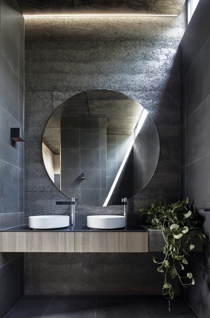
Charcoal rammed earth, timber, honed bluestone and brass trim are the predominant internal materials with concrete and steel also used for some of the joinery. Though constructed precisely, the palette perfectly reflects the pavilion’s rural context.
Specs
Basin
Laufen Kartell 420 round washbasins and Milli Axon basin mixers.
Vanity
Custom steel and concrete vanity by Martin Builders.
Shower and bath
Solo 1700 Lucite Acrylic Bath from Rogerseller and external copper shower by Martin Builders.
Bath House
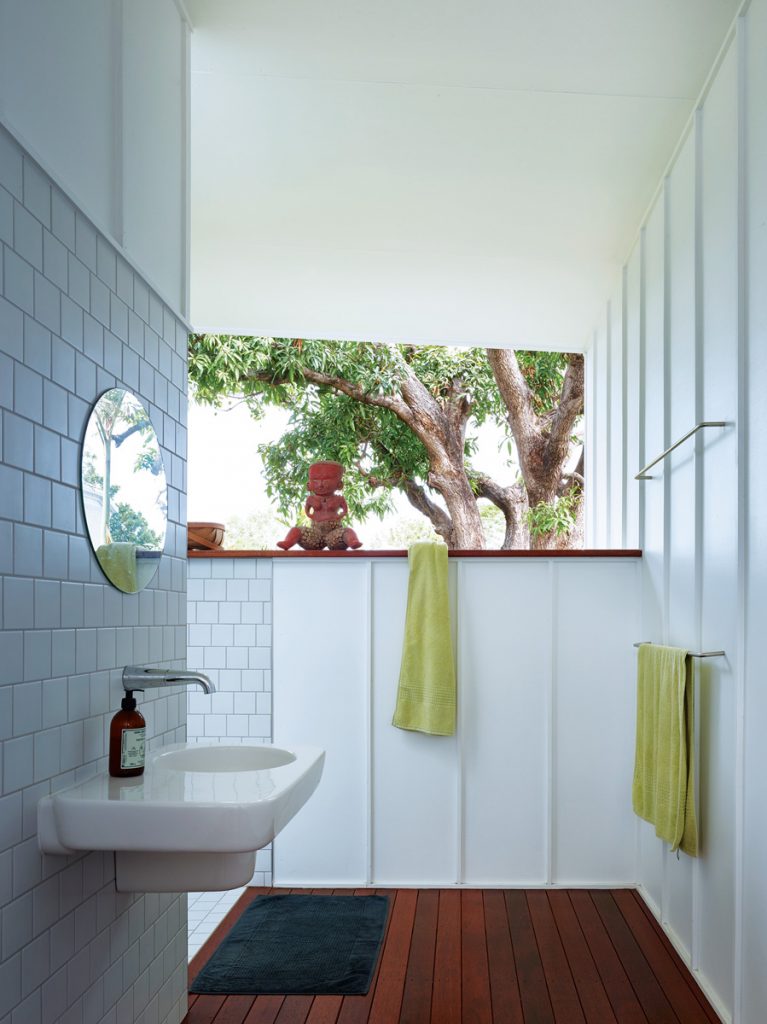
In the early days of Queenslander houses, bathrooms, and sometimes kitchens, were often situated at the back of the home, separated from the main building. And surprise, surprise, even after some other alterations, this was the case for the Bath House.
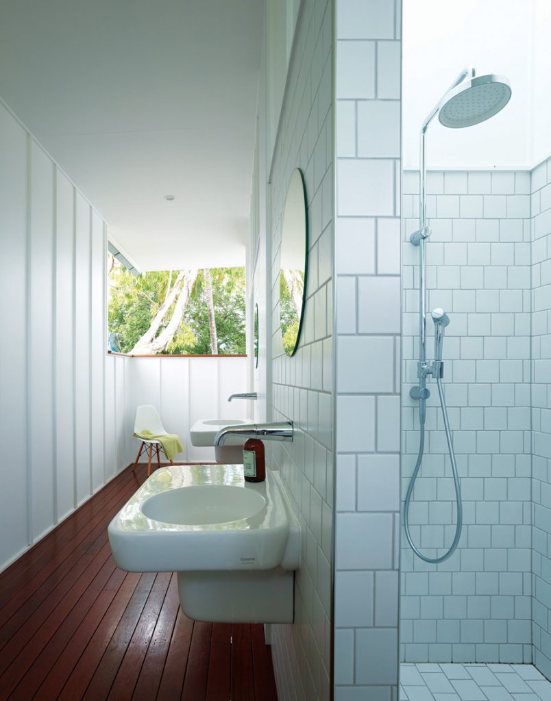
In response, the architects reworked the bathroom with Townsville’s hot and humid climate in mind; external bathrooms are surprisingly rare, but wet areas need to be ventilated so an outdoor, but still completely undercover, solution proved to be the perfect fix.
With a newly installed deck navigating the house, the bathroom is easily accessed through a covered verandah that links the toilet and shower. The careful placement of screening walls and framed views serves as a cohesive integration of interior and exterior, aided by tiling in the bathroom areas that differentiates between private and public space.
With a heap of natural light and cross ventilation, this bathroom is probably everyone’s favourite place to be.
Specs
Fittings
Basins, WC, mixers and shower all from Marc Newson “Caroma” range.
Flooring
Mixed hardwood shot edge boards.
Space Savers
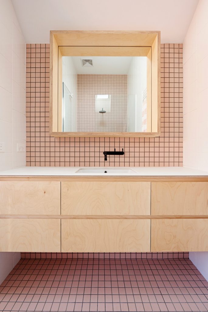
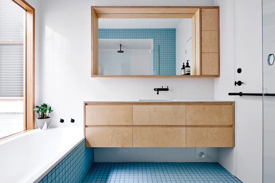
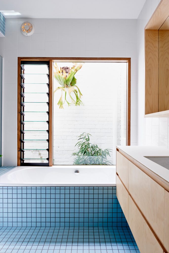
Rarely do we have to decide whether to feature the bathroom or the ensuite, but in this case we’ve just had to do both. In the bathroom Dan Gayfer Design ensured that not a single square millimetre was wasted through a strong merging of the elements in the space.
The porcelain bench top wraps down at one end of the vanity where it meets the porcelain of the bathtub. Then the end of the bath meets the glass of the shower screen, the screen resting on a tiled ledge that has been designed for parents to sit when children are having a bath.
Materials further aid the concept, the matte blue mosaic tiles on the floor snake up the bath and onto the seating ledge, while contrasting gloss white wall tiles find their way up onto the ceiling of the walkin shower.
The ensuite holds true to the no-start, no-finish theme with blush tiles that completely cover one plane of the ensuite (east to west). Similarly, in both the bathroom and ensuite an LED strip light has been recessed into the base of the mirror cabinets – this is not only the perfect night light for the owners but also one that is gorgeous as it softly washes across the porcelain bench tops.
Specs
Basin
Matte black taps by Brodware and basins by Parisi.
Bath
Bathroom: Kaldewei “Vaio Duo” Rectangle Bath.
Walls
Bathroom: Blue matte mosaic ceramic tile “Plain” by Inax. Ensuite: Blush matte mosaic ceramic tile “Plain” by Inax. Both: 200 x 250 mm gloss white wall tile.
Joinery
Porcelain benchtop by Maximum Australia in “Taxos” matte. Russian birch plywood cabinetry and shelving.
