
2019 Dulux Colour Awards Winners announced
IMG LINK
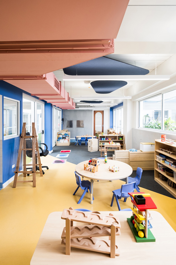
Dulux Colour Awards 2019 Australian Grand Prix and Commercial Interior: Workplace and Retail winner. GIRAFFE LEARNING CENTRE (NSW). Photographer: Adam Madigan and Bob Barrett
IMG LINK

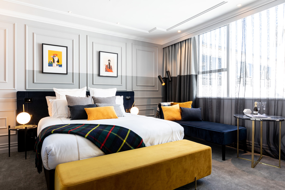
Dulux Colour Awards 2019 Commercial Interior: Public and Hospitality winner. SABLE DROP (VIC). Photographer: Peter Clarke
IMG LINK
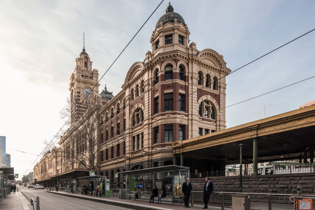
Dulux Colour Awards 2019 Commercial and Multi-Residential Exterior winner. FLINDERS STREET EXTERNAL WORKS (VIC). Photographer: Peter Glenane, Martin Leitch, Jenny Bolis and Kai Chen
IMG LINK
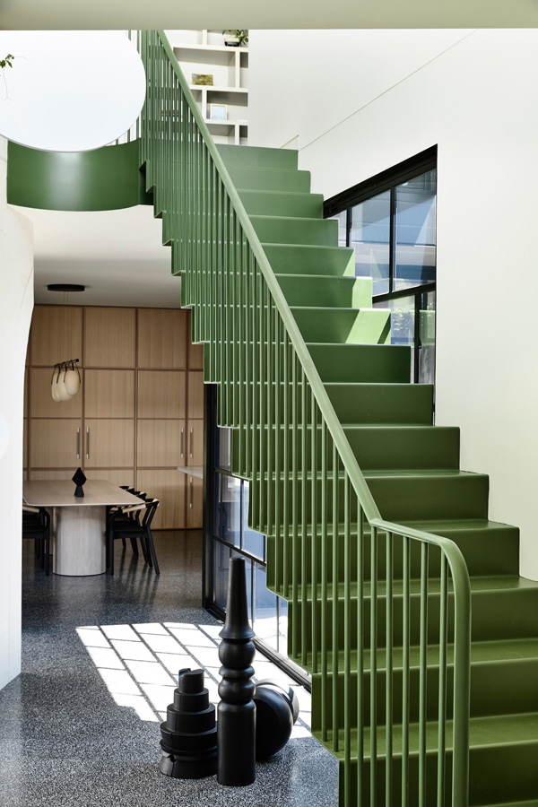
Dulux Colour Awards 2019 Residential Interior winner. CAROLINE HOUSE (VIC). Photographer: Derek Swalwell
IMG LINK
Dulux Colour Awards 2019 Residential Exterior winner. ALMA RESIDENCE (NSW). Photographer: Prue Ruscoe
IMG LINK

Dulux Colour Awards 2019 NZ Grand Prix Winner. WAINS HOTEL DUNEDIN (NZ). Photographer: Jono Parker
Courage and sophistication typified the inspired use of colour in the winning projects of the 33rd Dulux Colour Awards, announced at a Gala event at the National Gallery of Victoria.
This long-standing, highly acclaimed industry awards program recognises the most creative and considered use of colour across six categories of built work.
Attracting a record number of entries – in excess of 430 projects from around Australia and New Zealand combined – this year’s awards demonstrated the confidence with which colour is being employed in architecture and design.
Dulux Colour Planning and Communications Manager Andrea Lucena-Orr says, “Architects and designers have really set a precedent with their masterful employment of colour to create unexpected, lively, playful and refined interior and exterior spaces.”
The esteemed judging panel similarly applauded the new level of sophistication and ambition evident across the range of entries, whether in developing hues from historic references or using colour as a tool to delineate space and elicit emotion.
Epitomising this versatility, the Australian Grand Prix and Commercial Interior: Workplace and Retail Award winner was a stand out for what the judges described as, “Unexpected sophistication, original interpretation and application of colour, even to the colour of the floors – incredible!”
Equally, the NZ Grand Prix winner, Wains Hotel in Dunedin, demonstrated an exceptional level of refinement with subtle colour blocking and contextual references.
“Together, these outstanding projects epitomise the value of our awards program, which recognises the most creative and innovative use of colour in the built environment,” Andrea Lucena-Orr says.
For more information on the 33rd Dulux Colour Awards, visit dulux.com.au/colourawards. facebook.com/duluxaustralia @duluxaus #DuluxColourAwards2019
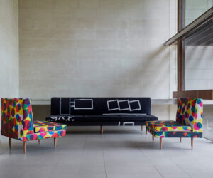
AUSTRALIAN GRAND PRIX AND COMMERCIAL INTERIOR: WORKPLACE AND RETAIL – WINNER
PROJECT: GIRAFFE LEARNING CENTRE (NSW)
ARCHITECTURE/DESIGN PRACTICE: SUPERCONTEXT ARCHITECTURE STUDIO
Judge’s comments: “In a project of its nature, with a low budget and aimed at children, this learning centre may have gone the way of many of its ilk and become either patronisingly cute or just plain bland. Instead, every opportunity has been taken to achieve the opposite. Conceptually strong, the design is accomplished, largely thanks to the strategic use of bold colour. It works hard to delineate zones, between old and new, as well as rooms and transitional spaces; to highlight, rather than hide, exposed building services; and, to assist the visually impaired. Appearing playful while serving multiple functional purposes is the epitome of clever colour usage, and makes this project the clear and deserving winner.” – Rosa Coy, Director of Coy Yiontis Architects
COMMERCIAL INTERIOR: WORKPLACE AND RETAIL
PROJECT: GIRAFFE LEARNING CENTRE (NSW)
ARCHITECTURE/DESIGN PRACTICE: SUPERCONTEXT ARCHITECTURE STUDIO
Judge’s comments: “The unexpected sophistication of this learning centre, right down to the colour of the floors, makes it a standout in its category. Given the context, it could have been heavy-handed but, instead, the innovative consideration of colour is contemporary and crisp. It eschews any expectation of the project type by not using colour in a patronising or obviously childlike way. By highlighting exposed building elements and transitional space, it is refreshingly original and sets a new benchmark.” – Rosa Coy, Director of Coy Yiontis Architects
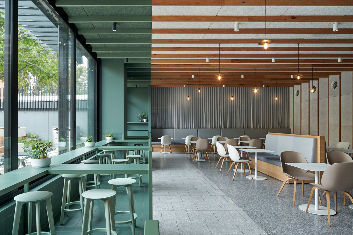
COMMENDATION
PROJECT: THE UNSW BOOKSHOP (NSW)
ARCHITECTURE/DESIGN PRACTICE: SJB
Judge’s comments: “Enveloping the visitor in its layers of sugary colour, this bookshop elicits a wonderful feeling of calm and warmth, more akin to a domestic setting than a retail store. Nuanced and detailed, the palette and saturation of colour is purposefully designed, from the colour-blocked, curved ceilings to graduating shades on the chairs. This beautiful layering allows the ‘sweet treats’ within to take pride of place and encourages users to linger.” – Rosa Coy, Director of Coy Yiontis Architects
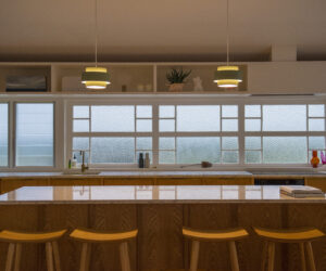
COMMERCIAL INTERIOR: PUBLIC AND HOSPITALITY
PROJECT: SABLE DROP (VIC)
ARCHITECTURE/DESIGN PRACTICE: JACKSON CLEMENTS BURROWS ARCHITECTS
Judge’s comments: “Ambition is one thing, execution another, and we commend this project on both. The use of colour is complex and considered, and its precise articulation, particularly the level of tonal matching, is no mean feat to achieve. Balance is key here. It is a large space, but the swathe of seamless green, a demarcation between the external landscaping and the interior, is an innovative device, demonstrating restraint and balance to achieve an impactful result. Overall, this is a courageous design.” – Simon Farrell-Green, Editor of HOME New Zealand magazine
COMMENDATION
PROJECT: PENTOLINA (VIC)
ARCHITECTURE/DESIGN PRACTICE: BIASOL
Judge’s comments: “Anyone who has been to Italy would appreciate the inspiration here: the hint of ruins in the hand rendered concrete walls, the marble bar, and the classic warmth of the Italian culture. The deep red ceiling is fabulously decadent and serves as a striking cap for the space. Reiterating this colour on exposed services, such as lighting rails, pipes and air-conditioning ducts, is unlikely yet stunningly effective. Bold yet restrained, it is breathtakingly simple and the effect has accurately fulfilled the brief to create a quintessential Italian with a Melbourne flavour. Bravo!” – Simon Farrell-Green, Editor of HOME New Zealand magazine
COMMENDATION
PROJECT: CURTIN THINK SPACE (WA)
ARCHITECTURE/DESIGN PRACTICE: ARCADIA DESIGN STUDIO
Judge’s comments: “Drawing upon Archigram’s bold imagery and 1960s Futurist visions, the use of saturated colour to delineate spaces within this University hub is powerful and impressive. It exemplifies how effective colour can be, especially on a tight budget. The unusual palette sees black used as a neutraliser, without being heavy or oppressive despite being employed on the ceiling and some vertical elements. Similarly, the chosen hues of yellow and red are nuanced to create warmth without overwhelming the senses.” – Simon Farrell-Green, Editor of HOME New Zealand magazine
COMMERCIAL AND MULTI-RESIDENTIAL EXTERIOR
WINNER
PROJECT: FLINDERS STREET EXTERNAL WORKS (VIC)
ARCHITECTURE/DESIGN PRACTICE: LOVELL CHEN
Judge’s comments: “Extraordinary investigation and science went into the paint choices here, with the architects undertaking extensive research into the original colours since the late 1970s. In fact, the rigour with which the paint scheme was established is the real story behind this project, with three new Dulux colours being created as a result. The Station’s historic significance and the public’s attachment to it necessitated an outcome that restored the integrity of the original design, and that has been done in an impressive and honourable fashion.” – Matt Gibson, Director of Matt Gibson Architecture + Design
COMMENDATION
PROJECT: WALAN (QLD)
ARCHITECTURE/DESIGN PRACTICE: BUREAU^PROBERTS
Judge’s comments: “This entry is a truly innovative renovation, beautifully executed on a significant site. In ochres and reds derived from adjacent rock faces, colour has been used to create a sculptural effect. The detailed façade is variegated and refined, and its patterned screens are reminiscent of a traditional Queenslander. Overall, it is a fabulous reworking.” – Matt Gibson, Director of Matt Gibson Architecture + Design
RESIDENTIAL INTERIOR
WINNER
PROJECT: CAROLINE HOUSE (VIC)
ARCHITECTURE/DESIGN PRACTICE: KENNEDY NOLAN
Judge’s comments: “Classic black and white with a punch of colour is eternally effective, and its articulation in this home is especially inspiring. The balanced tonal distribution ensures a subdued spatial feel, enabling detail and texture to come to the fore. At the home’s core is an inspired iteration of colour: the near-apple green hue on the stair, including its underside and hand rail, is a central connecting device, mirroring the greens of the pool, itself a focal point of the home, and subtly aligning inside and out. It is timeless and understated or, as the architects state, ‘meticulous and complete’.” – Carole Whiting, Director of Carole Whiting Interiors + Design
COMMENDATION
PROJECT: ELMORE HOMESTEAD (VIC)
ARCHITECTURE/DESIGN PRACTICE: FLACK STUDIO
Judge’s comments: “Much like a curated gallery, this is a finely wrought design whose effect relies upon the courageous use of colour. Unexpected moments are created as dark tones give way to splashes of brightness, delineating informal and formal spaces, while also serving as a strong foundation for the contemporary art and sculpture peppered throughout.” – Carole Whiting, Director of Carole Whiting Interiors + Design
COMMENDATION
PROJECT: CAPTAIN KELLY’S COTTAGE (TAS)
ARCHITECTURE/DESIGN PRACTICE: JOHN WARDLE ARCHITECTS
Judge’s comments: “Colour and paint is an important factor in restorations, and this project demonstrates their thoughtful use. It is not just the applied colour, but also the removal of colour to retain the original surface of the cottage and preserve its history that is so impressive. The use of green in the bedrooms is neither stark nor overbearing, and the matching of original colours is respectful and appropriate.” – Carole Whiting, Director of Carole Whiting Interiors + Design
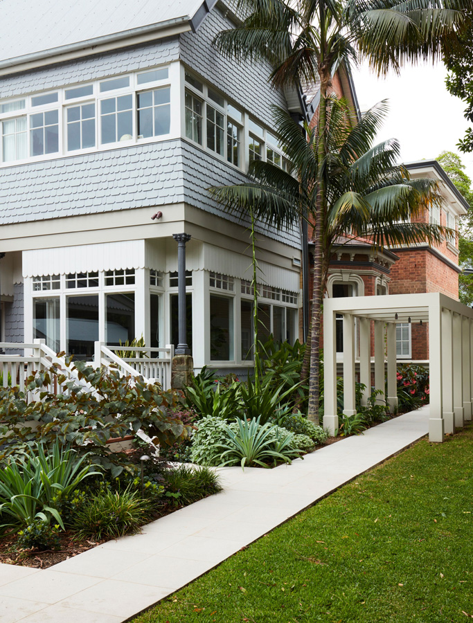
SINGLE RESIDENTIAL EXTERIOR
WINNER
PROJECT: ALMA RESIDENCE (NSW)
ARCHITECTURE/DESIGN PRACTICE: STUDIO GORMAN
Judge’s comments: “From the fabulous front door to the charming extension, the use of many and varied colours in this residence is sophisticated and refined. Anything but conservative, the subtle palette is full of surprising layers and complexity. Dulux colour Linseed takes on a green tinge against the existing red bricks in a beautiful juxtaposition. Soft blues distinguish the exterior extension and are amped up through the interior. Even the impact of shade on colour has been considered. Overall, the quirky combinations create an understated drama and cohesive take on contemporary Victoriana.” – Mardi Doherty, Director of Doherty Design Studio
COMMENDATION
PROJECT: THE BANK, VAUGHAN (VIC)
ARCHITECTURE/DESIGN PRACTICE: MARIA DANOS ARCHITECTURE
Judge’s comments: “A strikingly simple structure, this converted 1850s bank has been given new life as a dwelling by strategic injections of colour. The faded original exterior, its warm, soft-red bricks and sandstone base, is punctuated by a perfectly contrasting blue on the front door and window frames, articulating these elements in a simple, impactful gesture.” – Mardi Doherty, Director of Doherty Design Studio
NZ GRAND PRIX
WINNER
PROJECT: WAINS HOTEL DUNEDIN (NZ)
ARCHITECTURE/DESIGN PRACTICE: YELLOW6
Judge’s comments: “This contemporary but classic design is in keeping with the historic Victorian-era hotel, described by the architects as ‘a grand old dame with quirks and personality’. The subtle use of colour blocking, with soft greys and neutrals on walls to enhance the traditional mouldings, is especially worth noting, as is the choice of Dulux Tuatapere from the Colours of NZ range for the feature wall – a nod to the South Island. Even the clear delineation of curtain lines to define the colour blocks is clever.” – Simon Farrell-Green, Editor of HOME New Zealand magazine
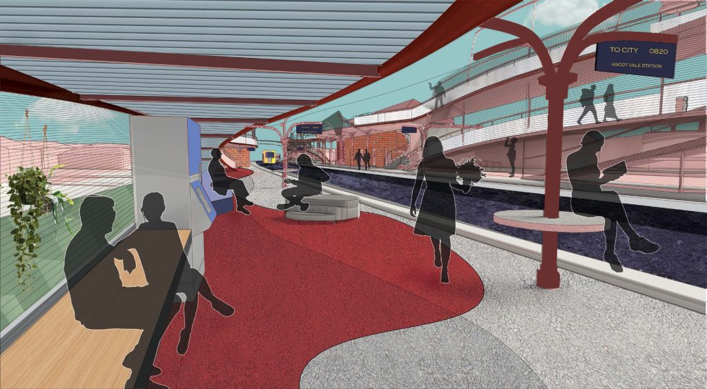
STUDENT
WINNER
PROJECT: REIMAGINING RAIL (VIC)
STUDENT: DIANA ONG, THE UNIVERSITY OF MELBOURNE
Judge’s comments: “Driven by an ambitious social imperative, this proposal seeks to connect people in public places and employs colour as a unifier in a way that feels real and natural. It truly pushes the boundaries, as students can and should before they are limited by the constraints of industry. Also worth noting is the beauty of the spectacular renderings, which are reminiscent of Constructivist paintings.” – Mardi Doherty, Director of Doherty Design Studio
COMMENDATION
PROJECT: THE PERFORMANCE TERRAIN THEATRE (NZ)
STUDENT: LAUREN GIBBS, AUCKLAND UNIVERSITY OF TECHNOLOGY
Judge’s comments: “In a similar response to community need as the winning project in this category, the use of colour in this proposal generates a sense of soul and an atmosphere of calm. Throughout the form, each colour view is unique and the play of light and shadow is visually striking. It demonstrates how colour can itself become form and illumination.” – Mardi Doherty, Director of Doherty Design Studio
COMMENDATION
PROJECT: THE COMMONS (NZ)
STUDENT: ABBEY HALE, AUCKLAND UNIVERSITY OF TECHNOLOGY
Judge’s comments: “Demonstrating a maturity in composition, this is a confident design and application of colour. Here, colour is functional, driving the space in a powerful cohesive fashion. The vibrant palette has been derived from materials found along the shoreline, connecting it to place as a means to build upon the spatial narrative.” – Mardi Doherty, Director of Doherty Design Studio
More green updates